

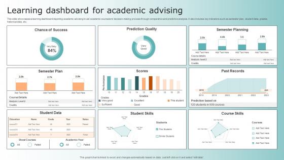
Learning Dashboard For Academic Advising




Try Before you Buy Download Free Sample Product
 Impress Your
 Audience
 100%
100% Editable
 Save Hours
 of Time


This slide showcases a learning dashboard depicting academic advising to aid academic counselors decision making process through comparative and predictive analysis. It also includes key indicators such as semester plan, student data, grades, historical data, etc.
People who downloaded this PowerPoint presentation also viewed the following :
Learning Dashboard For Academic Advising with all 7 slides:
Use our Learning Dashboard For Academic Advising to effectively help you save your valuable time. They are readymade to fit into any presentation structure.





FAQs for Learning Dashboard
Okay so for your learning dashboard, you'll need progress tracking first - completion rates, time spent, that kind of stuff. Performance metrics are huge too (quiz scores, assessments, etc). Don't underestimate how much good visual design matters - seriously, messy dashboards just make everyone anxious. Learning pathways help people figure out what's next. Oh, and throw in some social features like peer comparisons or team stats. People are weirdly competitive about learning progress. Start simple with these basics and build from there once you see what actually gets used.
Honestly, progress bars and badges are like crack for students - they get that little dopamine rush every time something fills up or unlocks. Your brain loves seeing abstract stuff become visual, you know? I've seen kids get way more excited about a skill map showing their improvement than just hearing "good job." Charts work great too because students can actually connect their hard work to real results. Just don't go overboard with fancy analytics right away - keep it simple at first. Celebrate the small wins, not just the big ones. Nobody wants to feel overwhelmed by data.
Track completion rates, time on activities, assessment scores, and login patterns first. The login stuff is actually super telling - I've caught kids falling behind way before they bombed any tests. Progress against learning goals matters too, plus discussion participation. Don't go overboard with data though, you'll just confuse yourself. These basics will help you spot at-risk students early. Once you see what patterns emerge in your specific classes, then you can get more detailed. Oh, and collaborative work engagement is worth watching if you do group projects.
So basically, you want to match the dashboard complexity to who's using it. Little kids need simple stuff - progress bars, bright colors, basic "you finished this" metrics. They'll get totally lost with too much info. High schoolers can handle more detailed stuff like how much time they spent on tasks and which skills they're struggling with. College students? Give them everything - performance breakdowns, learning paths, how they compare to others. The whole thing is figuring out what decisions people actually need to make first. Then build around that. I learned this the hard way when I made dashboards way too complicated for younger users.
Honestly, analytics is what makes your learning dashboard worth building instead of just another pretty interface. It takes all that messy data - completion rates, time spent, test scores, how users actually engage - and finds the patterns that matter. Without good analytics you're basically flying blind with a bunch of meaningless numbers. The smart part is how it spots learning gaps early, flags students who might struggle, and shows trends across different groups. Oh, and definitely figure out which specific behaviors you want to track first - saved me tons of headaches when I built mine.
Dude, these learning dashboards are game-changers. You get to see exactly where kids are bombing before they completely crash and burn. I'm talking real-time data on quiz scores, how long they're spending on stuff, engagement levels - the whole nine yards. Honestly? It's weirdly satisfying to watch the patterns emerge. Your students aren't wandering around clueless anymore either since they get instant feedback. The trick is setting up those automatic alerts when someone starts slipping. Then you can swoop in early instead of playing catch-up later. Way better than that awful mid-semester panic when you realize half the class is lost.
Make it super obvious what users are looking at right away - nobody wants to play detective with their dashboard. Keep your colors and icons consistent, but don't go crazy stuffing everything onto one screen. Put the big important stuff up front where people will actually see it. Group things that make sense together, like by goals or dates or whatever. Here's the thing though - you probably think your layout is way more intuitive than it actually is. Get real users to mess around with it early because they'll break your assumptions fast. Start simple with clear progress bars, then only add bells and whistles if people specifically ask for them.
Honestly, those dashboards are pretty clutch for figuring out where everyone's at. I can see who's stuck on fractions while other kids are bored and ready for harder stuff. Makes grouping so much easier! The real-time thing is what gets me though - you're not waiting weeks to find out someone's been completely lost. I usually check mine every week or so (sometimes I forget, oops) and use whatever patterns I see to plan different activities. You can switch up lessons mid-week if you need to. Way better than the old guessing game.
Honestly, I'd just start with whatever you're already familiar with and build from there. Tableau and Power BI are great if you want something powerful right out of the box. Google Data Studio won't cost you anything, which is nice. More of a coding person? Python's Plotly library is pretty solid, or you could go wild with D3.js. Canvas and Moodle have dashboard stuff built in too - might be worth checking if you're already using those. Hell, even Google Sheets can work for basic stuff when you're just getting started. The key is figuring out what insights you actually need first.
Honestly, treat it like a living thing that needs regular check-ups. Set up quarterly meetings with stakeholders - trust me, priorities change way faster than anyone expects. Monthly 15-minute reviews work great too - just ask yourself "would I actually use this data today?" Automate the data refresh stuff where you can, but don't forget about user feedback. Surveys or usage analytics will tell you when people stop caring about certain features. I've seen too many beautiful dashboards that nobody touches after month two. The whole thing should feel more like maintaining a product than a one-time project, you know?
Dashboards are honestly a game-changer for getting everyone on the same page about student progress. Parents can actually see real-time data instead of waiting for report cards - they'll spot trouble areas way earlier and have better convos with teachers. For administrators, it's like getting x-ray vision into what's happening across all classrooms. You can see which teaching methods actually work (spoiler: sometimes it's not what you'd expect). The trick is figuring out what metrics your stakeholders care about most, then building the views around that. Data-driven decisions about resources become so much easier when you're not flying blind.
Dude, you literally can't see what's happening anymore - no more scanning the room to spot who's confused or checked out. Everything has to come through data now. Dashboards track participation, assignments, progress when kids are everywhere. Without them you're totally guessing. The trick is setting up alerts that ping you fast when someone's struggling, not finding out three weeks later they've been drowning. It's kinda wild how dependent we've become on these systems, but honestly? They work way better than I expected for catching problems early.
Honestly, gamification is where it's at for learning dashboards. Points and badges are the obvious ones, but I'd definitely add progress bars - people love seeing that visual movement. Leaderboards get competitive types really hooked, especially if you're doing team stuff. Oh, and streaks are addictive as hell - nobody wants to break a "10 days completed" chain. Level-ups based on quiz scores work great too. The whole point is making it feel less like studying and more like... well, actually fun? Just don't go overboard at first - pick maybe two features so you don't overwhelm everyone right off the bat.
Honestly, teachers get overwhelmed by all the data - they just don't know what to do with it. Tech adoption is always messy too. Some people resist new tools, others need way more training than you'd expect. Privacy stuff comes up constantly with student info, which makes sense. The worst part? Most dashboards show metrics that teachers can't actually use day-to-day. Like, why would they care about district-wide averages when they need to know if Johnny gets fractions? Start with maybe 2 key things max and train them properly first. Don't dump everything at once.
Honestly, those dashboards are game-changers for getting kids to work together. Everyone can see who's crushing it and who needs help, which naturally leads to study groups and peer tutoring. The visibility thing is super motivating too - nobody wants to be the slacker when all their stats are public lol. You can set team goals and turn it into competitions, which kids love. I'd start by having students look at the data to find study partners who complement their weak spots. Short sentences work. But you'll probably find they gravitate toward it once they see how useful the shared progress tracking actually is.
-
It's always a delight to see new templates from you! I am extremely pleased with the fact that they are easy to modify and fit any presentation layout in seconds!
-
Nothing beats the well-formatted and professionally designed templates offered. Kudos to SlideTeam for their amazing collection of PPT slides.