


Learning Management System Dashboard For Online Course Management




Try Before you Buy Download Free Sample Product
 Impress Your
 Audience
 100%
100% Editable
 Save Hours
 of Time


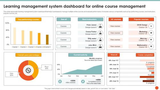
This slide represents learning management system dashboard that helps businesses to manage multiple online courses and evaluate performance. It includes various components such as top-performing courses, best instructors, popular courses, etc.
People who downloaded this PowerPoint presentation also viewed the following :
Learning Management System Dashboard For Online Course Management with all 10 slides:
Use our Learning Management System Dashboard For Online Course Management to effectively help you save your valuable time. They are readymade to fit into any presentation structure.










FAQs for Learning Management System Dashboard For
Honestly, focus on navigation that doesn't make people think too hard - boring is actually good here. Real-time progress tracking is key, plus you'll want different views depending on who's using it. Students need to see their progress and deadlines quickly, while admins want reporting and user management stuff. Mobile is non-negotiable since everyone lives on their phones now. Oh, and make sure it plays nice with whatever tools you're already using. Search functionality matters more than you'd think! I'd definitely test a few options with your actual team first - what looks good in demos can be totally different when real people use it.
UX makes or breaks your LMS dashboard, seriously. If people can't find their courses quickly, they'll just give up. Put the critical stuff first - assignments, progress bars, all that. I swear half the dashboards I see look like they were built by tech people who forgot regular humans would use them (which honestly might be true lol). Watch someone actually try to navigate your current setup. You'll immediately see where they get stuck or confused. The whole thing should feel natural, not like they need a manual just to check their grades.
Honestly, data viz is a game changer for LMS stuff. You know how you'd normally be drowning in spreadsheets full of completion rates and test scores? Charts and dashboards make all that actually readable. Heat maps show you patterns right away - like which parts of your course people are bombing or where they're getting stuck. I swear it's so much faster than digging through regular reports. You can spot the strugglers and see what content isn't working. My advice? Pick the metrics that actually matter for your goals first, then build from there.
So basically the LMS tracks how each student's doing and customizes everything based on their progress and learning style. Pretty neat stuff - it'll automatically give struggling kids extra practice while pushing the smart ones toward harder material. You can set up these adaptive paths that change as they go. Also shows knowledge gaps and suggests resources in real time, which honestly saves so much time. Just turn on the analytics features first and create learner profiles. Takes a few weeks to really kick in but totally worth it once it does.
Put the urgent stuff right at the top - deadlines and tasks they actually need to do today. Group similar things together (assignments here, announcements there). Most people barely glance at dashboards anyway, so your critical info better be visible immediately. Clear headings help too, nobody wants to hunt around for basic stuff. Map out how users actually work first, then build around that flow. Oh and definitely test with real people - I learned this the hard way, they'll catch confusing layouts in like two seconds. Consistent layouts save everyone's sanity.
Honestly, the analytics piece is what makes an LMS actually worth it. Instead of just hosting courses, you'll see real-time data on who's struggling, completion rates, quiz performance - all that good stuff. The visual dashboards beat scrolling through endless spreadsheets (trust me on this one). Spot patterns in what content actually works and where people get stuck. Generate reports for your boss without the manual work. Best part? You can tweak things mid-course instead of waiting until it's over to realize half your team was lost by week two.
Those LMS dashboards are honestly game-changers for keeping tabs on your students. Check who's actually logging in and completing assignments - you'll catch the ones slipping through the cracks way earlier. Grade patterns tell you so much about what's working (or isn't). But here's what I find most useful: engagement stuff like discussion posts and time spent reading. Sometimes that matters more than test scores, you know? My favorite part though is being able to reach out before kids are totally drowning instead of waiting for them to come to you.
Dude, mobile compatibility is everything for LMS dashboards. I learned this the hard way when our team rolled out a "desktop-first" design - total disaster. Your users will hate you if they're constantly pinching to zoom just to hit a submit button. Tiny text becomes impossible to read, and honestly? People just give up. When dashboards actually work on phones, engagement goes through the roof because learners can jump in whenever. My advice - and I can't stress this enough - test on real devices first. Don't just resize your browser window and call it good.
Honestly, start with the basics that'll save you headaches later. SSO is huge - nobody wants yet another login to forget. HR integration comes next for user setup and org charts. After that? Add Zoom or Teams for virtual stuff. The list gets crazy long if you let it - analytics, content tools, CRM for customer training, payment systems if you're selling courses. But here's the thing: don't go overboard right away. I'd focus on SSO and HR first, then build out based on what people actually complain about missing. Way easier than trying to integrate everything at once and breaking something.
Start with progress bars and badges - they're honestly addictive once people get hooked. Progress bars are perfect for tracking course completion, while badges can celebrate stuff like "First Quiz Done" or hitting a week-long streak. Leaderboards get competitive (which can be fun or annoying depending on your crowd). Point systems work well too - give points for forum posts, assignments, basically any engagement. Don't go overboard with these on your main dashboard though. Pick one or two elements first and see how users react before throwing everything at them.
Ugh, the technical integration stuff will drive you crazy - your IT people are gonna hate connecting everything to your current systems. Faculty? Good luck getting them to actually use it. They hate change. Data quality is where most people screw up though - clean that mess up first or you'll just have a pretty dashboard full of garbage. Oh, and don't fall into the trap of tracking metrics that look cool but don't actually help anyone. Honestly, just start with like 5-10 people who are actually interested. Get them using it, listen to their complaints, then expand from there.
Dude, user roles are literally everything for your LMS dashboard design. Students just want to see their courses, assignments, and grades right away. Teachers need their class management stuff and gradebooks up front. Poor admins though - they're stuck with endless reports and user management (their screens look like a hot mess tbh). Don't dump everything on everyone or you'll kill the user experience. Map out what each person actually does daily, then build around that. Hide the irrelevant crap. Short answer? Design for their real workflows, not what you think they need.
Honestly, the biggest thing right now is AI-powered personalization - dashboards that actually learn what each person needs instead of just dumping everything on them. Mobile-first design is huge too. Remember those awful college portals we used to hate? Yeah, now everything's more like Netflix recommendations, which is so much better. Real-time analytics are everywhere now, plus way better integration with other work tools. Oh, and adaptive layouts that don't suck on your phone. When you're looking at platforms, definitely focus on the mobile experience first - that's where people actually learn these days. API connections matter more than you'd think too.
Just build it into what users are already doing - star ratings after they finish modules, comment boxes on assignment pages, maybe some thumbs up/down buttons scattered around. Pop-ups can work but honestly they're pretty annoying if you go overboard. The trick is making it feel natural, not like extra work. Put feedback stuff where people naturally stop anyway - after videos, when they submit assignments, that kind of thing. Oh and definitely show the feedback data to instructors in their dashboard or it's basically pointless. I'd start simple with like one or two things and see what people actually use.
Start with screen reader stuff - proper headings, alt text, semantic HTML. Those default gray colors? Way too light for contrast standards. Your nav needs to work with just keyboard, and interactive stuff needs visible focus indicators. I'd also check that fonts can scale up and don't use color alone for important info (like red = overdue). Oh, and honestly? Run it through some accessibility checkers first before getting fancy with real assistive tech testing. Just audit what you've got against these basics and you'll catch most issues.
-
Very well designed and informative templates.
-
Very unique and reliable designs.