

Annual Learning And Development Training Dashboard




Try Before you Buy Download Free Sample Product
 Impress Your
 Audience
 100%
100% Editable
 Save Hours
 of Time


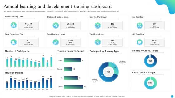
This slide provides glimpse about yearly data statistics related to Learning and Development L and D training sessions. It includes actual training costs, budgeted training costs, etc.
People who downloaded this PowerPoint presentation also viewed the following :
Annual Learning And Development Training Dashboard with all 7 slides:
Use our Annual Learning And Development Training Dashboard to effectively help you save your valuable time. They are readymade to fit into any presentation structure.





FAQs for Annual Learning And
Focus on completion rates and assessment scores first - those two tell you if your training's actually working. Track time-to-completion and engagement levels too. I'd add learner satisfaction because honestly, if everyone's miserable, who cares about the other numbers? Look for drop-off points and check knowledge retention later on. Break everything down by department or role so you can spot weird patterns. Oh, and don't go crazy with metrics - stick to maybe 5-7 max or you'll drown in spreadsheets.
So basically, when your employees can actually see their learning progress, they get way more into it. Completion rates, badges, goal tracking - all that stuff creates this weird competitive motivation. The data you get is honestly pretty wild too, shows you what training actually works vs what's just sitting there. Here's the thing though - the real game changer is letting people pick their own learning paths based on what gaps they see. Oh, and definitely set up those regular progress updates. I've seen participation rates literally double when people get consistent nudges about where they stand.
Stick with the basics - progress bars and line charts are clutch for showing completion rates and tracking learning over time. Heat maps are actually super useful for spotting knowledge gaps across teams (way underrated IMO). Bar charts work great for comparing performance between people or departments. Pie charts get a bad rap but they're fine for breaking down training categories. Don't go overboard with fancy stuff though. People just want to quickly see "where am I?" and "how am I doing?" Keep it straightforward and you'll be golden.
Honestly, most training platforms make this pretty straightforward - you just set up different views for each department. HR gets their compliance stuff, sales sees product training stats, IT focuses on certifications, whatever makes sense. Role-based permissions are your friend here. I'd definitely start with just one team as a test run though, maybe whichever department complains the most lol. You can mess with the visuals too - add logos, change layouts, tweak notifications. The trick is figuring out what each team actually cares about before you go crazy with all the customization options.
You need real-time data, trust me on this one. When learners start struggling or dropping out, you'll catch it immediately instead of finding out weeks later when the damage is done. I learned this the hard way - used to rely on monthly reports and missed so many red flags. Set up alerts for your most critical metrics so you're not glued to dashboards all day. Pick maybe 3-4 things that actually move the needle for your training goals. Without live data, you're basically guessing what's working. It's like trying to drive with your eyes closed.
Honestly, I just pick 2-3 metrics that actually matter to my boss and track those religiously. Completion rates are obvious, but the real magic happens when you can show skill improvements translating to actual results - like sales numbers going up or fewer mistakes happening. The dashboard gives you solid before/after comparisons which makes budget conversations way easier. Time-to-competency data is clutch too. Oh, and retention improvements? Those numbers can be pretty eye-opening when you tie them back to specific training programs. Just don't go overboard trying to measure everything at once.
So for training dashboards, I'd probably go with Power BI or Tableau first - they're both pretty solid for visualizations. Google Data Studio is decent too and it's free, which is nice if you're already using Google stuff. Oh, and don't overlook learning management systems like Cornerstone or Docebo. They usually have dashboard features built right in, so you might not need a separate tool at all. Really depends on where your data lives and how tech-savvy you are though. I'd just grab a free trial of Power BI or Google Data Studio and see what clicks with your training data.
Okay so first thing - validate your data sources and set up quality checks that run automatically. I'd start with clear pipelines that catch outliers and missing stuff. Weekly spot checks are clutch too. Document where every metric comes from because trust me, someone's always gonna ask and you don't want to look clueless. Also make sure your team definitions actually match up - I've seen dashboards completely tank because people were measuring different things. Set alerts for when numbers go wonky. Oh and double-check those database connections regularly!
Honestly, you want people to actually *find* stuff without getting frustrated. Clear navigation is huge - nobody wants to click around forever looking for their courses. Progress bars are your friend here, plus show upcoming deadlines and what they've already completed. Make the search function decent (seriously, broken search is the worst). Mobile matters too since everyone checks this stuff on their phones. Oh, and put certifications somewhere visible - people love seeing their accomplishments. Just figure out what users look for most and put that front and center.
Training dashboards are honestly a game changer - you get live data on completion rates, quiz scores, engagement, all that stuff in one spot. Instead of waiting months to find out your program sucks, you can catch problems early and fix them. Like if everyone's failing the same module, boom, you know it needs work. I usually check mine weekly or monthly depending on how much is going on. The whole point is actually using the data though, not just staring at pretty charts. Makes such a difference when you can pivot quickly instead of wondering why people aren't learning anything.
Dude, make the feedback stupid easy - like one-click thumbs up/down right after each section. Capture it while it's fresh, not buried in some random survey later. Ask specific stuff like "was this clear?" instead of boring generic questions. I've watched so many dashboards crash and burn because the feedback was a total pain to give. Oh and this is huge - actually show people when you fix things based on their input. Otherwise they'll just stop caring and won't bother next time. Trust me on that one.
So basically you hook up your training dashboard to all that historical data - completion rates, performance stuff, business forecasts. The system spots patterns like skill gaps and seasonal rushes that you'd probably miss. Pretty neat actually! Feed it info about upcoming projects, new hires, compliance deadlines - whatever's coming down the pipeline. Then you can get ahead of the chaos instead of scrambling when bottlenecks hit. Oh and don't try to predict everything at once. Pick your biggest 3-5 training headaches first and build from there.
Honestly, start with data minimization - just grab what you actually need for training, not everything you can get your hands on. Set up role-based permissions so managers can't snoop around where they shouldn't. Anonymize the sensitive stuff when possible. Also, you probably don't need to hoard individual performance records forever (seriously, some companies keep way too much). Do a quick audit of what you're collecting now. For each piece of data, ask yourself: does this actually help with training goals? If not, ditch it. Access controls are huge too.
Progress bars and point systems work great for this! I've actually seen people get weirdly competitive over completing training modules - it's pretty funny but effective. Set up badges for stuff like "5 courses this month" or perfect quiz scores. Team challenges are solid too, like having departments compete against each other. The trick is making everything super visual so people can see their progress. Don't overthink it though - start with basic points and see what sticks. You can always add leaderboards later once you figure out what actually motivates your users.
Don't cram everything onto one screen - it's just chaos and nobody knows what to focus on. Those vanity metrics are the worst too, like completion rates that tell you absolutely nothing about whether people actually learned anything (I've seen way too many dashboards obsessing over these). Pick 3-5 metrics that'll actually change how you do things. Make sure you're tracking real outcomes, not just busy work. Keep the layout simple so your team will want to use it instead of ignoring it completely.
-
I discovered some really original and instructive business slides here. I found that they suited me well.
-
“Excellent information with easy access.”