Marketing team weekly update report

Marketing team weekly update report
Slide 1 of 2
Favourites Favourites

Try Before you Buy Download Free Sample Product

Audience Impress Your
Audience
Editable 100%
Editable
Time Save Hours
of Time
The Biggest Sale is ending soon in
0
0
:
0
0
:
0
0
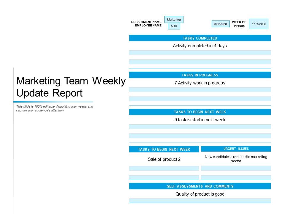
Presenting this set of slides with name Marketing Team Weekly Update Report. The topics discussed in these slides are Department, Employee, Progress, Sale Of Product, Quality, Tasks In Progress, Assessments. This is a completely editable PowerPoint presentation and is available for immediate download. Download now and impress your audience.

FAQs for Marketing team

Ok so for your presentation templates, definitely focus on AI personalization and interactive content - that stuff's everywhere right now. Video-first is massive too, especially short-form content (honestly can't escape it). Community marketing and voice search are pretty big deals. Oh and sustainability messaging - clients eat that up. Data privacy's become this weird competitive advantage now? Make your templates modular though, so you can swap in different case studies. Way better than just listing bullet points. Pick whatever trend hits hardest with each audience.

Templates are honestly a game-changer for presentations. You're not reinventing the wheel each time, which is huge when you're juggling multiple campaigns. Stakeholders get used to your format too - they know where to find the metrics, timelines, all that stuff. Makes meetings way smoother. Your strategic points land in the same spots every time, so decision-makers aren't hunting around for what they need. I'd start basic and tweak it as you go. My old team probably saved hours each week once we nailed down our template.

First thing - get your brand stuff sorted. Same colors, fonts, logo spots on every slide. White space is your friend here, nobody wants to stare at a wall of text. Build out different slide types now: titles, bullet points, image slides, charts. Oh and seriously, make your fonts big enough - 24pt minimum or people in the back row will hate you. I learned that one the hard way. Set up slide numbers and leave room for notes. Having templates ready beats panicking right before a presentation.

Honestly, ditch the bullet point slides. Nobody wants to stare at walls of text - they'll just scroll Instagram instead. Use actual visuals and tell a story with your presentation. Think about it like this: would you rather sit through a boring lecture or binge a show? Our brains eat up images way faster than reading anyway. I'd swap out at least half your text slides for compelling visuals that back up what you're saying. The Netflix comparison might be cheesy, but it's true - people remember stories and images so much better than random facts thrown at them.

Honestly, data viz is what makes or breaks marketing presentations. I always set up templates with pre-built spots for metrics and charts - saves me from reformatting hell every single time. Nothing kills credibility faster than numbers that look slapped on at the last minute (learned that one the hard way). Drop zones for conversion rates, ROI charts, customer journey stuff - whatever you need should fit seamlessly into your design. Oh, and create multiple chart layouts in advance. Bar charts, line graphs, heat maps - you'll want options depending on what story you're telling. Makes the whole process way smoother.

Start with a solid brand style guide - logo rules, color codes, fonts, spacing, all that stuff. Marketing should own template creation and actually police what gets used (seriously, I've seen brands look like 5 different companies because nobody checks). Set up one shared folder with approved templates only. Train people on when to use what - sales decks vs marketing presentations need different vibes. Short version: pick someone to be the template cop or everything will look like chaos. Also audit regularly because people love to "customize" things when you're not watching.

First thing - dive deep into their world. What keeps them up at night? What regulations do they deal with? You've gotta speak their language or you'll sound like an outsider. I spend way too much time creeping on competitor content, but honestly it works. Your visuals and case studies need to fit their vibe - healthcare stuff needs totally different compliance language than some flashy tech startup template. Focus on problems they actually face, not generic "increase efficiency" BS. Oh, and definitely test with real people in that industry before you go live. They'll catch things you missed.

Honestly, animated templates are a game changer - people actually stop scrolling when there's movement on screen. Your engagement goes way up because motion naturally draws the eye and holds attention longer. They make presenting way less boring too (trust me on this one). The animations help you break complex stuff into smaller pieces, so your main points land better and stick in people's heads. Just don't go crazy with the effects - keep transitions smooth and focus on highlighting what actually matters. I learned that the hard way after creating what basically looked like a PowerPoint disco ball once.

Dude, interactive templates are game-changers for engagement. Click-through rates go way up, and people actually stick around instead of mindlessly scrolling (we've all been there). You'll get better leads and collect real feedback while it's happening. Honestly, the data alone is worth it for tweaking your targeting later. Plus people remember interactive stuff way more - they might even share it if you nail those cool moments. Oh, and start simple! Try polls or clickable spots first. You'll be shocked how much more response you get versus boring static posts.

Oh man, cultural stuff will totally mess with your template designs if you're not careful. Colors are huge - like red screams "danger" here but it's lucky in China. Arabic markets need right-to-left layouts too. We had this fancy gold template that bombed hard in Germany because they're all about that clean, minimal look. Such a pain. You're way better off making different versions for each region instead of trying to make one work everywhere. Also, definitely loop in local marketing people early - they'll catch stuff you'd never think of. Trust me on that one.

Canva Pro is probably your best bet - their template game has gotten insane lately and you can actually make stuff look professional without being a designer. Adobe Creative Suite works if you're already comfortable with that whole ecosystem, but honestly it's overkill for most presentations. PowerPoint and Google Slides are fine too, just more basic design-wise. Oh, and Figma's pretty cool for team collaboration, though it takes some getting used to. I'd go with Canva first since you can set up brand kits and keep everything looking consistent across your decks.

Honestly, templates will save your life. I'd start with whatever campaigns you're doing most often - emails, social posts, landing pages, whatever. Build frameworks with placeholder spots for the specific details. Your team just plugs in new copy and visuals instead of rebuilding everything each time. We used to take weeks to launch stuff, now it's like 2-3 days max. The trick is making them modular so they work across different audiences. I probably sound like a broken record about this, but seriously - it's a total game changer once you get the system down.

Ugh, the worst thing you can do is just slap your logo on a template and call it a day. You'll look so generic. Also - and I can't stress this enough - don't jam paragraphs of text onto slides. Nobody reads that stuff anyway. Those cheesy stock photos are dead giveaways you used a template too. What I'd do? Spend like 20 minutes actually making it yours. Switch up the colors to match your brand, pick better fonts, cut down the text. Think of templates as your rough draft, not the final thing you're presenting to people.

Dude, templates are a lifesaver. I used to waste hours rebuilding the same training stuff over and over - so annoying. Now I just make standardized slide decks and worksheets once, then swap out examples for different teams. Your trainers won't forget key topics, and honestly? New hires get way more consistent training. You can actually focus on teaching instead of scrambling to create content last minute. Oh, and everyone gets the same quality experience, which is huge. Start with one template for whatever you train on most. Build from there.

Honestly, color psychology is such a game changer for presentations. Red screams urgency - great for those "act now" moments. Blue makes people trust you instantly. Green? Money and growth vibes. Orange just feels super approachable and energetic. I swear I've watched entire presentations flip their whole energy just by changing colors. If you're doing anything finance-related, stick with blues over something like bright yellow (learned that one the hard way lol). Green works amazing for sustainability stuff too. Pick your colors before you even start building - think about what emotion you want first, then build around that.

Ratings and Reviews

0% of 100
Review Form
Write a review
Most Relevant Reviews

No Reviews