


Monthly business product sales report




Try Before you Buy Download Free Sample Product
 Impress Your
 Audience
 100%
100% Editable
 Save Hours
 of Time


Our Monthly Business Product Sales Report are explicit and effective. They combine clarity and concise expression.
People who downloaded this PowerPoint presentation also viewed the following :
Content of this Powerpoint Presentation
Description:
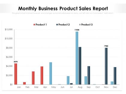
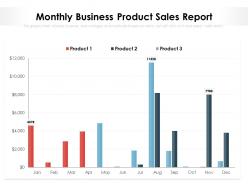
The image is a bar chart from a PowerPoint slide titled "Monthly Business Product Sales Report." It visually represents sales data for three different products across the months of the year. Each product has its own color on the chart—Product 1 is red, Product 2 is blue, and Product 3 is grey. The vertical axis represents sales in dollars, while the horizontal axis represents the months from January to December. Notable sales peaks for Product 2 are seen in August and November, while data for the other months and products appear to be placeholders, or not as prominently high.
Use Cases:
This slide can be utilized across various industries for performance tracking, sales meetings, and strategy development:
1. Retail:
Use: Tracking monthly sales figures for different product categories.
Presenter: Sales Manager.
Audience: Retail team, Store Managers.
2. E-commerce:
Use: Analyzing online sales trends for product optimization.
Presenter: E-commerce Analyst.
Audience: Marketing team, Product Managers.
3. Manufacturing:
Use: Monitoring production output against sales.
Presenter: Operations Director.
Audience: Manufacturing department, Executives.
4. Pharmaceuticals:
Use: Reporting on sales of various medications or health products.
Presenter: Pharma Sales Head.
Audience: Sales representatives, Marketing team.
5. Consumer Electronics:
Use: Visualizing sales trends for different tech gadgets.
Presenter: Product Lead.
Audience: Marketing department, R&D team.
6. Automotive:
Use: Reviewing monthly vehicle sales performance.
Presenter: Regional Sales Manager.
Audience: Dealership owners, Sales team.
7. Food and Beverage:
Use: Summarizing sales data for different food products.
Presenter: F&B Manager.
Audience: Distributors, Retail partners.
Monthly business product sales report with all 2 slides:
Give your audience a fulfilling experience. They will find our Monthly Business Product Sales Report elevating.
FAQs for Monthly business
Focus on revenue, conversion rates, and deal size first - those actually matter for decisions. Track how long your sales cycles take and pipeline health (qualified leads moving through stages). Activity stuff like calls and demos can help, but honestly they turn into fluff metrics pretty fast if you're not watching it. Customer acquisition cost versus lifetime value shows you which deals are worth chasing. Win/loss ratios by rep give you good intel too. I'd start simple with these basics. You can always pile on more KPIs later once you figure out what your team's actually struggling with.
Dude, charts and graphs are a game changer for sales data. Instead of staring at endless spreadsheet rows (my eyes literally glaze over), you'll instantly spot which products are bombing and which regions are killing it. Line graphs show seasonal patterns super clearly. Bar charts work great for monthly comparisons too. The visual stuff makes presenting to your boss way less painful - trust me on that one. You can catch those weird spikes or dips that would take forever to find otherwise. Start simple with basic charts, then get fancier if you need to.
Honestly, most people just throw way too much data at their audience. Pick like 3-5 metrics that actually matter instead of overwhelming everyone with every number you've got. Also, don't mix up your time periods or compare random stuff that doesn't make sense together - I've seen people compare quarterly revenue to monthly user stats and it's just... why? Keep your charts simple too. Nobody wants to stare at something that looks like a unicorn threw up. The real mistake though? Just dumping raw numbers without explaining what they mean. Your stakeholders want to know WHY something happened, not just that it did.
Know your audience, seriously. Executives want the 30,000-foot view - big metrics, trends, what it means for the business. They're gonna skim anyway, so load it up with charts and visuals. Sales teams? Totally different story. They need the detailed stuff they can actually use - individual numbers, pipeline breakdowns, specific deals to chase. I'd honestly just make two versions from the same data. Focus the exec one on strategy and outcomes. Make the sales version way more tactical with actionable insights they can run with tomorrow.
Oh man, if you're already using Salesforce then their Reports & Dashboards thing is pretty solid - though honestly can be overkill sometimes. HubSpot's got decent reporting too and way easier to figure out. Power BI or Tableau are killer if you need to pull from like 5 different places, but heads up - there's definitely a learning curve there. Actually, Google Data Studio works surprisingly well for basic stuff and won't cost you anything. I'd just start with whatever plays nice with your current CRM first. Trust me, you don't want to spend weeks trying to connect everything.
Honestly, I'd go with weekly reports for most situations. You get enough data to catch trends without drowning in meaningless day-to-day noise. Daily feels excessive unless you're in crunch mode or something - I've watched teams burn themselves out obsessing over every little fluctuation. For the leadership folks, throw them a monthly summary so they can do their big picture planning thing. Weekly's my sweet spot though. Gives you room to actually react when something's off track. Start there and see what works for your team's vibe.
So basically, reports are like taking a photo - you create them once to look at what already happened. Dashboards update constantly and show you what's happening right now. Reports work great when you need to dig deep into quarterly numbers or present to your boss. Dashboards are perfect for keeping an eye on daily stuff without having to generate new documents every time. Honestly, I use dashboards way more since they're just sitting there updating themselves. You'll probably want both though - dashboards for everyday monitoring and reports when you need that formal analysis.
Honestly, just dive into your old sales data first - that's where the gold is. Seasonal stuff jumps out pretty quick, plus you'll see which products or regions actually performed when it mattered. Excel works fine for this, don't overthink it. I'd probably start with quarterly comparisons since monthly can get messy. The tricky part? Going back far enough to catch real patterns without using ancient data that doesn't matter anymore. Once you spot your best indicators from the past, applying them forward is pretty straightforward. Growth rates tell you a lot too.
Dude, customer feedback is like a reality check for your sales reports. It shows you what actually matters to clients vs what you think matters. Ask your key accounts what insights they're missing - they'll tell you which KPIs they actually care about and what pain points aren't showing up in your data. Honestly, sometimes they catch blind spots you didn't even realize existed. Way better than tracking vanity metrics that look pretty but don't help anyone make decisions. I learned this the hard way last quarter when I was obsessing over activity metrics while clients just wanted to see pipeline health.
Look at your sales reports and find patterns - which reps keep struggling with the same stuff? Maybe it's conversion rates, dragging out deals forever, or they just can't upsell to save their lives. Those patterns show you exactly what training you need. Don't ignore your top performers either - honestly, they're goldmines for figuring out what actually works. Compare everyone's numbers to team averages and see where the gaps are. Then build training around those specific problems instead of some boring generic sales course that puts everyone to sleep.
Honestly, visuals are a game-changer for sales data. People actually get what's happening when they see charts instead of endless spreadsheet rows. Your team will spot trends and weird outliers way faster than staring at numbers all day. Also, let's face it - meetings with just data tables put everyone to sleep. Executives love this stuff because they can make quick decisions when the story's clear. I always start with the biggest insight, then build everything else around it. Way more effective than dumping raw figures on people.
Try adding year-over-year comparisons for the same months or quarters - that's honestly the easiest way to spot what's actually seasonal vs. a real problem. Charts showing multiple years of data work great for this. I'd start simple with just one YoY chart first, then expand from there. Also worth calling out any inventory or staffing changes you might need based on those patterns. The goal is helping your team quickly distinguish between "oh it's just December being slow again" versus actual performance issues. Monthly breakdowns usually work better than quarterly, but depends on your business I guess.
Side-by-side comparisons work really well - either columns or overlay charts with both lines. I'd also do visual variance analysis where you color-code the gaps (red for underperforming, green for beating projections). Honestly, waterfall charts are my favorite for this kind of thing though. They show exactly where you gained or lost ground. Dashboard layouts are perfect since people can scan everything quickly instead of diving into messy spreadsheets. Start with your variance summary up top, then break down the details below. Makes it way easier to digest.
Honestly, just dig into your regional numbers first - break them down by performance, demographics, seasonal stuff. Your best regions? Figure out what's actually working there, like local partnerships or messaging that clicks. Don't sleep on the underperforming areas though - they're showing you where awareness is lacking or your product just isn't fitting right. Compare acquisition costs across regions and see which channels give you the best bang for your buck. I'd start with last quarter's data and map it against current spend. You'll probably spot some obvious places to shift money around pretty quick.
Track your units sold, revenue, and profit margins for each product - that's the foundation. Conversion rates matter way more than most people think, plus average order values show what's actually making money vs just selling a bunch of cheap stuff. Returns will bite you if you ignore them (trust me on this one). Geographic data's gold if you're in multiple markets. Oh, and definitely compare year-over-year numbers. Seasonal trends too if your stuff follows patterns. Start simple with these basics, then dig deeper once you see what patterns emerge.
No Reviews