


Sales report template for lead





Try Before you Buy Download Free Sample Product
 Impress Your
 Audience
 100%
100% Editable
 Save Hours
 of Time


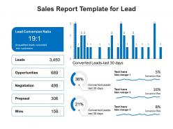
Our Sales Report Template For Lead are explicit and effective. They combine clarity and concise expression.
People who downloaded this PowerPoint presentation also viewed the following :
Sales report template for lead with all 2 slides:
Give your audience a fulfilling experience. They will find our Sales Report Template For Lead elevating.
FAQs for Sales report
Revenue's the obvious one - break it down by product and region. You'll want conversion rates, lead volume, and how long your sales cycles are running. Average deal size matters too, plus win/loss ratios since those really show what's clicking. Oh, and customer acquisition cost if you're doing any marketing spend. Pipeline velocity's huge for forecasting - leadership's always asking what next quarter looks like, right? Honestly, sales cycle length can be eye-opening when you actually track it properly. Start with these basics and build from there based on what your team cares about most.
Dude, charts and graphs are total game-changers for reports. Nobody wants to stare at endless spreadsheet rows - trust me, I learned this the hard way! Bar charts show trends super quick, pie charts break down percentages, and heat maps instantly highlight who's killing it vs who's... not. I used to wonder why my reports got ignored until I started throwing in visuals. Even simple color coding helps a ton. Tables work for nitty-gritty details, but visuals actually tell the story people give a damn about. Try adding 2-3 charts to your next one and you'll see what I mean.
Dude, you'll save SO much time every reporting cycle - like hours. No more staring at blank spreadsheets wondering where to start (honestly the worst feeling). Templates keep everything consistent so your data looks professional, plus all the formulas are already built in and tested. Less chance of screwing up calculations that way. Your stakeholders will love knowing exactly where to find stuff too. I'd grab a template that fits your industry first, then tweak it however you need. Way better than reinventing the wheel every single time.
Honestly, weekly reports are your best bet for managing day-to-day stuff, then do monthly ones for the bigger picture planning. Daily reports? Total information overload - learned that the hard way. Quarterly is way too long between check-ins, you'll miss everything important. With weekly reports, you can actually spot what's working and fix problems before they get worse. Your team won't tune out either since the data stays fresh. Monthly gives you that step-back view for forecasting and seeing real patterns emerge. Just start weekly and see how it feels with your sales cycle timing.
Don't leave anything blank - I learned this the hard way lol. Date formats are huge too, everyone does them differently and it screws up consolidated reports. Keep your numbers precise instead of rounding everything because totals won't match up later. Customer names need to stay consistent or you'll have duplicates everywhere. Always write something in the notes section, even if it's boring - future you will thank you when tracking trends. Honestly the worst part is when someone else has to decode your half-finished form months later. Quick scan before hitting submit saves so much headache.
Your CRM probably already does this - Salesforce, HubSpot, Pipedrive are all solid for auto-populating reports. If you need data from different places, Zapier or Power Automate can pull everything into Excel or Sheets templates. Fair warning though, the initial setup is kind of a pain. Power BI and Tableau are amazing for fancy charts if that's your thing. I'd honestly just start with whatever CRM you're using now since connecting it is way easier than learning a whole new system. Once you get it running smoothly, you'll wonder why you waited so long.
Just swap out whatever metrics actually matter for your business. SaaS companies track MRR and churn instead of units sold. Retail folks care more about inventory turnover and seasonal stuff - you know how it goes. Start by figuring out your core KPIs first. What does your leadership team bug you about in every meeting? List those 5-7 metrics, then rebuild the template around them. Honestly, once you nail down what actually drives your business (not just the generic stuff everyone tracks), the whole thing becomes way more useful. Templates are just starting points anyway.
Honestly, figuring out who's gonna read your sales report changes everything. CEOs just want the big picture stuff - key numbers they can glance at quickly. Your sales team? They need all the nitty-gritty details so they can actually do something about it. I made this mistake once where I created this super detailed report that looked amazing, but it totally bored the executives. Time constraints matter too - some people have like 30 seconds to scan through. Really think about what decisions each person needs to make with your data, then design around that.
Oh yeah, seasonal stuff will totally mess with your sales data! I'd skip month-to-month comparisons and do year-over-year instead - like, don't freak out comparing December to January, you know? Build in sections for seasonal benchmarks, maybe weather data if that hits your business. I always throw in a notes section for random external stuff too (supply chain issues, holidays, whatever). Short sentences work. The whole point is making your template flexible enough that you can tell if a dip is normal winter slowness or actually something bad happening.
Start with a "Key Actions Required" box right at the top - trust me on this one. Add trend indicators and variance columns so you can spot problems fast. Traffic light colors are kinda cheesy but executives eat that red/yellow/green stuff up. Make sure you're comparing against targets and previous periods too. Each section needs clear next steps with actual owners assigned. The whole point is making insights pop instead of drowning in boring data tables. Oh, and definitely call out performance gaps that need immediate attention - don't let those slide by.
Okay so basically these templates let you track stuff like monthly growth and seasonal patterns, then you can actually predict what's coming next. It's wild how much clearer things get when you're looking at consistent data over time - way better than just guessing. The standardized format makes it super easy to spot trends and see what's bombing vs. what's crushing it. I honestly think most people skip this step and then wonder why their forecasts are trash. You'll be able to set realistic goals and pivot before things go sideways.
Quarterly reports are all about the nitty-gritty - monthly breakdowns, how fast your pipeline's moving, what's trending right now. Annual ones though? That's where you pull back and look at the whole year, compare to last year, see how market share shifted, calculate ROI, all that strategic stuff. The quarterly template can be pretty rough around the edges since it's mostly for internal use anyway. But definitely make your annual template polished with exec summaries and forecasting sections - leadership actually uses those for big decisions. Oh, and don't try cramming both into one template. Trust me, just make two separate ones.
Oh absolutely, past feedback is gold for this stuff. I always dig through what people complained about - like if they said data was impossible to find, I'll totally reorganize the whole layout. Key metrics buried on page 3? Moving those babies right to the top. One thing that cracks me up is how many people still print these reports and then complain the formatting looks awful (honestly didn't see that coming the first time). Just collect feedback after each cycle and tackle the most common gripes first. Each version should be better than the last, you know?
Honestly, templates are a game changer because everyone's finally speaking the same language with metrics. No more "wait, what does this number actually mean?" moments. Comparing different reps or quarters becomes super straightforward when everything follows the same format. And god, handoffs are so much cleaner - like when Sarah was out last month, I could actually make sense of her reports. The best part though? Meetings don't turn into decoding sessions anymore. You skip right to the actual analysis and decision-making stuff. Just start simple and let people tweak their sections as they go.
Dude, yes - it's probably the most crucial part honestly. Your executives are drowning in data and half the time they'll only read the summary section. That's your chance to call out big wins, flag problems, and spell out what happens next. All your detailed work becomes pointless if nobody actually digests it. I learned this the hard way lol. Always stick it right at the top where they can't miss it. Makes everything way more actionable instead of just... existing as a report nobody acts on.
No Reviews