

Mind map for healthcare sector flat powerpoint design




Try Before you Buy Download Free Sample Product
 Impress Your
 Audience
 100%
100% Editable
 Save Hours
 of Time


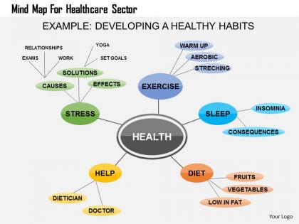
Choose our mind map for healthcare sector flat PowerPoint Design Template. The PPT slide is designed very carefully keeping in mind the importance of mind map in your business activities. A mind map is a diagram used to visually organize information. A mind map is hierarchical and shows relationships among pieces of the whole. The PPT Visual is created around a single concept, drawn as an image in the center of a blank page, to which associated representations of ideas such as images, words and parts of words are added. Major ideas are connected directly to the central concept and other ideas branch out from those. Mind mapping is a highly effective way of getting information in and out of your brain. Mind mapping is a creative and logical means of note-taking and note-making that literally "maps out" your ideas. The slide cab help you to convert a long list of monotonous information into a colorful, memorable and highly organized diagram that works in line with your brain's natural way of doing things. So stop thinking and use this highly useful PPT Design. Hasten approvals with our Mind Map For Healthcare Sector Flat Powerpoint Design. Comprehension gets faster and better.
People who downloaded this PowerPoint presentation also viewed the following :
Mind map for healthcare sector flat powerpoint design with all 5 slides:
Bag the desired deal with our Mind Map For Healthcare Sector Flat Powerpoint Design. They ensure you earn approval.


FAQs for Mind map for healthcare sector
Put patient outcomes right in the middle - that's your foundation. From there, map out regulatory stuff, tech integration, workforce planning, and keeping the finances solid. Stakeholder mapping is huge too (patients, providers, payers, community). I'd throw in competitive analysis and emerging trends - telehealth's obviously not going anywhere, plus AI and value-based care. Quality metrics matter. Risk management's another big branch. Honestly, the coolest part is watching how everything connects to everything else. Keep it broad at first, then get specific on each branch as you go deeper into planning.
So basically, mind maps give your healthcare team this shared visual thing everyone gets instantly. Complex patient cases? Treatment plans? Just throw it all in one diagram showing how symptoms connect to treatments and outcomes. Way better than those massive text docs nobody actually reads, honestly. Your whole team can see everything at once, which makes meetings way more focused and speeds up decisions. Different people can jump in and add their expertise to whatever branch makes sense. You should totally try one at your next case review - I bet it'll be a game changer.
Dude, mind maps are honestly a game changer for treatment planning. You get this whole visual web connecting patient history, symptoms, meds, comorbidities - everything in one spot. Linear notes? They miss so much. With mind maps you actually see patterns and catch potential problems before they bite you. The whole care team can look at it and instantly get what's going on with the patient. I mean, my attending still writes everything in boring lists but whatever. Try it on your next complicated case - just map out the main branches first. You'll be shocked how much clearer everything becomes.
Oh yeah, mind maps are great for EHR stuff! I mean, those projects are already chaotic enough without trying to juggle everything in random spreadsheets. You can throw all the pieces onto one visual - data migration paths, training timelines, workflow changes, system integrations. Makes it way easier to catch dependencies before they screw you over. Just start with "EHR Implementation" in the middle, then branch out to your main chunks like tech requirements and training phases. The visual layout honestly saves so much headache when you're trying to spot bottlenecks.
Dude, mind maps are seriously perfect for med school stuff. You can map out anatomy, disease processes, drug interactions - basically anything that feels overwhelming. I know residents who swear by them for boards prep. What's cool is how you visually connect symptoms to different diagnoses, especially with tricky cases. Honestly beats staring at walls of text any day. Patient workflows become way clearer too when you can see the whole picture branched out. Next time you're stuck on a complex case, try making one. You'll probably catch connections that weren't obvious before.
Honestly, mind maps are a game changer for healthcare policies. Put the main policy in the center, then branch out to requirements, deadlines, affected departments - all that stuff. Way easier than scrolling through endless documents (ugh). You'll actually see how everything connects and catch gaps you'd totally miss otherwise. My friend's team used them to map out compliance requirements and it made implementation planning so much clearer. The visual aspect just clicks better than spreadsheets, at least for me. You can spot which regulations hit which departments and plan around potential headaches.
Honestly, mind mapping is perfect for this stuff. You can throw patient feedback, new tech, regulatory changes, and market shifts all onto one visual canvas. Then you start seeing connections you'd totally miss buried in spreadsheets - it's wild how patterns emerge when everything's laid out like that. Plus you get this bird's eye view of all the healthcare chaos (and trust me, there's always chaos). The visual format makes gaps super obvious - like where new solutions could fit. I'd suggest doing quarterly trend maps if you really want to stay ahead of competitors who are still drowning in boring reports.
Color code your departments - blue for admin, green for patient care, red for emergency stuff. Icons work way better than just text boxes too, like little stethoscopes or charts. Honestly, executives eat up real numbers and KPIs, so definitely include those. Don't go crazy with branches though - stick to 5-7 main areas or it'll look messy. Use thick lines for major departments and thinner ones for smaller connections. Start with "Hospital Operations" in the center, then branch out to staffing, finance, patient flow, quality metrics. If you can make it interactive, even better! Simple animations keep people awake during those marathon presentations.
Oh mind maps are perfect for this! Start with the patient in the middle, then branch out to each team - nursing, PT, pharmacy, social work, whatever. Each branch shows what they're doing and when. Way clearer than those messy email threads we all hate. The visual thing really helps you spot where handoffs happen and where things might fall through cracks. Honestly, dependencies become so obvious when you can actually see them laid out. Try mapping one tricky case first - I bet you'll catch coordination issues you totally missed before. It's like having the whole care plan in one place finally.
Ugh, the resistance will be real - people hate change, especially when they're already drowning in work. Documentation systems aren't set up for this kind of visual stuff either, so that's annoying. Training's tough because some folks just don't think that way, you know? And don't get me started on compliance fears - everyone's terrified of breaking protocol. The skepticism hits hard initially. My advice? Find your early adopters first (there's always a few). Show them it actually works before trying to convince the whole department. Way easier than fighting uphill battles with everyone at once.
Mind maps are actually perfect for this! Start with 3-4 main branches - mood, behaviors, coping skills, whatever fits your patients. Then just add dated notes as you go along. Color-coding is where it gets interesting though - green for improvements, red for setbacks. Makes patterns jump out at you way faster than scrolling through regular notes. Your patients will dig seeing their progress visually too, honestly way better than staring at boring spreadsheets or whatever. The cool part? You'll spot connections between what you tried and how they responded that might've gotten buried otherwise. Build it up gradually - don't go crazy with branches right away.
Honestly, I'd try MindMeister or Lucidchart first - both handle HIPAA stuff properly and the team collaboration is pretty smooth. XMind's cheaper but looks kinda old school, which bugs me sometimes but whatever. Oh, Milanote's actually perfect if you're mapping patient journeys since you can throw in photos and random notes everywhere. The main thing is finding something that doesn't clash with whatever systems you're already using. I always tell people to grab free trials of like 2-3 options and just mess around with them. You'll know pretty quick which one feels right for how you think.
Honestly, mind maps are perfect for crisis stuff because you can see everything at once instead of drowning in documents. During COVID planning, our team used them and it was night and day difference. Put your crisis in the center, then branch out - response teams here, resources there, action items everywhere. You'll spot problems you'd totally miss otherwise, like when two departments are fighting over the same equipment (been there). Best part? You can update them super fast when everything inevitably changes. Way better than trying to track dependencies in some boring linear plan that nobody reads anyway.
Try mind maps for your community health assessment! Put your target population in the center, then branch out with demographics, health data, stakeholders, and resource gaps. Way easier than wrestling with a million spreadsheets - trust me on this one. You'll actually see how things connect, like housing issues affecting chronic disease care. I'd map out your next planning meeting this way. The patterns that pop up will totally shape your strategy, and honestly? You might catch connections you'd miss otherwise.
Dude, mind maps are actually clutch for this. When you map out the whole patient experience visually, gaps just jump out at you - like wait times, confusing discharge stuff, departments not talking to each other. Patients get lost in ways that don't show up in regular surveys. What's cool is seeing how all the touchpoints connect. I'd grab your team and focus on one specific patient type first. Then you can figure out which fixes will actually move the needle on satisfaction scores. Way better than guessing what matters most.
-
Use of icon with content is very relateable, informative and appealing.
-
Easily Editable.