

Mind map powerpoint presentation slides




Try Before you Buy Download Free Sample Product
 Impress Your
 Audience
 100%
100% Editable
 Save Hours
 of Time


Whether you are trying to impact knowledge or sell an idea, great presentations are in order. Therefore create those wonderful presentations using Mind Map Powerpoint Presentation Slides created with top quality in mind.
People who downloaded this PowerPoint presentation also viewed the following :
Mind map powerpoint presentation slides with all 24 slides:
We've dedicated ourselves to the development of the highest quality Mind Map Powerpoint Presentation Slides available today. Our products are designed to have your presentations perform at their best.

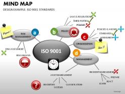
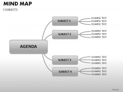
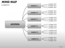
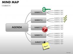
FAQs for Mind map
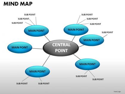
Honestly, mind maps are a game changer for presentations. They show how ideas connect instead of just listing random bullet points. People can actually follow your thinking, which is huge for keeping them engaged. Plus - and I might be biased here - but they're just way more interesting to look at than slides packed with text. You can break down complicated stuff without making everyone's eyes glaze over. The visual layout helps people spot the main points right away. Works great for brainstorming too. Next time you've got a slide that's basically a wall of bullets, try a simple mind map instead. You'll probably notice people pay attention way more.
Dude, mind maps are so much better for keeping people awake during presentations. Instead of boring bullet points, your audience can actually see how everything connects. Makes their brains work instead of just sitting there glazing over. You can reveal different branches bit by bit too - builds up this weird suspense that regular slides just can't do. I mean, who doesn't love watching ideas unfold like a story? Regular PowerPoints turn people into zombies. Mind maps get them thinking and piecing things together. Seriously, try it on your next big section and you'll see the difference immediately.
Put your main topic dead center, then branch out with different colored lines for each big idea. Single words work way better than long phrases - trust me on this one. I'd sketch it on paper first before messing with PowerPoint. Icons beat text blocks every time, and don't go crazy with tiny fonts that nobody can read. Three levels max or you'll end up with a tangled mess. Oh, and maybe avoid cramming every single detail in there? The whole point is keeping things clean and simple.
Okay so mind maps actually work because your brain doesn't think in bullet points - it makes connections and jumps around. When you show people a mind map, they can see how everything links together visually, which helps them remember way better. Honestly bullet points are just boring at this point. The branching thing lets everyone follow your logic more naturally too. Oh and definitely throw in some colors or little icons on the branches - our brains eat that visual stuff up. I started doing this last year and people actually pay attention now instead of checking their phones.
Honestly, mind map templates are pretty easy to customize. Start with the basic structure, then swap out colors and icons that fit your industry - medical symbols for healthcare stuff, gears for manufacturing, whatever works. The branch hierarchy is flexible, so rearrange it however your content flows best. Fonts make a huge difference too, and you can throw in your company logo or background images. I've seen some people get creative with custom shapes that match their branding. Text styles are adjustable as well. Really just play around with the visual elements until it clicks for your audience. Takes some trial and error but it's worth it.
For mind map slides, I'd start with PowerPoint's SmartArt - just hit Insert > SmartArt and grab a hierarchy diagram. Super easy. If that feels too basic, MindMeister or XMind are solid choices that export to PowerPoint. Lucidchart's another good one. Honestly though? I always end up overthinking the design when a simple layout works fine. You can even use basic shapes and connectors if you're feeling lazy - not the prettiest but it'll do the job. SmartArt's probably your best bet for minimal effort. Gets you most of the way there without the headache.
Honestly, visuals in mind maps are like shortcuts for your brain. Colors and icons create these mental anchors that make connections between ideas super obvious. Our brains think visually anyway, so it just clicks faster than reading tons of text. The way you arrange stuff spatially? That matches how we naturally organize thoughts in our heads. Different colors can show themes or what's most important - makes navigating complex topics way easier. Oh, and try keeping your visual codes consistent across slides. Your audience will follow your logic without even thinking about it. Works every time.
Dude, the worst thing you can do is cram way too much text on each slide - nobody's reading that wall of words. Also use bigger fonts! 18pt minimum or people in back won't see anything. For mind maps, don't go nuts with branches everywhere. Seriously, it ends up looking like spaghetti and confuses everyone. Three to five main branches tops. Oh and pick a color scheme that actually makes sense instead of random colors thrown together. Skip the fancy animations too - they're just annoying. Test it on a projector first because stuff always looks different than on your laptop screen.
Honestly, mind maps changed everything for me. Start with your main topic in the center, then just branch out with whatever related ideas pop up - it mimics how your brain actually works. I can spot gaps in my argument so much easier this way, plus you'll find connections between points that would've been invisible in a regular outline. The visual layout makes rearranging ideas super simple too. My presentations flow way better now. I actually got obsessed with different colored pens for mine, which is probably overkill but whatever. Seriously though, sketch one out next time - you'll see patterns emerge that linear notes just can't show you.
Oh totally! Your team will crush it if you mind map together first. Everyone throws in their ideas and you actually see how everything connects - way better than regular brainstorming that goes nowhere. The visual layout basically organizes your presentation flow for you. Here's the thing though - people get way more excited about presenting when they helped build the foundation. I'd definitely use Miro for this, or honestly even PowerPoint works if you're collaborating online. Just don't skip straight to making slides. Map it out together first and you'll see what I mean!
Honestly, less is way more with mind maps. Stick to 3-5 points per branch max, and use colors that actually make sense for grouping stuff. Don't cram everything together - white space saves lives here, trust me. Skip the walls of text and throw in some simple icons instead. Your main topic should pop with bigger text or brighter colors. Here's what changed everything for me though: build it across multiple slides. Like, don't vomit the entire map at once. Your audience won't hate you for it, and they'll actually absorb what you're showing them. Also, readable fonts only - save the fancy stuff for wedding invites.
Honestly, go digital for this one. The speed difference is insane - you can drag stuff around, change colors with a click, and export straight to PowerPoint without redoing everything. Tools like MindMeister have export features that'll format your map into slides automatically. I mean, I still love sketching mind maps on paper for initial brainstorming (there's something about it), but you'll waste so much time recreating that for slides. XMind's another good option. Just skip the scanning and manual recreation headache.
Honestly, color and font choices can totally make or break your mind map slides. I learned this the hard way after some pretty messy presentations lol. Different colors help group related stuff together - makes it way easier for people to follow your thinking. Just don't go overboard with like 8 different colors because that's when things get chaotic. Clean fonts work best, and you can play with sizes to show what's most important. The goal is helping people get complex ideas quickly. Oh, and pick one color scheme first then build everything around that. Trust me, it'll save you tons of time later.
Think of your mind map like giving directions - start with the overview, then zoom in. I usually say something like "alright, now that we've got the big picture, let's dig into this part" while pointing to whatever section I'm focusing on. Don't dump everything at once though, that's where people's eyes glaze over. Click through stuff progressively instead. The main thing is being super obvious about where you're taking them next. Like, almost annoyingly clear about the connection between sections. Trust me, your audience will thank you for it.
Honestly, just ask them stuff during your presentation - like "what connections do you see here?" Works way better than guessing. I always do that "draw what you remember" thing afterward too because it actually shows if your mind map stuck or if they just nodded along politely. Quick surveys help, but keep them focused on whether they got the relationships between ideas, not random details. One-on-ones are great if you have time. Mix a couple methods though - gives you a better read on what's clicking. Oh and group discussions right after can be gold since people build off each other's thoughts.
-
Use of icon with content is very relateable, informative and appealing.
-
Graphics are very appealing to eyes.