


Motivation process flow chart powerpoint layout




Try Before you Buy Download Free Sample Product
 Impress Your
 Audience
 100%
100% Editable
 Save Hours
 of Time


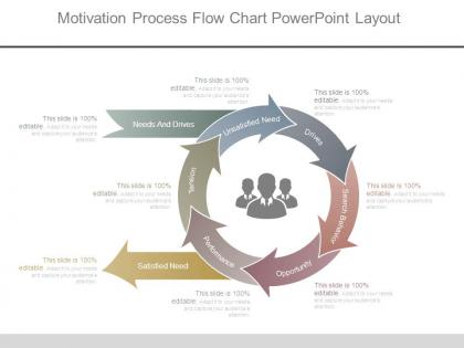
Have a look at our motivation process flow chart PowerPoint slide that has been designed with creative and innovative approach. Handling the business in a successful way requires you to work on the winning strategies. You need to define your workflow or process to achieve success or even to stay competitive in the market. Our presentation template shows some stages in this process which are needs and drives, satisfied need, unsatisfied need, drives, search behavior, opportunity, performance, tension. Now you can share the details using these aspects or can make changes according to your industry preference. The process flow chart shown in the PPT graphic is helpful to share the crucial details about the work flow, business process management, total quality management, business process-re-engineering etc. In the business industry any vital information needs to be delivered in the engaging way and this PowerPoint design does that for you. So, take the advantage of involving the audience with your presentation by downloading this impactful slide. To access more process flow chart designs, check our website. Discard jaded approaches with our Motivation Process Flow Chart Powerpoint Layout. Introduce a breath of fresh air.
People who downloaded this PowerPoint presentation also viewed the following :
Motivation process flow chart powerpoint layout with all 7 slides:
Enlighten folks on contemporary design with our Motivation Process Flow Chart Powerpoint Layout. Elaborate on current haute couture.
FAQs for Motivation process flow
So basically you start with figuring out what problem you're trying to solve, then set some clear goals. After that comes the planning and actually doing stuff phase. Don't forget the feedback loops though - seriously, everyone skips these and then wonders why things go sideways. You need decision points too where people can change course if needed. Oh and obviously some way to measure if it worked at the end. I'd map out those main stages first, then worry about adding all the feedback stuff later. The whole thing should just flow naturally from problem to solution.
So basically start with your trigger/goal at the top, then split into two paths. Internal stuff goes on one side - curiosity, wanting to get better at something, feeling like it matters. External rewards on the other - cash, getting props from people, deadlines breathing down your neck. I always use different colors because honestly it just looks way better that way. Then bring both streams back together at the action step. That's the realistic part - most people aren't running on just one type of motivation, they're getting pulled by both. Don't make it seem like it's either/or.
Look, goals are literally what turn "I wish I could..." into actual plans you can follow. Otherwise you're just hoping stuff works out somehow (trust me, doesn't work). They create direction for everything else you do. Plus having specific milestones lets you see if you're actually making progress, which keeps you motivated when things get tough. Make them detailed enough to guide your daily decisions but don't be so rigid that you can't pivot - life's messy like that. Honestly, just write down three things you want to accomplish this quarter and go from there.
Honestly, visuals are a game-changer for motivation charts. Color coding works great - red for low motivation, green when people are fired up. Most folks just scan anyway, so throw in some icons so they don't have to read everything. Arrows are clutch for showing how one thing leads to another. Progress bars or little milestone markers really help people see where they're at in the process. Oh, and don't go overboard - I'd stick with maybe 2-3 visual elements max. You'll just confuse people if there's too much going on. Keep it simple but impactful.
Honestly, the worst thing you can do is overcomplicate it. Too many branches and decision points? People's eyes will glaze over instantly. Focus on maybe 3-5 key drivers for your specific team first. Don't ignore the psychological stuff either - everyone gets caught up in external rewards but forgets what actually motivates people internally. Test it with your actual team members before rolling it out. I learned this the hard way... what seemed obvious to me was total gibberish to everyone else. Oh, and skip the one-size-fits-all approach. Your accounting folks need different motivation than your creative types.
So curved arrows work great for this - just connect them from later stages back to earlier ones. Like from "results achieved" back to "goal setting" to show how outcomes affect future motivation. Dotted lines are honestly my go-to for feedback arrows since they stand out from the main flow. Oh, and definitely add little text boxes explaining what flows back - stuff like "performance data" or "satisfaction levels." Makes it way clearer how the whole motivation process actually adapts. Color-coding different feedback types helps too, though that might be overkill depending on how complex you're getting.
Start with the basics - track engagement rates and how people actually participate in your motivational stuff. Productivity metrics before/after are huge. Employee satisfaction and retention rates will tell you way more than fancy analytics honestly. Don't overcomplicate it at first. Simple completion rates, feedback quality, and how fast people move through your process stages work great. Oh, and definitely set up baseline measurements first - otherwise you're just guessing if things improve. A monthly dashboard keeps you on track without being overwhelming. The boring metrics often reveal the most surprising insights.
So basically start with the bottom of the pyramid - physiological needs. If someone's starving, they're not gonna care about self-actualization, you know? Make that your first decision point in the flowchart. Then branch out to safety, belonging, esteem, and finally self-actualization. Each level is like a gate - you can't move up until the current need is satisfied. I actually think this works better as a flowchart than the traditional pyramid because it shows the actual decision process. Sketch out Maslow's pyramid first, then just turn each tier into "yes/no" boxes. Way easier to follow that way.
Honestly, flow charts are perfect for this stuff. You can take those heavy motivational theories and turn them into simple visual steps people actually get. Like instead of throwing Maslow's hierarchy at someone, just map it out: "need identified → goal set → action taken → outcome evaluated." Way less overwhelming. Your audience will see how everything connects instead of getting lost in theory jargon. The decision points are clutch too - shows how motivation really plays out in practice, not just textbooks. I'd start with your messiest theory first and just pull out 4-5 main steps. Much more engaging than lecture mode.
Oh man, this is so true from my experience! Different cultures will totally flip your motivation chart upside down. Like, Americans might get pumped by personal achievement stuff, but that same approach could actually turn off someone from a more group-focused culture. You've gotta rethink your feedback loops and rewards for each place. Hierarchy matters way more in some cultures too - learned that one the hard way during a global rollout last year, what a mess. Same structure works fine, but you'll need to swap out the actual content and triggers. Otherwise you're just spinning your wheels.
Honestly, I'd go with Miro or Lucidchart for motivation flowcharts. Both let your whole team jump in and edit together, which is clutch. Miro's got some decent templates specifically for motivation mapping - their free version is worth trying first. Lucidchart's solid too, just maybe a bit more corporate feeling? If you're already deep in Microsoft stuff, Visio works but it's kind of a pain to use. Oh, and don't sleep on Canva if you want something simple that looks good without much effort. Main thing is picking whatever everyone can actually access and won't fight you on.
Honestly, most flow charts bomb because they're way too generic. You've gotta think about who's actually using this thing. Younger people? Go visual and play up the achievement angle. Older folks usually care more about stability and leaving something behind. Cultural stuff matters too - some groups are all about individual wins, others want to know how it helps their team or family. I'd probably run a quick survey first to see what language they actually use. Then match your examples and visual style to what resonates with them. Test one version before you build out the whole thing.
Honestly, these flow charts work for so many things. I've mapped out why people procrastinate on big projects (spoiler: usually fear of failure) and it's pretty eye-opening. You could track an employee going from feeling undervalued to either gunning for a promotion or just bailing completely. Customer journeys are huge too - like how someone goes from "hmm interesting" to actually buying something. Career changes, fitness motivation, even why teams just... lose steam halfway through projects. My advice? Pick something you're dealing with right now and map it out. You'll probably spot patterns you didn't see before.
Your flowchart needs regular tune-ups - like monthly or quarterly check-ins to see what's actually working. Most people create these things and then never look at them again, which is honestly just setting yourself up to fail. Build in spots where you can pivot when life throws curveballs. The steps should be specific enough to follow but not so rigid they break under pressure. Here's the thing though - you've gotta test it out with real situations, not just theoretical stuff. Get feedback from anyone else who might use it. Think of it more like an app that gets updates, not something carved in stone.
Start with a rough sketch first - trust me on this one, it'll save you headaches later. Make your labels super clear and action-focused, like "Identify goal" not just "Goal." Anyone should be able to follow the flow without squinting at it for five minutes. Keep text short but descriptive, and stay consistent with formatting. Color-coding helps too - maybe blue for actions, red for decisions. Your arrows should flow logically, usually left to right or top to bottom. The whole thing needs to tell a story that actually makes sense to fresh eyes.
-
Visually stunning presentation, love the content.
-
Very well designed and informative templates.