

NPS Trend Dashboard For Performance Assessment




Try Before you Buy Download Free Sample Product
 Impress Your
 Audience
 100%
100% Editable
 Save Hours
 of Time


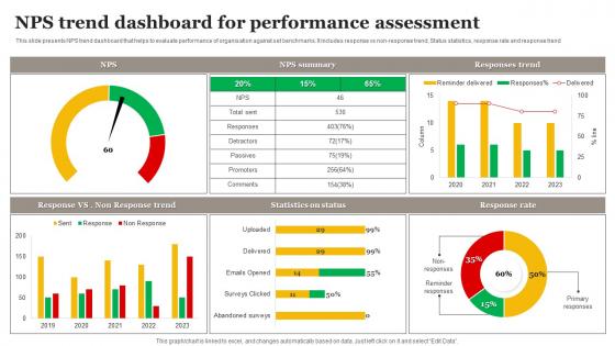
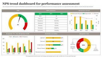
This slide presents NPS trend dashboard that helps to evaluate performance of organisation against set benchmarks. It includes response vs non-response trend, Status statistics, response rate and response trend.
People who downloaded this PowerPoint presentation also viewed the following :
NPS Trend Dashboard For Performance Assessment with all 7 slides:
Use our NPS Trend Dashboard For Performance Assessment to effectively help you save your valuable time. They are readymade to fit into any presentation structure.





FAQs for NPS Trend Dashboard
Obviously start with your main NPS score and how it's trending - that's the big picture stuff. Break it down by segments too (region, product, whatever makes sense for you). Response rates matter more than people think - if only your angry customers are responding, you're screwed. I'd throw in the promoter/detractor split and grab some of those raw comments, especially the harsh ones since they're usually most helpful. Oh and definitely connect it to actual business stuff like churn if you can. Time filters are clutch for spotting patterns. Honestly just nail these basics first before getting fancy with it.
So for customizing your NPS dashboard, first figure out 2-3 metrics that actually matter in your industry. SaaS companies track different touchpoints than retail - makes total sense. Most platforms let you set up custom feedback categories and adjust score ranges for your space. The timing thing is massive though, people always mess that up. You can throw in custom fields too for stuff like purchase frequency or service tiers. Oh, and definitely tweak when you send surveys - that alone can change everything. Start with what drives success for you, then build around that.
Start with a basic gauge chart - shows your current NPS right up front. Then add a trend line because one number by itself is pretty useless, honestly. I'd throw in a stacked bar chart to break down promoters vs. passives vs. detractors. Makes it super easy to spot the split. Heat maps are solid if you're comparing different segments or tracking over time. Don't get too creative with the visuals though. Your stakeholders just want to see if things are improving and figure out what needs attention. Simple beats flashy every time.
Weekly updates are the minimum I'd go with, but daily is way better if you're getting decent response numbers. Real-time feels fancy but it's kinda pointless - scores bounce around too much day to day when sample sizes are small. The goal is catching trends before they blow up into real issues. Daily helps a lot if you're in hospitality or dealing with customer service drama. Oh and definitely automate the refresh so you're not sitting there pulling reports constantly. That gets old fast.
So basically, you break down your NPS scores by different customer groups - age, location, company size, whatever makes sense for your business. It's wild how different the results can be. Like you might find out your enterprise customers love you but small businesses are totally frustrated, or millennials hate some feature that boomers actually use all the time. Without doing this, you're just staring at one big average number that doesn't really tell you anything useful. My advice? Pick maybe 2-3 segments that actually matter to your company and stick with tracking those consistently. Don't go overboard trying to analyze every possible angle at once.
Here's the thing - NPS scores don't tell you much on their own. You need surveys, reviews, and support tickets to figure out what's actually happening. Like, you might see that promoters love your speed but detractors can't stand your pricing. That's gold right there. Customer interviews and exit surveys are super helpful too (social media monitoring if you're feeling ambitious). Without all that extra context, NPS is kinda useless honestly. I'd start by connecting your NPS data with whatever feedback channel you use most. Makes the whole picture way clearer.
Don't just stare at the score by itself - that's the classic mistake. Like if you get a 50 but only 10 people answered? Meaningless. Small monthly changes are noise anyway, you want to track trends over time. Here's what most people miss: those "meh" respondents (7-8 scores) are goldmines since they're almost ready to love you. Actually read the comments too - numbers don't tell you what's broken. And honestly, slice your data up by customer type or whatever makes sense for your business. Otherwise you're just looking at a pretty dashboard that doesn't help you fix anything.
Honestly, NPS trends are super useful for catching problems early. I'd track your scores monthly and look for patterns - like if certain product features keep getting complained about. You can break it down by customer segments too, which gets pretty interesting. When scores drop, that's your cue to dig deeper into the feedback and figure out what's actually bugging people. Here's the thing though - don't obsess over the detractors right away. Focus on those passive customers first since they're way easier to flip into promoters. Those quick wins add up fast.
Make those NPS numbers super scannable - big headline score with trend arrows so people get it instantly. Break it down by segments (customer type, product, whatever) so execs can spot the problem areas fast. I always throw in a "so what" section because nobody wants to stare at random percentages, you know? Customer quotes are gold - they drive way more action than just the numbers. Don't go overboard with historical data though. Oh, and this is key: always end with 2-3 concrete next steps based on what you're actually seeing in the data.
Honestly, NPS dashboards are pretty clutch for product decisions. You'll see exactly what your promoters love versus what makes detractors angry about specific features. The real magic happens when you segment - like if power users consistently trash your mobile app but love desktop, that's your answer right there. Don't sleep on the comment analysis though, that's where you get the actual "why" behind scores. Set up alerts for when things tank so you can jump on issues fast. Oh and one more thing - use it to figure out which improvements will actually matter to customers instead of just guessing.
Start with clean charts that show your NPS trends over time - this stuff needs to be super obvious at first glance. Break it down by customer segments and touchpoints too. Make the actual score big and prominent (seriously, I've seen dashboards where you have to hunt for it). Include response volume because a 90 NPS from 3 customers isn't exactly meaningful, you know? Give people easy filtering options for dates, departments, whatever. Don't forget the actual comments - that's where the real insights live. Oh, and make it work on mobile since managers are always checking this stuff on their phones.
Try segmenting your NPS data with revenue stuff like lifetime value or how often people buy. Set up your dashboard to show NPS by customer groups, then add the revenue data for those same people on top. Honestly, the patterns are usually pretty shocking - promoters spend way more than detractors, like it's not even close. You can track how NPS changes affect revenue over time too. I'd start with your biggest spenders first and see how their satisfaction lines up with what they're actually paying you. Makes the correlation super obvious.
Tableau and Power BI are your best options honestly - they're built for this stuff and make NPS trends look really clean. Google Data Studio works if you don't want to spend money. You could build something custom with React but that's way more work than it's worth unless you have weird requirements. Even Excel can handle basic NPS tracking surprisingly well (I've seen some pretty decent ones). My advice? Just go with whatever your team already uses. Don't overthink it - I've seen people spend weeks debating dashboard tools when they could've had something running already.
Line charts are definitely the way to go for tracking NPS over time - you can actually see what's happening with your scores. I'd break it down monthly or quarterly depending on your data. Moving averages help smooth out random spikes that don't mean much. One thing that's super useful is marking major events on your timeline - like product launches or that time marketing went crazy with ads. Segment by customer type too if you can. Honestly, the simpler the better. You want people to look at it and instantly know if things are getting better or worse.
Dude, AI is a game-changer for NPS stuff. Instead of reading through hundreds of customer comments (which honestly sounds like torture), it automatically finds patterns in all that feedback. You'll get complaints sorted by topic, sentiment analysis, even predictions about who might bail on your service. The coolest part? It catches problems early before they blow up. Plus those automated alerts are clutch - you can jump on issues way faster instead of discovering them weeks later. Seriously saves so much time compared to doing it manually.
-
Excellent Designs.
-
Great quality slides in rapid time.