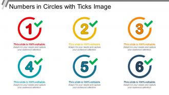
Numbers in circles with ticks image
Try Before you Buy Download Free Sample Product
Audience
Editable
of Time
Feelings of hostility disappear due to our Numbers In Circles With Ticks Image. The desire for dialogue gets a boost.
People who downloaded this PowerPoint presentation also viewed the following :
Numbers in circles with ticks image with all 5 slides:
Folks definitely appreciate your joke due to our Numbers In Circles With Ticks Image. Employ humor to your advantage.
FAQs for Numbers in circles
Oh dude, tally marks are actually perfect for presentations! Your audience can instantly see what's going on without having to decode some complicated chart. Works great for survey results, votes, that kind of stuff - honestly reminds me of keeping track of wins in board games lol. They're super clear even if you're sitting in the back row squinting at the screen. Bar charts are cool and all, but if you've got data under like 20, tally marks hit different. Way more approachable and people can count along if they want to double-check your numbers.
Tally marks are seriously a game-changer for kids! They can group things by fives instead of getting lost somewhere around "seventeen... eighteen... uh, what comes next?" That diagonal line creates these perfect little bundles they can actually see. Plus when they're physically drawing each mark, it clicks better - like their brain connects the dot between the number and what they're counting. My sister's a teacher and swears by having kids tally classroom supplies or track stuff throughout the day. You'll probably notice them getting way more confident with numbers pretty quickly once they get the hang of it.
Dude, get people physically involved! Have everyone stand up while you draw the tally marks on screen - it's way more fun than just showing numbers. Animated tallies that fill in real-time work great too, especially when revealing stats. Oh, and try those guessing games where people estimate quantities first, then you dramatically reveal the actual count one mark at a time. Digital whiteboards are clutch for letting people add their own marks together. Honestly, the whole suspense thing really works - builds way more engagement than static charts ever will.
Honestly, manufacturing floors are where tally marks really shine - workers are constantly marking defects and production counts when their hands are dirty or they can't grab their phone. Restaurants do this all the time too, especially for inventory and tracking tables (you've probably seen those little marks on receipts). Retail and warehouses love them since you need something quick when you're juggling boxes or helping customers. Event staff uses them tons as well. The thing is, they work best when your whole team needs to see the count right away and add to it without any fuss.
Honestly, tally marks are pretty genius for presentations. People instantly get that "counting on paper" vibe - way more engaging than just throwing numbers at them. You can even do this cool thing where you reveal them bit by bit to build suspense. Those little groups of five? Your audience won't need to do math in their heads to figure out what's going on. Just don't use them for huge datasets or you'll be there forever making little lines. Perfect for survey results though! I actually wish more people used them instead of boring bar charts all the time.
Oh man, the biggest thing people mess up is thinking each line = one count. But actually? That diagonal slash crossing through four lines IS the fifth tally in that group. Kids do this constantly when they're learning! Also watch out for reading right to left instead of left to right. And those incomplete groups with just three marks still count normally, obviously. Honestly, different cultures have totally different tally systems anyway, so there's no single "right" way. When you're reading someone else's marks, count the complete bundles of five first, then add whatever's left over.
Oh, this is actually pretty simple! You can just use Unicode characters (
) - search "tally mark" in your symbol menu and they'll pop right up. PowerPoint, Google Slides, all those apps have drawing tools too if you want to sketch them by hand. Honestly? The hand-drawn ones look way more natural anyway, like you're actually counting something real. If you're doing it live, you could add marks during your presentation to track audience responses - that's pretty cool. Just practice making those little groups of five beforehand if you're using a stylus or whatever.
Okay so tally marks are actually super useful for historians digging through old data. Census records, election stuff, surveys - anything before computers basically has these marks scattered throughout the archives. They're weirdly fascinating once you figure out how to read them. Here's the thing though - don't just look at the final numbers. The original tally sheets show you how they counted and where they might've screwed up. You can spot collection bias and methodology issues that way. Plus the raw counting process tells you way more about data reliability than those polished summary reports ever will.
Make those slides super animated - kids go crazy watching that fifth line slash through the other four. I always use fun scenarios like tracking cookies eaten or goals scored because plain numbers are just brutal at that age. Throw in practice slides where they count with you. Real examples work great too, like game scores or classroom stuff. The whole "bundling by fives" thing is key - definitely hammer that it makes counting way faster. Oh, and interactive is everything. If they're not participating, you've lost them.
oh definitely do the groups of five with the diagonal slash thing - makes counting way easier later. I used to just do random lines everywhere and it was a nightmare lol. Space them out so you're not squinting at a mess of marks. Make sure you label what you're counting at the top too or you'll forget (trust me). If you've got multiple things to track, separate sections work great. Different colored pens are honestly a game changer for this. Oh and go back through each group of five at the end to double-check your math.
So with complex data sets, I usually try different symbols or colors for each category. Like dots for one thing, triangles for another - or just grab different colored pens if you have them. Separate sections on your paper work too. Honestly though, more than 2-3 categories gets pretty messy fast. I learned that the hard way trying to track like 5 things at once lol. Mini tally grids can help organize it better. Just don't forget to make a legend! You'll definitely need it later when you're staring at random symbols wondering what they meant.
-
Very well designed and informative templates.
-
Easy to edit slides with easy to understand instructions.