

Organization Pitch Deck Ppt Template




Try Before you Buy Download Free Sample Product
 Impress Your
 Audience
 100%
100% Editable
 Save Hours
 of Time


Organization Pitch Deck gives an overview of the company, which will help the entrepreneurs to understand the financing rounds of investments. Check out our efficiently designed Organization Pitch Deck that covers the problem faced by the customers and the solutions offered by our company. We have also provided an outline of the company and its objectives. The details of the product and services are covered in this deck, along with target customers, business model, go-to-market plans, and roll-out plans. To understand the market better, we have focused on the competitors, competitive analysis, and market size of the company. In this PowerPoint presentation, we have discussed the funding investments, project performance over the years, company traction, milestones, business strategy, team details, and client testimonials. Customize this 100 percent editable pitch deck based on your specific business needs.
People who downloaded this PowerPoint presentation also viewed the following :
Content of this Powerpoint Presentation
Slide 1: This slide introduces Organization Pitch Deck. State your company name and begin.
Slide 2: This slide shows Table of Content for the presentation.
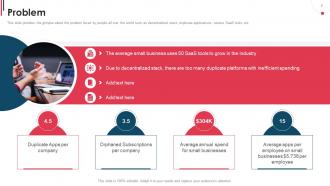
Slide 3: This slide provides the glimpse about the problem faced by people all over the world such as decentralized stack, duplicate applications, various SaaS tools, etc.
Slide 4: This slide provides the glimpse about the solution offered by our company for expense tracking and optimization.
Slide 5: This slide provides the glimpse about our company overview which focuses o foundation date, number of employees, revenue earned per customer, etc.
Slide 6: This slide provides the glimpse about our company objectives which focuses on mission, vision and values such as energy, excellence, excitement, etc.
Slide 7: This slide provides the glimpse about the smart billing product offered by our company such as unified SaaS subscription, centralized payment, etc.
Slide 8: This slide exhibits target customers which focuses on startups with less than 100 employees, top level management handles the subscriptions, etc.
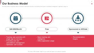
Slide 9: This slide provides the glimpse about our business model which focuses on user activity track system, cancellations management, application usage, etc.
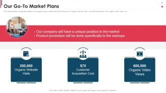
Slide 10: This slide highlights company’s go to market plan which focuses on organic website visits, customer acquisition cost, organic video views, etc.
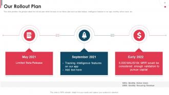
Slide 11: This slide illustrates roll out plan which focuses on our future plan such as beta release, intelligence features in our app, monthly active users, etc.
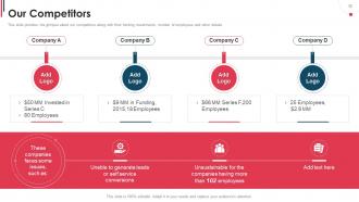
Slide 12: This slide provides the glimpse about our competitors along with their funding investments, number of employees and other details.
Slide 13: This slide displays competitive analysis of our company with others, which focuses on low cost, customer service, mobile application, on demand service, etc.
Slide 14: This slide provides the glimpse about the size of the market which focuses on TAM, SAM and SOM that showcase the fundamental market size metrics.
Slide 15: This slide presents funding investments of our company on different rounds such as seed, series A, B, C with their average and total investments.
Slide 16: This slide provides the glimpse about our project performance in the organization which focuses on growth rate of our project and how our company is performing.
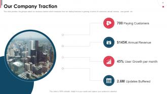
Slide 17: This slide exhibits business traction which measures how our startup business is growing in terms of customers, annual revenue, user growth, etc.
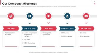
Slide 18: This slide displays company milestones which focuses on business process tracking and our plan has been implemented within the organization.
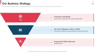
Slide 19: This slide provides the glimpse about our company business model which focuses on trial model, customer churn, projected revenues, etc.
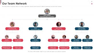
Slide 20: This slide provides the glimpse about our company organization structure which focuses on different departments and their team members.
Slide 21: This slide presents customer testimonials, along with their reviews about our company, their designation and star ratings provided by them.
Slide 22: This slide contains all the icons used in this presentation.
Slide 23: This slide is titled as Additional Slides for moving forward.
Slide 24: This slide depicts Area chart with two products comparison.
Slide 25: This is Our Mission slide with related imagery and text.
Slide 26: This slide shows Post It Notes. Post your important notes here.
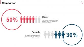
Slide 27: This is a Comparison slide to state comparison between commodities, entities etc.
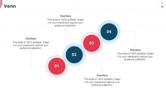
Slide 28: This slide depicts Venn diagram with text boxes.
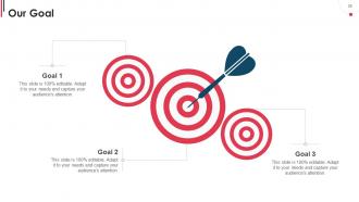
Slide 29: This is Our Goal slide. State your firm's goals here.
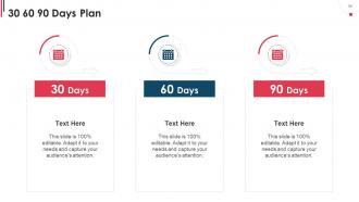
Slide 30: This slide provides 30 60 90 Days Plan with text boxes.
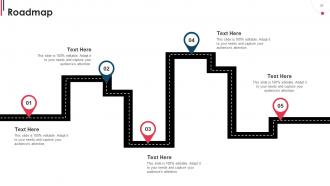
Slide 31: This slide presents Roadmap with additional textboxes.
Slide 32: This slide shows Linear Diagram with text boxes.
Slide 33: This is a Thank You slide with address, contact numbers and email address.
Organization Pitch Deck Ppt Template with all 38 slides:
Use our Organization Pitch Deck Ppt Template to effectively help you save your valuable time. They are readymade to fit into any presentation structure.
-
Organization Pitch Deck
-
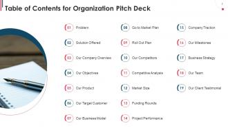
Table of Contents for Organization Pitch Deck
-
Problem
-
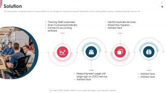
Solution
-
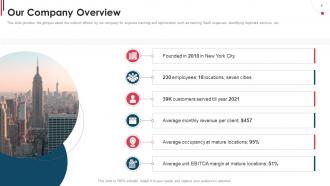
Our Company Overview
-
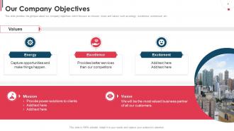
Our Company Objectives
-
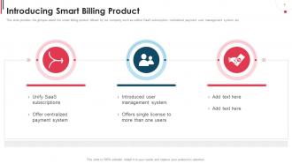
Introducing Smart Billing Product
-

Our Target Customer
-
Our Business Model
-
Our Go To Market Plans
-
Our Rollout Plan
-
Our Competitors
-
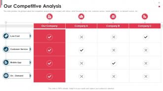
Our Competitive Analysis
-
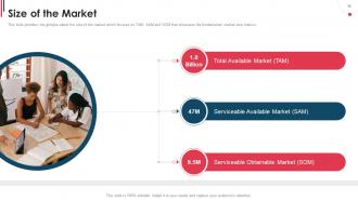
Size of the Market
-
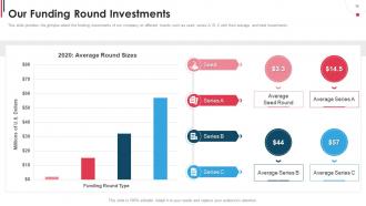
Our Funding Round Investments
-
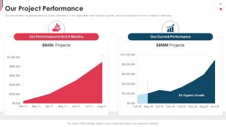
Our Project Performance
-
Our Company Traction
-
Our Company Milestones
-
Our Business Strategy
-
Our Team Network
-
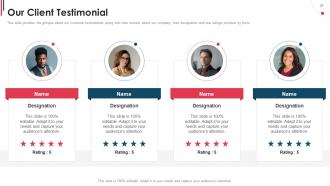
Our Client Testimonial
-
Icons Slide for Organization Pitch Deck
-

Additional Slides
-

Area Chart
-
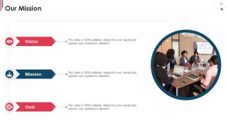
Our Mission
-
Poste it Notes
-
Comparison
-
Venn
-
Our Goal
-
30 60 90 Days Plan
-
Roadmap
-
Linear Diagram
-
Thank You for Watching
-

-

-

-

-

FAQs for Organization Pitch
So you need the basics: problem, solution, market size, business model, traction, team, competition, and funding ask. Here's the thing though - most founders totally underestimate the team slide. Investors are literally betting on YOU, not just your brilliant idea. Don't cram everything onto one slide either, it looks messy. Start with something that grabs attention right away. Oh and definitely include your financials plus a timeline showing exactly where their money's going. End with a super clear ask so they know what you want from them. Keep it tight and focused.
Look, nobody wants to sit through a feature list - that's just painful for everyone. Start with a real customer story instead. Walk them through someone's actual problem, how frustrated they got trying to fix it, then boom - your solution saves the day. It's way more engaging than jumping straight into market data (though honestly, everyone still does that). Stories stick in people's heads. They make investors actually feel something, and that emotional hook matters more than perfect numbers. Trust me, open with a specific scenario and you'll have them from minute one.
Honestly, visual hierarchy saves your life here. Clear headings, consistent fonts, tons of white space - otherwise people get lost instantly. I learned the hard way that bold colors and high contrast are clutch, especially in bright rooms. One main point per slide, no walls of text. Use visuals that actually mean something. Make your font big enough for the back row to read without squinting. Oh, and pause sometimes! Ask questions. The whole point is keeping their eyes on you instead of having them decode a messy slide like it's some puzzle.
Honestly, who you're pitching to changes everything about your deck. VCs want to see market size, scalability, crazy growth potential - all that numbers stuff. But customers? They just care if you actually solve their problem. I made this mistake once and used the exact same presentation for both - total disaster lol. The language has to shift too. Tech people can handle the complex details, but if you're talking to regular folks, keep it simple. Oh and definitely stalk... I mean research who's gonna be there first. Then you can figure out what they actually want to hear and rearrange your slides accordingly.
Honestly, most people just cram way too much stuff on their slides - like they're trying to fit their entire business plan in there. Bad move. You want maybe 10-12 slides tops, and tell a story instead of info-dumping everything. Skip those boring templates everyone uses too, they make you look generic as hell. Practice your pitch until it doesn't sound rehearsed. Oh, and actually ask for what you want! So many people forget to mention how much funding they need. Use more visuals, less text walls. Test it on someone who knows nothing about your business first - they'll catch the confusing parts you missed.
Dude, make your charts actually prove something instead of just filling space. Show market size, your growth numbers, why you're beating competitors - data that makes investors want to write checks. I can't tell you how many pitch decks I've seen where the graphs are basically wallpaper. Keep everything simple so people get it instantly, and always explain what each chart means for your business. Like, don't just show user growth - say why that trajectory matters. Your visuals should build the case that you're going to win, not just look professional.
Your branding definitely matters for the pitch deck - makes you look professional and helps investors remember you. Pick a simple color scheme and maybe two fonts max, then use them consistently. But honestly, don't overdo it. I've watched founders turn their decks into these overly branded marketing pieces that just distract from the actual story. Keep it clean but let your company's personality show through. The content's still king here - your branding should just support what you're saying, not compete with it. Start simple and build from there.
So basically, investors just want to know how they'll make their money back - show them market size, revenue projections, your competitive edge. Client presentations are totally different though. Focus on their actual problems and how you'll solve them. I'd definitely spend way more time on the problem/solution slides for clients since they need to picture exactly what you're doing for them. Case studies work great here too. Honestly, it's kinda like the difference between selling a business idea versus selling an actual service. Figure out your audience first, then just flip your whole approach.
Honestly, just stick to one main idea per slide - saves everyone's sanity. Complex stuff? Chop it up into smaller pieces. Charts and visuals beat giant text blocks every time, trust me on this. Always start with why people should care before you get into the weeds. I've sat through way too many presentations that throw everything at you upfront and completely lose the room. Keep it conversational, ditch the fancy jargon (or at least explain it quickly if you can't avoid it). Oh, and definitely run your slides by someone who wasn't involved - if they understand it, you're good to go.
Keep it to 10-12 slides max for investors. Internal presentations can stretch to 15-20 but that's pushing it. You've probably heard of Kawasaki's 10/20/30 rule - honestly the 30-point font part is ancient but the rest holds up. Problem, solution, market size, business model, traction, team, financials, and your ask. That's your core stuff right there. Anything beyond 15 slides means you're getting lost in weeds that should go in backup slides anyway. I've sat through way too many 25-slide decks that could've been emails. Practice until you can nail it in 10-15 minutes because you'll want time for questions. Trust me on this one.
Here's what I'd focus on - pick your best 3-4 metrics that actually show momentum. MRR, CAC, LTV, user growth rates are the classics. But honestly, less is more here because investors' eyes glaze over when you throw everything at them. If you're not making money yet, engagement stuff works - daily actives, conversion rates, whatever shows people actually care about your product. The main thing is having at least 6 months of solid upward trends. That's what proves you're not just having a lucky month, you know? Don't overthink it - just show consistent growth in the numbers that matter most for your specific business.
Dude, go heavy on visuals - like 80% pictures/charts, 20% text max. People zone out hard when slides are just walls of words. Nobody wants to read paragraphs while you're talking! Use photos, charts, whatever tells your story visually. Then sprinkle in just the key points as text. I'm pretty militant about the one-message-per-slide rule too - if you can't explain it in under a minute, break it up. Oh and here's something that actually works: if your bullet points need more than 7 words, you're definitely overdoing it. Trust me on that one.
Okay so this might sound obvious but practice out loud a ton. Yeah it's awkward but it actually works. Time yourself too - nothing worse than running over. I'd grab a friend or coworker to listen and give you real feedback. Oh and practice those slide transitions! That's where everyone gets tripped up. Don't just read your slides word for word - tell a story instead. Your slides should back up what you're saying, not be your entire script. Start practicing like a week early so you're not scrambling last minute and can actually feel confident up there.
Here's my take: gather feedback from different people - investors, mentors, other founders you know. Don't just listen to one person's opinion though. Wait until you're hearing the same issues from multiple sources before you actually change anything. I used to get so defensive about criticism (honestly, still do sometimes), but now I think of it as getting free advice from people who know what they're talking about. Always test your updated deck on a smaller group first. Watch their faces during practice - if they look confused, that's exactly where your pitch isn't working. Keep tweaking it until your main point hits every single time.
Dude, just use Canva or Figma - both have decent templates and you don't need to know design. PowerPoint works fine too if that's what you're used to. Beautiful.ai is actually pretty cool since it formats stuff automatically, but it'll cost you. Honestly though? I've watched people spend weeks obsessing over fonts and colors when their actual pitch was weak. Pick whatever tool feels easiest, grab a clean template, and focus on your story instead. The content's gonna matter way more than whether your slides look like they belong in a design museum.
-
Helpful product design for delivering presentation.
-
Informative presentations that are easily editable.