


Partnership overview ppt diagrams





Try Before you Buy Download Free Sample Product
 Impress Your
 Audience
 100%
100% Editable
 Save Hours
 of Time


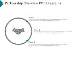
The Partnership Overview PPT Diagrams can be used to embed all the information for the stakeholders. Clarify all the terms, conditions and expectations before getting involved in a partnership using this readily available PPT template. Explain the clause included in the partnership contract agreement. This partnership overview PowerPoint slide will clear all the doubts of your partner about the functioning. The business partnership PPT template is a very important and crucial agreement template that you should go through before investing your money. Depict all the rules, policies of the partnership agreement through this professionally designed PPT slide. Business organizations can showcase this partnership overview PowerPoint template to the team to enlighten them about the requirements of the agreement. Get this slide to educate the audience on how to draft documents. Such presentation slide will help you to discuss the common issues. This way, you will be able to grab the attention of your business partner for a successful and a long term partnership. Enter the clan with our Partnership Overview Ppt Diagrams. Gain entry into elite groups.
People who downloaded this PowerPoint presentation also viewed the following :
Partnership overview ppt diagrams with all 5 slides:
Compose your thoughts with our Partnership Overview Ppt Diagrams. Your audience will revel in their harmony.


FAQs for Partnership
**INPUT**: What are the key components of an effective partnership overview diagram? **OUTPUT**: Effective partnership overview diagrams include clear partner roles, relationship structures, value exchanges, communication flows, and shared objectives or outcomes. These components work together by visualizing collaboration frameworks, defining accountability structures, and mapping resource allocation, with many organizations finding that comprehensive diagrams streamline partnership management and enhance strategic alignment. **Word count: 50 words**
Partnership overview diagrams enhance stakeholder communication by visualizing complex relationships, clarifying roles and responsibilities, and streamlining information flow across all parties involved. These visual tools enable organizations to present partnership structures more effectively, reduce misunderstandings during negotiations, and facilitate faster decision-making processes, ultimately delivering improved transparency and stronger collaborative outcomes.
Common visual elements in partnership overview diagrams include organizational logos, connecting arrows, partnership type labels, role descriptions, and data flow indicators. These components work together by clearly defining each partner's contribution, showing relationship hierarchies, and illustrating value exchanges, with many organizations finding that well-designed visuals enhance stakeholder understanding and accelerate partnership negotiations.
Partnership overview diagrams emphasize collaborative relationships, shared resources, and mutual dependencies between entities, while traditional organizational charts focus on hierarchical reporting structures and internal authority lines. These partnership visualizations showcase strategic alliances, joint ventures, and cross-organizational workflows, enabling businesses to map complex ecosystems, identify collaboration opportunities, and ultimately optimize multi-partner initiatives for enhanced market reach and operational efficiency.
Colors in partnership overview diagrams enhance comprehension by differentiating stakeholder types, indicating relationship strength levels, and highlighting critical pathways or decision points. Strategic color coding enables viewers to quickly identify primary versus secondary partnerships, track collaboration flows, and assess organizational hierarchies, while consistent color schemes across multiple diagrams streamline interpretation and improve stakeholder communication effectiveness.
Partnership overview diagrams facilitate strategic planning sessions by providing visual clarity on existing alliances, identifying collaboration gaps, and highlighting potential synergies across different business areas. These visual tools enable leadership teams to assess partnership portfolios, evaluate resource allocation strategies, and develop comprehensive growth plans, with many organizations finding that structured visual frameworks accelerate decision-making and strategic alignment.
**INPUT**: What software tools are most effective for creating partnership overview diagrams? **OUTPUT**: Effective software tools for partnership overview diagrams include Microsoft Visio, Lucidchart, Draw.io, Miro, and PowerPoint with SmartArt capabilities. These platforms streamline collaboration by enabling real-time editing, template customization, and seamless integration with business systems, with many organizations finding that cloud-based solutions like Lucidchart and Miro enhance team coordination and accelerate strategic planning processes.
**INPUT**: How can you ensure clarity and simplicity in complex partnership overview diagrams? **OUTPUT**: Clarity in partnership diagrams requires strategic visual hierarchy, consistent color coding, simplified connection pathways, and focused content that highlights key relationships without overwhelming details. Through clean layouts and intuitive flow patterns, organizations streamline stakeholder communication, enhance decision-making processes, and accelerate partnership negotiations, with many finding that simplified visuals ultimately deliver faster approvals and stronger collaborative outcomes. **Word count: 59 words**
Best practices for presenting partnership overview diagrams include using clear visual hierarchy, consistent color coding, simplified language, scalable detail levels, and audience-specific customization. These approaches enhance comprehension by eliminating jargon overload, highlighting key relationships through strategic design elements, and adapting complexity to audience expertise, with many organizations finding that tailored presentations significantly improve stakeholder engagement and partnership approval rates.
Partnership overview diagrams support project management by clarifying roles, responsibilities, communication channels, and decision-making hierarchies across all stakeholders involved. These visual frameworks streamline coordination between organizations, minimize conflicts through transparent accountability structures, and accelerate project timelines, with many cross-functional teams finding that clear partnership mapping ultimately delivers faster execution and improved collaborative outcomes.
Partnership overview diagrams should be updated during key project milestones, including stakeholder changes, role modifications, new partnership agreements, budget reallocations, and scope adjustments. These updates ensure accurate communication across teams while maintaining strategic alignment, with many organizations finding that regular diagram revisions during quarterly reviews, partnership renewals, and resource redistributions ultimately streamline collaboration and enhance project transparency.
Common mistakes include overcrowding diagrams with excessive detail, using inconsistent visual elements, failing to clearly define partner roles and responsibilities, neglecting to show relationship hierarchies, and omitting key communication flows. These design flaws can confuse stakeholders and undermine strategic clarity, with many organizations finding that streamlined, well-structured diagrams significantly enhance partnership understanding and operational alignment.
Incorporating stakeholder feedback into partnership overview diagrams involves conducting structured review sessions, gathering input on roles and responsibilities, and iterating based on clarity concerns and missing elements. These collaborative processes enhance diagram accuracy by validating partnership structures, refining communication flows, and ensuring all critical touchpoints are represented, ultimately delivering visualizations that align with stakeholder expectations and operational realities.
Partnership dynamics can be visualized through network diagrams, flow charts, stakeholder mapping, process timelines, and interaction matrices. These techniques enhance understanding by illustrating communication pathways, resource flows, and decision-making hierarchies, with many organizations finding that clear visual representations streamline partner onboarding, improve collaboration efficiency, and ultimately deliver stronger strategic alignment across complex partnership ecosystems.
Cultural considerations significantly influence partnership overview diagrams through color symbolism, directional flow patterns, hierarchy representations, and communication styles that resonate with different cultural contexts. Organizations operating across diverse markets find that adapting visual elements, symbolic representations, and structural layouts enhances stakeholder understanding and engagement, ultimately delivering more effective cross-cultural partnerships and stronger business relationships.
-
Best way of representation of the topic.
-
Presentation Design is very nice, good work with the content as well.