


Synergy diagram ppt sample presentations




Try Before you Buy Download Free Sample Product
 Impress Your
 Audience
 100%
100% Editable
 Save Hours
 of Time


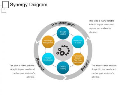
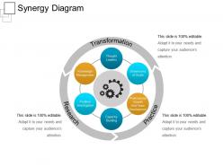
If you want to make your team believe synergy is important then use our creative means to attract attention to this idea. Explain the concept of synergy to your team using our Synergy Diagram PPT Sample Presentations. Synergy is a state in which two or more things work together in a particularly fruitful way that produces an effect greater than the sum of their individual. This concept has been brainstormed by SlideTeam and a very unique diagram has been created showing the importance of research, practice and transformation. The gear icon represents how correct matching is necessary for true synergy. The PPT helps to focus on various important points on teamwork, unity, union and collaboration. The perfect diagram created by our team helps to understand and interpret the whole concept in much better way. This slideshow can be used for various corporate presentations.It can be used in any field or any domain where a group of people are connected together to do a particular task. So, use our amazing pre designed PPT to create synergy within your team and reach success to greater heights. Commence on a firm footing with our Synergy Diagram Ppt Sample Presentations. Begin the attempt full of confidence.
People who downloaded this PowerPoint presentation also viewed the following :
Synergy diagram ppt sample presentations with all 5 slides:
Figure out the cause of inhibitions with our Synergy Diagram Ppt Sample Presentations. Eliminate factors holding folks back.
FAQs for Synergy diagram
So synergy diagrams are just visual ways to show how different things work together - usually overlapping circles or connected shapes. Picture a Venn diagram but more corporate looking. They're perfect when you need to explain partnerships, team collaboration, or how departments complement each other. Honestly, they make boring integration stuff way easier to understand. Use them in presentations to show stakeholders how combining resources creates extra value. If you're ever pitching a cross-functional project, definitely throw one in your deck. Makes the whole "working together is better" concept super obvious.
Okay so synergy diagrams are basically visual roadmaps that show how different ideas connect instead of just listing everything separately. Way better than drowning people in bullet points (honestly, death by PowerPoint is real). You can use arrows, overlapping circles, whatever - just show how things influence each other. Makes the big picture click for people and they'll actually remember the relationships. I always sketch mine out first because you'd be surprised which connections aren't as obvious as you think. Try it before your next presentation - it's a game changer for explaining complex stuff.
Focus on the input/output stuff first - that's your foundation. Show clear feedback loops because honestly, most people skip this and their diagrams end up looking nice but totally useless. Timeline needs to be realistic, not some fantasy scenario. Include both the hard numbers (cost savings) and softer benefits like better teamwork. Make it visual enough that someone can look at it for like 5 seconds and get why combining these things creates more value than keeping them separate. Oh, and start with your most obvious synergies - don't try to be clever with the subtle ones right away. Stakeholder roles should be super specific too.
You'll want synergy diagrams for strategic planning sessions or when teams need to see how they actually work together. They're perfect when the connections between things matter more than the individual pieces themselves. Unlike regular flowcharts that just show steps, these highlight how overlap creates something bigger. I've found they work way better than Venn diagrams for showing real collaboration - not just where things intersect, but how that intersection makes magic happen. Great for those "how do our departments mesh" meetings. Honestly, use them whenever you want people focused on relationships, not just isolated parts.
Colors are your best friend here - blue for good relationships, red for conflicts, green for neutral stuff. Different shapes help too: circles for departments, squares for processes, triangles for outside factors. Size matters as well (bigger = more important). Stay consistent with your coding system or people will get lost. Oh, and definitely add a legend - I learned this the hard way when everyone kept asking what my weird purple shapes meant during a presentation. Even smart people forget that stuff! You'll thank yourself later when someone can actually follow your diagram without asking a million questions.
Honestly, Lucidchart is probably your best bet - the web interface is super clean and team collaboration actually works without wanting to throw your laptop out the window. Visio's solid too if you're stuck in Microsoft land. Miro and Mural are more fun for interactive stuff, though I feel like Mural's gotten a bit bloated lately? You could even just use PowerPoint in a pinch. Start with Lucidchart's free trial first - worst case you're out zero dollars and know it's not for you.
So basically, Venn diagrams just show you what different things have in common - like overlapping circles, right? Synergy diagrams are different though. They're all about showing how things actually work together to create something bigger. Like, a Venn diagram might tell you that marketing and sales both deal with customers (which, duh). But a synergy diagram would actually show how marketing makes sales way more effective, boosting your revenue. Honestly, if you're trying to map out real collaborative value instead of just "here's what these things share," definitely go with the synergy approach.
Honestly, the worst thing you can do is overcomplicate the diagram - I've seen so many that look like spaghetti because someone tried cramming every connection in there. Nobody wants to decode that mess. Also, cut the vague corporate speak like "improved efficiency" - what does that even mean? Be way more specific about what each synergy actually does. And here's the thing that drives me crazy: people just assume their synergies will work without any real data to back it up. That's wishful thinking, not strategy. Pick your 3-4 strongest ones first and actually prove they make sense before getting fancy.
Dude, yes! I'm obsessed with synergy diagrams in meetings now. Draw them live on a whiteboard while everyone's talking - it's weirdly satisfying watching all the connections pop up. Your team can actually see how their ideas link together instead of just talking in circles. What I love is how they stop those awkward moments where two people realize they've been working on identical stuff for weeks. The diagram just evolves as you chat, nothing fancy. Sometimes I get carried away and make them too complex, but simple works best. It turns messy brainstorming into something that actually makes sense.
Consulting firms are obsessed with these things - they throw synergy diagrams into every strategy deck. Healthcare companies use them constantly too, especially when they're explaining how different departments coordinate patient care. Tech companies are pretty big on them for showing platform integrations. But honestly? Skip them if you're in creative fields. They just come across way too corporate and stuffy for that crowd. Oh, and finance teams love them during merger presentations - forgot about that one. If your work involves showing how different pieces fit together, they're actually pretty useful. Just don't overdo it.
Power BI or Tableau are your best bets for connecting live data to your synergy diagram. Excel works too if you set up API connections. Just make sure everything auto-refreshes so your metrics update in real-time during the presentation. Honestly, this trick never gets old - people always freak out when they see live data flowing in. Test your internet connection like crazy beforehand though. Maybe run a backup dashboard on screen share just in case? The whole thing falls apart if your connection craps out mid-presentation, so definitely do a few practice runs first.
Dude, if your audience isn't engaged with your synergy diagram, you're basically just making fancy doodles. Get them involved - have them help build it or walk through examples together. The real value comes when people start spotting connections you missed or questioning your assumptions. It's like a group puzzle where everyone needs to see how their piece fits. I've seen so many presentations where people just stare blankly at these diagrams. Don't let that happen! Short bursts of interaction work way better than long explanations. Trust me, passive audiences = wasted effort.
Start with your 3-5 most important connections - the ones that actually drive your main outcome. Everything else is just noise at first. Group related stuff together so people can follow along without their eyes glazing over. Here's the thing though - most folks check out if you dump everything on them upfront. Show how the big pieces connect and amplify each other, then add the messy details later only if they matter. Label things clearly. Oh, and definitely test it on someone who doesn't know the topic - they'll catch what doesn't make sense way faster than you will.
Don't dump your whole synergy diagram on them at once - build it piece by piece so they can actually follow along. I usually start with the individual components, then add the arrows or overlapping bits to show how everything connects. Honestly? Most people go way overboard with flashy transitions that just end up being distracting. Stick with simple fade-ins and smooth movements instead of all that spinning nonsense. The key is timing each piece to pop up right when you're talking about it. Trust me, your audience will be way more engaged when the visuals match what's coming out of your mouth.
So synergy diagrams are pretty cool for mapping out how your strategic projects actually connect. Start by plotting your current priorities - you'll probably find overlaps you missed. I've watched teams have those lightbulb moments when they realize two random initiatives could share resources or create way bigger impact together. Honestly, it's one of those tools that sounds boring but actually helps you see which combo of efforts will give the most payback. Plus they make prioritizing investments less of a guessing game. Worth trying if you're juggling multiple strategic things right now.
-
Designs have enough space to add content.
-
Excellent work done on template design and graphics.
-
Excellent template with unique design.
-
Easily Editable.