Synergy diagram template ppt sample file

Rating:
95%
Synergy diagram template ppt sample file
Slide 1 of 5

or

Favourites Favourites

Try Before you Buy Download Free Sample Product

Audience Impress Your
Audience
Editable 100%
Editable
Time Save Hours
of Time
The Biggest Sale is ending soon in
0
0
:
0
0
:
0
0
Rating:
95%
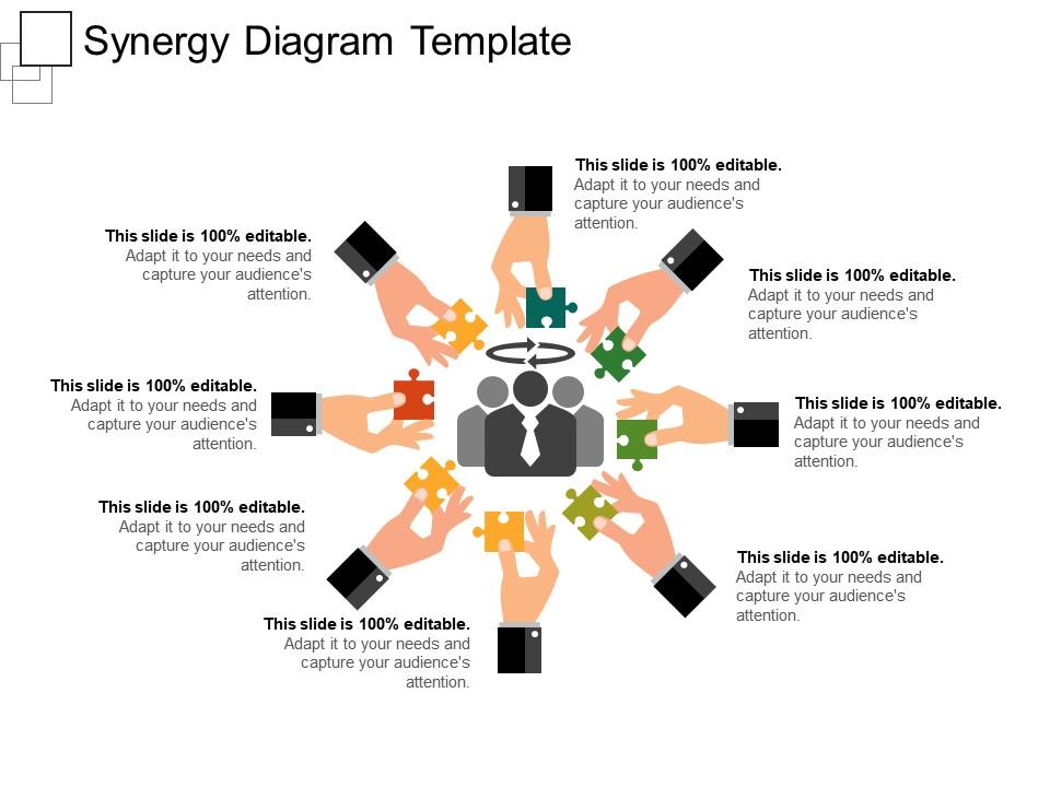
Presenting synergy PPT diagram. This is productive PPT design gainful for the business management professionals and experts from different fields. The Presentation image, information structure, theme, color etc. are completely transformable. This PowerPoint format can likewise be assorted into various structures like JPG, XML, and PDF. This is also well versatile with Google Slides and business applications. It additionally gives a simple and quick downloading alternative.

People who downloaded this PowerPoint presentation also viewed the following :

FAQs for Synergy diagram template

Start with clear labels for each team and department. Use circles that overlap or arrows connecting them - shows where people actually work together. Map out specific collaboration points first, then spot the gaps where you're missing opportunities. Timeline's super helpful too since this stuff takes time to develop. Include resource flows like shared budgets or data - stakeholders love seeing the money trail, honestly. Add outcome boxes for each partnership so everyone knows what they're getting out of it. Keep it clean but don't leave out the important details. Oh, and definitely include measurable benefits for each collaboration.

So basically it's like mapping out all the people involved in your project and how they're connected. Instead of juggling everything mentally (which honestly never works), you get this visual web showing who influences who. Super helpful for spotting the big players and finding collaboration opportunities you'd totally miss otherwise. You might discover two groups that should be talking but aren't, or see someone has way more pull than expected. Just start by listing everyone, then draw lines showing how they interact. Trust me, the patterns become obvious once it's all laid out visually.

Start with visual hierarchy, clear labels, and logical flow - that's your foundation. Use consistent colors and fonts so readers can follow along naturally. I swear, half the synergy diagrams I see look like complete chaos! White space is your friend here. Clean lines make everything more readable. Short sentences work great for clarity. Complex relationships should feel obvious when people first look at it. Honestly, sketch the core stuff on paper before you touch any software - saves tons of time later. Don't overthink the fancy elements. Simple usually wins.

Honestly, synergy diagrams are a game changer for project communication. You can map out how different pieces connect instead of writing those endless explanation emails that nobody reads anyway. Teams instantly see the big picture and spot collaboration opportunities they'd totally miss otherwise. The visual aspect keeps people way more engaged than boring bullet points - especially when you're presenting to executives who have like zero attention span. I started using them in kickoffs and it seriously cuts down on all that "wait, what are we doing again?" confusion. Worth trying for sure.

Color coding is seriously a game-changer for those diagrams. People's eyes naturally follow certain colors first, so you can basically control where they look. I'd stick to maybe 3-4 colors tops - learned that one the hard way when I made this crazy rainbow chart that nobody could follow. Group similar stuff with the same colors and use contrast for the big connections you want highlighted. Oh and definitely check if your colors work for colorblind folks too. Honestly, the right palette makes even messy relationship webs look clean and logical. Run it by someone else first though!

Yeah totally! These templates work pretty much anywhere - you just swap out the pieces. Healthcare teams map patient touchpoints, manufacturing focuses on supply chains and production stuff. Tech companies love them for product integrations. Honestly the flexibility is what makes them so useful. You grab a basic template and replace all the generic labels with whatever fits your business. The structure stays the same but the content changes completely. I've seen finance teams use them, even retail - it's just about matching the categories to how your specific industry actually works and who your key players are.

Start with the biggest money-makers and keep it simple. Don't say "operational efficiencies" - executives want real numbers like "$2M IT cost reduction annually." Color-code everything (revenue, cost, tax) so people can scan quickly. Dollar amounts should jump off the page, honestly. Make your arrows super obvious - if anyone has to squint, you've messed up. Go left to right when presenting, and definitely prep backup slides with your assumptions. Trust me, someone will ask for the math behind those numbers. Oh, and avoid cramming too much on one slide.

Honestly, the digital tools blow static templates out of the water. Lucidchart and Miro are solid choices - you can drag stuff around, change colors on the fly, resize everything instantly. PowerPoint actually has some decent features too if you dig around. The cool part is how some platforms suggest layouts automatically based on what you input. Super handy. You can also save your tweaked versions as new templates, which I do all the time now. My advice? Start with whatever your team's already using - even Google Drawings works surprisingly well for basic stuff, though it's definitely more limited.

Oh man, definitely get feedback on that thing before you call it done. Your first draft is gonna miss stuff - mine always do. Get input from everyone who's actually dealing with those connections you mapped out. People will catch dependencies you totally overlooked or point out where you're being way too optimistic about timelines. Sometimes they'll spot redundant processes too, which is super helpful. Do at least two rounds of feedback though. The first round usually surfaces the big obvious stuff, but the second one? That's where people really dig in and give you the good details.

Yeah, so your synergy diagram might totally confuse people depending on where they're from. Like, hierarchical cultures expect clear chains of command - your overlapping circles could look messy to them. Power distance is huge too. If everything looks "equal" on your diagram, some cultures will be like wait, where's the boss? Oh, and colors are tricky - red screams danger in the US but means good luck in China (learned that the hard way once). Before you share it internationally, maybe run it past someone from that culture first? Or just add a quick note explaining your visual choices. Saves awkward conversations later.

Honestly, the worst thing you can do is overcomplicate your template right off the bat. People will take one look and nope out immediately. Simple labels, logical flow - that's it. Don't try cramming every relationship into perfect little boxes either. Synergies are naturally messy! Leave plenty of white space too, otherwise everything looks claustrophobic. Skip the internal jargon since these things get passed around to other teams who won't know what you're talking about. My advice? Start basic, test it with real data, then maybe add more layers if you actually need them.

Honestly, synergy diagrams are pretty flexible - you can drop them in a bunch of different spots. I like putting them early on to show how everything connects before getting into the weedy details. Or do the opposite and explain each piece first, then BAM - hit them with the diagram so they see how it all fits together. Those "aha!" moments are the best. They're solid transition slides too. Oh, and try starting simple then showing a more complex version at the end. Animation works way better than dumping everything on screen at once - trust me on that one.

Honestly, just see if people actually use what came out of the session. Did you get real action items with owners? Are teams talking to each other more now? I always send a quick survey asking if the visual format helped them think differently - usually they say yes if you did it right. Watch for people bringing up the diagram in other meetings or referencing those insights later. The dead giveaway it worked? When it sparks ongoing conversations instead of getting buried in some folder. Oh, and if you uncovered blind spots that weren't obvious before, that's gold. Short version: effective sessions change how people behave afterward.

Look at Disney buying Marvel - that synergy map must've been insane! Distribution channels, theme parks, merchandising know-how meeting Marvel's characters and stories. The payoff? Massive box office hits, new park rides, products everywhere. Amazon does this too with Prime, AWS, Alexa all connecting. Honestly, once you draw out these connections, you can see why certain deals just make sense. I actually started sketching these for big decisions at work and it's pretty eye-opening. You should try it next time you're stuck on something strategic.

Group similar synergies together first—cuts down on visual mess. Ditch the obvious stuff like "shared office space" and focus on what actually moves the needle. Color-coding is honestly clutch here, makes everything way more readable. Use thick lines for big synergies, thin ones for smaller stuff. Your labels should be snappy too. "Cost savings" beats "operational cost reduction through blah blah blah." Oh, and definitely test it on someone fresh. If they squint at it for more than 5 seconds, you've got work to do.

Ratings and Reviews

95% of 100
Review Form
Write a review
Most Relevant Reviews
  1. 100%

    by William King

    Content of slide is easy to understand and edit.
  2. 100%

    by Rodriguez Morgan

    Good research work and creative work done on every template.
  3. 100%

    by Diego Gardner

    Qualitative and comprehensive slides.
  4. 80%

    by Jacob Wilson

    Unique and attractive product design.

4 Item(s)

per page: