


Brand synergy diagram ppt presentation examples




Try Before you Buy Download Free Sample Product
 Impress Your
 Audience
 100%
100% Editable
 Save Hours
 of Time


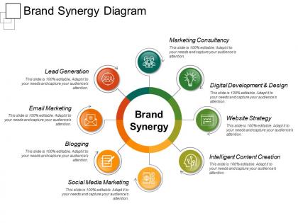
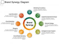
Develop your brand value in the market with our brand synergy diagram PPT design. This brand marketing PPT template allows you to graphically represent the strategies which further helps in attracting more customers. Such as lead generation, email marketing, blogging, social media marketing, website strategy, digital development and design and more. You can define your business vision through this brand synergy PPT image to let your customer known about your business capabilities. You can likewise define the various benefits with this branding synergy PowerPoint layout design. Such as, it helps in enhancing your company’s profit. It also helps you to provide an enhanced and better customer experience. Use this PPT diagram to simply reposition your brand value in the market. It is also cost effective for your business and also allows you to easily cooperate with the other established business brands. Thus, use this business synergy PPT image to reduce your marketing cost which directly results in enhancing your profitability level. Highlight the benefits agreement can bring with our Brand Synergy Diagram Ppt Presentation Examples. It helps elaborate on the deal.
People who downloaded this PowerPoint presentation also viewed the following :
Brand synergy diagram ppt presentation examples with all 5 slides:
Elaborate on iconic events in history with our Brand Synergy Diagram Ppt Presentation Examples. Enable folks to draw inspiration from them.
FAQs for Brand synergy diagram
So brand synergy diagrams are different from regular brand mapping - they show how brands actually connect and work together instead of just where they sit on a chart. Regular mapping is like "Brand A is expensive, Brand B is cheap" which is pretty boring honestly. Synergy diagrams reveal the real relationships. Shared customers, partnership potential, where brands might clash. It's more like mapping a social network but for companies. You'd start by figuring out which brands relate to yours, then plot how strong those connections are. Really helpful for spotting collaboration opportunities you might've missed.
So basically you're mapping out where your different brands actually connect - like shared audiences, similar values, that kind of thing. Plot each brand's strengths and who they're targeting. Then hunt for those overlap zones where partnerships would feel natural instead of forced. Honestly, I've seen too many brands try to collaborate just because they can, not because it makes sense. Short sentences work better here. The visual helps you spot which brands could cross-promote without stealing each other's customers. Just start with your top 3-5 brands and you'll see patterns pretty quickly.
Start with your brand values in the middle, then map every single place customers hit your brand - website, socials, packaging, customer service calls, even if they swing by your office. Don't forget the internal stuff! Your employees ARE your brand, so their training matters way more than people realize. Draw arrows between everything to see how it all connects. Look for weird gaps where things feel off or disconnected. Oh, and include any partnerships too since they're basically extending your brand. Honestly, just audit what you've got first, then figure out where you can create the biggest wins.
So basically, it gives your marketing teams a visual map they can all work from. No more confusion about how campaigns should connect - everyone's looking at the same thing. Saves you from those annoying meetings where people are like "wait, I thought we were doing this instead." Teams can actually see how their work affects other people's stuff and catch problems early. Honestly, the best part is when teams build it together from the start. Makes them feel like they own it, you know? Plus it shows all the dependencies between different projects, which is super helpful when you're trying to keep everything coordinated.
Honestly, visuals are a game-changer for brand synergy diagrams. Color coding shows relationship strength way better than text ever could. Use arrows for influence flow, different shapes for hierarchy stuff. Icons are clutch but most people skip them for some reason. Your stakeholders won't get buried in details when they can see everything at a glance. Oh, and stick to a consistent system - maybe warm colors for strong synergies, cool ones for weak connections. Makes the whole thing way less overwhelming to look at.
Retail and tech companies use these diagrams constantly - like when credit card companies partner with stores, or when platforms integrate with each other. Entertainment does it too (McDonald's movie tie-ins, anyone?). Airlines team up with hotels all the time. Really, any business doing collaborations should map this stuff out. Consumer brands especially love these when they're launching joint products or trying to break into new markets. My advice? Start by listing all your current partnerships first - I bet you'll find opportunities you totally overlooked before.
Try making a brand synergy diagram - it's like a Venn diagram but for partnerships. Map out your brand values, target audience, and positioning first. Then add theirs on top and see where things overlap vs. clash. Honestly, it's saved me from some terrible partnership ideas when I spotted major conflicts early (like pairing luxury brands with discount retailers - yikes). The cool part? You'll also find sweet spots where your combined strengths could create something way more powerful. Just start with your stuff first, then layer theirs in.
You've got to figure out your audience before anything else - it's literally the whole point of the diagram. Your visual stuff, messaging, all those touchpoints need to work together for the people you're actually trying to reach. Without knowing what they care about or how they act, you're basically making a fancy chart that nobody connects with. I've watched so many teams skip this part and then act shocked when nothing lands right. Map out your main audience groups first, then build everything else around them. Otherwise you're just guessing and hoping it works.
So here's what I'd do - add KPI nodes right at those interaction points in your synergy diagram. Customer satisfaction scores work great where messaging hits experience. Engagement rates are perfect for visual identity stuff. Honestly, this makes all that fluffy brand theory actually useful because now you can measure it. Map specific metrics to each relationship - like brand awareness + product quality should equal your Net Promoter Score. Just pick metrics that show how components work together, not individual pieces performing alone. Oh and start with maybe 3-4 core ones first, then build out.
Don't try cramming every single touchpoint in there - it becomes a hot mess visually. Focus on the big brand intersections that actually move the needle for your audience. Keep connections grounded in reality, not some theoretical nonsense. I've seen people go way too artsy with these (honestly kind of annoying). Clean layout is everything so stakeholders can follow along without getting lost. Validate your synergies with real data or customer feedback before you call it done. Oh, and start simple! Only add complexity where it genuinely helps tell your story better.
Start with solid brand guidelines that cover your messaging, visuals, and tone - honestly, this is where most companies drop the ball. Your synergy diagram should map every single touchpoint so you can catch inconsistencies early. I've watched teams get all excited about cool partnerships then completely forget their own brand rules (whoops). Document the non-negotiables: logo specs, colors, core values that absolutely can't change no matter what. Build a simple checklist your team can actually use when they're working on diagram elements. Short and sweet.
Honestly, Lucidchart and Miro are solid choices since they're built for this kind of collaborative stuff. Your team can jump in and edit together pretty easily. Figma's good too if you're already using it for design work - though it's not specifically made for diagrams. I mean, even Canva works if you just need something simple and don't want to overcomplicate things. The main thing is making sure everyone can actually access it without being a pain. Brand synergy maps usually need input from like five different people, so you don't want tool friction slowing things down.
Honestly, stakeholder feedback is like having people double-check your work – except way more valuable. They catch blind spots you'd never see. Get input from customers, employees, partners, maybe even competitors if you can swing it. Each group sees your brand differently. You might think two elements connect perfectly, but then someone goes "wait, this messaging is confusing" or "these touchpoints feel contradictory." Super helpful reality check. I'd show rough drafts to 3-5 different groups, but ask specific questions about connections that seem unclear rather than the generic "thoughts?" That gets you nowhere fast.
Disney's the obvious one - their brand mapping is insane, connecting theme parks to movies to merch to Disney+. It literally looks like a web when you see their actual diagram. Virgin did something similar when they jumped from music to airlines, showing how that "rebel" vibe worked everywhere. Nike mapped out how their athlete sponsorships tied into products and retail too. Oh and there's this Harvard Business Review case study about Disney's approach that's actually super helpful - has real examples you can steal from. Brand synergy diagrams aren't just corporate fluff when done right.
Every quarter for sure, but honestly whenever big stuff happens in your market too. New competitors, major product drops, partnerships - all good reasons to update it. I learned this the hard way when our team made decisions based on connections that didn't even exist anymore. Pretty embarrassing in hindsight. The whole point is keeping it current, right? Outdated maps are worse than useless - they'll actually steer you wrong. Set a reminder for quarterly but don't be rigid about it. Market changes fast these days.
-
It saves your time and decrease your efforts in half.
-
Awesomely designed templates, Easy to understand.
-
Excellent template with unique design.
-
Great experience, I would definitely use your services further.