


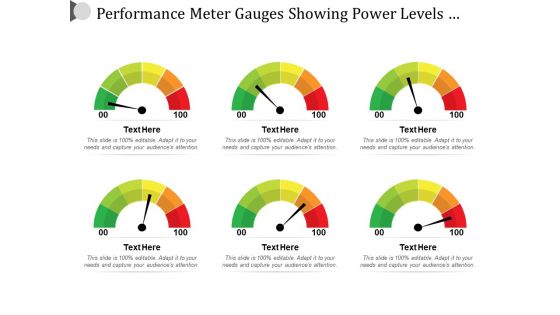
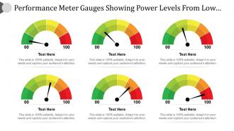
Performance meter gauges showing power levels from low high





Try Before you Buy Download Free Sample Product
 Impress Your
 Audience
 100%
100% Editable
 Save Hours
 of Time


The performance meter gauges Slide PPT incorporates key features like performance meter, performance dashboard, and performance KPI. The performance level Template PPT shows the performance level of a company or an organization with passing time, the company in its initial stage may yield less profit due to its low or slow performance but can gradually increase its performance or productivity chart leading to a concrete establishment of your company in the market. There are many factors which unanimously come together to make a company reach another level, the combination or summation of such crucial factors only forms the performance or yielding output of the company or an organization. The company can reach heights slowly and steadily as it is not possible for any company to directly yield the maximum profit in just a jiff without any real labor. The performance meter Template PPT beautifully shows the idea of increasing the performance rate of a company and it is very feasible as it gives you the convenience of writing texts as well. Secure the performance meter Template PPT to gain highly positive reviews from your receiving audience in a very short span of time. Examine alternatives closely with our Performance Meter Gauges Showing Power Levels From Low High. Compare them down to the finest details.
People who downloaded this PowerPoint presentation also viewed the following :
Performance meter gauges showing power levels from low high with all 6 slides:
Exorcise haunting fears with our Performance Meter Gauges Showing Power Levels From Low High. Dispel all doubts that crop up.

FAQs for Performance meter gauges showing power levels
So basically you've got the sensing part - that's your bourdon tube or diaphragm doing the actual measuring. Then there's the movement mechanism that turns pressure into needle movement, plus the face with all the numbers. Most have adjustment screws for calibration too, which you'll definitely need over time. Housing keeps everything safe and usually comes with mounting stuff. Oh, and dampening systems are clutch - they stop the needle from going crazy and make readings way easier. Honestly, I'd focus on what type of sensing element you need first since that determines what you can measure and how accurate it'll be.
Gauge choice makes a huge difference in how people read your data. Linear ones are perfect for progress tracking, but circular gauges work better for quick status checks. I've watched people totally butcher speedometer-style ones when the scale's confusing though - it's painful. Bullet graphs are my go-to for dashboards since they cram so much info into tiny spaces. You get actual vs target plus those performance bands all at once. Really think about what decision you want people making after they see it. That'll tell you which gauge type to pick.
Three main things to check first: accuracy, response time, and measurement range. Accuracy's pretty obvious - gotta trust those readings for whatever tolerance you need. Response time depends on your app though. Real-time safety monitoring? You need speed. Just tracking trends over time? Slower's fine. Make sure the range covers your normal conditions plus any spikes or dips you might see. Oh, and don't overlook the environmental stuff - temperature limits, vibration tolerance, whether you need digital outputs. Honestly, these basics alone will cut your options down to something manageable pretty fast.
Check if your monitoring platform already connects to your gauge model - saves tons of headache. Most stuff like Grafana or Prometheus pulls the data automatically through APIs or SNMP. The annoying bit is usually the data formatting since gauges love using weird units your system doesn't recognize. Set your polling intervals based on how often you actually need updates. No native integration? You'll have to write some scripts or find middleware to translate everything. Database connections work too if that's easier for your setup. Honestly, mapping the formats correctly is where most people get stuck.
Honestly, digital is the way to go for most stuff - way more accurate and you can actually log data to see trends over time. Reading them from across the room is so much easier too. Analog gauges are pretty old school now, though I'll give them credit for working when the power's out and being bulletproof in nasty conditions. For critical processes where you need historical data? Definitely go digital. Just keep a couple analog ones as backup because Murphy's law and all that. You'll thank me when your fancy digital display craps out at 2am.
Material choice is huge for gauge performance. Steel's your best bet for heavy-duty stuff - handles temperature changes and rough use without losing calibration. Yeah, it's heavier and can rust if you don't maintain it. Aluminum works great when you need something lighter and corrosion-resistant, though it won't take as much abuse. I've honestly wasted money on cheap plastic gauges that died in like 3 months - total mistake. Composite materials are pretty solid too, especially around chemicals. Steel keeps its shape the longest, so your readings stay accurate. Go aluminum if you're moving it around a lot.
Dude, you really can't skip calibration and maintenance on those gauges. Your readings will drift without regular cal checks - I've watched teams learn this the hard way when their data went to shit. Monthly maintenance catches problems early, plus it keeps everything running longer. Honestly, most people think it's overkill until something breaks at the worst possible time. Set up calibration every 6-12 months depending on what you're measuring. Start by making a list of what gauges you've got and track when you last serviced them.
Yeah, there's actually quite a few ways to customize those gauges. Most manufacturers will do custom scale ranges and different units of measurement depending on what you need. Housing materials are swappable too - stainless steel for food stuff, explosion-proof cases if you're dealing with hazardous areas. Custom dial faces are pretty common now. You can add your company logo or color-coded zones that match your thresholds. Some vendors even integrate custom sensors for weird measurement parameters. Honestly, your best bet is just calling your supplier directly with your specs. They're usually down to modify things - way more flexible than you'd think.
Honestly, IoT and AI analytics are where it's at right now - your gauges basically become mini computers. Real-time data streaming, predictive maintenance alerts, cloud dashboards you can check from your couch. Digital displays are taking over, though I'm weirdly nostalgic for those old needle gauges sometimes. Wireless sensors cut out so much wiring BS. Machine learning catches patterns you'd totally miss. Oh, and if you're buying new stuff, go wireless and cloud-ready. Trust me on this one - you'll thank yourself later when you're not dealing with compatibility nightmares.
So basically, these gauges let you see what's happening in real-time instead of flying blind. You can catch problems early - like when equipment starts acting weird or resources aren't being used right. Way better than scrambling around after everything's already broken, you know? I'd honestly start with whatever metrics matter most to your operation first. Don't try to track everything at once or you'll go crazy. Once you get those dialed in, you'll probably notice your uptime and output getting better pretty quickly. It's kind of like finally getting glasses when you didn't realize you needed them.
So basically these gauges give you the hard data to prove your stuff's running right when regulators come knocking. They track pressure, temp, flow rates - whatever you need monitored. Real-time plus historical records mean you can show compliance with ISO, OSHA, all that fun paperwork. Honestly sounds super boring until audit day hits! The trick is keeping your gauges calibrated properly and actually logging everything consistently. Trust me, you'll thank yourself later when you've got all that documentation ready instead of scrambling around like a headless chicken trying to find proof your systems work.
Honestly, the worst part is drowning in data that doesn't mean anything. You'll have thousands of metrics but zero clue what actually moves the needle. Different systems never play nice together either - especially when you're stuck with old legacy stuff. Oh, and every team wants their own custom dashboard showing completely different things. It's chaos. My advice? Pick maybe 3-5 KPIs that directly hit your bottom line and nail those first. Once those are bulletproof, then you can start adding more. Don't try to boil the ocean right away.
Color-coding is your best friend here - green/yellow/red zones make everything instantly clear. Make sure the gauges are big enough to actually read (I swear some designers forget people have eyes). Numbers should be super obvious, and honestly? A little animation when values change is clutch for catching attention. You'll want all your meters looking consistent so it doesn't feel janky. Short version: design choices should help people make quick decisions, not just look cool. Oh, and proper sizing really can't be overstated - tiny gauges are basically decoration at that point.
First thing - get your baseline measurements down, then track trends instead of panicking over single readings. Your gauge might be lying to you (seriously, calibrate that thing regularly because I've watched people lose their minds over bad instruments). Read at the same times and conditions since temperature and vibration mess with everything. Cross-check with other metrics too - helps you know if what you're seeing is real. Short story: patterns matter way more than random spikes. Start keeping a proper log so you can actually tell the difference between real issues and normal ups and downs.
Honestly, user training is everything with performance gauges. Without it, people just stare at dashboards like they're written in ancient Greek. You've got to show your team what the numbers actually mean - not just the technical stuff, but how it connects to what they do every day. Pretty obvious when you think about it, but so many companies skip this step. Start with hands-on sessions where they can mess around with real data. Short sentences work here. Otherwise you'll have expensive monitors showing pretty colors that nobody understands or acts on.
-
Great quality slides in rapid time.
-
Top Quality presentations that are easily editable.