


Pitch deck for beauty and personal care brand startup ppt template




Try Before you Buy Download Free Sample Product
 Impress Your
 Audience
 100%
100% Editable
 Save Hours
 of Time


Beauty and personal care address the appearance and health of hair, skin, and nails. It includes stylists, barbers, make-up artists, and other professionals. Here is an efficiently designed pitch deck on Beauty and Personal Care Brand Startup that consists of a company overview and focuses on the beauty and personal care market overview, product details, key executive, team management, etc. This deck shows the beauty brand formulation philosophy, containing various features such as safety, natural and effective formulae, etc. Ethical sourcing concerning packaging and distribution of personal care products are also included in this PPT. This highlights the product distinctions of beauty brand products, including dermatologist-tested products, fair trade, certified by the government, etc. We have also focused on upcoming beauty products and features with their pricing details. This deck includes why to invest in beauty brands such as organic beauty products, socially conscious, etc. We have also discussed the competitive landscape of beauty and cosmetic brands. Market growth opportunities for beauty and personal care brands are also highlighted in this PPT. Get access now.
People who downloaded this PowerPoint presentation also viewed the following :
Content of this Powerpoint Presentation
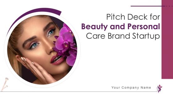
Slide 1: This slide introduces Pitch Deck for Beauty and Personal Care Brand. State Your Company Name and begin.
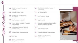
Slide 2: This slide shows Table of Content for the presentation.
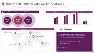
Slide 3: This slide presents Beauty and Personal Care Market Overview.
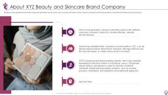
Slide 4: This slide shows information about next generation beauty brand.
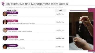
Slide 5: This slide displays Key Executive and Management Team Details.
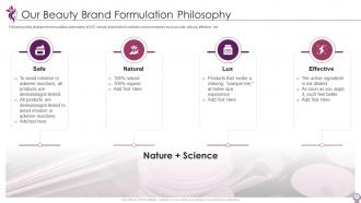
Slide 6: This slide represents Our Beauty Brand Formulation Philosophy.
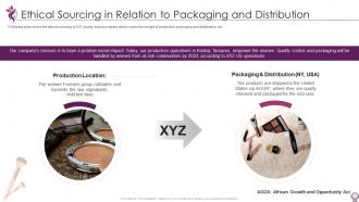
Slide 7: This slide shows ethical sourcing of XYZ beauty brand company which covers the insight of production, packaging and distribution, etc.
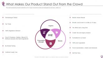
Slide 8: This slide presents What Makes Our Product Stand Out From the Crowd.
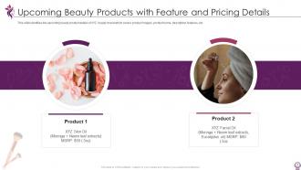
Slide 9: This slide identifies the upcoming beauty product details of XYZ beauty brand.
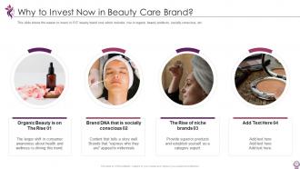
Slide 10: This slide displays the reason to invest in XYZ beauty brand now which includes rise in organic beauty products, socially conscious, etc.
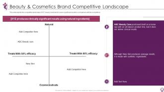
Slide 11: This slide represents Beauty & Cosmetics Brand Competitive Landscape.
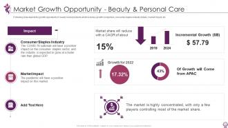
Slide 12: This slide shows Market Growth Opportunity - Beauty & Personal Care.
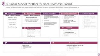
Slide 13: This slide presents Business Model for Beauty and Cosmetic Brand.
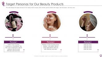
Slide 14: This slide shows Target Personas for Our Beauty Products.
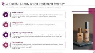
Slide 15: This slide displays Successful Beauty Brand Positioning Strategy.
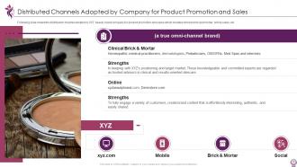
Slide 16: This slide represents Distributed Channels Adopted by Company for Product Promotion and Sales.
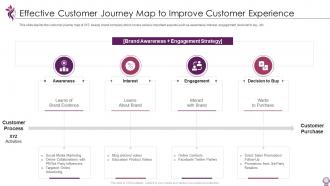
Slide 17: This slide shows Effective Customer Journey Map to Improve Customer Experience.
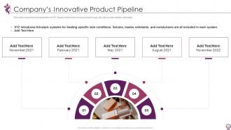
Slide 18: This slide presents the product pipeline of XYZ Beauty brand which shows product image, full-stack system details, with dates.
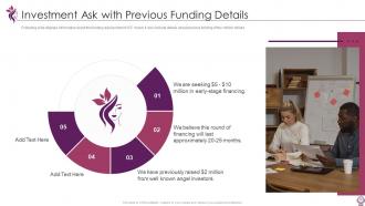
Slide 19: This slide shows Investment Ask with Previous Funding Details.
Slide 20: This slide displays Icons for Beauty Brand Pitch Deck.
Slide 21: This slide is titled as Additional Slides for moving forward.
Slide 22: This slide provides 30 60 90 Days Plan with text boxes.
Slide 23: This slide presents Roadmap with additional textboxes.
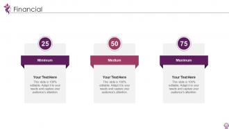
Slide 24: This is a Financial slide. Show your finance related stuff here.
Slide 25: This slide shows Post It Notes. Post your important notes here.
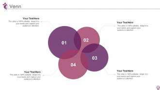
Slide 26: This slide depicts Venn diagram with text boxes.
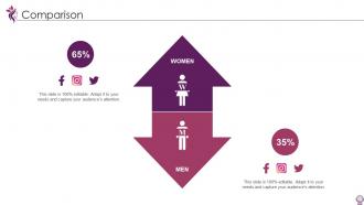
Slide 27: This is a Comparison slide to state comparison between commodities, entities etc.
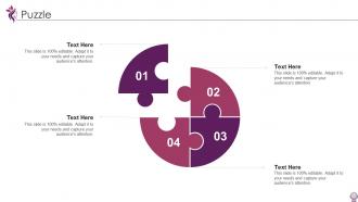
Slide 28: This slide contains Puzzle with related icons and text.
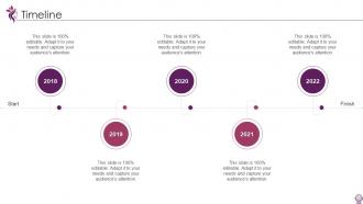
Slide 29: This is a Timeline slide. Show data related to time intervals here.
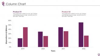
Slide 30: This slide displays Column chart with two products comparison.
Slide 31: This is a Thank You slide with address, contact numbers and email address.
Pitch deck for beauty and personal care brand startup ppt template with all 36 slides:
Use our Pitch Deck For Beauty And Personal Care Brand Startup Ppt Template to effectively help you save your valuable time. They are readymade to fit into any presentation structure.





FAQs for Pitch deck for beauty and personal care brand
Okay so for your pitch deck, you'll want to cover the basics: problem, solution, market size, business model, traction, competition, team, financials, and your funding ask. Don't sleep on the "why now" slide though - investors eat that timing stuff up. Keep it tight, like 10-12 slides for presenting, but have backup slides ready for the inevitable random questions they'll throw at you. The whole thing should flow like a story from "here's what sucks" to "here's how we fix it" to "we're the right people for this." Start with a template but honestly, tweak it based on who you're pitching to.
Honestly, templates are lifesavers for pitch decks. When you're super passionate about your startup, it's so easy to go off on tangents and lose people. A solid template keeps you hitting those key beats - problem, solution, traction, the ask. The flow matters way more than most founders think. Information needs to build momentum instead of jumping all over the place. Good templates also remind you to throw in emotional hooks and real examples that'll stick with investors. Oh, and don't just fill in the blanks like it's a Mad Libs game. Use the structure but make it yours.
Investor decks are all about the money - they want to see your financials, market size, and how they'll cash out. Partners? Totally different story. They care more about how you'll actually work together and what's in it for them. With investors, you're basically proving your numbers will explode. Partners want to know about integration, timelines, and whether this whole thing makes sense strategically. Honestly, just build two separate decks from scratch. Way easier than trying to Frankenstein one deck into something that works for both - trust me on this one.
Oh man, visual design is HUGE for pitch decks. I've watched brilliant ideas completely bomb just because their slides looked like trash - it's brutal but true. You want clean layouts with breathing room so people actually focus on what you're saying. Good fonts and colors create that emotional hook you need. Here's the thing though - consistency is everything. Pick one template that fits your vibe and stick with it. Your slides should flow naturally, guiding eyes where you want them to go. Use contrast and hierarchy to highlight the important stuff. Honestly, even if your idea is solid, messy design just screams unprofessional and kills credibility fast.
Honestly, branding makes or breaks your pitch deck customization. Don't just slap your logo on there and call it done – I see that mistake constantly. Your colors, fonts, and imagery style need to match your vibe. But here's what people miss: the tone and structure should scream "you" too. Like, if you're a scrappy startup, don't write copy that sounds corporate and stiff. Create some quick brand guidelines first (saves time later). Then actually follow them throughout the whole deck. It's the difference between looking professional and looking like you downloaded something generic off Canva.
Oh man, definitely make your fonts way bigger - like 24pt minimum because everyone's squinting at laptops. I'd go heavy on visuals too since people's brains just check out on video calls, honestly. Slide numbers are clutch so folks can catch up if they drift off (which they will). Throw in an agenda slide at the start - it helps more than you'd think. The biggest thing though? Test it first by screensharing to yourself. I've seen so many presentations where the text was basically unreadable once shared. Also section breaks between topics keep people oriented.
Honestly, the worst thing you can do is follow it like gospel. Templates are just starting points, not rules. Don't stuff your slides with paragraphs - nobody reads that crap anyway. I once saw someone pitch with "Company XYZ" still on their title slide... yikes. Pick slides that actually matter for your story. Half the template? Probably useless for you. Make it look like your brand too. Oh, and practice the actual talking part - the slides won't save you if you sound like you're reading a grocery list up there.
Definitely matters what industry you're in. SaaS companies need to hammer metrics and recurring revenue stuff hard, but biotech? They care way more about research validation and those crazy long timelines. B2C vs B2B is totally different too - like how you show market size and customer costs changes completely. Generic templates are honestly the worst because you end up trying to jam your story into slides that don't fit. Way better to find something built for your space already. Trust me, investors can tell when you're using the wrong template from slide one.
OK so here's the deal with pitch decks - lead with the problem, then hit solution, market size, business model, all that stuff. But honestly? Most people screw up by jamming everything into like slide 2. Don't do that. One key point per slide, and visuals beat walls of text every time. Your opening needs to grab them right away. Oh and practice the transitions between slides - that's where you'll actually win them over. Keep it tight, maybe 10-12 slides tops. Make sure your ask is super clear at the end because investors hate guessing what you want.
Honestly, it depends on your stage. Seed funding? Go heavy on problem-solution fit and why your team rocks - you probably don't have much traction anyway. Series A is different though. That's when you need solid metrics and proof you can actually scale. Later rounds want the fancy financials and competitive stuff. The slides themselves stay pretty much the same, but you're basically telling a totally different story each time. I'd grab a flexible template and just switch up how deep you go on each section. Way easier than rebuilding everything from scratch every round.
Start with your user numbers - MAU, DAU, growth rates. That's what they look for first. Unit economics come next: CAC, LTV, churn, MRR if you're doing SaaS. Charts over text blocks, trust me on this one. Show them product-market fit with NPS scores or retention data. I'd throw in burn rate and runway too since they always ask anyway. The thing is, most decks are garbage so clean metrics actually make you memorable. Keep the whole traction story visual and easy to scan.
User feedback shows you what's actually broken vs what you *think* is broken. People consistently skipping sections? That's your answer right there. I've watched entire templates get flipped around because users kept asking "wait, where does market size go again?" - which honestly should've been obvious but wasn't. Quick surveys after downloads work great, or just throw up a comment box. Design elements matter too, especially readability stuff when you're presenting to different crowds. Even like 5-6 responses will show you patterns you'd never spot otherwise.
Dude, pitch decks are totally different now. Everyone's doing minimal designs with way less text - like 10-12 slides max. Bold visuals are huge, plus custom illustrations instead of those cringe stock photos we used to see everywhere. Interactive stuff and video backgrounds are pretty common too. Honestly? The data viz has gotten so much better. Charts that actually tell stories instead of just barfing numbers at people. Each slide should make investors curious enough to ask questions rather than explaining every single detail upfront. Oh and skip those old templates - they scream 2019.
Think of your pitch deck like telling a story over drinks. Start with the problem - that's your villain. Then bring in your solution as the hero who saves the day. I hate when people just dump feature lists on slides, honestly feels so robotic. Use real customer examples instead of bullet points. Each slide should build on the last one, like you're walking through this exciting discovery you made. Show the conflict (market challenges), your fix, then paint that future vision. Oh and make sure it flows naturally - investors want to follow a story, not slog through some boring business report.
PowerPoint and Google Slides are your best bet - they're easy and most templates just work. Canva's really nice if you want something that looks more polished without being a design expert. Figma gives you way more control but honestly, it's kind of a pain to learn if you haven't used it before. I'd just go with whatever you already know how to use. No point stressing about learning new software when you're trying to get your pitch ready. Oh, and Google Slides is clutch if you need to collaborate with anyone since the sharing is so seamless.
-
Best Representation of topics, really appreciable.
-
Wonderful templates design to use in business meetings.