


Pitch deck for pre seed funding powerpoint presentation slides






Try Before you Buy Download Free Sample Product
 Impress Your
 Audience
 100%
100% Editable
 Save Hours
 of Time


This is an early stage investment which the owner requires to start the business. This is also known as pre seed capital or pre seed money. Business owners can raise this money from friends, family or investors and give stakes in the company in exchange. The presentation is helpful for start ups looking to raise funding for the initial development of the product, to set up a business, or to build a new team. This presentation will help the start ups to present their business or business idea and future growth plans in front of the potential investors. This presentation comprises the following sections Company Overview, Company introduction, unique business idea, business model, revenue streams, historical events, products, and services etc. Market Overview Target audience identification and segmentation, competitive landscape, market size and opportunities etc. Financials Overview Income statement, revenue, and cash flow projections, capitalization tables, valuation, break even point, and cost analysis etc. Investment and funding overview Funding requirements, use of raised funds, future plans, the exit strategy for the investors etc. This presentation will help the organizations to move from the situation, where they need funds for initial business development to set the future targets, use, and goals of raised funding.
People who downloaded this PowerPoint presentation also viewed the following :
Content of this Powerpoint Presentation
Slide 1: This slide introduces Pitch Deck for Pre Seed Funding.
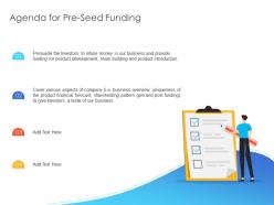
Slide 2: This slide displays Agenda for Pre-Seed Funding.
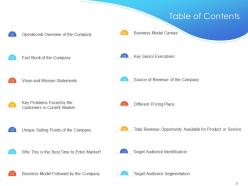
Slide 3: This slide displays Table of Contents of the presentation.
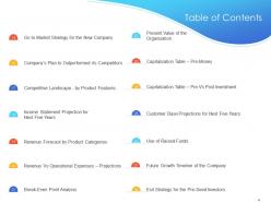
Slide 4: This slide displays Table of Contents.
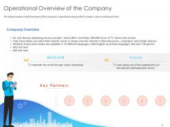
Slide 5: This slide presents Operational Overview of the Company.
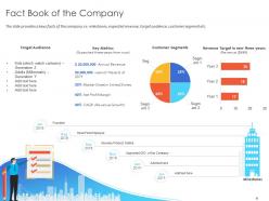
Slide 6: This slide depicts Fact Book of the Company. The slide provides a keys facts of the company i.e. milestones, expected revenue, target audience, customer segment etc.
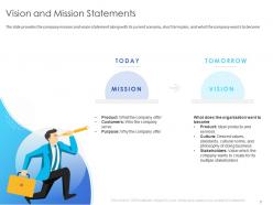
Slide 7: This slide depicts Vision and Mission Statements.
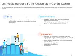
Slide 8: This slide showcases Key Problems Faced by the Customers in Current Market.
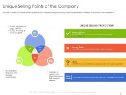
Slide 9: This slide presents Unique Selling Points of the Company. The slide provides the unique benefit offered by the company through its service, product or brand that enables it to stand out from competitors
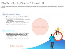
Slide 10: This slide showcases Why This is the Best Time to Enter Market?
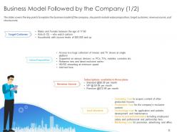
Slide 11: This slide describes Business Model Followed by the Company.
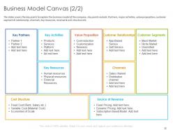
Slide 12: This slide displays Business Model Canvas.
Slide 13: This slide depicts Key Senior Executives.
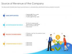
Slide 14: This slide represents Source of Revenue of the Company.
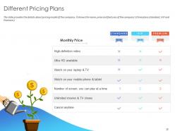
Slide 15: This slide showcases Different Pricing Plans.
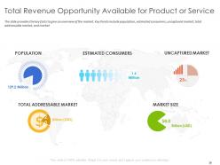
Slide 16: This slide shows Total Revenue Opportunity Available for Product or Service.
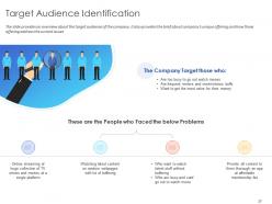
Slide 17: This slide presents Target Audience Identification.
Slide 18: This slide showcases Target Audience Segmentation.
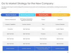
Slide 19: This slide represents Go to Market Strategy for the New Company.
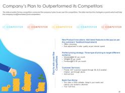
Slide 20: This slide depicts Company’s Plan to Outperformed its Competitors.
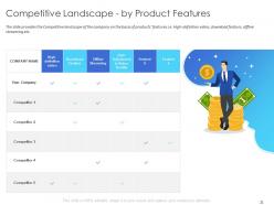
Slide 21: This slide showcases Competitive Landscape - by Product Features.
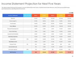
Slide 22: This slide depicts Income Statement Projection for Next Five Years.
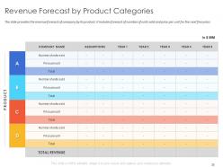
Slide 23: This slide represents Revenue Forecast by Product Categories.
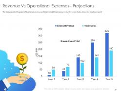
Slide 24: This slide presents Revenue Vs Operational Expenses - Projections.
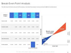
Slide 25: This slide depicts Break-Even Point Analysis. The slide shows the break-even point of the company. It provides the company’s revenue and cost at different unit of products
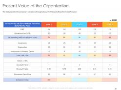
Slide 26: This slide showcases Present Value of the Organization.
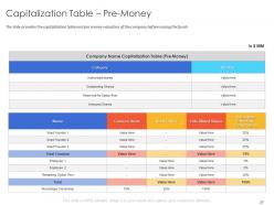
Slide 27: This slide depicts Capitalization Table – Pre-Money. The slide provides the capitalization table and pre money valuation of the company before raising the funds
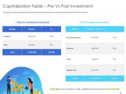
Slide 28: This slide showcases Capitalization Table – Pre Vs Post Investment. The slide provides the capital structure of the company Prior to pre-seed Investment and Post the Investment
Slide 29: This slide showcases Customer Base Projections for Next Five Years.
Slide 30: This slide presents Use of Raised Funds.
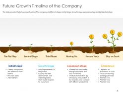
Slide 31: This slide represents Future Growth Timeline of the Company. The slide provides the future growth plans of the company at different stages: Initial stage, Growth stage, expansion stage and Established stage
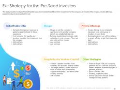
Slide 32: This slide depicts Exit Strategy for the Pre-Seed Investors.
Slide 33: This slide is titled as Additional Slides for moving forward.
Slide 34: This is Our Mission slide with Vision, Mission and Values.
Slide 35: This is Venn slide.
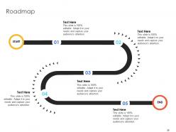
Slide 36: This slide depicts Roadmap process.
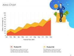
Slide 37: This slide displays Area Chart with product comparison.
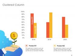
Slide 38: This slide depicts Clustered Column chart with different product comparison.
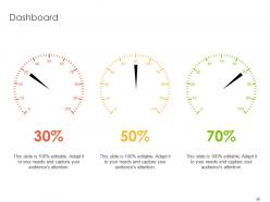
Slide 39: This is Dashboard slide with percentages.
Slide 40: This slide displays Quotes to convey message, beliefs etc.
Slide 41: This is Thank You slide with Address, Contact number and Email address.
Pitch deck for pre seed funding powerpoint presentation slides with all 41 slides:
Don't despair if you feel it's difficult. Our Pitch Deck For Pre Seed Funding Powerpoint Presentation Slides ensure they get it with ease.









FAQs for Pitch deck for pre seed funding
Okay so definitely include the basics - problem, solution, market size, business model, your traction so far, competition, team bios, and how much you're raising. Oh and the "why now" bit is huge, investors eat that timing stuff up. Keep it tight though, like 10-12 slides tops for presenting (you can always have extras ready for questions). Front-load your problem and solution since that's make-or-break territory. Don't be vague at the end either - instead of "we want investment," say exactly how much cash you need and where it's going. I learned that one the hard way.
Dude, visuals are what make your pitch deck actually stick. Nobody wants to stare at walls of text - charts and mockups tell your story way better. People remember visual stuff like 6x more than just words (picked that up somewhere, probably true). Before/after screenshots are gold for showing transformation. Customer journey maps walk investors through the pain points without you having to explain everything. Product demos make your solution feel real instead of theoretical. Just make sure each visual actually supports your story arc. Pretty pictures that don't connect to your narrative are honestly just distracting fluff.
Honestly, most people just cram way too much stuff onto their slides - it's painful to watch. Keep it to like 10-12 slides tops. And don't start by bragging about your product features! Investors want to hear about the actual problem first, then market size. Use bigger fonts too because squinting at tiny text from the back row sucks. Your financial projections should be realistic - crazy optimistic numbers just scream "I have no idea what I'm doing." Oh and seriously, practice your timing. I've seen so many great pitches die because someone ran out of time during the important parts. Test it on your mom or whoever first.
Honestly, you've gotta completely change your approach based on who you're talking to. Investors want the money stuff upfront - market size, revenue projections, competitive advantage. They're hunting for scalability and dollar signs. But with customers? Start with their actual pain points and how you'll fix them. Way more demos and testimonials, less abstract business jargon. The investor pitch is honestly pretty boring compared to the customer one. I'd make two separate decks - sounds like extra work but trust me, it's worth it. Practice switching between both so you don't accidentally bore customers with revenue charts.
Dude, typography can make or break your whole presentation. I've watched investors completely check out because someone used tiny Comic Sans or whatever. Go with clean sans-serif fonts - Montserrat's solid, Open Sans too. Mix up your font weights so headers actually stand out from body text. People need to scan this stuff quickly. Oh, and stick to 2-3 font families max or it gets messy fast. Your slides should look professional but not boring - there's definitely a sweet spot there. Make sure everything's readable from across the room. Trust me, good typography is the difference between people listening vs. scrolling their phones.
Honestly, investors can smell BS market research from a mile away. Do 2-3 slides max with real data - market size from actual sources, customer pain points from surveys you did yourself, competitive analysis that shows you've done your homework. Charts beat walls of text every time when you're up there presenting. Primary research trumps those cookie-cutter industry reports if you can swing it. Oh and here's the thing - every single number needs to tie back to why YOUR startup wins in this space. Don't just throw random stats around hoping something sticks.
Honestly, just keep those projections realistic - investors can spot BS numbers instantly. Stick to 3-5 years and show your main revenue drivers. Always include your assumptions too, otherwise they'll have no clue how you got there. I've watched so many founders crash and burn trying to defend some ridiculous hockey stick they made up. You need to walk through the logic for every big line item. Oh, and definitely have a conservative scenario ready because they'll 100% ask "what if you're only half right?" Trust me on that one.
Get super specific about what problem you're solving and why you're the only one who can do it that way. By slide 3, investors should totally get your value prop - don't make them dig for it through a bunch of buzzwords. Skip the "we're disrupting everything" nonsense. Show actual numbers and real examples instead. What makes you different from competitors? Your tech, your team, how you approach the market? Test it on your neighbor or something - if they look confused, you need to simplify. Honestly, most pitch decks sound exactly the same. Don't be one of those.
Honestly, good visuals are what separate amateur decks from ones that actually get funded. Go with clean fonts and pick a color scheme - then stick with it. Your charts need to be dead simple because squinting at messy graphs is the fastest way to lose someone's attention. Think movie trailer, not boring documentary. White space is your friend here. Don't go crazy with animations either - I've seen too many decks that look like PowerPoint threw up everywhere. Oh, and definitely test it on a big screen first. What looks perfect on your laptop might be totally unreadable when projected.
Blue's your best friend for trust stuff - financial numbers, credibility, all that. Red works for urgent things but don't go crazy with it. Green's obvious for growth and wins. Seriously though, I cannot tell you how many decks I've seen that look like a 5-year-old went nuts with crayons. Two or three colors max, trust me. Conservative investors? Navy and grey are safe bets. Pitching to a startup crowd? You can probably get away with something bolder. Dark colors make you look serious, lighter ones are more friendly. Maybe run it by someone first to make sure you're hitting the right vibe.
Start with the problem, then walk them through your solution and market opportunity. The flow between slides matters way more than people think - I've sat through so many pitches where they just bounce around randomly and everyone gets lost. Tell an actual story from "here's what's broken" to "here's how we fix it." Each slide should connect naturally to the next one. Keep your main message consistent throughout. Honestly? The verbal transitions between slides are where most people mess up, so practice those. You want your audience feeling like they're on a journey, not getting a data dump.
Honestly, stick to 15 minutes tops. I've watched so many founders completely bomb by going 30+ minutes while everyone's scrolling their phones. Super painful to watch. You need buffer time for questions anyway - that's the good stuff where real discussions happen. Practice until you can crush it in 12 minutes, then you're golden if nerves hit. If explaining your business takes longer than 15 minutes, your story's probably too complicated. Keep slides tight. The whole "less is more" thing actually works here, even though it sounds cliché.
Honestly? Just go with PowerPoint or Google Slides. Everyone can open them, they work fine, and you probably already know how to use them. Canva's solid if you want something prettier without paying a designer - though yeah, sometimes it screams "I used a template." There's also Pitch and Beautiful.ai if you're feeling fancy, they've got better collaboration stuff. But real talk - I've seen gorgeous decks bomb because the story sucked. Your content matters way more than which tool you pick. Use whatever doesn't frustrate you and spend your energy on the actual pitch instead.
Yeah, totally add testimonials - they're worth their weight in gold for social proof. Make a "Customer Success" slide with 2-3 short quotes that mention actual results, not just fluffy "amazing product!" stuff (those make me cringe honestly). Case studies work great too for showing real traction - like "Company X boosted revenue 40% in 6 months." Keep it punchy and throw in customer logos if you can. I'd put this right after your demo to hammer home the credibility. Oh, and specific pain points your product solved always hit harder than generic praise.
Start with the problem you're solving - make the pain point super obvious and show why your solution beats everything else out there. Market size and business model need to be dead simple to understand. Show your traction numbers if you've got them. Honestly, don't sleep on the team slide because VCs are basically betting on whether they think you can pull this off. Keep everything visual, not walls of text (nobody reads that stuff anyway). Practice until your story flows smoothly from slide to slide. End with exactly how much money you need and what you'll spend it on.
-
WELL DONE!!