


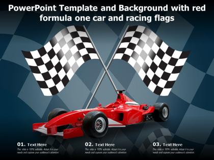
Powerpoint template and background with red formula one car and racing flags




Try Before you Buy Download Free Sample Product
 Impress Your
 Audience
 100%
100% Editable
 Save Hours
 of Time


Our Powerpoint Template And Background With Red Formula One Car And Racing Flags are topically designed to provide an attractive backdrop to any subject. Use them to look like a presentation pro.
People who downloaded this PowerPoint presentation also viewed the following :
Powerpoint template and background with red formula one car and racing flags with all 2 slides:
Use our Powerpoint Template And Background With Red Formula One Car And Racing Flags to effectively help you save your valuable time. They are readymade to fit into any presentation structure.

FAQs for Powerpoint template and background with red formula one car
Honestly, just stick to 2 fonts max and pick a color scheme that doesn't hurt people's eyes. White space is your friend - cramped slides look awful. Make sure your titles stand out and everything flows nicely. Those cheesy default animations? Skip them entirely, they're the worst. Good images beat clipart every single time, trust me on this one. I always start with a simple grid layout first. Then build up from there. Being consistent matters way more than getting fancy with it. Oh, and readable fonts are non-negotiable if you want people to actually pay attention.
Honestly, just think about who you're presenting to first. Finance people want everything super clean and minimal - they hate clutter. Creative types? Go wild with colors and fun graphics. Healthcare and legal are stuck in the stone age with their safe blues and grays, but whatever works I guess. Check out what your competitors are doing for ideas, just don't be obvious about it. If you've got tons of charts and data, keep backgrounds simple so your numbers actually stand out. Maybe mock up a few slides with real content before you go all-in on a design.
Honestly, just pick 2-3 fonts and stick with them - same with your brand colors. White space is your friend here. Nobody wants to decode tiny text in a meeting room. I'd go 24pt minimum for body text so people in back can actually see it. Your logo should live in the same spot on every slide, and similar slide types need the same layout structure. Oh, and definitely test it with real content first! I learned this the hard way - templates that look clean when empty can get messy fast once you start cramming actual data in there.
Yeah, tons of templates are made just for data stuff! Clean chart layouts, consistent colors, lots of white space so everything doesn't look squished. Pre-made slides for dashboards and comparison tables too. Search for "business intelligence" or "analytics" templates - those have the good features already set up. Honestly? They make even the most boring spreadsheet data look halfway decent, which is kind of amazing. Way better than trying to cram everything into a basic template that wasn't built for numbers.
Hey! So for accessible PowerPoint templates - use high contrast colors and stick with fonts like Arial or Calibri, 18pt minimum. Alt text on all your images is crucial. I always mess up the heading styles thing though - you gotta use PowerPoint's actual heading styles instead of just bolding random text. Screen readers need that structure to navigate properly. Oh and descriptive slide titles help too. There's an accessibility checker somewhere under Review if you want to double-check everything. Try tabbing through your slides without using your mouse - it's kinda eye-opening how clunky it can feel!
So colors actually mess with people's heads before they even start reading your slides. Blue makes you seem trustworthy - that's why every boring corporate deck uses it. Red screams urgency, green feels calm or like "we're growing." Pretty crazy how it works. You don't want your colors fighting your message though. Like if you're announcing layoffs, maybe skip the cheerful yellow? I'd grab 2-3 colors that match what you're trying to say and who you're presenting to. Makes everything look way more put-together instead of random.
Dude, just use a template. Seriously saves so much time when you're not sitting there like "ok now what" at a blank slide. The colors and fonts are already picked out and actually look decent together. I used to waste forever on formatting headers and stuff - now I just dump my content in and maybe change a few things. Oh and your whole team's presentations will match, which honestly makes you all look way more professional than you probably are lol. Trust me, grab one next time instead of starting from scratch.
Ugh, don't cram every single detail onto your slides - nobody wants to read a novel up there. Pick colors that actually match your brand instead of using whatever random template you downloaded. And please, for the love of everything, stop with the crazy animations! Those spinning transitions are so cringe. Stick to one or two fonts max, otherwise it looks like a mess. I learned this the hard way - sometimes your content just doesn't fit the template structure, and that's okay. Find a different one instead of forcing it. Clean templates work way better than flashy ones anyway. Focus on what you're actually saying, not making everything bounce around the screen.
Okay so layouts totally control how people read your stuff - they're basically invisible roadmaps. When you're explaining something new, go with title/content layouts. Comparison ones are perfect for weighing options side by side (obviously). Section headers are honestly game-changers for long presentations - they give people's brains a break. Image-heavy layouts keep things interesting but slow down info delivery, which can be annoying. Here's the thing though - match your layout to what you're actually trying to say, not just what looks cool. Sketch your story first, then pick templates that help tell it.
Honestly, templates are a game changer. You'll save so much time not messing with fonts and colors every single time - that tedious stuff really drags on projects. Plus your presentations actually look cohesive instead of thrown together last minute. People start recognizing your style too, which is pretty cool for building your brand. I learned this the hard way after making like 20 random-looking decks that looked totally different from each other. Just make one solid template with your favorite fonts and layouts, then copy it whenever you need a new presentation. Way easier than starting from scratch every time.
Honestly, animations can be great if you don't go overboard with them. Simple stuff like clean slide transitions or having bullet points appear one by one? That actually helps people follow along better. But I've seen way too many presentations with spinning graphics and text flying everywhere - it's like watching a carnival show instead of learning something useful. My rule is just ask yourself: does this animation actually help make my point clearer? If not, ditch it. Oh and definitely run through your slides a few times first because timing matters more than you'd think.
Oh, slide master is where you wanna start - View > Slide Master gets you there. That thing's seriously underrated once you figure it out. Swap the logos, fix the colors to match your brand, change fonts to whatever you guys use. Don't forget to update placeholder text with your actual company info too. Background stuff and graphics should probably get tweaked to fit your look. Definitely save it as a new template after or you'll hate yourself later. I'd test a couple slides first though - sometimes things look weird together until you see the full picture.
Hey! So this year's PowerPoint trends are pretty cool - lots of clean, minimalist stuff with tons of white space. Bold fonts are huge right now. Dark mode templates finally caught on (about time lol). Data visualization is built right into most templates now, which saves me so much time honestly. Interactive elements are popping up everywhere too. Oh, and gradient overlays look sick if you pick the right ones. Most templates work better for hybrid meetings now since half your audience is probably on Zoom anyway. Everything's just more readable because we're all burnt out from staring at screens. Definitely worth updating your go-to templates!
Free templates are fine for internal stuff or quick team meetings, but they look pretty basic. Premium ones usually give you better layouts and that polished vibe - makes your content actually stand out instead of looking like everyone else's deck. I'd spend the $10-30 on a good template if you're presenting to clients or it's a big meeting. Regular team updates though? Just use the free ones. Oh, and whatever you pick, make sure it doesn't clash with your brand colors or you'll look super unprofessional.
Honestly, just stick with .pptx templates - they work on pretty much everything from 2007 onward. Microsoft's template gallery is clutch because they actually test their stuff, unlike some random sites. I always check SlideModel or PresentationGo since they're good about listing what versions work. Avoid the old .ppt format if you can help it. Quick tip: peek at the system requirements before downloading. Trust me, you don't want to be scrambling last minute when your slides look weird on someone else's computer. Been there, not fun.
-
Nice and innovative design.
-
Great product with effective design. Helped a lot in our corporate presentations. Easy to edit and stunning visuals.
-
Wonderful templates design to use in business meetings.
-
I discovered this website through a google search, the services matched my needs perfectly and the pricing was very reasonable. I was thrilled with the product and the customer service. I will definitely use their slides again for my presentations and recommend them to other colleagues.
-
Qualitative and comprehensive slides.
-
Awesomely designed templates, Easy to understand.