


Project management dashboard tool implement prioritization techniques to manage teams workload




Try Before you Buy Download Free Sample Product
 Impress Your
 Audience
 100%
100% Editable
 Save Hours
 of Time


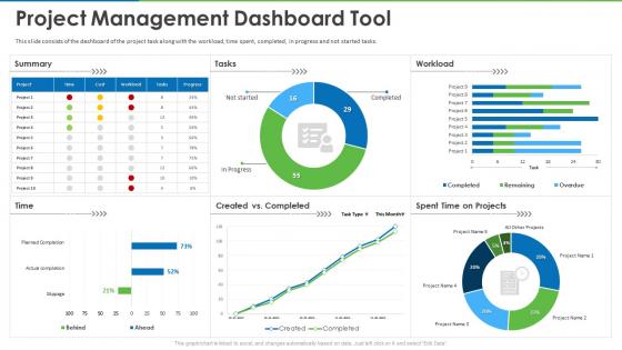
This slide consists of the dashboard of the project task along with the workload, time spent, completed, in progress and not started tasks.
People who downloaded this PowerPoint presentation also viewed the following :
Project management dashboard tool implement prioritization techniques to manage teams workload with all 7 slides:
Use our Project Management Dashboard Tool Implement Prioritization Techniques To Manage Teams Workload to effectively help you save your valuable time. They are readymade to fit into any presentation structure.





FAQs for Project management dashboard tool implement prioritization techniques to
Honestly, start with the basics - timeline stuff, budget tracking, and how fast tasks are getting done. Team workload is crucial too because nobody wants to be stuck hunting for developers last minute (been there, not fun). I'd throw in some risk flags and maybe stakeholder happiness scores. Bug counts help track quality. Keep it visual with those red/green status things so problems jump out at you. Don't go crazy though - maybe 6-8 metrics tops until everyone gets used to checking it regularly.
Dude, visuals are a game changer for project stuff. Your brain just processes pictures way faster than digging through endless spreadsheets. I'm talking progress bars, those red/yellow/green status dots, timeline charts that actually show if you're screwed or not. Honestly? I thought dashboards were total BS until I saw one that didn't suck. Gauges work great for budget tracking, and those kanban boards are solid for workflow. Oh, and simple traffic light colors for overall health - can't go wrong there. Just don't go crazy with like 20 different charts. Start with maybe 3-4 max.
Honestly, you want real-time updates and alerts that don't spam you with useless stuff. Most dashboards just sit there looking pretty but nobody touches them. The good ones let you dig into details, filter by person or dates, and actually update things without switching apps constantly. Customizable views are huge too - like, you should control what shows up first instead of some generic layout. Oh, and automated notifications for bottlenecks before they blow up your timeline? Game changer. If it integrates with tools you're already using, even better. Skip anything that feels built for executives who just want colorful charts.
Honestly, dashboards are game-changers because everyone stops bugging you with "hey what's going on with X project?" Your whole team can see who's doing what and when stuff's due. The cool part is catching problems early before they blow up. Real-time updates are where it gets good though - people can comment directly on tasks instead of those annoying email threads that go nowhere. I always tell teams to update their status daily (sounds boring but trust me, it works). Way better than digging through random Slack messages trying to figure out what happened last week.
Honestly, I'd go with Monday.com for what you're looking for. It's got that sweet spot between being super customizable but not making your brain hurt trying to set it up. Notion and ClickUp are solid too if you want to go nuts with customization. Asana's more structured which can actually be nice sometimes - less decision fatigue, you know? Oh, and Airtable's crazy powerful if you're into that spreadsheet-database hybrid thing (though it can be overkill). I'd just start with Monday's free trial, build something basic first, then add the fancy stuff once you figure out what metrics your team actually cares about.
Honestly, ditch those spreadsheets - they're painful to look at. Gantt charts are your best friend here, plus timeline bars and milestone markers. Your team will actually thank you. Interactive stuff is clutch too, like hovering over tasks for details or filtering by person. I'm weirdly obsessed with color-coding everything by priority because bottlenecks become so obvious it's almost embarrassing we missed them before. Kanban boards work great for showing workflow stages. Progress bars help everyone see completion percentages instantly. Start simple with a basic Gantt chart - stakeholders get it right away and you can add fancy stuff later.
Dude, you NEED real-time data or your dashboard is basically useless eye candy. When stuff updates live, you'll catch problems immediately instead of finding out weeks later that everything's on fire. Your whole team stays on the same page too - no more awkward "wait, what happened?" meetings. I learned this the hard way on a project last year, honestly. Quick fixes beat major disasters every time. Just make sure you're pulling from live sources, not those stale weekly reports everyone loves to generate.
Honestly, the drag-and-drop feature is your best friend here - just reorder stuff as priorities change. Use your dashboard's filters to sort by deadlines or importance levels. Color coding works great too for flagging urgent items. That matrix view thing where you plot urgency vs importance? Total game changer, makes everything super visual. I always set up custom views for critical path stuff or anything that's overdue (which let's be real, there's always something). The trick is tweaking those filters to match how you actually think about work, not how you think you should think about it.
Honestly, the biggest pain is just getting people to actually use the thing. Everyone's so stuck on their spreadsheets and email chains - good luck breaking those habits lol. Data quality is another nightmare because you're only as good as what gets fed in. Oh, and teams always go overboard with metrics at first, then nobody knows what to focus on anymore. Start super basic though - maybe 3 or 4 numbers that everyone actually cares about. Once they're not intimidated by it, you can throw in the fancy stuff. Trust me, less is more in the beginning.
Honestly, the worst thing you can do is cram everything onto one screen - it's just overwhelming. Skip the vanity metrics too, like total hours logged or whatever looks impressive but doesn't actually help with decisions. Put your most important stuff right up front where people can't miss it. Don't make stakeholders dig around for critical info, and please avoid those confusing rainbow color schemes that need a whole legend to figure out. Oh, and definitely test it with actual users first - I learned that one the hard way when I rolled out something everyone hated.
Honestly, dashboards are a game changer - your stakeholders can finally see what's happening without constantly asking for updates. Real-time progress, budget stuff, milestones, all right there. Makes them way more confident in decisions since they're not flying blind anymore. Those weekly status meetings? Yeah, you can probably skip half of them now. I'd definitely set up automated reports so you're not stuck manually pulling data every week (learned that one the hard way). Your life gets so much easier when people can just check the dashboard instead of emailing you constantly.
Dude, automated reports are a game changer. Your dashboard basically becomes your personal assistant instead of just sitting there looking pretty. No more scrambling to pull numbers every week - everything gets sent straight to people's inboxes automatically. Honestly, I wish I'd set these up sooner on my last project. You'll catch trends and problems you'd totally miss otherwise when you're buried in day-to-day stuff. Plus your team actually stays in the loop without you having to bug them constantly. Set it up once and you're golden.
Here's my take: early stages are all about planning stuff - resource allocation, timeline milestones, that kind of groundwork. Once you're actually executing though, flip to tracking deadlines, budget burn, and risk flags. That's honestly where most projects go sideways if you're not watching closely. Near the end, switch again to quality checks, deliverable status, client happiness scores. Don't just pile on more widgets as you go - actually remove the outdated ones. I learned this the hard way when my dashboard became this overwhelming mess. Review it monthly to keep things clean and actually useful.
Honestly? Just ask your users what sucks. They'll tell you straight up if they can't find the timeline view or if your color coding makes no sense. We always think we nailed the design, but users will humble you real quick. I'd throw up a simple feedback widget or do some casual check-ins with people. The stuff they complain about usually points to bigger workflow issues you totally missed. Plus their random suggestions often end up being game-changers. It's wild how much better things get once you actually listen to the people using it daily.
Honestly, dashboard access can make or break remote teams. Your people are spread everywhere - different time zones, crappy wifi, ancient phones. If someone can't pull up project updates easily, you're screwed. I've watched teams completely lose track because their dashboard was garbage on mobile or took forever to load. Super frustrating when you're trying to hit deadlines. Mobile optimization is huge, plus fast loading times. Keep the interface simple so even your least tech-savvy person can navigate it. Otherwise you'll have information gaps and people working off old data.
-
Helpful product design for delivering presentation.
-
Awesomely designed templates, Easy to understand.