


Project management status icons powerpoint slide clipart





Try Before you Buy Download Free Sample Product
 Impress Your
 Audience
 100%
100% Editable
 Save Hours
 of Time


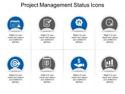
Create your project report effortlessly with our Project Management Status Icons PowerPoint Slide. Use the ready-to-use project icons to describe multiple aspects of your project such as project tasks or deliverables, project deadlines, responsibilities, and work in progress. Easily access through this project management icons template visual representation for concepts such as project report icon, project timeline icon, project goals icon, and project performance icon. PPT icons help reinforce the message and turn textually-heavy project management presentations into visually engaging ones. Explain the project management process using this 8-step description slide. Bring together the fundamental components of designing and planning process to curate a project status report. Make the process of project management easier for your team. Create a vivid presentation of all the project details and specifications.
People who downloaded this PowerPoint presentation also viewed the following :
Project management status icons powerpoint slide clipart with all 5 slides:
Cash in on it with our Project Management Status Icons Powerpoint Slide Clipart. The audience will be eager to fund you.
FAQs for Project management status icons
Green circles or checkmarks mean "on track," yellow triangles show "at risk," and red usually means "behind" or blocked. Blue dots are typically "not started" while gray means on hold. Honestly though, every platform does their own thing with these icons which gets super annoying when you jump between tools. Purple sometimes pops up for "completed" - distinguishes it from green "in progress" I guess. Main thing is making sure your team knows what each one means in whatever system you're using. Otherwise you'll spend half your meetings just explaining what the colors mean instead of actually talking about the work.
Okay so status icons are basically visual shortcuts that show you what's happening across your whole project instantly. No more scrolling through endless updates or bugging people for info. Red = problem, green = we're good, yellow = heads up. Everyone gets it right away. Honestly, they're pretty clutch for busy teams. You can spot issues fast and celebrate wins without reading paragraphs of status reports. Way less "hey what's the deal with X?" messages flying around too. Just use them consistently on your dashboard and watch how much smoother communication gets. Trust me on this one.
Yeah, definitely use color coding for your status icons! Makes everything so much faster to scan. I usually go with green for good, red for blocked/issues, yellow for in progress or needs attention. Way better than reading tiny labels all day. Oh, and don't forget about colorblind folks - add shapes or patterns too, not just colors. We had this one project manager who used like 6 different shades of blue... total nightmare. Keep it consistent across projects so people aren't constantly figuring out what everything means. Trust me, your team will thank you when they can actually tell what's going on at a glance.
Most project tools like Asana or Jira let you upload custom icons through their admin settings - usually under "custom fields" or something similar. Pick 3-4 key statuses your team actually uses first, then find simple icons that make sense instantly. I've honestly wasted time making fancy ones that confused everyone lol. Red/yellow/green circles are boring but they work for a reason. Monday.com has pretty decent customization options if you're looking for a new platform. Just keep them super obvious - your team shouldn't have to think twice about what each icon means.
Honestly, just stick with red/yellow/green - everyone gets it immediately. Put a legend on your first slide and keep those icons in the exact same spots every time. Don't get fancy with like 6 different colors because people will spend forever trying to figure out what they mean instead of listening to you. Three status types, maybe four tops. Oh and make them big enough that remote folks can actually see them! The other thing - definitely explain what makes something flip from green to yellow so people aren't guessing.
Honestly, it's all about timing. Waterfall uses pretty basic stuff - "done," "in progress," "not started" - because everything happens in order. Agile gets way messier though. You'll see "blocked," "ready for review," "testing," even "done done" (which sounds ridiculous but whatever). Kanban boards go crazy with the status options since work never stops flowing. I guess Waterfall's more like hitting checkpoints while Agile needs constant updates. My old team used like 12 different icons and it was chaos. Just pick what actually makes sense for how your team works.
Oh for status icons? Figma's great if you want to get fancy, but honestly Canva or even PowerPoint work fine. I've literally seen people crush it with Excel traffic lights - sounds weird but it totally works! Most PM tools like Asana or Monday.com let you upload custom stuff, or they already have status indicators built in. Trello's more basic so you're stuck with colored labels or emojis (which isn't the worst thing). My take? Just use whatever your team's already on. Consistency beats having the prettiest icons every time.
So I'd go with colored icons for different milestone statuses. Green = done, yellow = working on it, red = oh crap we're behind, gray = not started yet. Honestly game-changer for me because you can see everything instantly without digging through spreadsheets or whatever. You can either set them to change automatically based on your deadlines, or just update manually when stuff gets finished. Best part is your whole team knows what's actually happening - like which projects are solid vs which ones are about to become disasters. Start with maybe 3 colors first though, don't overcomplicate it right away.
Think of icons as your project's cheat sheet - instead of reading tons of text, you just glance at color-coded dots to see what's going well or what's totally screwed. Green for on track, red for blocked, yellow for risky. Honestly, your boss will love you for this because they can walk by your desk and instantly know if something needs attention. Just pick symbols that actually make sense and don't change them halfway through (learned that one the hard way). It's like turning a boring report into a quick visual scan.
Yeah, icons are super ambiguous - what looks like "minor delay" to you screams "major crisis" to someone else. I've literally sat through meetings where we argued for ages about what a yellow dot actually meant lol. Red/green systems also screw over colorblind teammates. Plus icons give you zero context about WHY something's problematic or what to do next. You'll save yourself so many headaches if you just add a quick sentence explaining the actual situation. Even something super brief works - just don't leave people guessing what your little symbols mean.
Honestly, status icons are a lifesaver for spotting risks fast. Red and yellow flags across your dashboard? You'll know exactly where problems are brewing without scrolling through endless reports. During standups, I just glance at the colors and boom - I know what needs attention first. Plus you start noticing patterns, like when the same team keeps hitting yellow week after week (awkward convos ahead). The visual thing really works though. Skip the deep dives and focus your risk talks on what actually matters before stuff hits the fan.
Start with quick surveys asking if icons make sense to users. A/B test different designs too. Watching actual user sessions is honestly where you'll find the weirdest confusion points - stuff you'd never think of. Set up a feedback channel in team chat so anyone can flag confusing icons they spot. Support tickets are another goldmine since unclear status icons always generate those "how do I..." questions. Don't make it a one-time thing though. I'd do quarterly reviews to look at all the feedback and tweak your icon set based on what people actually struggle with.
Honestly, just make a shared style guide that everyone can actually find and use. Document what each icon means with visual examples - trust me, this will save you so many headaches later. Pin it somewhere obvious like your project channel so people don't have to hunt for it. Train new folks on it when they start, and maybe do quick refreshers if things get messy. I'd start with your most common status icons first, then expand from there. The whole point is making it so easy to reference that nobody has an excuse to just wing it.
Don't rely on just colors since they mean different things everywhere - like red means danger here but luck in China. Also, colorblind people exist! Mix in shapes or text labels with your colors. Skip thumbs up/down icons since they're actually offensive in some places (who knew?). Stick with boring but safe stuff like checkmarks and progress bars. Oh, and some cultures read right-to-left, which totally changes how they see your interface flow. Honestly, just test whatever you pick with people from different regions first. Way better than guessing and getting it wrong later.
Red/yellow/green status icons are seriously a game-changer for getting people to actually read your reports. Busy executives can spot problems at a glance instead of hunting through walls of text. Smart visual cues like that grab attention way better than paragraphs ever will. People respond faster when they can instantly see what needs their input or decisions. Just keep your color meanings consistent across reports - you don't want yellow meaning "caution" one week and "on hold" the next. Trust me, that confuses everyone. Simple colors make complex information digestible, which honestly saves you from having to chase people down later.
-
Awesomely designed templates, Easy to understand.
-
Qualitative and comprehensive slides.