


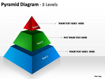
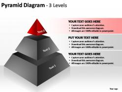
Pyramid diagram 3 levels powerpoint templates




Try Before you Buy Download Free Sample Product
 Impress Your
 Audience
 100%
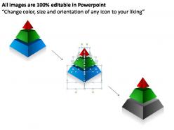
100% Editable
 Save Hours
 of Time


Our pyramid diagram 3 levels powerpoint templates will help in your delivery. Carry your ideas into each and every mind.
People who downloaded this PowerPoint presentation also viewed the following :
Pyramid diagram 3 levels powerpoint templates with all 7 slides:
Charge your batteries with our pyramid diagram 3 levels powerpoint templates. Your thoughts will go on and on.

FAQs for Pyramid diagram 3
So basically you want your main point right at the top, then your supporting stuff below that, and all your detailed evidence at the bottom. Each part should back up what's above it - otherwise the whole thing falls apart. I'd sketch your big argument first, then work down from there. Keep everything tight and don't make it look like a mess with weird formatting. Honestly, white space is your friend here because nobody wants to read a wall of text. Oh and don't start every sentence the same way or it'll sound robotic.
So pyramid diagrams are seriously great for showing hierarchies and breaking down complicated stuff into chunks people can actually follow. Put your main point at the top, then work down to the details. They're way better than boring bullet points, honestly. Your audience gets it instantly - they can see what matters most right at the peak. Works awesome for org charts, priorities, strategies, that kind of thing. I probably use them too much but whatever, they just make everything clearer. The visual flow from broad to specific is chef's kiss.
Dude, pyramid diagrams are everywhere in consulting, healthcare, and education. They're clutch for showing hierarchies or breaking down complicated stuff. Marketing teams use them constantly too - customer segments, campaign flows, you name it. Basically any industry where you've got that "this leads to this leads to this" thing going on. Project management, sales funnels, org charts. What I love about them is they make you prioritize what's actually important visually. Way better than boring bullet points, honestly. If you're presenting anything with stages or levels, just grab a pyramid template. Your audience won't zone out halfway through.
For pyramid diagrams, I'd go with either different shades of one color or colors that sit next to each other on the color wheel. Blues and greens are solid choices - professional without being stale. Don't do crazy contrasts like bright yellow and purple unless you want people's eyes to hurt lol. Each level needs to stand out from the others, but the whole thing should look like it belongs together. Oh, and if you've got brand colors already, start there. Makes your life way easier. The monochromatic thing usually works best though.
Honestly, pyramids just make more sense when you're dealing with hierarchy or volume stuff. Tree diagrams are cool for family trees and all that, but pyramids? They instantly show what's most important through size - bigger base means more foundational. Your brain doesn't have to work to figure it out. Org charts only show who reports to who, which is totally different. If you're mapping out market segments or skill levels or whatever, pyramids nail it because wider automatically feels more significant. Way more intuitive than most other options, trust me.
PowerPoint's probably your best bet since you already have it - the SmartArt stuff works pretty well for basic pyramids. If you need something fancier, Visio's got way more precision for detailed diagrams. Lucidchart's solid too, especially when your team needs to collaborate online. Honestly, I see these three used like 90% of the time. There's also Canva and Google Drawings if you want free options, though they're more basic. I'd just start with whatever's already on your computer - you can make something decent in any of these without pulling your hair out.
Totally depends on your audience! Executives want clean blues/grays and high-level strategy speak. Technical folks? Get detailed with their specific jargon. For kids or regular people, go bright and super simple. The visual style honestly makes or breaks it. Switch up icons, fonts, even the pyramid shape - some people vibe better with triangles, others prefer those stepped block things. I always match complexity to whoever's looking at it. Oh, and don't underestimate how much the right colors can grab attention. Makes presentations way more engaging than boring corporate templates.
Ugh, the worst thing you can do is cram way too much text into each section - it becomes this unreadable mess. I've seen so many presentations where people use similar-sized boxes or super vague labels, and honestly? Nobody can follow it. Make sure your broad concepts stay at the top, then get more specific as you go down. Don't get obsessed with fancy colors and effects either - they're just distracting. Oh, and here's the thing that bugs me most: people force everything into pyramid format even when a basic list would work way better. Sometimes simple wins.
Honestly, pyramid diagrams just click with how we think naturally - big picture stuff at the top, details underneath. They're great for breaking down complex topics without overwhelming people. The visual flow guides your eye downward, which feels intuitive. Perfect for showing hierarchies or explaining processes step by step. Main thing is making sure each level connects logically to what's above it. I'd start with your core concept at the peak, then get more specific as you go down. Works way better than dumping everything at once - learned that the hard way in presentations!
Make your labels punchy and action-focused - "Implement" beats "Implementation Phase" every time. People need to scan and get it instantly. Stick with the same verb tenses, and your hierarchy should flow from big picture down to specifics. Honestly, nothing drives me crazier than seeing walls of text shoved into pyramid boxes! Match your audience's vocabulary level without the corporate jargon. Left-align text and keep font sizes consistent within each level. Here's what actually works: read your labels out loud. If they sound weird together, they probably are.
Honestly, animated pyramids are so much better than regular ones. They reveal info piece by piece instead of dumping everything at once - keeps people actually paying attention to what you're saying. The movement naturally guides where they look, which is huge during presentations. Plus you can time it with your speaking pace, which feels way more natural than just clicking through static slides. Complex stuff becomes way easier to follow when you build it up layer by layer. People's brains seem to process hierarchy better with the animation too. Start basic though - just fade-ins between levels work great.
Honestly, pyramid diagrams are game-changers for those meetings where everyone's just rambling. They force you to stack things logically - big goals at the top, then break down into actual steps below. Works great when you need stakeholders to see how their stuff connects to the bigger picture. I've found people buy in way faster when they can visually trace their role up to the main objective. Oh, and they're perfect for cascading strategy from those vague "we need to grow" conversations down to "Sarah does X by Friday" tasks. Try it next planning session - seriously helps cut through the chaos.
Honestly, pyramid diagrams are amazing for teaching because kids just *get* visual hierarchies way better than walls of text. I use them for everything - Bloom's taxonomy, food chains, historical stuff, you name it. Students love how they can see concepts building from basic to complex. Works great when you're breaking down something complicated into bite-sized pieces that actually connect to each other. Oh, and they're perfect for helping kids organize their thoughts during research projects too. Way more effective than traditional outlines, in my experience. Give them a shot next time you're tackling layered concepts!
Yeah, pyramid diagrams are solid for infographics! They work really well when you need to show hierarchies or break down processes. I use them all the time for org charts and data stuff. Just don't make yours clash with the rest of your design - match your colors and make sure people can actually read the text. Oh, and honestly? Start simple with maybe 3-4 levels max. You can always get fancier later, but I've seen too many pyramids that try to cram everything in and just look messy. They're pretty versatile once you get the hang of it.
Oh, pyramid diagrams work great for this! So you start with your huge audience at the bottom - that's everyone who knows you exist. Then it gets smaller going up through people actually considering buying, then those ready to purchase, and finally your actual customers at the top. Makes total sense when you think about it. The visual really helps you see exactly where people are bailing out of your process. Plus your boss will actually understand what you're showing them (trust me on this one). Just grab a template and map out your stages - I bet you'll find some weak spots you didn't notice before.
-
Colors used are bright and distinctive.
-
The content is very helpful from business point of view.