


Quality Assessment Powerpoint Presentation Slides




Try Before you Buy Download Free Sample Product
 Impress Your
 Audience
 100%
100% Editable
 Save Hours
 of Time


A quality assurance system increases customer confidence and a companys credibility. Grab our professionally curated Quality Assessment template. It addresses the quality assessment strategy that is built on risk. It is all part of assessing, managing, expressing, and reviewing quality issues. Additionally, our Risk-based approach deck can be used by the pharmaceutical industry because product quality significantly affects customer health and safety. It further provides information on quality risk assessment for the pharmaceutical industry using various tools and methods. Our QRM PowerPoint Presentation also includes data on the stakeholders ability to accept risk and a tracker for potential dangers in the future. It also contains processes for risk assessment like risk identification, analysis, and evaluation. The risk control method is then covered, including risk reduction, risk acceptance, risk control policy, risk communication, and review processes. Furthermore, our quality assurance PPT includes risk management methodologies like risk ranking and filtering, fault tree analysis, hazard operability analysis, hazard analysis, and critical control points. Lastly, it showcases failure mode analysis and discusses risk tracker and risk tolerance capability. Download our Google Slides-compatible template, which is entirely editable and configurable.
People who downloaded this PowerPoint presentation also viewed the following :
Content of this Powerpoint Presentation
Slide 1: This slide introduces Quality Assessment. Commence by stating Your Company Name.
Slide 2: This slide depicts the Agenda of the presentation.
Slide 3: This slide incorporates the Table Of Contents.
Slide 4: This is yet another slide continuing the Table of contents.
Slide 5: This slide highlights the Title for the Topics to be covered further.
Slide 6: This slide covers scope, background and principles of the quality risk management.
Slide 7: This slide shows the Interdisciplinary teams responsibilities in quality risk management process.
Slide 8: This slide continues the Interdisciplinary teams responsibilities in quality risk management process.
Slide 9: This slide portrays the risk matrix to facilitate categorization of risks identified during the risk assessment phase.
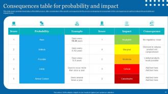
Slide 10: This slide lists the Consequences table for probability and impact.
Slide 11: This slide mentions the Heading for the Components to be discussed next.
Slide 12: This slide highlights the Overview of a typical quality risk management process.
Slide 13: This slide talks about the Quality risk identification.
Slide 14: This slide illustrates the Qualitative risk analysis.
Slide 15: This slide presents the Quality risk evaluation.
Slide 16: This slide reveals the Title for the Ideas to be covered further.
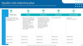
Slide 17: This slide covers the Quality risk reduction plan.
Slide 18: This slide reveals the Quality risk acceptance criteria.
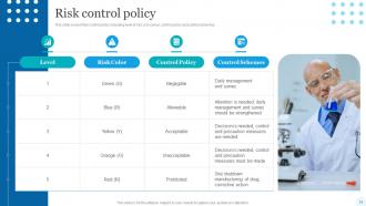
Slide 19: This slide elucidates the Risk control policy.
Slide 20: This slide displays the Heading for the Contents to be discussed next.
Slide 21: This slide talks about Quality risk communication.
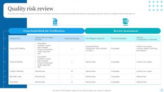
Slide 22: This slide showcases the Quality risk review.
Slide 23: This slide reveals the Heading for the Ideas to be discussed in the following template.
Slide 24: This slide exhibits the Common quality risk management tools.
Slide 25: This slide presents the Flowcharts-risk management tool.
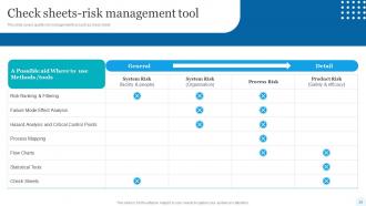
Slide 26: This slide covers the quality risk management tool such as check sheet.
Slide 27: This slide depicts the Process mapping -risk management tool.
Slide 28: This slide highlights the quality risk management tool such as Cause/ effect diagram.
Slide 29: This slide includes the Title for the Contents to be covered next.
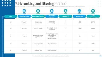
Slide 30: This slide showcases the Risk ranking and filtering method.
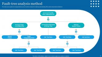
Slide 31: This slide highlights the Fault-tree analysis method.
Slide 32: This slide showcases Hazard operability analysis (HAZOP).
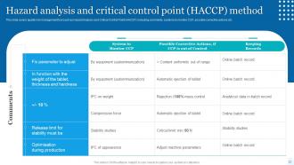
Slide 33: This slide covers mentions about Hazard analysis and critical control point (HACCP) method.
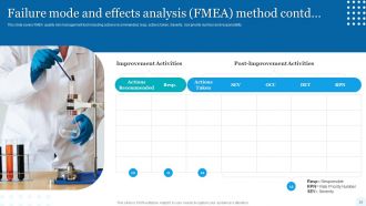
Slide 34: This slide portrays Failure mode and effects analysis (FMEA) method.
Slide 35: This slide continues the Failure mode and effects analysis (FMEA) method.
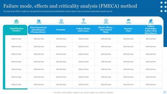
Slide 36: This slide illustrates the Failure mode, effects and criticality analysis (FMECA) method.
Slide 37: This slide continues the Failure mode, effects and criticality analysis (FMECA) method.
Slide 38: THis slide exhibits the Heading for the Topics to be covered further.
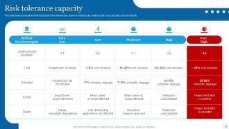
Slide 39: This slide indicates the Risk tolerance capacity.
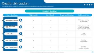
Slide 40: This slide elucidates the Quality risk tracker.
Slide 41: This is the Icons slide containing all the Icons used in the plan.
Slide 42: This slide is used for showcasing some Additional information.
Slide 43: This slide reveals the Venn diagram.
Slide 44: This is the 30-60-90 days plan slide for effective planning.
Slide 45: This slide represents the company Timeline.
Slide 46: This slide displays the Column chart.
Slide 47: This slide contains the Post it notes for reminders and deadlines.
Slide 48: This is Our team slide. State your team-related information here.
Slide 49: This is the Thank Yous slide for acknowledgement.
Quality Assessment Powerpoint Presentation Slides with all 54 slides:
Use our Quality Assessment Powerpoint Presentation Slides to effectively help you save your valuable time. They are readymade to fit into any presentation structure.

























FAQs for Quality Assessment
Honestly, just focus on the basics first - consistent fonts and colors that don't make people's eyes bleed. Check your alignment too because wonky text boxes scream amateur hour. I always test templates with actual content since pretty designs usually break the second you add real data (learned that the hard way). White space is your friend - cramped slides are the worst. Oh, and do the across-the-room test with coworkers. If they're squinting, your fonts are too small.
Honestly, checking in with your audience changes everything. You'll actually notice when people are zoning out vs. when they're locked in. I used to just barrel through my slides no matter what - big mistake. Now I pause and really look around the room. Are they scrolling their phones? Leaning forward? Your examples either click or they don't, and you can tell pretty quickly. When something's clearly resonating, dive deeper into it. If not, pivot to something more interactive or ask different questions. I do these little pulse checks every 10 minutes or so to make sure everyone's still with me.
User feedback is your best friend for figuring out if your templates actually work. Sure, you might think something looks great, but if people can't customize it easily or it doesn't match what they need, that's a problem. Honestly, some of the templates I thought were genius turned out to be total disasters based on user comments. Collect ratings and see how people actually use them - the data will show you patterns. Focus on fixing the ones causing the most headaches first. Pain points like weird layouts or missing slide types become super obvious once you start paying attention to what users are saying.
Honestly, your slides are like your first handshake - messy design makes people think your ideas are messy too. I've watched brilliant presentations get shot down just because the fonts were all over the place. Clean typography and consistent colors? That stuff makes audiences trust you before you even start talking. Short sentences work. But when everything flows together visually, people automatically assume you know what you're doing. My advice: grab a decent template first, nail down the basics, then pour your energy into the actual content. Way easier than trying to make things look professional from scratch.
Look, forget how pretty your slides are - what matters is actual results. Track stuff like how many people stick around, questions you get, and follow-ups afterward. Sales teams should watch conversion rates. Academic folks? Maybe do surveys to see if people actually learned something. Here's my honest take: the template that gets you promoted is probably working! Try A/B testing 2-3 different designs with the same content though. Pick whatever metrics matter most for your field and test them across at least 10 presentations. Otherwise you're just guessing.
You know what's been a total lifesaver? Using quality assessment tools when I'm building templates. They give you this consistent framework to check design, content flow, usability - all that stuff upfront. No more endless revision cycles where someone inevitably says "make it poppier" (ugh). Create simple checklists for readability, brand stuff, slide transitions. Short sentences work. Your whole team can follow the same standards so you're not reinventing the wheel every time. Actually, start with just a basic scoring system for whatever presentation types you do most. Trust me, it'll save you hours of headaches later when everything's already dialed in.
Oh this drives me crazy when people mess this up! Make your body text at least 24pt, headers 36pt or bigger. Sans-serif fonts are your friend - Arial, Calibri, whatever's clean. I learned the hard way that cramped line spacing kills readability. Dark text on light backgrounds works best, shoot for 4.5:1 contrast ratio if you want to get technical about it. Here's the real test though: if you're squinting at your laptop screen, everyone in the back row will be completely lost. Always check how it looks from across the room first.
So basically, being flexible with templates makes you look way smarter to whoever's grading you. Think about it - if you can tweak your approach for different situations, that shows you actually get what's going on instead of just copying the same format over and over. Assessors eat that stuff up because it proves you understand context matters. Like, a template for analyzing data shouldn't look identical to one for creative projects, you know? The key is showing you can customize things while still keeping everything organized. Way better than being that person who forces everything into the exact same rigid structure.
Honestly, AI design analysis tools are killing it right now for checking template quality. They'll automatically catch font/color inconsistencies and spacing issues across your slides. The readability scoring is super helpful too. What's crazy is some machine learning can actually predict how engaged your audience will be based on the layout - sounds like sci-fi but it works. Cloud collaboration makes getting real-time feedback way easier, so you catch problems early. Oh, and definitely start with the automated consistency checkers first. Trust me, they'll save you hours of tedious manual work.
Good templates have three things down: visual hierarchy, consistency, and flexibility. You'll spot clean typography right away, plus smart white space that actually guides your eye. When colors and fonts work together instead of fighting? That's what separates pros from amateurs, honestly. The best ones give you layout options without drowning you in choices. They enhance your content rather than competing with it - which sounds obvious but you'd be surprised how many don't. Oh, and definitely test them with real data first. Nothing worse than a template that looks amazing empty but falls apart with actual content.
Honestly, the more people can customize a template, the better it feels to them. Colors, fonts, layouts - when users can tweak all that stuff easily, they see it as way more professional and worth paying for. Think about it like buying a generic shirt versus designing your own, you know? Even if the original design is decent, zero customization makes everything look cheap and boring. Oh and this applies to content too, not just visuals. When you're picking templates, definitely go for ones with solid customization options. Trust me, your users will totally feel the difference.
Think of consistent branding as your quality control system. Same logos, colors, fonts everywhere? That tells customers you've got your stuff together. Mixed messaging and random design choices make you look sloppy - not a good look. Plus it's way easier to catch problems when you have clear standards to compare against. I'd honestly just make a basic brand checklist and run through it whenever you're putting stuff out there. Deviations become super obvious once you know what to look for. It's one of those things that seems small but really adds up over time.
Honestly, the biggest mistake is falling for templates just because they look pretty. Skip the whole "ooh I love this color scheme" thing - that's just your personal taste talking. Test them with actual content first, not those weird placeholder paragraphs about lorem ipsum whatever. Does the layout actually work when you dump real text in there? Can people read it on their phones without squinting? I always make a little checklist of what I actually need before I get distracted by fonts. Pretty design means nothing if users can't figure out where to click.
Honestly, you need both aesthetics and functionality - can't skimp on either. A gorgeous template that's impossible to navigate? Your users will hate you. But an ugly one that works great won't keep anyone's attention (seriously, we've all sat through those painfully dated presentations). Test everything when you're evaluating options. Does it actually look professional? Can you edit it without wanting to throw your laptop? The magic happens when good design makes things easier to use - think clear layouts, fonts you can actually read. That's your sweet spot right there.
You'd be surprised how much accessibility affects whether a template is actually good quality. Check your color contrast ratios and make sure fonts are readable - that stuff matters more than you think. Also test if it works with screen readers and don't forget alt text for images. I learned this the hard way when someone couldn't use a presentation I spent hours on because the contrast was terrible. Beautiful design means nothing if half your audience can't access it. Run it through accessibility checkers first, then test with real people if you can.
-
You can rely on SlideTeam whenever you run out of designs for your presentation. Thank you so much SlideTeam!
-
Extremely professional slides with attractive designs. I especially appreciate how easily they can be modified and come in different colors, shapes, and sizes!