

Relationship diagram template ppt




Try Before you Buy Download Free Sample Product
 Impress Your
 Audience
 100%
100% Editable
 Save Hours
 of Time


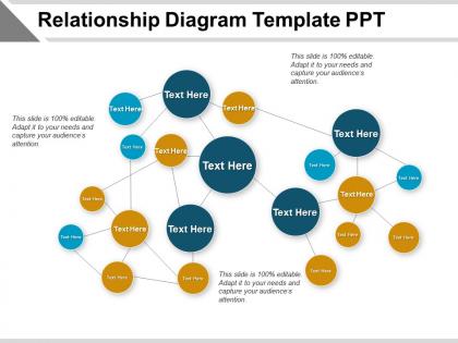
Incorporate this Relationship Diagram Template PPT in your company. This management PowerPoint theme can be valuable in keeping a track of the progress and share the feedback. With this enterprise customer relationship PPT template, this can enhance the performance of the employee as this company relationship PowerPoint template can elucidate the work sequence. Using our network flow diagram PPT layout, you can discuss the project schedule with your colleagues as well as your clients. By employing this organizational PowerPoint layout you can illustrate the scope of the business project to your colleagues and suggest methodologies for its improvement. Using our business networking PPT theme, you can demonstrate the relationship between different business activities. Furthermore, you can comprehend a complex process structure in an easy to understand manner. Download this correlation PPT theme so that you can explain to your employees the company hierarchy and introduce the reporting staff in an effective way.
People who downloaded this PowerPoint presentation also viewed the following :
Relationship diagram template ppt with all 5 slides:
Counter bad effects with our Relationship Diagram Template Ppt. The fear of hazards diminish.
FAQs for Relationship
Honestly, just start with the basics - your main entities (people, objects, whatever) and draw lines between them showing how they connect. Different line styles help too, like solid vs dotted for different relationship types. I always throw in a legend because otherwise people get lost trying to figure out what everything means. Oh, and if you've got parent-child type hierarchies, mark those clearly. Keep your shapes and colors consistent - looks way more professional that way. Don't overcomplicate it from the start though. Build the core relationships first, then add the messy details later when you actually need them.
Honestly, relationship diagrams are a game changer for presentations. Instead of drowning people in bullet points, you're showing them exactly how everything connects. Dependencies, workflows, whatever - it's all right there visually. I've watched audiences completely check out when someone's just talking through complex stuff, but throw up a diagram? Suddenly everyone's engaged and asking smart questions. You can literally point to parts during discussion too, which keeps things on track. Oh and don't overthink it - grab a basic template, drag your elements in, and you'll see what I mean immediately.
Don't cram too many entities into one diagram - it gets messy fast. Label your relationships clearly or you'll hate yourself later. Also, use a legend if you're mixing different relationship types. Keep entity names consistent and avoid vague labels like "related to" (seriously, what does that even mean?). You don't need every possible connection either. Focus on what actually matters for your project. I always start simple and show it to someone else first. If they get confused, so will you in six months. Add complexity later if you really need it.
Oh man, colors totally change the game with relationship diagrams! When everything's the same shade, people squint trying to figure out what connects to what. I made this org chart once that was basically a color explosion - learned my lesson there lol. Pick maybe 3-4 contrasting colors and stick with them. Blue for one department, green for another, red for the messy stuff. People scan way faster when there's actual logic behind your color choices. More than 4 colors though? You'll just confuse everyone.
Honestly, these diagrams work for tons of stuff. Family trees, org charts, database relationships, project timelines - you name it. They're perfect when you need to show connections between things. Like how departments relate to each other, or mapping out a customer's journey through your product. I've even seen people use them for social networks and software architecture (which seems overkill but whatever works). The trick is picking the right template first. Then just start linking everything up. Works best for parent-child setups or cause-and-effect chains.
Honestly, these templates are super helpful for seeing how everyone connects on your project. You'll spot who the real decision makers are and catch those communication gaps before they bite you. I've found they're especially clutch when you're dealing with tons of people and moving pieces - saves your sanity, trust me. New team members love them too since they can figure out the whole "who does what" thing without bugging everyone with questions. Just start mapping out your current project relationships. You'll probably find some weird blind spots you never noticed before.
Honestly, draw.io is probably your best starting point since it's free and doesn't make you want to pull your hair out. Lucidchart's really solid too if you need team collaboration stuff. Visio works great if you're already stuck in Microsoft land, though it can be kinda sluggish. I've seen people do some surprisingly decent work in Miro or Figma - not their main purpose but whatever works, right? Start with draw.io and see how it feels. You can always switch later if you need something fancier.
Relationship diagrams are seriously game-changers for breaking down complex stuff. Your students can actually see how concepts connect instead of just memorizing random facts. Biology teachers love them for ecosystems, history teachers map out cause-and-effect chains, literature classes track character relationships. I remember using one for photosynthesis - suddenly kids got it. The best part? Students can make their own diagrams as assignments. Gets them actively thinking instead of just cramming. Plot structures, scientific processes, whatever - once you try it, you'll probably kick yourself for not doing it sooner. Makes abstract ideas way more concrete.
Honestly, templates are a game changer. You'll save so much time not building diagrams from zero each time. Everything stays consistent too, which means your team can actually read your work without squinting at it for ten minutes. I used to forget random stuff all the time - like that one connection between systems that seems obvious but isn't. Templates basically force you to think through everything. Oh, and stakeholders love it because they don't need a PhD to understand your diagrams. Pick one format and make everyone use it. Trust me on this.
So basically you want to match your diagram to who's looking at it. Executives? Keep it simple with business terms and clean boxes. Tech teams can handle way more detail and their own jargon. Color coding is honestly a game changer - different colors for departments or relationship types makes everything pop. Some people love hierarchical layouts, others prefer the network style (though I find those can get messy fast). Here's what works: think about what decision they need to make first, then build backwards. What info do they actually need to act on? Start there and you'll nail it.
Honestly, visuals are a game-changer for relationship diagrams. People absorb pictures way faster than text - it's just how our brains work. Use gear icons for processes, little person symbols for stakeholders, that kind of thing. Way less scary than staring at blocks of text everywhere. Color coding is clutch too - different colors can show relationship types or who's in charge of what. I always start with basic shapes first, then get fancy later if I need to. Oh, and they're actually fun to make once you get going!
Honestly, these diagrams are game-changers for stakeholder meetings. Instead of fumbling through verbal explanations, you just point at the visual map showing who connects to who. Super helpful for spotting decision makers and communication paths upfront. Stakeholders actually get excited seeing where they fit in - weird but true. I'd start with your main players first, then layer in the connections and influence stuff. Oh and it catches bottlenecks before they bite you later. Way less confusing than trying to describe complex relationships with just words.
So basically, flowcharts show you processes step-by-step - like "do this, then that, make a decision here." Relationship diagrams are totally different. They just map out how things connect to each other. Think org charts or those network diagrams we used to draw in college. Flowcharts answer "what's next?" while relationship diagrams show "who's connected to who?" Honestly, I mix them up sometimes too. But once you see them together it clicks. Just figure out if you're showing a process or mapping connections - that'll tell you which one you need.
Honestly, user feedback is pure gold for fixing relationship diagrams. People will show you exactly where they get confused - like when connectors don't make sense or your fancy visual hierarchy is actually a mess. I've watched designers create these "perfect" templates that users couldn't figure out at all. It's kind of painful to watch, actually. Users help you spot missing relationship types and symbols that look cool but mean nothing. Their questions reveal which labels work and which ones are garbage. Grab a few coworkers and watch where they pause or look lost while using your templates.
Oh man, they're literally everywhere once you notice! Org charts are probably the most obvious - showing who reports to who. Customer journey maps are huge in marketing, tracking people from first hearing about you to actually buying. My company uses tons of network diagrams for IT stuff, and don't get me started on database relationship diagrams (they look scary but aren't that bad). Family trees are the classic example everyone knows. Project managers love dependency charts to show what needs to happen before other things can start. The whole point is making messy relationships visual instead of trying to explain them with words. Just figure out what connections you're dealing with first, then find a template that fits.
-
Great experience, I would definitely use your services further.
-
Graphics are very appealing to eyes.