


Dependencies diagram ppt examples slides




Try Before you Buy Download Free Sample Product
 Impress Your
 Audience
 100%
100% Editable
 Save Hours
 of Time


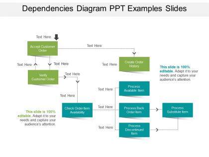
Our professionally built dependencies diagram PPT examples slides are sure to assist you well in your every presentation need. Created by the field experts, the provided dependencies flowchart PowerPoint model gives you the utmost creative advantage. It is one of the visually impressive ways to present your message. The slide design consists of colorfully vibrant and aesthetically sophisticated designs. A rare and impressive combination of graphical innovation and technological smartness is maintained in the set. This is the best way to illustrate inter-dependency. Whether it is between different process and strategies or different departments and verticals within a business, our slide graphic explains it well. With this slide in hand, your entire task gets curtailed to simply adding your content and modifying the background details. How difficult might your audiences be and how so ever complicated your topic be, our visuals will always be ready to help you in no time. Simply emphasize your message and leave the rest to us. You'll surely make your audience skip their heartbeats! Exorcise all your fears with our Dependencies Diagram Ppt Examples Slides. Ensure that they don't ever haunt you.
People who downloaded this PowerPoint presentation also viewed the following :
Dependencies diagram ppt examples slides with all 5 slides:
Create conditions that facilitate change with our Dependencies Diagram Ppt Examples Slides. Break down inflexible approaches.


FAQs for Dependencies diagram
For your dependencies slide, start with clear task boxes and arrows showing the flow. Timeline indicators are crucial too. Label everything - seriously, unclear diagrams are the worst. Highlight your critical path so people can spot bottlenecks right away. Color coding helps if you're juggling multiple teams or priorities. Don't cram everything onto one slide though, it'll look messy. Oh, and definitely include a legend. Test it on someone fresh - they'll catch stuff you missed since you've been staring at it forever.
Dude, color coding totally saves the day with those messy dependency diagrams. I always stick with the traffic light thing - red for critical blockers, yellow for moderate stuff, green for nice-to-haves. Works every time. You could also do it by department or timeline phases instead. Just don't go crazy with too many colors or people's eyes will hate you. Three or four max is plenty. Oh, and throw in a quick legend so nobody's confused about what purple means (learned that one the hard way). The whole point is making those tiny arrows actually readable without everyone squinting at their screens.
Don't cram everything onto one slide - seriously, I've sat through presentations that looked like someone threw spaghetti at a wall. Keep fonts big enough that people in the back can actually read them. Your arrows should make sense too, not just connect random boxes because it looks neat. Match your detail level to who's watching - your CEO doesn't need to see every tiny task. Oh, and use consistent colors for different dependency types. Makes a huge difference. Always run it by someone first though. What seems obvious to you might be total chaos to everyone else.
So it really depends on your industry, but here's what I've noticed. Tech companies are obsessed with showing software architecture and how their APIs connect. Manufacturing gets super into supply chain stuff - some of those diagrams are honestly ridiculous, like a giant spider web. Healthcare focuses on patient workflows and compliance chains (makes sense). Finance does risk dependencies and audit processes. Oh, and construction/project management people LOVE these things - always mapping out task dependencies and critical paths. Just match whatever your audience actually cares about, you know?
Oh man, don't torture yourself with PowerPoint's basic shapes for dependency diagrams. I'd go with Draw.io first since it's free - has all these smart connectors that actually snap where they should. Lucidchart's solid too, just costs money. If you've got Visio through work, that works great as well. I watched my coworker spend like 3 hours trying to get arrows lined up perfectly in PowerPoint once and it was brutal. Just build it in one of these tools, then export as an image and drop it in your slides. Way less headache.
Honestly, dependency diagrams are game-changers for presentations. Your stakeholders won't get lost in messy Gantt charts anymore. Show them which tasks actually block each other and where things might get stuck. I've watched PMs use these to explain cascading delays - way better than just telling people "everything's connected" or whatever. People instantly see why you can't rush certain phases and which resources you absolutely need. Oh, and color-code different types (technical stuff, resources, approvals) - makes it super clear. Trust me, beats bullet points every time.
Think of dependency diagrams as your project's early warning system. They show you exactly how one screwup can ripple through everything else - honestly, it's kind of terrifying but super useful. You'll spot those nightmare scenarios where one delayed component kills your whole timeline. Plus, stakeholders actually pay attention when you can point to a visual instead of just talking at them about risks. I'd start by mapping what you've got now, then play the "what breaks if this fails" game. Short bursts work better than trying to diagram everything at once.
Honestly, visual hierarchy is a game changer for dependency maps. Start with your main flow and make it pop - bigger elements, bold colors, whatever catches the eye first. Then tone down the secondary stuff with lighter colors and smaller text. It's basically like giving people a roadmap instead of dumping them into a mess of random arrows (I swear some of these charts look like spaghetti). Different sizes and positioning help tons too. People's eyes will naturally follow the emphasis you create, so they won't get overwhelmed trying to figure out what matters most.
Use short, clear labels with verbs like "requires" or "blocks" instead of vague arrows. Nobody should have to guess what your connections mean. Stay consistent too - if you write "feeds data to" on one slide, don't randomly switch to "provides input for" later. That's just annoying. Honestly, the best test is showing your diagram to someone who knows nothing about the project. If they immediately get it, you're golden. If they squint and ask questions... well, time to fix those labels. Also stick with the same style throughout your whole presentation - makes everything way cleaner.
Make sure your dependency diagrams match your slide colors and fonts - basic but people mess this up constantly. Don't just drop a complex diagram on people without context first. Walk through the main components, then show how they connect. Animation helps tons here - reveal connections one by one instead of this overwhelming web of lines everywhere. I always do a clean summary slide after showing the full diagram. Honestly, half your audience zones out during the detailed view anyway. Reference it again when you're talking timelines later. Trust me, it makes resource conversations way smoother.
Honestly, color coding is a game changer - red for blockers, green for stuff that helps move things along. I've been using curved arrows lately instead of straight ones and it looks so much better. Try grouping related items in clusters or swim lanes. Make your nodes bigger/smaller based on how much impact they have. Icons work way better than boring text boxes too. Black and white diagrams are basically guaranteed to put people to sleep. Oh and don't go crazy with everything at once - pick one technique per slide or you'll overwhelm everyone.
Yeah so I'd totally go with step-by-step animations instead of dumping everything on screen at once. Nobody wants to see spaghetti madness right off the bat. Start with your main components, then animate those connecting arrows to show the flow. Fade-ins work great for this - slide-ins too if you're feeling fancy. Different colors for different dependency types is clutch, like red for the critical stuff. Oh and definitely use click-to-advance instead of auto-timing. Trust me on this one - you'll want control over the pacing when you're presenting. Build the story piece by piece so people can actually follow what's happening.
Oh definitely use templates! They're already set up with the right arrows, shapes, and color schemes for showing task relationships. Way better than starting from zero and trying to figure out formatting. Your project docs will actually look cohesive instead of like... well, my usual hot mess attempts at diagrams. Just drop in your specific data and adjust whatever doesn't fit. Honestly, I'd grab a couple different template styles since some projects are way more complex than others. Saves so much time it's not even funny.
Honestly, I just make different versions for different people. Executives want the big picture stuff - major systems and critical paths, that's it. Tech teams? They actually want to see the APIs, databases, all that granular stuff. Project managers are tricky though - they need enough detail to catch potential issues but not so much that their eyes glaze over. I've found it's way easier to create 2-3 separate diagrams instead of trying to cram everything into one massive mess that nobody understands. Start detailed, then strip out layers for each group you're presenting to.
So Microsoft and Atlassian are crushing it with dependency diagrams for product roadmaps. McKinsey does this thing where they map out organizational changes - honestly makes everything way less confusing than typical consultant speak. Netflix and Spotify teams use them constantly to explain tech architecture to non-technical execs. The magic happens when you focus on showing what causes what instead of just listing stuff. Oh, and Spotify's examples are particularly clean if you can find them online. Start by mapping your current project's dependencies first.
-
Illustrative design with editable content. Exceptional value for money. Highly pleased with the product.
-
Designs have enough space to add content.