


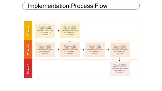
Implementation process flow




Try Before you Buy Download Free Sample Product
 Impress Your
 Audience
 100%
100% Editable
 Save Hours
 of Time


Get your description just right. Our Implementation Process Flow will get it spot on.
People who downloaded this PowerPoint presentation also viewed the following :
Implementation process flow with all 5 slides:
Your thoughts are ready on the runway. Kick in the power with our Implementation Process Flow.
FAQs for
So basically you need start/end points, decision diamonds, process boxes, and arrows that actually flow logically. If multiple teams are involved, throw in some swimlanes - seriously saves you from those awkward "I thought YOU were handling this" conversations. Keep your symbols consistent and fonts readable. White space is your friend here, otherwise it looks like a hot mess. Oh, and definitely add a legend plus version numbers because people will ask. Work backwards from what your audience actually needs to see - no point overwhelming them with every tiny detail if they just want the big picture.
Oh totally! Visuals are a game changer for complex stuff. Your brain processes images way faster than text anyway. I'd sketch it out first - you'll spot the confusing parts immediately. Use flowcharts or simple diagrams instead of endless bullet points. Consistent colors help too, like blue for actions, red for decisions. People need that visual roadmap showing how everything connects. honestly, I always get lost in those text-heavy process docs... they're the worst. Try icons or shapes for different steps. Makes everything so much clearer.
Honestly, manufacturing and healthcare companies see the best results with ProcessFlow templates. Finance too - loan approvals, patient protocols, assembly line stuff. All those repetitive processes that need to stay consistent. Software teams are obsessed with them as well, though that's probably obvious. You won't have to build workflows from scratch anymore. The templates come loaded with standard symbols and compliance checks that actually catch mistakes. My advice? Start with whatever process you do most often - that's where the time savings hit hardest. Way better than mapping everything out manually each time.
Honestly, good ProcessFlow design is what keeps people from clicking away after like 10 seconds. You want clear visuals and logical steps that actually make sense. I've watched flows bomb hard - losing over half their viewers by step 2, which is brutal. The trick? Map out how your audience thinks first, then build around that. Clean spacing and readable fonts matter way more than you'd think. People get frustrated with messy layouts and just bail. Short sentences work. But mix in longer ones that flow naturally too. If someone's fighting your design instead of following your content, you've already lost them.
Don't cram every tiny detail into each step - people's eyes will glaze over. Each step should focus on one main action. Also, real processes aren't perfectly linear, so don't pretend yours is. Include decision points and loops where things actually branch off. I learned this the hard way when my "simple" flowchart had someone going in circles for an hour. Test it with someone who's never done the process before - they'll spot the gaps you're blind to. Start broad, then only add detail where it's actually needed. Your diagram should match reality, not the other way around.
So basically, you gotta match your audience. Execs want the big picture stuff - ROI, timelines, major risks. Skip all the technical weirdness they don't care about. Technical teams are the opposite - they need the actual nuts and bolts to build it. I learned this the hard way and now just make two versions of everything. Saves me from getting pinged constantly with "but how does this actually work?" messages later. Honestly, once you figure out what each group actually needs to see, it makes these presentations way less painful. Short version: show execs the money, show developers the code.
Dude, nobody wants to read a boring step-by-step manual. Turn your ProcessFlow into an actual story instead. Start with the customer's problem, walk them through how you solve it, then show the win at the end. Way better than just bullet points, right? I always think of it like being a tour guide - you're taking people on a journey, not reading them instructions. Oh, and throw in little "here's why this step matters" notes at the big moments. Makes people actually care about following through. Trust me, it works so much better than those dry process docs everyone ignores.
Just drag chart widgets right into your ProcessFlow template - super straightforward. Connect them to your data sources and you're basically set. The tricky part is mapping your process fields to the chart inputs, which honestly feels clunky at first. But whatever, you get used to it. Start simple with bar charts or basic trend lines before getting fancy. Focus on KPIs your team actually cares about, not just pretty charts that look impressive. Most templates have decent drag-and-drop builders now. Oh, and make sure it's real-time data - nobody wants to look at yesterday's numbers when they're trying to fix today's problems.
For ProcessFlow templates, go with proper workflow tools like Lucidchart, Visio, or draw.io - they've got the drag-and-drop stuff that actually works. Way less headache than building from scratch. Need something interactive? Nintex or Power Automate can create templates that run workflows, not just show them. I watched a coworker try making these in PowerPoint once... yeah, don't. Just don't. Figure out what you're after first though - documenting existing processes or setting up actual automation? That'll determine which direction to go.
ProcessFlow templates are basically blueprints for finding where your operations get stuck. Map out your current process step-by-step - honestly, seeing everything laid out like that is pretty eye-opening. The cool thing is you can test different workflows before actually changing anything, so you're not flying blind. Track timing and resources at each step to spot inefficiencies. Oh, and definitely start with whatever process is driving you crazy right now. That's where you'll get the biggest payoff fast, plus it feels good to fix the thing that's been bugging you most.
Honestly, interactive stuff is where it's at now. People want to actually click through your ProcessFlows during meetings instead of just staring at boring static slides. Clean, minimal design is huge too - think lots of white space and way less text cluttering everything up. Though some people go overboard with the "modern" look if you ask me. Oh, and mobile design matters more than you'd think since everyone's checking processes on their phones these days. My advice? Make it interactive first, then worry about how it looks on different screens.
User feedback is seriously the best way to fix your ProcessFlow templates. People will straight up tell you when something doesn't make sense - like if your arrows are confusing or there's way too much text crammed in. After each presentation, just ask what tripped them up. You'll be surprised how often we designers totally overthink things that users find super unclear. Keep a list of what keeps coming up as problems. Decision points that are hard to find, weird terminology, steps that don't flow right - all that stuff becomes obvious once real people actually try to follow your template.
Honestly, just watch people's faces during your presentation - are they engaged or zoned out? Quick surveys afterward help, but the real proof is whether they can actually DO the process later. I'd track error rates and how long tasks take once they start implementing. The dead giveaway though? If your Slack isn't blowing up with "wait, what was step 3 again?" messages, you probably nailed it. Oh, and definitely do a check-in after like 30 days. That's when you'll really see if it stuck or if everyone's back to winging it.
Honestly, collaboration tools are a game changer for ProcessFlow stuff. Your team can jump into different sections at the same time instead of waiting around. One person handles the visual flow, another writes copy, and everyone sees updates instantly. No more of those nightmare email threads with "final_ACTUAL_final_v4.docx" - we've all been there, right? Figma and Miro work great for this, even Google Slides if that's what people will actually use. The comment features are clutch because stakeholders can drop feedback without completely derailing everything. Pick something your team won't hate using.
So here's the thing - culture totally changes how people want to see processes laid out. Some teams love that top-down hierarchy style, others work way better with circular flows or network diagrams. Colors actually matter too (weird, right?). Linear cultures want step-by-step everything, but other cultures need to see the whole picture at once. You'll want to think about how much detail to include and where you put decision points based on who's using it. Honestly, just ask your international teammates how they'd naturally map out a process before you lock anything down.
-
The content is very helpful from business point of view.
-
Visually stunning presentation, love the content.