


Sample Customer Feedback Survey Questionnaire For Hotel Stay Survey SS




Try Before you Buy Download Free Sample Product
 Impress Your
 Audience
 100%
100% Editable
 Save Hours
 of Time


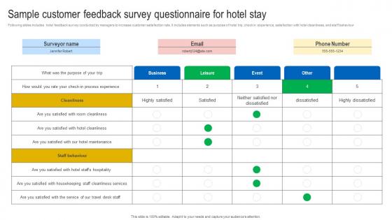
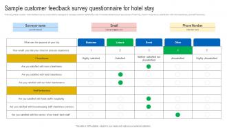
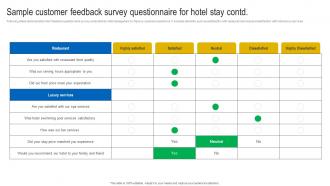
Following slides includes hotel feedback survey conducted by managers to increase customer satisfaction rate. It includes elements such as purpose of hotel trip, check in experience, satisfaction with hotel cleanliness, and staff behaviour
People who downloaded this PowerPoint presentation also viewed the following :
Sample Customer Feedback Survey Questionnaire For Hotel Stay Survey SS with all 7 slides:
Use our Sample Customer Feedback Survey Questionnaire For Hotel Stay Survey SS to effectively help you save your valuable time. They are readymade to fit into any presentation structure.





FAQs for Sample Customer Feedback Survey Questionnaire For Hotel
So we're mostly after feedback on how usable they are and whether they look polished enough for clients. Font readability is huge - can you actually read the text without squinting? Plus we want to know if the color schemes work for your brand or if you're stuck with our choices. Layout flexibility matters too since everyone's content is different. Slide transitions always split people 50/50 (honestly not sure why we keep those). The big thing though - are you wasting hours tweaking templates instead of working on your actual presentation? That's a red flag for us. Screenshots help way more than survey responses, by the way. Show us your customized versions so we can see what's actually working.
So we do feedback reviews every quarter - works way better than constantly changing stuff. Look for patterns, not random one-off complaints. Like if three people say the same thing is confusing, that's your signal. Sometimes feedback is just noise though, you know? What I'd do is grab a simple spreadsheet and track themes as they pop up. Then every three months, go through it and see what actually needs fixing. We batch all our template changes together so we're not tweaking things constantly. Way less chaotic that way.
Honestly, your progress indicators are clutch - people actually stick around when they know how much is left. Grouping similar questions together is smart too, way less annoying than jumping all over the place. Most folks are doing this stuff on mobile anyway, so good call on making it responsive. One thing though - I'd totally run it by a few customers first. See where they fly through vs. where they're like "ugh what does this even mean?" You'll probably catch stuff you didn't think about.
Honestly? I'd give them an 8/10. The designs are really solid and save me tons of time when I'm rushing to get client stuff together. Customizing is super easy too - swap colors and fonts without things looking weird. My only complaint is the layouts start feeling repetitive after using them for a while. Like, you can tell when someone used the same template pack, you know? But I'd still recommend them, especially if you're building presentations from scratch constantly. Way better than staring at a blank slide for 20 minutes.
Ask about industry-specific stuff first - that's where the real gaps are. Healthcare, nonprofits, retail places... they all want templates that actually get their sector, not some bland corporate thing. Visual style matters too. Some people are all about clean minimalist vibes, others want bold colors everywhere. I swear design preferences are so random - I've watched entire meetings derail over whether something should be blue or green. Don't forget seasonal themes and mobile designs. But here's the thing - be specific when you ask. Give them actual options to choose from instead of that useless "what do you want" question.
Yeah, I'm pretty happy with the customization stuff. Colors, fonts, layouts - you can change most things without wanting to throw your laptop out the window. The drag-and-drop thing is nice, though I totally got confused with image sizing at first lol. Pre-built color schemes are clutch, and saving your own templates is super helpful. Only annoying part? Some of the advanced formatting is hidden in random menus. But honestly, for regular use it's got what you need. Oh and definitely check out their template library first - way easier than starting from zero.
Honestly, these templates are a total game-changer for prep time. No more staring at blank slides wondering what the hell to do next. The layouts already look clean and professional, plus everything matches so your branding stays consistent. Colors and fonts are picked for readability too, which keeps people actually paying attention. I love how the pre-built structures help you organize your ideas - makes the whole thing way less overwhelming. You'll spend way less time messing with design stuff and can focus on what you're actually trying to say. That new executive template is perfect for leadership presentations btw.
The templates are way too rigid tbh - you can't really customize anything without the whole layout falling apart. Plus the color options are terrible when you're trying to match brand stuff. Adding slides is a nightmare too, everything just gets messy and weird. Oh and the fonts? Half of them look awful on projectors, which is kinda the whole point lol. I'd definitely work on making them more flexible first. Then maybe throw in some design options that don't look like they're from 2015. Conference rooms deserve better than that.
Our templates are honestly way better than most competitors out there. The big players have stuff that looks stuck in 2015 - ours actually look current. What really sets us apart is how easy they are to customize without needing design skills. You can tweak layouts and branding however you want, which is huge for mid-market clients. I keep seeing prospects get excited about that flexibility piece. Oh and they're just cleaner overall compared to what else is out there. Definitely play up those customization features when you're pitching.
Your template game needs work tbh. Customers keep wanting industry-specific stuff - healthcare, retail, SaaS templates instead of those boring generic ones you've got now. The follow-up logic is pretty much nonexistent too, which sucks when people want to ask deeper questions based on responses. Visual customization is meh at best. Oh and the conditional branching thing? That's gotta be priority
-
The visual appeal of the templates is just unparalleled! I was so worried about the design of my presentation but SlideTeam made it all so easy.
-
Best Representation of topics, really appreciable.