


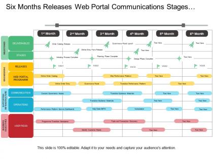
Six months releases web portal communications stages program timeline




Try Before you Buy Download Free Sample Product
 Impress Your
 Audience
 100%
100% Editable
 Save Hours
 of Time


Help your business in creating an effective communication plan with our six months releases web portal communications stages program timeline PowerPoint template. This PPT layout of six stages of communication allows you to introduce a new service, product or to launch an initiative within your company. This slideshow allows you to converse new corporate direction and vision in a manner that excites and involves team members. Our effective communication strategies PPT layout can be used to create employee engagement to help you have more retention because when employee engagement efforts are in place employees are better aligned with your business objectives and are more committed. Our marketing communications strategy presentation slide can be used to implement your marketing plan and to identify different marketing communication strategies. This slide can be used to display various options for marketing communications such as content marketing, advertising and sales promotion. Download this slide and for more visit our website. Eyes get fixed by the brilliance on display of our Six Months Releases Web Portal Communications Stages Program Timeline. It forces folks to gaze at it.
People who downloaded this PowerPoint presentation also viewed the following :
Six months releases web portal communications stages program timeline with all 5 slides:
Bring your ideas into effect. Our Six Months Releases Web Portal Communications Stages Program Timeline will help them materialise.
FAQs for Six months releases web portal communications
Okay so web portals basically went through four phases. Late 90s started with basic static stuff - just company intranets with documents and links. Around 2000-2005 things got dynamic with personalization and dashboards (those customizable widgets were everywhere lol). Social features exploded 2005-2010, bringing user content and collaboration tools. Now it's all mobile-first with real-time notifications and app-like experiences. Honestly, the jump from widgets to mobile happened faster than anyone expected. For your portal strategy, just figure out what phase matches where your users actually are tech-wise.
Honestly, user behavior has shaped every big change in web portals. Started with basic link directories because people just needed to find stuff online. Yahoo jumped on personalized homepages when users wanted customization. Social features were inevitable - we're social by nature, right? Mobile completely flipped everything though. Your portal either worked perfectly on phones or people ditched it instantly. Now it's AI personalization and real-time everything. Here's the thing - watch what users actually do, not what they tell you they want. Their actions reveal way more than surveys ever will.
Honestly, mobile's pretty much taking over how people use web portals now. Users want instant notifications whether they're grabbing lunch or jumping between their laptop and phone all day. Responsive design is obviously crucial, but I'm really seeing progressive web apps blow up lately - you get that app-like experience without dealing with app stores, which is nice. Cross-device stuff is where it's headed though. Your portal needs to just... work, no matter what screen size someone's on. I'd probably start by checking where people are dropping off when they switch from desktop to mobile. That usually tells you everything you need to know.
Honestly, analytics will blow your mind once you see what users actually do vs what you think they do. Track their clicks, see where they bail out, figure out which pages get ignored. Heatmaps are crazy helpful for this stuff - you'll spot patterns immediately. Then you can tweak your navigation, send better-timed messages, maybe test different layouts. I'd probably start simple though, just basic user flow tracking. Don't overthink it at first. Once you've got that data flowing, you can get fancy with personalization and A/B testing different approaches.
Data breaches are the biggest headache right now, especially with weak passwords everywhere. Web portals basically put all your sensitive stuff in one giant basket - which hackers absolutely love. Session hijacking and cross-site scripting attacks happen way more than people think. Everyone's logging in from sketchy coffee shop wifi these days too, which doesn't help. Honestly, multi-factor authentication isn't optional anymore. You'll want regular security audits running. Oh, and good luck getting employees to stop reusing the same terrible password across every portal they touch.
So there's a few ways to do this. Social login is probably your best starting point - way easier than making people create yet another account, you know? Then add sharing buttons and maybe pull in live feeds from Twitter or LinkedIn right into your dashboard. The commenting integration stuff works pretty well too. Oh, and you can set it up to automatically post portal updates to your social channels. Honestly I was surprised how much engagement goes up when sharing is dead simple. My friend's company saw like a 40% bump just from adding basic social features. Start small though - login and sharing buttons first, then build from there.
Navigation's gotta be dead simple - 2-3 clicks max to find anything. Don't cram everything on the homepage (seriously, I've seen some disasters). Put your most-used features front and center instead. Your search better actually work too. Oh, and wireframe first before you get distracted by pretty colors - trust me on this one. Mobile's obviously required now. Test it with real people early, use the same design patterns everywhere, and map out those user paths. Short version? Start simple and build up.
Your stack choice literally determines everything - load speed, user capacity, what features you can even build. React + Node.js gives you sick real-time stuff but eats server resources. PHP/MySQL feels dated but honestly? Still rock solid and powers like half the internet. Django's great for quick development, though scaling gets pricey fast. Database choice is massive too. PostgreSQL vs MongoDB completely changes your data setup. I'd say pick what your team actually knows rather than chasing whatever's hot on dev Twitter right now. User load matters way more than trends.
Don't rush your comms timeline - that's the biggest mistake. People need actual time to prepare, not a random email two days before launch (seriously, who thinks that works?). Skip the "migrate everyone at once" disaster too. Rolling launches are way smarter since you can fix stuff before it becomes a nightmare. Your help desk will thank you later. Oh, and don't assume users will magically know what to do. Write clear guides and have your support team prepped with real answers from day one.
Honestly, web portals are perfect for this. They're like your team's home base where everyone can collaborate on docs, track projects, and chat in real-time. No more switching between a million different apps - everything's right there. You can jump in from anywhere, which obviously helps when people are scattered everywhere. Most have video calls and file sharing built in too. Oh, and the timeline stuff is clutch for keeping track of deadlines when you're dealing with different time zones. Just make sure everyone actually knows how to use it before you dive into your next project. Trust me on that one.
Look at actual user behavior instead of just assuming demographics work. Age stuff can be super misleading - I've seen 70-year-olds who are way more tech-savvy than expected. Dig into your usage data to see how different groups navigate and what they actually click on. Let people customize their dashboards so they can put their most-used tools front and center. Some users want all the details spelled out, others just want the bullet points. A/B testing is your friend here - test different flows for each segment. Oh, and don't forget mobile users expect everything to be lightning fast.
Messaging and announcements are your bread and butter - start there. Push notifications are critical because let's be real, who actually remembers to check these things? File sharing with version control prevents those "wait, which draft are we using" disasters. Calendar integration cuts down on all the deadline confusion too. Mobile has to work perfectly since that's where students live. Oh, and make everything searchable by course - trust me on that one. Forums are nice but honestly? Get the basics working first, then worry about the fancy features once people are hooked.
So basically, SEO makes your site way easier for people to find on Google. You'll want to fix your page titles and meta descriptions first - that stuff really matters. Keywords throughout your content help too, but don't go overboard with it. Internal links between pages are honestly underrated - they keep people clicking around and Google loves that. Oh, and update your content regularly since search engines favor fresh stuff. I'd start by looking at your current pages and seeing which ones need the most work. It's not rocket science, just takes some time.
So APIs are basically like having really fast messengers between all your systems. When someone fills out a form on your portal, it instantly talks to your databases and other services - no waiting around for updates to process later. They're like digital translators keeping everything in sync. The coolest part? You can set up automatic notifications so users actually know what's happening with their requests instead of just... hoping it worked, I guess. I'd start by figuring out which systems talk to each other the most. Makes the whole portal feel way more responsive.
Honestly, start simple with just one or two methods first. Quick rating buttons after someone completes an action work great - super easy for users. Those slide-out feedback tabs on the side are clutch because they're there when needed but don't get in anyone's way. Pop-ups can work but man, if you time them wrong people hate them. I'd also throw in a basic feedback form that's accessible from anywhere on your site. Chat widgets are solid too since they feel more natural. Test what actually gets responses before you go crazy adding a bunch of different options. The whole point is making it feel effortless, not like homework.
-
Understandable and informative presentation.
-
Great designs, really helpful.