


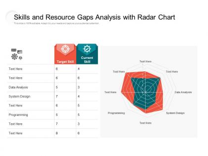
Skills and resource gaps analysis with radar chart




Try Before you Buy Download Free Sample Product
 Impress Your
 Audience
 100%
100% Editable
 Save Hours
 of Time


Hit the circuit with our Skills And Resource Gaps Analysis With Radar Chart. They are great to travel with.
People who downloaded this PowerPoint presentation also viewed the following :
Skills and resource gaps analysis with radar chart with all 2 slides:
Complete the circuit with our Skills And Resource Gaps Analysis With Radar Chart. Feel the energy begin to flow.
FAQs for Skills and resource gaps analysis
So you've got your axes - one for each variable you're measuring. Plot your data points and connect them to make that web shape. Make sure each axis uses the same scale or you can't really compare anything (I've seen people mess this up constantly). Different colors help if you're showing multiple things. What's cool is you can immediately see patterns - like where something's strong vs where it totally sucks. Labels are obviously important too. Just don't go crazy with too many variables or it turns into a messy nightmare that nobody can read.
Honestly, radar charts are clutch for comparing stuff across multiple factors at once. Like if you're doing performance reviews with 5-6 different areas, or sizing up products that have tons of features. The whole circular thing makes it way easier to see who's balanced vs. who's just crushing it in one specific area. Tables are boring and bar charts miss those patterns completely. But skip them if you've got like 15+ categories - total visual nightmare. Also not great when you need exact numbers instead of just the general vibe. I probably use them more than I should, but they're honestly perfect for multi-factor comparisons.
Ugh, overlapping radar charts are the worst! Try making some lines transparent or use different dash patterns - that usually helps separate things visually. You could also nudge your data points around slightly or add those hover tooltips so people can actually see the values. Honestly though? Radar charts kinda suck when there's too much overlap. If you're really stuck with it, maybe highlight one or two important series and fade everything else way back. Your readers won't hate you for it. Focus on the main comparison first, then add other stuff if it doesn't look like complete chaos.
So radar charts - don't go crazy with too many variables, maybe 3-5 tops. Use different colors for each series and make your labels super clear. Honestly, I've seen so many that just look like colorful spiderwebs! If you've got multiple datasets, try mixing solid and dashed lines. Keep the gridlines clean too - nobody wants visual chaos. Oh, and definitely test it on someone first. I learned this the hard way when my boss stared at mine for like 30 seconds trying to figure out what the hell I was showing her. Give people breathing room to actually understand what they're looking at.
So radar charts are basically spokes coming out from the center, with each variable getting its own line that forms a shape. The bigger the shape, the better that category performs overall. I'd stick to like 4-8 variables max - any more and it turns into visual chaos, trust me. What's cool is you can layer multiple shapes on top of each other to compare stuff. Oh, and definitely normalize your data first or one metric will completely overshadow everything else. They're perfect for spotting trade-offs between different options at a glance.
Dude, colors make or break radar charts. Too similar and people can't tell what's overlapping - it's painful to watch. Go for high contrast so different categories actually pop. Oh and don't forget about colorblind folks (learned that the hard way once). Red-green combos are a no-go. For showing intensity or progression, those sequential schemes work really well. Honestly, I'd cap it at 5-7 colors max or it gets messy. Test it on someone else first - what looks obvious to you might be confusing as hell to others.
Oh man, don't cram like 15 variables on there - stick to 7 max or it looks like chaos. Group similar stuff together too, not just random order. The scale thing trips everyone up though - if you've got one thing measuring 0-100 and another at 1-5, your chart's gonna look completely wrong. I've seen so many people mess this up! Start all your axes from zero or you're basically lying with the visual. And honestly? Show it to someone who doesn't know your data first - if they're confused, you need to fix it.
Honestly, radar charts are perfect for this stuff because everything's right there in one view. You can instantly spot if your data looks balanced or if there's some weird weak spot dragging everything down. Multiple comparisons? Even better - just overlay a few charts and the differences basically smack you in the face. Though I learned this the hard way: double-check your scales are the same across all axes first. Otherwise you end up with these crazy dramatic shapes that look important but are actually total nonsense. They're clutch for comparing suppliers or product features.
You definitely need to normalize your data or else one variable will completely hijack the whole chart. Like imagine plotting revenue (millions of dollars) against customer ratings (1-10 scale) - the chart becomes useless because everything gets warped. I usually just convert everything to 0-100 since it's easy math. Some people prefer 0-1 but honestly whatever works. The key thing is making sure each dimension gets equal visual weight on the radar chart. Oh and write down which method you picked because someone's gonna ask you about it later and you won't remember.
Radar charts are clutch for comparing stuff across multiple factors at once - like when you're evaluating vendors or positioning products. Way better than staring at spreadsheet hell! I'd stick to 5-8 criteria max though, otherwise it gets messy. They work great in strategy meetings to show trade-offs visually. Just make sure everyone knows what each spoke means first. Oh, and if you can overlay competitor data or industry benchmarks, that really makes your recommendations hit different. Perfect for performance reviews too.
Honestly, I'd go with **Tableau** or **Power BI** first - they're solid and let you customize everything. **Excel** works too but the charts always look kinda... Excel-ish, you know? If you code at all, **Python's matplotlib** or **R's ggplot2** are amazing for getting exactly what you want. **Canva** and **Illustrator** are perfect when you need something that looks super polished rather than just functional. Here's what I actually do though: sketch it out in Excel or Google Sheets first. Figure out your data, see what works. Then once you know what story you're telling, move to the prettier tools.
Honestly, just start with the 5-7 metrics your audience actually cares about - that's the foundation. Marketing folks might want brand awareness, engagement, conversions. HR teams track performance, teamwork, communication skills, whatever. Then swap out those boring generic axis labels for your industry's real terminology. Colors are easy - match your company branding or go with standard performance colors like red/green. Oh and definitely adjust those scale ranges so they make sense for your actual data. I always find the color choices end up taking way longer than expected for some reason, but it's worth getting right.
Honestly, radar charts are kind of a pain - they get super cluttered once you're dealing with more than 3-4 things. The axis order weirdly affects how people read them, which shouldn't matter but totally does. Don't use them if your variables have different units or scales because it assumes everything's equally weighted. They're awful for getting precise numbers too. I learned this the hard way in a presentation once! Bar charts or line graphs work way better when you need accuracy. Only go with radar charts if you're trying to show an overall "shape" or pattern across similar metrics.
Honestly, less is more here - stick to 5-7 variables max or your chart turns into a hot mess. Pick stuff that actually relates to what you're trying to show, and make sure they're on similar scales so one dimension doesn't completely dwarf the others. Cut anything redundant (like having both "revenue" and "sales" - they're basically the same thing). Your audience needs to care about what you're showing them, otherwise what's the point? Also double-check your data quality first - nothing worse than building a beautiful chart with garbage data. I usually dump all possible variables on paper first, then get brutal about what stays and what goes.
Keep radar charts stupid simple - max 3-5 dimensions or people just check out. Clear labels, no jargon. If you're presenting online, throw in some interactive stuff where they can hover over points or switch datasets. Colors should actually mean something, and explain what "good" looks like on each axis upfront. Here's the thing though - the chart itself isn't the point. Walk them through 2-3 key insights and tie it back to real decisions they need to make. I've seen too many presentations where someone drops a beautiful chart and then... crickets. Don't be that person.
No Reviews