


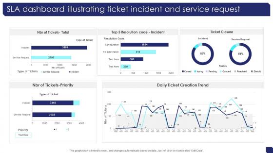
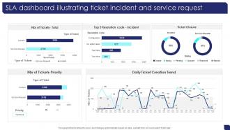
SLA Dashboard Illustrating Ticket Incident And Service Request




Try Before you Buy Download Free Sample Product
 Impress Your
 Audience
 100%
100% Editable
 Save Hours
 of Time


Our SLA Dashboard Illustrating Ticket Incident And Service Request are topically designed to provide an attractive backdrop to any subject. Use them to look like a presentation pro.
People who downloaded this PowerPoint presentation also viewed the following :
SLA Dashboard Illustrating Ticket Incident And Service Request with all 7 slides:
Use our SLA Dashboard Illustrating Ticket Incident And Service Request to effectively help you save your valuable time. They are readymade to fit into any presentation structure.





FAQs for SLA Dashboard Illustrating Ticket Incident
Focus on the basics: uptime percentages, response/resolution times, and ticket volumes. Customer satisfaction scores are clutch if you're tracking them. Escalation rates too - nobody wants surprises there. Honestly, all those fancy metrics that look impressive? Skip 'em. They just clutter things up without actually helping you catch problems. What matters is spotting when you're hitting targets vs when stuff's going south. Oh, and set alerts for when KPIs drop below thresholds. Otherwise you'll waste time staring at dashboards instead of fixing issues.
Keep it simple with the usual green/red color scheme - people get that instantly. Charts beat tables every time, trust me on this. Your most important SLAs should be right up top where nobody can miss them. Don't cram everything together either; white space actually helps people think. I'd definitely test it with real users first since they'll spot weird stuff you totally missed. Oh, and arrange things logically so people aren't clicking around forever. If someone stares at your dashboard for more than 30 seconds looking confused, you've overcomplicated it.
Tableau, Power BI, or Grafana are your best bets for SLA dashboards. Grafana's great if you're dealing with time-series stuff. I've watched so many teams burn months building custom solutions when these tools already do everything you need - real-time monitoring, alerts, the works. ServiceNow has decent built-in reporting too if that's what you're using. The main thing is finding something that plays nice with your ticketing system and can show response times, resolution rates, breach alerts. Oh, and honestly? Just pick whatever integrates easiest with what you already have. Makes life so much simpler.
Set up automated monitoring that pulls from your ticketing system and tracks SLA metrics in real time. Response times, uptime, resolution rates - all that stuff gets calculated automatically. The live green/red indicators are honestly pretty addictive to watch! Configure alerts at like 80% of your SLA target so you get warnings before things go sideways. That way you can jump on issues early instead of scrambling when you're already in breach territory. Oh, and make sure the dashboard pulls from all your monitoring tools - otherwise you're flying blind on half your metrics.
Look, automation is what makes SLA dashboards actually usable. Set it up to pull data automatically from your monitoring tools and ticket systems - otherwise you'll go crazy updating spreadsheets all day. The dashboard should calculate compliance percentages on its own and ping you when things are getting close to breaking SLA thresholds. I learned this the hard way when I first tried doing it manually... never again. Get those integrations working upfront so the data stays fresh without you touching it. Then you can spend time on the fun stuff - figuring out what the trends mean.
Honestly, go for real-time if you can swing it. But bare minimum? Refresh every 15-30 minutes during business hours. I've watched teams get absolutely roasted by leadership because they were doing hourly updates and missed a massive SLA breach - awkward doesn't even cover it. Your stakeholders need current data when stuff hits the fan. Nights and weekends you can probably stretch to hourly unless your environment is crazy 24/7. Just match your refresh rate to whatever your SLA windows are. Oh, and definitely set up alerts before you hit those thresholds. Being proactive beats scrambling every time.
Bright red is your best friend here - make those SLA breaches impossible to miss with bold colors and warning icons. Stick them right at the top of your dashboard. Executives eat up those breach counters (daily/weekly totals), so definitely throw one in there. Timestamps are clutch so your team knows exactly when everything went to hell. If you can swing it, add severity levels or show how long each breach has been sitting there. Honestly, the whole point is making your dashboard loud and annoying when things break - you want it practically yelling at you so fixes happen fast.
So basically, visual dashboards turn boring spreadsheet data into something you can actually use. Heat maps are clutch for spotting which services keep crashing. Charts show trends way faster than scrolling through endless numbers. Plus your boss will love those green/red indicators instead of having to decode tables (trust me on this one). Start with automated charts for your biggest SLAs first. Then add drill-down stuff so you can dig deeper when things go sideways. It's honestly night and day compared to staring at raw percentages all morning.
Looking at your historical SLA data is honestly a game changer. You'll start noticing which services are constantly screwing up and which ones actually hit their targets. The seasonal stuff is wild too - like how everything goes to hell during peak business periods. Plus you can tell if your team is genuinely improving or just getting lucky some weeks. I'd use it to spot performance issues before they blow up into major problems. Really helps with planning resources and setting realistic targets based on what you can actually deliver, not some fantasy numbers management wants to see.
Honestly, it depends on your industry. Healthcare obsesses over patient safety metrics and how fast they respond to critical stuff. IT teams? Uptime percentages and ticket resolution times. Financial companies track transaction speeds and security responses - they have to with all those regulations breathing down their necks. Manufacturing is more about equipment downtime and maintenance response. The real trick is building your dashboard around what actually hurts when it breaks, not just metrics that sound fancy. Focus on the stuff that makes your customers mad or costs you money when it goes wrong.
Honestly, data integration is your biggest headache - all your SLA stuff lives in different systems that hate each other. Thresholds are weirdly hard too because numbers that look great don't always match what customers actually feel. Stakeholders will have a million opinions about tracking (trust me on this one). Don't overwhelm people with every metric under the sun though. Start with maybe 3-4 solid ones first. You can always add more once you've got those dialed in. Way easier than trying to boil the ocean from day one.
Honestly, having an SLA dashboard is like putting everyone's work performance on display - which sounds harsh but totally works. Nobody can pull the "I didn't realize we were falling behind" excuse when those numbers are right there in red every morning. It's awkward at first, not gonna lie. But that visibility is what actually gets people moving on their commitments. The best part? Zero confusion about who owns what. Just make sure everyone can access it easily and bring it up in your regular team check-ins. Creates this natural pressure that keeps everyone honest.
Look, different people need totally different info, so you're not drowning them in useless data. Executives want the big picture - trends, breach summaries, that kind of stuff. Your support team? They need real-time ticket updates and response times. IT managers are somewhere in the middle, caring about resolution stats and who's working on what. It's like... you wouldn't give your grandma turn-by-turn GPS directions when she just wants to know if you'll be late for dinner, right? Customized dashboards let people actually make quick decisions instead of scrolling through endless screens. Just ask each team what their top 3 daily headaches are.
Okay so dashboards need to be super visual - colorful charts showing uptime, response times, all that stuff. Green/red/yellow indicators are your best friend because clients get it instantly. Honestly, I've seen way too many that look like they were made by tech nerds for other tech nerds. Show trends over time, not just today's numbers. When you miss an SLA, explain why briefly - no one likes surprises. Oh and set up automated reports so they're not constantly bugging you for updates. The whole point is keeping clients in the loop without making them work for it.
Start with role-based permissions so only the right people see your SLA data. HTTPS encryption is non-negotiable for transmission, plus encrypt sensitive stuff at rest. Multi-factor auth is huge here - these dashboards show business-critical performance data that hackers love. I've watched teams skip MFA and pay for it later. Audit logging tracks who's viewing what and when. Oh, and don't forget regular permission reviews. People switch teams all the time and you don't want your ex-teammate still peeking at sensitive metrics.
-
“I always have a wonderful experience with SlideTeam. It's my ""go to"" when I need a template.”
-
I want to express my gratitude to SlideTeam’s presentation design services team for helping me create the best presentation of my life!