


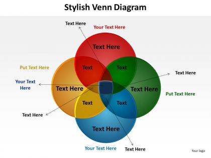
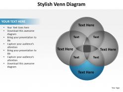
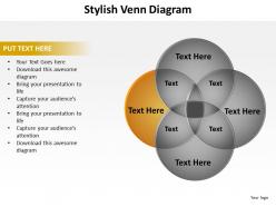
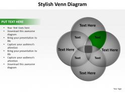
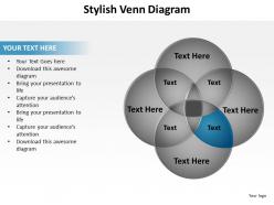
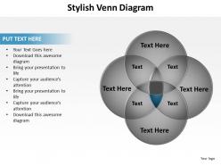
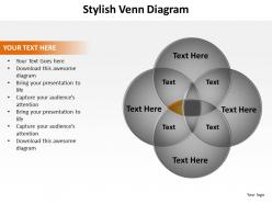
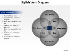
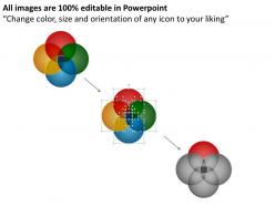
Stylish venn diagram with 4 circles overlapping for education schooling powerpoint graphics 712




Try Before you Buy Download Free Sample Product
 Impress Your
 Audience
 100%
100% Editable
 Save Hours
 of Time


Provide us the information you need to present and well use our well designed stylish venn diagram with 4 circles overlapping for education schooling powerpoint graphics 712 to create powerful presentations for you. You dont have to accept what we give, your input is very necessary.
People who downloaded this PowerPoint presentation also viewed the following :
Stylish venn diagram with 4 circles overlapping for education schooling powerpoint graphics 712 with all 17 slides:
Our stylish venn diagram with 4 circles overlapping for education schooling powerpoint graphics 712 have many a desirable quality. They are always clear, concise and correct.
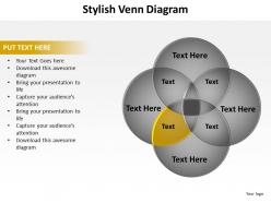
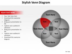
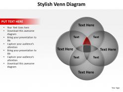
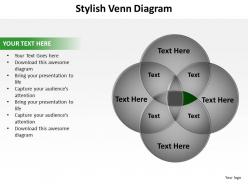
FAQs for Stylish venn diagram with 4 circles overlapping for education schooling
**INPUT**: What are the key elements of a stylish Venn diagram that capture audience attention? **OUTPUT**: Stylish Venn diagrams include vibrant color schemes, clean typography, balanced proportions, strategic whitespace, and meaningful icons or imagery. These design elements enhance audience engagement by improving visual hierarchy, ensuring readability across presentation formats, and creating memorable brand-consistent visuals, with many organizations finding that well-designed diagrams significantly increase information retention and stakeholder buy-in.
Color theory enhances stylish Venn diagrams by creating visual hierarchy through contrast, using complementary colors to distinguish overlapping sections, and applying consistent color schemes that guide audience attention to key insights. Strategic color choices streamline comprehension, reduce cognitive load, and deliver more engaging presentations, with many organizations finding that thoughtfully colored diagrams significantly improve stakeholder understanding and decision-making processes.
**INPUT**: What software or tools are recommended for creating visually appealing Venn diagrams? **OUTPUT**: Recommended tools include Microsoft PowerPoint, Canva, Lucidchart, Venngage, and Google Drawings, each offering customizable templates and design flexibility. These platforms streamline diagram creation by providing professional templates, color schemes, and formatting options, with many organizations finding that PowerPoint and Canva deliver the most accessible combination of visual appeal and functionality.
Deciding which data sets to include in a stylish Venn diagram requires focusing on datasets with meaningful overlaps, clear relationships, and relevant comparisons that support your presentation's core message. These selections should enhance audience understanding by highlighting strategic intersections, shared characteristics, and distinct differentiators, with many organizations finding that limiting to 2-3 well-chosen datasets delivers maximum visual impact and clearer insights.
Innovative Venn diagram design tips include using gradient fills, custom shapes beyond circles, strategic color contrast, dimensional effects, and interactive elements. These approaches enhance visual appeal by incorporating brand colors, asymmetrical layouts, and textured backgrounds, while maintaining clarity through consistent typography and whitespace, ultimately delivering more engaging presentations that capture audience attention.
Typography significantly influences Venn diagram readability through font selection, size hierarchy, contrast ratios, and strategic placement within overlapping circles. Clear, sans-serif fonts with adequate spacing enhance comprehension, while consistent sizing and high contrast between text and background colors ensure accessibility across different viewing conditions, ultimately delivering professional presentations that communicate complex relationships effectively.
Common mistakes when designing Venn diagrams include overcrowding with excessive text, using poor color contrast that reduces readability, creating disproportionate circles that misrepresent data relationships, and neglecting proper alignment. These design flaws can confuse audiences and undermine presentation effectiveness, with many professionals finding that clean layouts, strategic color choices, and balanced proportions ultimately enhance comprehension and deliver stronger visual impact.
Stylish Venn diagrams are most effectively utilized in executive presentations, marketing proposals, strategic planning sessions, and client-facing reports where visual appeal enhances credibility and engagement. These polished visualizations streamline complex relationship communication across sectors like consulting, financial services, and technology, ultimately delivering clearer insights while maintaining professional aesthetics that resonate with stakeholders.
Animation enhances stylish Venn diagrams through progressive reveals, smooth transitions between data sets, and interactive hover effects that highlight specific overlapping areas. These dynamic elements streamline complex data storytelling by building audience engagement, emphasizing key relationships sequentially, and enabling presenters to control information flow, with many organizations finding that animated Venn diagrams significantly improve comprehension and retention rates.
Whitespace in stylish Venn diagrams enhances readability by creating visual breathing room, reducing cognitive load, and directing attention to key overlapping areas and data points. This strategic spacing enables cleaner typography placement, improved color contrast, and better overall composition, with many design professionals finding that adequate whitespace transforms complex data relationships into more accessible, professional presentations that engage audiences effectively.
Stylish Venn diagrams excel at storytelling by visually representing relationships, overlaps, and intersections between narrative elements, characters, themes, or concepts through engaging design elements. Creative professionals, educators, and marketers use them to illustrate character development arcs, thematic connections, or brand positioning stories, transforming complex narratives into compelling visual experiences that enhance audience engagement and comprehension.
Icons and graphics transform Venn diagrams by replacing text-heavy labels with visual elements, incorporating thematic imagery that reflects your content, and using color-coded symbols to represent different data sets or categories. This visual approach enhances comprehension across diverse audiences, with marketing teams finding that icon-based diagrams communicate complex relationships more effectively, ultimately delivering clearer presentations and improved stakeholder engagement.
Best practices for labeling Venn diagram intersections include using clear, concise terminology, maintaining consistent font sizes and styles, positioning labels strategically within intersection areas, ensuring adequate contrast against background colors, and aligning text horizontally for readability. These approaches enhance comprehension by creating visual hierarchy, minimizing cognitive load, and maximizing accessibility, with many presenters finding that well-labeled intersections significantly improve audience engagement and data interpretation.
User feedback improves Venn diagram design through iterative refinement of visual clarity, color schemes, labeling accuracy, and data interpretation ease. Organizations regularly collect audience insights on readability, aesthetic appeal, and comprehension rates, with many design teams finding that incorporating user suggestions for font sizes, overlap visibility, and layout spacing ultimately delivers more engaging presentations and enhanced audience understanding.
Current trends influencing stylish Venn diagram design include minimalist aesthetics, vibrant color gradients, interactive elements, 3D visual effects, and custom iconography integration. These design approaches enhance audience engagement by creating visually compelling data stories, improving information retention through strategic color psychology, and delivering more memorable presentations, with many organizations finding that modernized Venn diagrams significantly boost stakeholder comprehension and meeting effectiveness.
-
Easily Understandable slides.
-
Awesome presentation, really professional and easy to edit.