

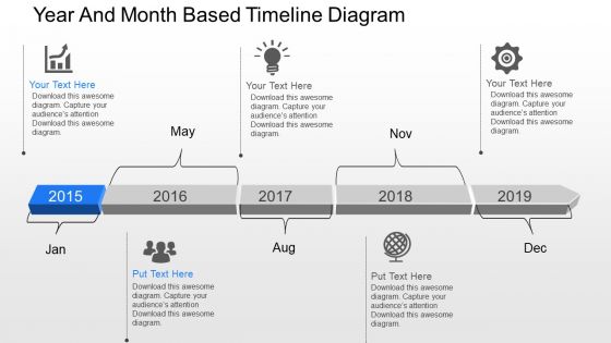
Su year and month based timeline diagram powerpoint template





Try Before you Buy Download Free Sample Product
 Impress Your
 Audience
 100%
100% Editable
 Save Hours
 of Time


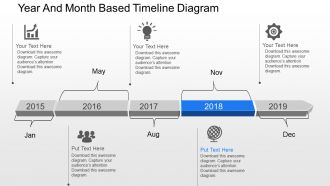
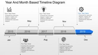
To keep a spot on potential days or to keep the system running all you need is a time line based PPT layout which very well states the project artifacts. The graphical bar has been segregated well and yet gives an integrated touch to the PowerPoint template as a whole which can basically be used to segregate data according to months and years thus using a linear scale to make features in PPT layout more interactive, clickable and zoom able without compromising on the resolution. The visualization of timeline in template visual makes the record of events, activities and meetings well synchronized and helps to make necessary and instant changes as the presentation slide show allows ready to edit features. Valuable space and time can be saved for the later run if data is added in the colorful and art graphic loaded PPT design so that the trust, reputation, awareness, influence, partnership or promotion is not sacrificed with its good color effects and complementary diametric feature objectives.Be the first among equals with our Su Year And Month Based Timeline Diagram Powerpoint Template. They allow you that commanding edge.
People who downloaded this PowerPoint presentation also viewed the following :
Su year and month based timeline diagram powerpoint template with all 8 slides:
Discover the happiness our Su Year And Month Based Timeline Diagram Powerpoint Template bring. You will be glad you encountered them.

FAQs for Su year and month based timeline
Dude, timeline templates are a lifesaver - no more starting from zero every single time. You can actually see your whole project laid out, which makes it way easier to catch problems early. Your team stays on the same page about deadlines too. Honestly? Bosses eat this stuff up. They'd rather look at a clean timeline than dig through some messy spreadsheet any day. The best part is it forces you to think about how tasks connect and what's actually realistic upfront. Just grab a basic one and tweak it for whatever you're working on.
Okay so timeline templates basically turn your presentation into a story that people can actually follow. Your audience gets to see how things unfold step by step instead of just getting hit with random facts. Our brains love narratives - we're totally wired for that stuff. The visual flow helps build up tension and shows how one thing leads to another. People can see what's coming next, which honestly keeps them way more engaged. You should try using different colors or icons for each phase too - makes it pop more. Those "aha!" moments when everything clicks? That's where the magic happens.
You'll want clear milestones with actual dates and who's doing what. Dependencies matter too - like what has to happen before other stuff can start. Always build in buffer time because something will definitely go wrong (it just does). Break everything into phases that are easy to see at a glance. If you're using colors or symbols, throw in a legend so people aren't confused. Honestly, simpler is better - anyone should be able to look at it and get the gist right away. Start basic and add details as you go.
Okay so timeline templates are totally different across industries. Education ones focus on semester planning and curriculum stuff - you know, quarterly assessments and course deadlines. Marketing is all about campaigns though - launch dates, content schedules, that whole promotional timeline thing. Healthcare templates track patient journeys, construction does project phases and regulatory stuff. It's honestly pretty wild how each field has its own approach! Don't try to force some random generic template to work - find one that actually matches your industry's workflow and deadlines. Makes life way easier.
Drag-and-drop is huge - you don't want to be manually typing coordinates every time you tweak something. Color coding and custom date ranges are must-haves too. Dependencies between tasks? Super helpful for complex projects. Here's the thing though - so many templates look gorgeous but are basically impossible to edit once you download them. Test it out first! Can you actually move stuff around easily? Does it handle monthly vs quarterly views? Oh, and check if it exports to different formats. I learned that one the hard way. Start simple and build up from there.
Honestly, digital timeline templates are such a lifesaver for team projects. Everyone sees the same roadmap updating in real-time, which beats those chaotic email threads by miles. You can assign tasks right on the timeline and actually see who's doing what. The visual part makes spotting problems way easier before they blow up. Your teammates can drop comments and update stuff as they go - oh, and most sync across phones and laptops so remote people don't get left out. I'd grab one that works with whatever tools you're already using. Makes the whole transition less painful.
I'd start with PowerPoint or Google Slides - they've got decent timeline templates built in. Canva's probably your best bet though if you want something that actually looks good. Seriously, I've watched people whip up really nice timelines there in like 20 minutes. Way less painful than fighting with PowerPoint's formatting. If you need something more complex for project management stuff, Lucidchart works well, or there's Timeline JS but that might be overdoing it. Oh, and Timeline JS is free which is nice. Just use whatever you already have first and see if it does the trick.
Don't go crazy with multimedia on every single point - pick the important moments instead. Before/after shots are perfect for images. Videos work well for showing processes or big changes happening. I love using audio clips for historical stuff or interviews, they really bring it to life. But seriously, less is better here. Too much media just overwhelms people and makes everything load super slow. Compress your files so they're web-friendly. Start with maybe one type per section, then add more if it actually helps tell the story better.
Make your important dates stand out with bold colors or bigger text. Honestly, icons beat huge text blocks every time - people just won't read paragraphs on a timeline. Mix up where you put stuff (left, right, top, bottom) so there's some visual flow happening. Color-coding different phases makes everything way easier to follow. Don't pack everything together though - white space actually helps a ton. Oh, and try alternating your layout pattern so it doesn't look boring. Keep it clean and give people room to breathe between events.
Dude, timeline templates are seriously game-changers for history stuff. You get this visual flow of events instead of drowning in walls of text trying to remember dates. Way easier to spot how one thing led to another, you know? Like dominoes falling. I always thought history was boring until I started doing this - now you can actually see the patterns and connections. Short bursts work better than those marathon study sessions too. Just grab the main events first and map them out chronologically. Trust me, everything'll start making sense way faster than cramming paragraphs.
Oh man, timelines are seriously a game changer for product development. Start with your big phases - concept, research, prototyping, testing, launch. Then fill in the detailed stuff underneath. What I love about them is how they show dependencies between stages, so you're not caught off guard when something gets delayed. During stakeholder meetings (which honestly can be a nightmare), you can just point to the timeline when people ask where things stand. They're also great for tracking feature rollouts and planning what's next. The visual aspect makes it click for both your team and executives way faster than some boring status report.
Honestly, the worst thing you can do is jam way too much detail into each milestone. Makes the whole thing impossible to read. Buffer time is huge too - always assume stuff will take longer than you think. I learned this the hard way lol. Pick your absolute must-haves first, then work backwards with realistic dates. Don't just use whatever timeframes the template suggests because they're usually garbage. Oh and actually update the damn thing regularly - nothing's more useless than an outdated timeline sitting there mocking you.
So basically you just tweak the same template for whoever's looking at it. Executives want the big picture stuff - quarterly milestones, business jargon, you know the drill. Technical teams need all the nitty-gritty details and task dependencies. For kids or regular people, dumb down the language and add more colors (though honestly, even executives secretly love colorful charts). Time scale matters too - execs think in quarters while project teams live day-to-day. Keep your core structure but mess with how you present it. Figure out what each group actually cares about first, then adjust from there. Way easier than starting from scratch every time.
Colors totally make or break your timeline! I'd stick with blues and greens for anything that needs to feel calm and trustworthy. Reds and oranges work great when you want to show urgency or mark big milestones. Honestly, I've made the mistake of going overboard with colors before - it just looks chaotic. Keep it simple with maybe 2-3 colors max. Use them consistently so each color means something specific, like different project phases or priority levels. It actually helps people follow along way better than you'd think.
Dude, timeline templates are honestly a game changer for goals. Instead of keeping everything jumbled in your head (guilty as charged), you break big stuff into actual deadlines you can see. I always start with the end goal and work backwards - sounds backwards but trust me on this one. Map out your quarterly targets, and suddenly it's obvious when you're behind or if one thing will mess up everything else. Way better than having goals scattered everywhere. The visual part is clutch because you can spot problems early and shift things around when life happens. Which it always does.
-
Really like the color and design of the presentation.
-
Helpful product design for delivering presentation.