


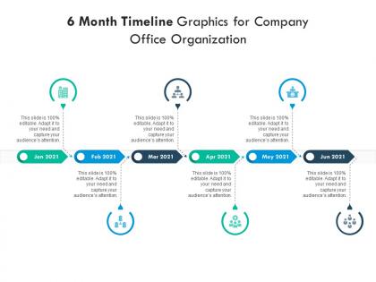
6 month timeline graphics for company office organization infographic template




Try Before you Buy Download Free Sample Product
 Impress Your
 Audience
 100%
100% Editable
 Save Hours
 of Time


Derive factual results using this 6 Month Timeline Graphics For Company Office Organization Infographic Template. Deploy this PowerPoint template to make and display prospective strategies using impressive graphics that enhance the visual quotient of the presentation. This infographic template also helps in elevating the aesthetic appeal of the presentation, making it useful for every organization. Apart from this, things and projects can be visualized from the onset using this PPT design. As this PowerPoint visual provides an abundance of information in a single layout, it can impress any viewer or higher managerial staff. It also boosts business actions by presenting flawless presentations. The biggest advantage of this slide is that it can be reproduced in various formats, including Google Slides. Therefore, download it now to present a unique presentation every time.
People who downloaded this PowerPoint presentation also viewed the following :
6 month timeline graphics for company office organization infographic template with all 2 slides:
Use our 6 Month Timeline Graphics For Company Office Organization Infographic Template to effectively help you save your valuable time. They are readymade to fit into any presentation structure.
FAQs for 6 month timeline graphics for company office
So for your timeline, you'll definitely need clear dates and a consistent flow - either left to right or top to bottom works. Make sure each milestone has its own icon or marker. Keep the text short and sweet because honestly, no one's gonna read a novel on there. Don't forget a good title at the top. Color coding helps a ton if you're tracking different themes or categories. Space things out properly so it doesn't look all squished together. Oh, and if you use symbols or colors, throw in a legend. I'd start with your biggest events first, then add the smaller stuff around them.
Colors make a huge difference for timelines - way more than most people realize. Blues and greens work perfect for showing stable, foundational stuff since they feel trustworthy. For the big moments though? Go with reds or oranges to really make them pop. Sequential colors help your eye follow the flow naturally too. Honestly, I see so many boring single-color timelines that just... blend together. Your brain actually processes color before it even reads text, which is kinda wild when you think about it. Pick one standout color for your most crucial events - it'll make everything way easier to follow.
Honestly? Just go with Canva if you're starting out - their timeline templates are pretty solid and you'll figure it out in like 10 minutes. Piktochart's another good drag-and-drop option. PowerPoint actually works way better than you'd think for basic stuff, plus you probably already have it. Adobe Illustrator gives you tons of control but it's kind of a pain to learn unless you're gonna be making these regularly. Oh, and if you need to collaborate with people, Lucidchart or Google Slides work well since everyone can edit online. But yeah, Canva first - it'll get you most of the way there without the headache.
Okay so first thing - figure out if this is going digital or print because that totally changes everything. Print needs 300 DPI and honestly colors always look weird compared to your screen, so test a small section first. Digital's way more forgiving since you can add animations or make stuff clickable. I usually just export like 3 different versions right away because going back to remake things later is such a pain. Oh and make sure your text isn't tiny - people can't zoom in on printed stuff. The color thing really gets me though, I've been burned by that before.
Ugh, the worst thing you can do is cram way too much text into each point - nobody wants to read a novel on your timeline! Keep it super short, like bullet-point brief. Also make sure the flow actually makes sense. Left to right or top to bottom, whatever, just pick one and stick with it. I've seen timelines that jump around everywhere and honestly it's exhausting to follow. Don't go crazy with fancy fonts either. Leave some breathing room between stuff or it'll look cluttered as hell. Oh and here's a good test - show it to someone for like 10 seconds and see if they get it right away.
Hey! So for timeline accessibility - contrast is huge. Dark text on light backgrounds, fonts at least 12pt. Don't just use color coding either (I made that mistake once, my colorblind coworker was totally lost). Alt text for everything visual is a must. Honestly, the spacing thing matters more than you'd think - cramped timelines are brutal to read. Left-to-right or top-to-bottom flow works best. Oh, and definitely have someone else look at it first! They'll spot stuff you missed. A plain text version as backup doesn't hurt either.
Timeline infographics work great when you've got events that happened in order over time. Company milestones, product launches, project phases - that kind of stuff. You'll want clear dates and events that actually tell a story as they unfold. Don't try forcing comparisons or random data points into a timeline format though. That never looks right. Keep it to maybe 5-8 events so people can actually follow along without getting overwhelmed. I'd start by writing out everything chronologically, then just pick the moments that'll hit hardest with whoever's reading it.
Dude, icons are seriously clutch for timelines. People can scan through and instantly get what happened without reading every single word - it's like visual shortcuts for your brain. Just don't go crazy with random pretty graphics that make no sense. Pick stuff that actually connects to your content and keep it consistent throughout. Honestly, I've seen so many timelines where the icons are more distracting than helpful. You want them supporting your story, not stealing the show. When you nail it though, you're giving people two ways to absorb the info - they see it AND read it.
Honestly, there's so much you can do beyond basic horizontal layouts! Circular timelines are cool - everything flows around a center point. I've been seeing tons of "metro map" styles lately where different branches connect like subway lines, which looks way more interesting than boring straight lines. Vertical zigzag patterns work well too if you want people to actually follow along. Oh, and roadmap designs are perfect when you're showing actual progress or journeys. For digital stuff, interactive elements are pretty much expected now - hover details, expandable sections, whatever. Just pick something that doesn't feel totally random for your content and you'll be fine.
Think of each milestone as a chapter in your story. Don't just list dates - show how one thing led to another. Most people mess this up by dumping random facts without explaining the "why" behind each moment. Focus on the challenges you faced or those unexpected breakthroughs that changed everything. Short descriptions work better than walls of text, honestly. Add some visuals if you can. The whole point is making people feel like they're following an actual journey, not reading some boring chronology. Figure out your main plot first, then everything else falls into place way easier.
Just swap out the graphics for stuff that fits your field - medical symbols for healthcare, gears if you're in manufacturing, that kind of thing. Colors matter too. Blues work great for tech companies, greens for anything environmental. Honestly, some of the best ones I've seen look nothing like the original template anymore! Time intervals are huge - you'll want quarterly breakdowns for business stuff but maybe decades for historical timelines. Oh, and definitely use language your audience already knows. Makes everything click faster.
Honestly, timeline infographics are a game-changer in classrooms. Kids actually retain stuff when it's visual instead of buried in boring paragraphs. Perfect for history, science processes, book plots - whatever you're teaching. Students can see how events connect and lead to each other, which is huge. The best part? Have them make their own timelines as homework. Gets them way more involved than regular assignments. I always wondered why more teachers don't use these. Just grab a simple template and let students fill in the important dates and events.
Interactive timelines are huge right now - users can actually click through different time periods instead of just scrolling past everything. Visual storytelling's taking over too, with way more icons and illustrations replacing those boring text walls. The scrolling ones that reveal content as you go down are honestly pretty addictive. Mobile's driving the vertical layouts since that's where everyone lives now. Oh, and thank god designers are finally ditching those corporate blue-gray color schemes for something with actual personality. You should definitely play around with some interactive examples first though - static timelines just feel dead compared to these new ones.
Yeah, this is super important to think about! Western audiences read left-to-right, so that's how they expect timelines to flow. But Arabic and Hebrew readers go right-to-left. Some Asian cultures actually prefer vertical timelines from top to bottom - which honestly makes more sense sometimes? Colors are tricky too. Red means luck in China but screams danger to most Western people. Oh, and not everyone thinks about time as this straight line moving forward. Some cultures see it as cyclical instead. Do a bit of research on your audience first so you don't accidentally confuse people.
Check how long people actually stay on your infographic and how far they scroll down - that stuff tells you if they're engaged. Social shares are gold too since people only share things they actually get. Quick surveys work great for testing if viewers remember the key dates or can put events in order. I'd also peek at click-through rates to see if your timeline makes them curious enough to read more. A/B testing different versions is probably your best bet though - I always forget how much that reveals. Short surveys might feel like extra work but they're honestly worth it.
-
Professional and unique presentations.
-
Great quality product.
-
Thanks for all your great templates they have saved me lots of time and accelerate my presentations. Great product, keep them up!
-
Excellent Designs.
-
Enough space for editing and adding your own content.