


Evolution timeline chart powerpoint guide




Try Before you Buy Download Free Sample Product
 Impress Your
 Audience
 100%
100% Editable
 Save Hours
 of Time


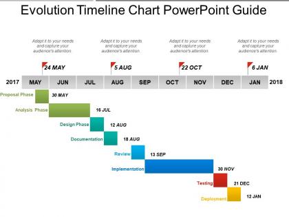
Choose this evolution timeline chart PowerPoint guide PPT slide for creating a business presentation to your viewers, team and / or audience in order to deal with the history of business organizations, of business methods, of government regulation of businesses, of labor relations and of business impacts on society. The usage of the business history figure PowerPoint shape also allows the user to include the biographies of individual companies, executives and entrepreneurs specially who are related to economic history. Narrate the gradual development of a particular activity of your business to your team members in a natural and sequential flow by using this corporate history diagram PowerPoint shape. The presenter may avail the benefits of this template to refer to the development of the business activity(s) of the organization at different stages from the day of its commencement till the day of its consideration. The platform of this slideshow further facilitates the presenter to make a business model that is a strategic plan for explaining about the factors which are required to be taken into consideration for earning the profit and the means of showing how income will exceed expenses. Identify causes of insecurity with our Evolution Timeline Chart Powerpoint Guide. Eliminate factors that can be harmful.
People who downloaded this PowerPoint presentation also viewed the following :
Evolution timeline chart powerpoint guide with all 5 slides:
Exult in a fresh dawn with our Evolution Timeline Chart Powerpoint Guide. Begin the day with new ideas.



FAQs for Evolution timeline
You'll definitely want those fish-to-land creatures around 365 million years ago - talk about a major leap! Photosynthesis 2.5 billion years ago is huge too since it basically remade Earth's whole atmosphere. After the dinosaurs got wiped out 66 million years ago, that's when mammals really took off. Oh, and primates getting opposable thumbs around 55 million years ago was pretty game-changing. Honestly, extinction events seem to be nature's way of forcing innovation. I'd do it chronologically but maybe highlight these big "survival breakthrough" moments somehow? That way people can spot the most dramatic adaptations easily.
Hey! So evolution research has blown up since Darwin's time - we've got DNA sequencing now instead of just fossils and guesswork. Turns out family trees were totally wrong in some cases. Evolution doesn't always crawl along gradually either; sometimes it jumps in bursts. Weirdly, species swap genes horizontally way more than anyone expected. Oh, and environmental stuff can flip genes on/off without actually changing DNA itself (that one's pretty wild). When you're updating those charts, definitely throw in molecular evidence next to the fossil timeline. Makes everything way more accurate.
So mutations are basically what fuel evolution - they give natural selection something to work with. Random genetic changes happen all the time in populations. The good ones stick around, bad ones usually die out. It's like nature constantly experimenting, which is pretty cool when you think about it. Over millions of years, these small changes add up to huge evolutionary jumps. Simple organisms develop crazy complex features, new species branch off completely. When you're looking at any transition on that timeline, just trace it back - there's always some genetic change that made it happen first.
Honestly, visual timelines are a game-changer for teaching evolution. Like, when you see that humans have only existed for 0.007% of Earth's history, it actually hits you. Reading that stat is one thing, but seeing the tiny sliver on a timeline? That's when it clicks. Short sentences work better than paragraphs of explanation. You can map out how species branch off from common ancestors too - way clearer than trying to explain it with words. I always thought those branching diagrams were kinda ugly in textbooks, but they're so effective. Start there if you're explaining this stuff to anyone.
Most evolution charts hit the same big moments - life starting around 3.8 billion years ago, then photosynthesis kicking in. The Cambrian explosion is huge since that's when animals got really creative with body plans. After that you've got the move onto land, dinosaurs doing their thing until they didn't, mammals stepping up. Those "fish to human" timelines are everywhere but honestly it's messier than they make it look - more like a crazy branching tree. Oh, and mass extinctions always get highlighted because they basically hit reset on everything. Just pick whatever timeframe fits your audience best.
So basically different cultures see evolution timelines totally differently depending on their beliefs. Western science focuses on that gradual fossil record progression. Indigenous groups often blend evolutionary ideas with spiritual creation stories that go way further back. Muslims might frame it within divine creation, and Hindus work with those crazy long cyclical time periods that make geological time look short! Honestly it's wild how the same data gets interpreted so many ways. For your timeline, maybe think about who's gonna see it and throw in some different cultural perspectives as side notes? Makes it way more relatable and shows you get that there's multiple ways to understand this stuff.
Dude, climate change is huge for evolution - check any timeline and you'll see it everywhere. Species either adapt fast or they're toast when the climate shifts. Ice ages, warming periods, asteroid hits - they all trigger massive evolutionary changes. The Cambrian explosion happened right after climate shifts, which is pretty wild if you think about it. Animals basically have to evolve quickly or die when their environment changes. Look for those climate markers on your timeline - I swear they're almost always right before the big evolutionary jumps or when tons of species go extinct.
So here's the thing - plants are basically evolutionary slowpokes compared to animals. Animals can adapt in thousands to millions of years, but plants? They're looking at tens of millions of years for major changes. It's wild when you think about it. Plants have longer generation times and more stable genetics, plus they deal with totally different pressures than animals do. When you're making those evolution charts, you'll need different time scales for each - otherwise plant "rapid evolution" looks like nothing happened while animal changes seem crazy fast.
So here's the thing - evolution took millions of years to create all this biodiversity, but we're wiping out species 1,000-10,000 times faster than they'd naturally disappear. Honestly pretty scary stuff. Once they're gone, that's it forever - you can't magically reverse those evolutionary pathways. Plus ecosystems evolved together over huge timescales, so everything's super interconnected. My advice? Focus on saving whole habitats instead of just individual species. And definitely prioritize those evolutionary hotspots where you've still got unique lineages hanging on.
Don't just slap up a timeline poster and call it done - make your students actually plot the major events themselves. The hands-on part makes the massive time scales click way better. I'm obsessed with that "Earth's history as a 24-hour day" thing because kids genuinely freak out when they realize humans show up like 2 seconds before midnight. When you're teaching about specific fossils or organisms, always circle back to where they fit on your timeline. It becomes this reference point for explaining weird fossil patterns and why certain adaptations happened when they did. Keep building on it throughout the unit so it actually matters to them.
Ugh, those evolution charts are so frustrating! They totally ignore fungi and all the weird protists that don't fit into neat little boxes. Bacteria get maybe one tiny branch even though they literally invented photosynthesis and changed our entire atmosphere - pretty major if you ask me. Instead these timelines just jump from "first life" straight to fish or whatever. We're missing billions of years where all the actual groundwork happened! Like, I get that vertebrates are flashy but come on. All those early innovations made everything else possible.
So basically speciation is what creates all those branching points on evolution charts - that's where one species splits into two or more. Picture a family tree but way more intense. Each split happens when populations get separated and can't reproduce together anymore, so they develop different traits over time. Those branch points are literally speciation events! That's honestly the coolest part to me. When you're looking at any evolution timeline, focus on where the lines diverge - that shows you how closely related different species actually are. It's what gave us all the crazy biodiversity we see today.
Honestly, evolution timelines are pretty bad for predicting specific stuff - it's way too messy for that. But you can pick up on broader patterns, like how antibiotic resistance keeps getting worse in bacteria. That'll probably continue. Climate change is throwing new pressures at everything too, so we might see more heat/habitat adaptations. The cool thing is looking at how organisms handled past environmental chaos - gives you decent clues about what could happen next. Though I swear evolution loves curveballs, so any predictions are really just educated guesses at best.
Ugh, those evolution charts are so annoying because they make it seem like everything was building up to humans - like we're some amazing finale. Total BS! They also show species just popping up and vanishing instead of all the gradual branching that really happened. Most skip over the weird intermediate creatures (which are honestly the coolest part) and focus only on the big groups. Oh, and they mess with the time scales to cram everything onto one page, so recent stuff looks super important when it's really just a blip. Don't trust them completely.
So here's the deal - artistic evolution charts are all about drama and visual impact, while scientific ones show the messy reality. Artists will skip millions of years or exaggerate changes because honestly, accurate timelines would be boring as hell - just tons of empty space! They love that "ladder of progress" thing even though it's totally wrong. Real evolution branches everywhere and species don't "upgrade," they just adapt. Scientists focus on showing those branching patterns and proper time scales. Quick tip: always check if a chart's meant for education or just inspiration. Saves you from looking dumb later.
-
Out of the box and creative design.
-
Best way of representation of the topic.