


Evolution Chart Powerpoint Presentation Slides




Try Before you Buy Download Free Sample Product
 Impress Your
 Audience
 100%
100% Editable
 Save Hours
 of Time


Get your clients attention towards your accomplishments using Evolution Chart PPT presentation templates. Incorporate professionally designed evolution chart PowerPoint presentation slides and keep a tab on the organization growth. Showcase how your company evolves and is relevant and innovative. Highlight company history and a successful journey of achievements with the help of evolution chart PPT presentation templates. It is a deck of various professional and innovative company evolution growth chart PPT slides. Get access to this PPT slideshow for your next presentation to put forward your best work. Showcase profit, revenue growth, customer service experience, sales, and other achievements in the form of timeline, line graph, evolution roadmap, and more. This deck gives you a lot of options to flaunt your success such as product development timeline, product evolution roadmap, business evolution timeline, business evolution at glance and more. Grab business evolution chart PowerPoint presentation templates and get your clients onboard with you. Make a friendly approach with our Evolution Chart Powerpoint Presentation Slides. The audience will find you disarming.
People who downloaded this PowerPoint presentation also viewed the following :
Content of this Powerpoint Presentation
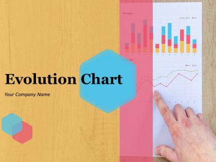
Slide 1: This slide introduces Evolution Chart. State Your Company Name and get started.
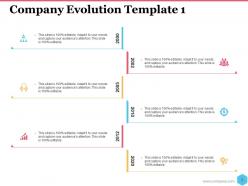
Slide 2: This slide presents Company Evolution Template 1. You can add the company details inthis timeline and use it.
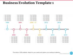
Slide 3: This slide showcases Business Evolution Template 1. You can use this for showing the timeline about the organization.
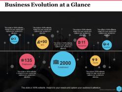
Slide 4: This slide presents Business Evolution at a Glance. Use it as per your requirement.
Slide 5: This slide presents Business Evolution template 2. Use it for some options to put .
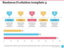
Slide 6: This slide showcases Business Evolution template 3. You can add the data in this as per requirement.
Slide 7: This slide shows Business Evolution template 4. Add the content and use it accordingly.
Slide 8: This slide presnts Business Evolution template 5. Use it accordingly.
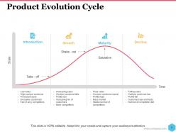
Slide 9: This slide showcases Product Evolution Cycle. Use this chart and make it possible to analyse the growth.
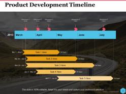
Slide 10: This slide presents Product Development Timeline. Use this timeline and add it for your product and add milestone.
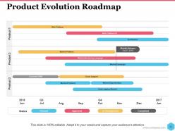
Slide 11: This slide showcases Product Evolution Roadmap. You can add the product development in this roadmap.
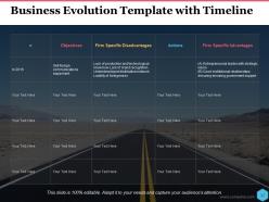
Slide 12: This slide presents Business Evolution Template with Timeline. Use this for your business requirement.
Slide 13: This slide is a Coffee Break image for a halt.
Slide 14: This slide presents Evolution Chart Icon Slide
Slide 15: This slide forwards to Charts & Graphs.
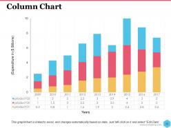
Slide 16: This slide showcases Column Chart. You can use it as per your requirement.
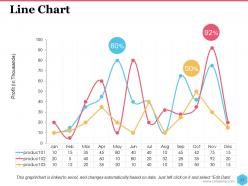
Slide 17: This slide shows a Line Chart for two product comparison
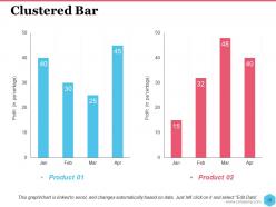
Slide 18: This slide presents Clustered Bar. You can add it as per your requirement.
Slide 19: This slide is titled Additional slides.
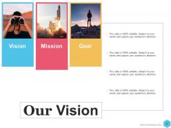
Slide 20: This slide contains Our Mission with text boxes.
Slide 21: This slide helps show- About Our Company. The sub headings include- Creative Design, Customer Care, Expand Company
Slide 22: This slide showcases Our Team with Name and Designation to fill.
Slide 23: This is a Thank You slide with Address:# street number, city, state, Contact Numbers and Email Address.
Evolution Chart Powerpoint Presentation Slides with all 23 slides:
Feel completely at ease with our Evolution Chart Powerpoint Presentation Slides. They put you in the correct frame of mind.





FAQs for Evolution Chart
Really depends what species you're doing, but most charts follow the same basic pattern. Look for the big morphological changes and where populations branch off. Human evolution goes something like early primates → hominids → Homo species, though they keep finding new fossils that mess with the timeline lol. Honestly? Don't get bogged down trying to show every tiny variation. Focus on the major transition points where you see huge anatomical or behavioral shifts. Those critical leaps will tell the clearest story. Way easier to follow than cramming in every detail.
Look, evolution charts are honestly game-changers for bio presentations. Your students can actually follow what's happening instead of zoning out during lectures about natural selection. Show them the step-by-step changes over time - it's basically a visual roadmap through millions of years. Branching patterns and timelines make evolutionary relationships click way faster. You can compare different species' paths side by side too, which is pretty cool. I'd start simple with horse evolution (classic example) then work up to those crazy complex phylogenetic trees once they get it.
Lucidchart and Draw.io are your best bets here - they're both really good with those branching tree diagrams. Draw.io is free which is nice. Canva works but honestly their science templates look kind of goofy sometimes. If you're feeling fancy, Tableau handles complex data visualization well, or there's always Illustrator if you don't mind the learning curve. The main thing is finding something that won't make your labels look like a hot mess when you adjust branch lengths. I'd just try the free versions first and see what feels right - no point paying for features you won't use.
So evolution charts are basically family trees for every living thing - super helpful for seeing how species connect to each other. Way better than slogging through boring research papers, honestly. You can follow the lines back to find common ancestors and watch how different traits developed. The cool part is looking at where branches split off - recent splits mean closer relationships, while older splits show species that went separate ways ages ago. Oh, and those branch points? That's where all the interesting evolutionary drama actually happened. Makes the whole thing click way faster than just reading about it.
Yeah, evolution charts are actually great for conservation talks! The visual storytelling really clicks with people - like when you show polar bear adaptations and then explain why ice loss hits them so hard. Audiences get why these animals can't just quickly adapt to what we've thrown at them. I mean, evolution takes millennia, not decades, right? The polar bear example is probably overused at this point, but it works. Definitely pair your charts with current population numbers. That combo of "here's how they evolved" plus "here's how screwed they are now" really drives the urgency home.
So linear charts are basically just A → B → C in a straight line, super simple to follow. But branching ones? Way more interesting - they're like family trees where one species can split off into tons of different directions. Honestly, the branching ones are what actually happens in real life since evolution isn't this neat, tidy process. Linear works great if you're just showing direct parent-to-child relationships. Go with branching though when you want to show how messy and diverse evolution really gets. They're harder to read but so much more accurate.
Honestly, cultural stuff is what drives all those big artistic shifts you see on charts. Each major transition usually lines up with some kind of social chaos, new technology, or cultures mixing together. Renaissance humanism led to realistic portraits, industrialization sparked abstract expressionism when artists got fed up with all the machinery. Religious movements and political upheaval show up as clear turning points too. I never realized how messy art history actually was! When you're looking at these charts, just ask yourself what was going down in society during each style change. Makes everything click way better.
Dude, evolution charts are basically visual timelines showing how we went from early primates to modern humans over millions of years. Way better than just reading about it - you can actually see the branching family tree thing happening. They show when different hominid species split off, plus changes in brain size and tool use. What's cool is realizing evolution isn't this straight line like people think. It's messy, with tons of branches and dead ends. The time scale really hits you too - we're talking millions of years here. Trust me, start with a chart when you're explaining this stuff to anyone.
Ditch the boring wall charts! Get your kids building phylogenetic trees with pipe cleaners or drag-and-drop tools like Scratch. Seriously messy = memorable. Set up timeline stations around the room and have them walk through different evolutionary periods. The arguments are honestly the best part - let them debate where species belong and watch the concepts actually stick. Short version: make it tactile and let them get their hands dirty. Digital tools work great too, but there's something about physically moving pieces around that just clicks better for most kids.
Honestly, the biggest mistake I see is cramming way too many stages onto one chart - it just turns into visual chaos. Skip the rainbow color scheme too, pick maybe 2-3 colors max and stick with them. Your timeline needs to be realistic, so don't gloss over major milestones just because they mess up your neat little progression. Oh, and for the love of all things holy, make your text big enough to actually read! I swear, half the evolution charts I've seen lately look like they were designed for ants. Before you finalize anything, grab someone who's never seen it and watch their face - you'll know instantly if it makes sense.
Honestly, it's all about knowing your crowd. Kids need super bright colors and maybe like 3-4 animals max - think fun cartoon dinosaurs, not complex family trees. Teens are actually perfect for the dramatic extinction events (they eat that stuff up) plus more scientific terms. Adults want all the messy details - full phylogenetic trees, multiple pathways, the works. I always start simple though. People can always ask for more complexity, but you'll lose them if you dump too much info upfront. Match the brain power to attention span, basically.
Oh, the colors? They're basically like a subway map for evolution - you'd go crazy trying to follow all those branching lines without them! Different colors usually mean different groups (mammals, reptiles, etc.) or time periods. Sometimes I forget to check the legend first and get totally confused lol. But once you know what each color represents, it's so much easier to trace how species are related. Makes those super complex charts way less overwhelming, especially when they're covering like millions of years of evolution.
Honestly, evolution charts are a lifesaver when you're dealing with genetic data. Instead of getting lost in boring spreadsheets, you can actually see how traits move through populations over time. Timeline plots work great - they'll show you right away which changes happened slowly vs the dramatic ones. Plus you can layer in stuff like climate data or predator info to see what actually caused the shifts. I always forget how much easier it is to spot patterns visually until I'm staring at endless allele frequency tables again. The visual approach just clicks better than raw numbers, at least for me.
You need longitudinal data - measurements from the same groups over time. Way more reliable than one-off studies. Track quantitative stuff like morphological changes, genetic sequences, behavioral patterns. Skip the anecdotal stories though, they're pretty useless for solid charts. Consistency is huge here - if you change how you're measuring halfway through, you've basically screwed your whole dataset. More data points = better results, obviously. First figure out exactly which trait you're following, then nail down the most objective measurement method. Oh and longer timeframes help too, evolution doesn't happen overnight.
Oh evolution charts are perfect for this! Basically you map out how tech moves through different stages - like how phones went from those chunky Nokia bricks to smartphones that are basically tiny computers. I'd focus on the big breakthrough moments rather than just dates, you know? Like when touchscreens killed off keypads, or suddenly every phone had a camera. Makes the whole story click better. Also try grouping by what actually improved instead of just timeline order - stakeholders get it way faster that way. Super helpful for product roadmaps too, honestly one of my favorite visual tools.
-
Presentation Design is very nice, good work with the content as well.
-
Use of icon with content is very relateable, informative and appealing.