

Summary conclusion sample presentation ppt


Try Before you Buy Download Free Sample Product
 Impress Your
 Audience
Editable
of Time


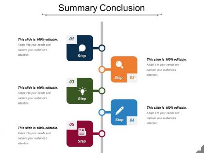
Tell your audience about your business goals with this Summary conclusion sample presentation PPT. Plan to build a successful enterprise with a streamlined business plan. Address the areas and issues that need to be focused through a summary. Impress your audience including investors, lenders, your employees, customers, and suppliers. Seek capital investment by attracting investors. Motivate your employees to work and achieve the set goals using Executive summary PPT examples. Convince the sponsors to make the necessary investments in your project with an easy to understand business plan. Streamline the functioning and execution of your business with our Executive summary of the business plan PPT slide . Executive summary examples PPT design is readily available and professionally designed by our designers at SlideTeam. Communicate easily with your audience using brief executive summary of your business plan. Keep the structure and content of the PowerPoint presentation clear and understandable for the target audience. With high quality graphic and content, curate an attractive and effective presentation. Avail our executive summary PPT template immediately. Draw folks into fruitful discussions with our Summary Conclusion Sample Presentation Ppt. Bring an end to all the jabber.
People who downloaded this PowerPoint presentation also viewed the following :
Summary conclusion sample presentation ppt with all 5 slides:
Find every bit of information you hoped for in our Summary Conclusion Sample Presentation Ppt. Acquire all the desired inputs.


FAQs for Summary conclusion
Okay so for summary slides - stick to 2-3 key takeaways max. Don't dump everything you covered (I've done this, it's painful to watch). Focus on what actually helps them decide. Next part is crucial: spell out who's doing what and when. None of that "we'll circle back" nonsense because honestly? That kills all momentum. Finally, be super direct about what you need from them. Approval? Feedback? Just questions? Whatever it is, make it obvious before people start packing up their laptops and mentally checking out.
Honestly, visuals are a game-changer for conclusions. People actually remember your points when you've got a solid chart or infographic backing them up. I'd go with one clean visual per main point – nothing cluttered or fancy, just clear. Before/after charts work great, or even nicely formatted bullet points beat plain text every day. You know how people's attention starts wandering at the end? Visuals give them something to lock onto. I've watched so many good presentations fall flat because the conclusion was just... boring text slides. Such a waste! Keep it simple though – you want the visual supporting your message, not fighting it.
Ok so biggest thing - don't dump new info in your conclusion! I see people do this all the time and it's so annoying. You're supposed to wrap up what you already talked about, not surprise everyone with random new arguments. Skip those boring "in conclusion, many factors exist" type endings too. They're the worst. Focus on your actual main points instead. Make sure you're answering whatever question you started with - sounds obvious but people forget this constantly. Oh and always end with some kind of next step. What should people actually DO with all this info you just gave them?
Ugh, tailoring summaries is such a pain but you gotta match your audience. Executives want the business impact stuff - ROI, big picture wins. Technical folks need the nitty-gritty details and how you actually did it. I once totally bombed presenting to C-suite because I threw like 20 charts at them (never again). Mixed groups are tricky - I start broad then get specific for whoever cares about what. Oh, and tone matters too. Formal for outside people, way more chill internally. Before writing anything, I literally ask myself "what decision do they need to make?" Then build around that.
Honestly, visuals just make your data way more convincing. People's brains love charts and graphs - we process that stuff so much faster than raw numbers. Plus when you show trends visually, audiences can actually see patterns they'd totally miss otherwise. I always lead with my main point first, then hit them with the charts that prove it. Just don't mess around with misleading visuals though. That'll backfire hard. Oh and infographics are clutch for highlighting your key stats - makes everything feel more concrete and memorable.
Make it stick! Group your main points into threes - our brains eat that up. Skip the boring bullet points and throw in a story or real example instead. I swear, people will remember a good analogy way longer than some abstract list. Don't just say "thanks for your time" at the end either. Give them something concrete to do next, or better yet, circle back to how you opened the talk. That feels so much cleaner. Oh, and definitely end with one punchy phrase they can actually repeat to their coworkers later.
Okay so here's what works - turn your conclusion into a mini story. Start with the problem you tackled, then walk through what you discovered, and finish with your big "aha" moment. Like "we had this mess of a situation, dug into these different angles, and boom - here's what actually matters." I know it sounds kinda basic but trust me, people eat this stuff up way more than boring bullet points. Try starting with something like "Here's what the data is really telling us..." and watch how much more people actually pay attention. Stories just hit different than regular summaries.
Honestly, just give people a heads up when you're wrapping things up - something like "so to sum this up" or "here's the main stuff." I'm kind of partial to "here's what this all means" because it doesn't sound so formal and stuffy. Take a beat after you say it too, lets everyone catch up mentally. Then just hit your biggest 2-3 points without going through everything again. Don't make it complicated. Focus on what they'll actually use or need to do afterward, you know?
Look, your conclusion's tone can totally make or break everything you just presented. Match whatever formality level you've been using, but stay confident and clear. Skip the jargon unless everyone expects it - seriously, corporate buzzwords at the end just confuse people. Be decisive here, not wishy-washy. This is where you hammer your main points home. I always read mine out loud first because you'll catch weird phrasing that sounds fine on paper but trips you up when speaking. Trust me on this one.
Honestly, timing is everything here. You don't want to jump in too early and kill the discussion, but wait too long and people are already mentally gone (scrolling Instagram under the table lol). I usually watch for when the energy shifts - like when people start leaning back or the questions slow down. That's your moment. The conversation's naturally winding down but hasn't totally died yet. Jump in with confidence and keep it short. Nobody wants to sit through a marathon recap when they're ready to wrap up.
Your audience basically needs a mental filing cabinet, and that's what your conclusion does for them. Recapping main points gives their brains another shot at processing everything - honestly, most people zone out at least once during presentations anyway. It's like when you highlight important stuff in textbooks, except you're doing it for their memory. Short sentences work better here. The repetition creates these neural pathways that stick around longer. I'd go with something like "Here are the three big takeaways..." because people love numbered lists. Gives them a framework they'll actually remember walking out.
Honestly, there are three go-to formats that work best. First is the "key takeaways" slide - just 3-5 solid bullet points. Business folks eat that stuff up, especially executives. You can also do a visual summary with charts or infographics, which looks way more polished. Then there's the basic conclusion slide with your main point right up front. For sales stuff, go visual and hit that value prop hard. Academic presentations? Tables or flowcharts work great since you're showing connections between ideas. Just match whatever your audience expects - and seriously, simpler wins every time.
Try asking direct questions during your wrap-up - stuff like "What hit home for you?" or "Which idea will you tackle first?" Don't just restate everything. Make it feel like a real conversation! I hate when speakers rush through their recap like they're checking a box. The plus/delta thing works great too - ask what they'd add or change about your points. Maybe throw in a quick poll or get some hands up. Short sentences keep energy high. Your summary should feel collaborative, not like you're just dumping info on them. Always end by getting them to commit to one next step.
Honestly, I'd go with Canva first - their templates actually look good without much work. PowerPoint works too if you use SmartArt and decent transitions, but everyone's seen those default slides a million times. Prezi's cool for summary slides because you can zoom in on different points and bring them together at the end. If you've got more time, Figma's great for custom stuff. Miro too if you want something interactive. But yeah, start with Canva if you're in a rush - you'll save hours and it won't look like you threw it together last minute.
Here's what I've figured out: if your content is simple, just do a quick recap and you're good. But complex stuff? That's where you really need to spell things out. Connect the dots for people - don't assume they'll get it. I made this mistake so many times early on, just watching people's faces go blank during presentations. Technical topics especially need you to restate your main point in plain English. Your conclusion should match whatever you just threw at your audience. Honestly, being too obvious is way better than losing people at the finish line.
-
Easily Understandable slides.
-
It saves your time and decrease your efforts in half.