


Timeline for technology advancement powerpoint shapes




Try Before you Buy Download Free Sample Product
 Impress Your
 Audience
 100%
100% Editable
 Save Hours
 of Time


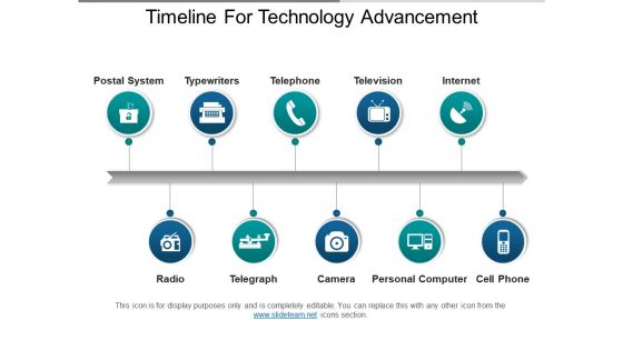
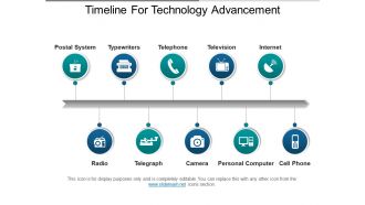
Graphically represent the evolution of technological development with our timeline for technology advancement PPT slide. It allows you to define the growth of your business through the implementation of advanced technology. Thus, use this technology timeline PPT diagram to define the roadmap of inventiveness in your business communication channel. You can describe how the communication mode has been developed over the years from the postal system till the advanced internet mode with this business technology timeline PPT slide design. In the same manner, this PPT image can be used for describing the other changes in to your business model with the new technological inventions. Such as the invention of typewriters to the laptops, the change from the telegraph to the mobile phones and more. You can likewise signify the importance of such changes to your business with this technology roadmap PowerPoint layout. Thus, simply download and start working over this immense PowerPoint image now. Have the best available to you with our Timeline For Technology Advancement Powerpoint Shapes. Get to chose from an excellent array.
People who downloaded this PowerPoint presentation also viewed the following :
Timeline for technology advancement powerpoint shapes with all 5 slides:
Accept the bet with our Timeline For Technology Advancement Powerpoint Shapes. The chances will be greatly in your favor.
FAQs for Timeline for technology
Okay so first thing - you need clear milestones and realistic deadlines, plus figure out which tasks depend on others. Assign owners to everything so there's no "I thought you were doing that" drama later. Build in buffer time because something always goes wrong (learned this the hard way). Visual markers for big deliverables help tons. Oh, and don't skip the progress tracking stuff and regular check-ins. If you've got external people involved, throw in some approval stages too. Honestly once you nail these basics, you can tweak everything else based on whatever project you're running.
Honestly, timeline templates are lifesavers. You get this visual roadmap showing what happens when, which helps you catch those "oh crap, we can't do X until Y is finished" situations early. Your team stays on the same page about deadlines too. Stakeholders eat this stuff up - they can see progress at a glance instead of wading through boring status reports. The trick is starting with your big milestones first, then working backwards to fill in all the smaller tasks. Trust me, you'll spot bottlenecks way before they become actual problems.
Dude, visual timelines are a game changer. Your audience can actually see how everything connects instead of zoning out during another bullet point marathon. I swear people's eyes just glaze over with those. Timelines work great for project updates or walking through any process really. Plus our brains just process visuals way faster than text - people will remember your stuff better. They keep you on track too so you don't end up rambling about random details. Honestly, try it for your next presentation and watch how much more engaged everyone stays.
Yeah so companies totally adapt these timeline templates to fit what they actually do. Healthcare has ones for patient treatment and clinical trials - super strict compliance stuff. Construction teams are obsessed with Gantt charts for project phases and permits (honestly they go overboard sometimes). Marketing uses them for campaign launches and content calendars. Legal firms track case milestones and court deadlines. Each industry just builds in their own approval processes and critical dates. I'd grab a template from your field first, then modify it from there.
Lucidchart and Canva are solid picks for timeline templates - super user-friendly with tons of customization. PowerPoint's actually way more flexible than people give it credit for if you're already using it. Google Sheets works fine for basic timelines too, which sounds weird but trust me on this one. Notion has cool database timeline features if your team's into that platform. Really depends on whether you need multiple people collaborating and how polished you want it to look. I'd honestly just start with whatever software you already have before buying anything new - might surprise you what you can pull off.
Honestly, just match the timeline to who you're showing it to. Executives want the big picture stuff - major milestones, not every tiny task. But project teams? They need all the details and deadlines so nobody's confused about what they're doing. Visual people love the templates with colors and icons (makes everything pop). Interactive ones are actually pretty awesome for meetings - people get weirdly excited about clicking through things, which somehow keeps them awake lol. Quick tip though: always preview it first. If you can't read it easily, they definitely can't.
Stick with clean, high-contrast colors - navy and white work great, or dark gray with bright accents for key stuff. I swear, rainbow timelines are the worst and just make my head hurt! Go horizontal since that's how we naturally read, but vertical's actually perfect for mobile. Oh, and when you've got a ton of details to cram in. Space your events consistently. Make sure fonts stay readable when scaled down. Here's something I learned the hard way - always check how it prints in black and white first! Saved me from so many disasters.
Honestly, timeline templates are a game-changer for presenting complex stuff. You know how overwhelming it gets when you're trying to explain a messy historical event or complicated case study? Timelines let you break everything into bite-sized pieces people can actually follow. Major dates, turning points, cause-and-effect - it all becomes way clearer visually. Your audience starts seeing patterns they'd totally miss in a regular presentation. I always sketch out the big milestones first, then add the smaller details. Way better than dumping a massive wall of text on people and watching their eyes glaze over.
Honestly, visual hierarchy is everything here. Use contrasting colors for different phases and throw in some icons to break up all that text. Your biggest milestones need to really stand out - make them impossible to miss. Don't cram everything together either, white space actually helps people follow along. Oh, and instead of just listing dates, add little "why this matters" notes for the key stuff. Nobody wants to read a boring timeline, right? The whole point is making it engaging enough that people actually read instead of just scrolling past. Test it on a coworker first - see where their eyes naturally go.
So there's tons of cool stuff you can do! Clickable events that expand with more details work great. Hover effects are nice too - they highlight different periods when you mouse over them. Most tools let you embed videos or images right in there, which honestly makes everything way more engaging. Oh and linking to external pages is clutch for when people want to dig deeper. Filtering by categories is super useful, especially if your timeline gets crazy long. Zoom features help too. Just don't go nuts with it - pick like 2 or 3 things that'll actually help your users instead of throwing everything at the wall.
Ugh, don't cram everything into tiny boxes - nobody wants to squint at your timeline! Keep it scannable so people get the main flow right away. Leave buffer time too because literally everything takes way longer than expected (learned this the hard way). Clean design matters - consistent colors and spacing make a huge difference. Also check that your milestones actually make sense together and aren't impossible to hit. Honestly, the best thing you can do is show it to someone else first. They'll spot confusing stuff you missed.
Set up different sections or swimlanes for each timeline - so like one row for development, another for marketing, etc. Color coding is your best friend here, seriously makes everything so much clearer at a glance. The main thing is making sure you can see how the timelines connect and depend on each other. When something gets delayed (and it will), you need to spot what else gets screwed up immediately. I'd start with your big workstreams first, then fill in the details after. Oh and it definitely gets chaotic without proper structure - learned that the hard way on my last project!
Okay so timeline templates are basically lifesavers when you're trying to tell any kind of story. They keep everything chronological so people don't get lost - you know how annoying it is when someone's jumping around randomly? Maps out your key events and turning points too. I swear they're magic for catching pacing issues or weird gaps in your story. Even something super basic like beginning/middle/end makes such a difference. Your narrative will flow way better and actually make sense to follow. Honestly wish I'd started using them sooner!
So for education timelines, I'd definitely break complex stuff into smaller chunks with clear milestones - makes it way less overwhelming. Interactive bits help too, like checkboxes for readings or due dates. Visual cues are honestly a game changer - different colors for subjects or little icons for activity types. Students can scan it quickly but still see how everything connects. Oh, and here's what works for me: start with your big assessments and work backward. That way you don't end up cramming everything at the end. Then just fill in all the supporting activities around those anchor points.
Interactive timelines are huge right now - you can zoom in, filter stuff, actually explore the data. Mobile layouts are finally getting better too. Those awful horizontal scrollers that nobody could read on their phone? Pretty much dead, which is honestly about time. Visual storytelling is everywhere now with embedded videos, smooth animations, color coding that actually makes sense. Oh, and real-time editing is basically expected - your whole team can jump in and update project timelines at once. Definitely worth looking at newer tools if you're presenting to stakeholders who want that slick, interactive feel.
-
Professional and unique presentations.
-
Commendable slides with attractive designs. Extremely pleased with the fact that they are easy to modify. Great work!