

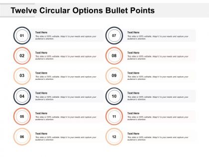
Twelve circular options bullet points





Try Before you Buy Download Free Sample Product
 Impress Your
 Audience
 100%
100% Editable
 Save Hours
 of Time


Concentrate on critical aspects with our Twelve Circular Options Bullet Points. It helps focus on important features.
People who downloaded this PowerPoint presentation also viewed the following :
Twelve circular options bullet points with all 5 slides:
Appear confident and assured with our PTS. Display an exceptional degree of awareness.
FAQs for Twelve circular
Oh, those round bullet points? They're way more interactive than regular ones - like mini buttons basically. Most have hover effects or little animations that make them feel clickable. Your eye follows circles more naturally than sharp shapes too, which is why they work so well for step-by-step guides. I've noticed people actually click through lists more when you use them instead of boring static dots. Honestly, it's such a simple switch but makes everything look more polished. Perfect for any list where you want users to actually engage with the content instead of just skimming past it.
Honestly, circular bullet points are way better than those harsh square ones. People's eyes just glide around them more naturally - it's weird but it works. The whole presentation feels less like a boring corporate meeting and more like... I dunno, an actual conversation? I've noticed audiences don't zone out as much when I use them. They're just friendlier somehow. Works best for your main takeaways or action items though - wouldn't use them for super technical stuff. You'll definitely see people following along better instead of mentally checking their phones halfway through.
Use circular bullets when your points are all equal - no hierarchy needed. Perfect for features, benefits, or random steps. The biggest mistake I see? People using them for numbered processes (seriously, just use numbers!). They work great for brainstorming dumps, menu items, anything where order doesn't matter. I actually prefer them over those boxy square bullets - feels less aggressive somehow. Just double-check that your content really is non-sequential first, or you'll leave readers wondering what's most important.
Honestly, circular bullets are such a game changer. Your slides instantly look more polished than the boring square ones everyone uses. There's something about round shapes that feels friendlier too - like your presentation isn't trying to attack people lol. The eye flows better when scanning through circular bullet points versus those harsh angular ones. Plus they help with spacing and alignment, which makes everything look cleaner overall. I started using them a few months ago and people always comment that my decks look more "professional" even though it's literally just changing the bullet style. Try it next time!
Honestly, Canva's your best friend for this - their circle tools are dead simple and you can bang something out super fast. PowerPoint works too if you're already in there doing presentation stuff. Figma's solid if you want more control over the design, but it's got a bit of a learning curve. Adobe Illustrator is probably overkill unless you're already using it for other projects (that subscription fee though, ugh). I'd just start with Canva since it's free and has templates. You can always export and tweak it somewhere else if you need to get fancy with the spacing later.
Honestly? Skip the circular bullets for technical stuff. They eat up way too much space and make everything look messy - I've seen reports that looked like someone went wild with PowerPoint templates lol. Standard bullets just look more professional, especially for financial docs or legal stuff where you want that clean, serious vibe. Plus screen readers can't tell the difference anyway, so you're not helping accessibility. Some companies actually ban them in their style guides. Save circles for creative presentations or those random internal memos nobody really reads.
Oh, circular bullets are perfect for this! They make everything look equal - no ranking or order implied, which is nice when all your points matter the same amount. I always use them to chunk down heavy info so people don't get overwhelmed by giant text blocks (honestly, who reads those anymore?). Keep each bullet focused on just one idea, and group them under clear headings if you've got a lot. Makes it way easier to scan. They're also great when you're listing different solutions to something - doesn't make one seem better than another, you know?
Okay so this is actually pretty cool - circular bullet points make your content feel way less harsh than those sharp square ones. Our brains process round shapes faster because we're evolutionarily wired to see them as "safer" (random, right?). But it works! People feel more relaxed reading your stuff, which means they'll actually remember it better. Plus circles create this smooth visual flow down your list instead of those jarring stops you get with squares. Honestly, I started using them for anything important and noticed people engage more. Give it a shot next time you want someone to actually read through your whole list.
Colors are seriously a game-changer for bullet points! Contrast is your best friend - use bright accent colors for the stuff that really matters, then keep everything else neutral. I always go for like 2-3 colors max because more than that gets messy fast. Warm colors (reds, oranges) work great for urgent points, cool ones (blues, greens) for background info. Oh and definitely check how your colors look on whatever screen you'll actually be presenting on - learned that one the hard way! Brand colors are clutch if it's an external presentation too.
Tech companies absolutely love these things - they're always showing off complex workflows. Healthcare and education use them tons too for illustrating cycles. Manufacturing's big on them for production processes. Honestly, once I started using circular bullets, regular ones felt so... flat? Financial services jumped on them for customer journey mapping. Marketing agencies can't get enough of them for feedback loops. Oh, and project management people are obsessed. Try swapping them into your next process doc - I bet you'll spot at least three places where they just work better than basic bullets.
Oh dude, those circular bullets are actually killing your flow! Your audience can't tell what's most important when everything looks identical. It's like when you stare at a wall of text and your brain just... gives up? People waste mental energy figuring out where to look first instead of listening to you. I made this mistake in a client presentation once - learned the hard way. Switch to numbers or mix up your bullet styles. Creates way better visual rhythm that'll match how you're actually talking.
Don't go crazy with them - that's the main thing. Circular bullets work great for quick lists where everything's equally important, but they're terrible for long explanations or when you need to show priority (just use numbers for that stuff). Oh, and never mix bullet styles in one document - looks super unprofessional. Try to keep your bullet points roughly the same length too. Like, if one's a quick phrase and another's practically a paragraph, it just looks weird. I'd stick to maybe 5 or 6 items max per list, otherwise people's eyes glaze over.
Oh, this is actually pretty straightforward! First thing - use proper HTML lists (`
- ` and `
- `) instead of just making things look like bullets with CSS. Screen readers need that structure to work properly. Make sure there's enough contrast between your bullets and the background too. Those super light gray trendy ones? Half your users probably can't even see them. If the bullets mean something specific (not just decoration), throw in some alt text or aria-labels. And honestly, just test it with an actual screen reader before you launch - or at least run it through one of those accessibility checker tools.
So you need visual and verbal bridges to connect those circular bullet points. Reference the previous point when you start the next one - "building on that" or "which brings us full circle to..." works great. Your audience will totally get lost if you just bounce around randomly (honestly, circular presentations can be tricky even when done well). Hand gestures should follow that circular flow too. Pause between transitions so people can actually process each point. The whole thing needs to feel intentional, not like you're just confusing everyone. Definitely practice those transitions out loud first - they'll sound way more natural.
Match your bullet points to whatever color palette you're already using - that's like the biggest thing. Make sure the circle size actually works with your text hierarchy too. I always see designs where someone just threw circles in there without thinking about spacing or how they look next to buttons and other stuff. Honestly drives me crazy! Create a few different sizes in your design system first. Test them out with your other UI elements. Short version: treat them like they belong with everything else, not some random add-on you stuck in last minute.
No Reviews