


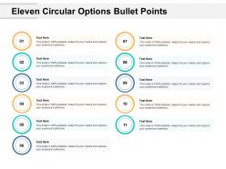
Eleven circular options bullet points






Try Before you Buy Download Free Sample Product
 Impress Your
Audience
 100%
Editable
 Save Hours
of Time


Establish communication between groups with our Eleven Circular Options Bullet Points. It helps connect the clusters.
People who downloaded this PowerPoint presentation also viewed the following :
Eleven circular options bullet points with all 5 slides:
Gain intercontinental access with our Eleven Circular Options Bullet Points. Impress folks around the globe.


FAQs for Eleven circular
Keep bullets short - like 5-7 words tops. Start with action words when you can and make sure each one covers just one idea. People's attention spans are terrible these days, so if there's a wall of text they'll just check out completely. I always read mine out loud to see if they sound weird when I'm actually presenting. Make sure your font's big enough that people in the back can read it (learned that one the hard way). Keep the formatting consistent too - same bullet style, same font size, all that stuff. Sometimes you'll need a few extra words for context, but honestly most people cram way too much text on slides.
Honestly, bullet points are a game changer because they chop up all that dense info into bite-sized pieces. Your brain doesn't have to work overtime trying to parse through walls of text. I literally use them for everything now - work emails, grocery lists, you name it. Each bullet forces you to get straight to the point, which makes everything clearer. People can scan and grab what they actually need instead of hunting through paragraphs. Next time you're writing something complicated, try switching to bullets. It's wild how much easier it becomes to follow.
Oh man, the worst thing you can do is mix formats - like having one bullet that's a full sentence and another that's just "Cost savings." Pick a style and stick with it. Also, people love writing entire paragraphs as single bullets, which defeats the whole point. Keep each one focused on just one thing. Make sure they all start similarly too - either all action words or all nouns, whatever works. And honestly? If you only have one bullet point, just write a normal sentence instead. Looks weird otherwise. I'd say 3-7 bullets max before people's eyes glaze over.
So for bullet points, you'll want to start each one the same way - like all action verbs or all nouns. Keep the formatting consistent too (same punctuation, tense, length). I swear this is one of my biggest pet peeves when people don't do it! Each bullet should be one clear idea that makes sense on its own. Stick to sentence fragments instead of full sentences - way easier to scan. Don't go crazy with too many bullets, maybe 5-7 max. Put your best point first obviously. Pro tip: read it out loud and see if it sounds awkward.
Honestly, stick to 6-8 words max per bullet point. Maybe even shorter if you can swing it. Nobody wants to squint at paragraphs while you're talking - trust me on this one. I bombed so many early presentations because people would just zone out reading my novels disguised as slides. Here's the thing: bullets should be like headlines, not complete thoughts. Save the juicy details for what you actually say out loud. My quick test? If I can't read it in one glance, it's getting chopped. Your audience will thank you for it.
Bullet points are honestly perfect for visual storytelling. They chop up complex stories into bite-sized pieces people can actually follow. Each bullet becomes like a stepping stone - moving your plot forward without overwhelming anyone. I've sat through way too many presentations where massive text blocks just murdered the whole vibe. Use bullets to highlight key plot points, character stuff, or how events connect to each other. The spacing between them gives everyone's brain a breather too. Oh, and definitely pair each one with images or icons if you can - makes the whole story stick way better.
Dude, bullet points are honestly game-changers. They take those scary walls of text and chop them up so people can actually scan through stuff quickly. Nobody has time for giant paragraphs anymore - I sure don't. When you use bullets, readers can grab the main points without their eyes glazing over. It's like giving their brain little rest stops instead of forcing them through a marathon. People naturally think in chunks anyway, so you're just working with how their mind already processes things. Anytime you've got 3+ related points, just bullet them out. Way easier to digest.
Honestly, it's such a weird thing but bullet points hit different depending on where you're presenting. Americans eat that stuff up - we love efficiency. Germans too, they're all about structure. But I learned this the hard way when I was presenting to some Japanese clients... they definitely prefer the whole storytelling, relationship-building thing. Bullet points felt way too blunt. Same goes for a lot of Middle Eastern cultures. Latin Americans can see heavy bullets as kinda cold too. My take? Figure out your audience first and maybe have a story version ready as backup, just in case.
Seriously, bullet points are a game changer. People can actually scan them instead of getting lost in huge blocks of text - which let's be honest, nobody wants to read on a slide anyway. They make you cut the fluff too, so you end up being way more direct. Your slides look cleaner and less scary. I'd stick to like 3-5 bullets max per slide. Keep each one focused on just one thing. Oh and people's brains are wired to follow that structure, so they'll actually pay attention instead of checking their phones.
Put your bullet points right next to the parts of your images they're talking about - or draw little arrows connecting them. Makes such a huge difference! I've seen some infographics where they alternate text blocks with graphics and it looks super clean. Honestly, the worst ones are when the bullets and images feel like they're fighting each other instead of working together. You don't want people bouncing back and forth trying to figure out what goes with what. Maybe sketch it out first? That way you can see if the whole thing flows before you commit to it.
Honestly, bullet points are a game changer for getting people to actually remember your stuff. Our brains just handle lists better than big chunks of text - there's something about the way we process that makes it stick. People can scan quickly and find what they need later too. I mean, when's the last time you wanted to read through a massive paragraph when you could have bullets instead? Never, right? The visual breaks alone make such a difference. If you're trying to explain something important, definitely chop it up into bullets. Your audience will thank you for it.
Okay so for virtual stuff, make your fonts way bigger - screens are honestly terrible compared to projectors. People zone out on video calls like crazy, so cut your bullet points down to almost nothing. In-person you can add more detail since they can actually see your slides and won't mute themselves to grab coffee mid-presentation. Try icons or visuals instead of text walls for virtual. Oh and definitely test everything on the actual platform first - I learned this the hard way when my "readable" slides looked like ants on Zoom.
Ugh yes, bullet points are so boring! I've been swapping them out for icons or emojis lately - way more fun. Grid layouts look super clean too. For anything that's step-by-step, timelines are perfect. Oh and those numbered circles? So much better than regular bullets. I'm weirdly into using checkboxes for to-do stuff - makes everything feel more actionable somehow. You can also connect points with arrows if it's showing a process. Cards with different colors work great in presentations (though maybe don't go crazy with the rainbow thing). Just pick whatever feels right for your content and people will actually read it instead of glazing over.
Yeah, bullet points totally change your rhythm when presenting - but that's actually perfect! Each bullet creates this natural pause where people can actually absorb what you just said. Otherwise you'd barrel through some massive paragraph and half the room would zone out. Plus you can control the flow better. Important stuff? Take your sweet time. Obvious points? Zip right through. Way better than trying to present from a wall of text (trust me on this one). So lean into those pauses and let each point actually sink in.
Definitely prioritize auto-formatting - it'll save you so much time getting consistent bullet styles across slides. Smart indent controls are huge too, makes creating sub-bullets way easier without fighting the spacing. Oh, and animation presets where bullets appear one by one? Game changer for presentations. Honestly, half the headache is just finding software that doesn't make basic formatting a nightmare. Look for ones with bullet libraries so you're not stuck with plain dots forever (there's some pretty cool options out there). My biggest tip? Test the bullet stuff during any free trial. It's one of those features that sounds minor but will absolutely make or break your daily workflow.
No Reviews