

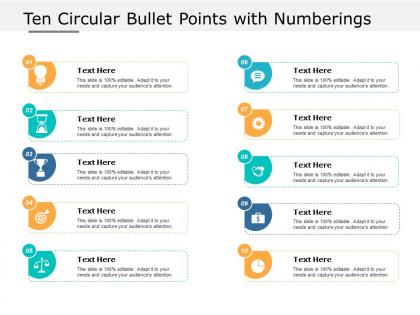
Ten circular bullet points with numberings




Try Before you Buy Download Free Sample Product
 Impress Your
 Audience
 100%
100% Editable
 Save Hours
 of Time


Our Ten Circular Bullet Points With Numberings erase all differences. No gulf is too big for them.
People who downloaded this PowerPoint presentation also viewed the following :
Ten circular bullet points with numberings with all 5 slides:
Take the stand with our Ten Circular Bullet Points With Numberings. Maintain control at the dais.
FAQs for Ten circular bullet
Honestly, circular bullet points just look way cleaner than squares or those weird arrow things. They're softer too - doesn't sound like much but it actually makes your slides feel less harsh. Round bullets work with pretty much any font without looking cluttered. I always use them for client stuff now because they make everything easier to scan quickly. Your audience's eye flows down the slide more naturally too. Might seem like a tiny detail but I swear it makes presentations look more polished overall. Worth trying next time you're putting slides together.
Honestly, circular bullets are a game changer for slides. Your eyes just flow better with curves instead of getting caught on those harsh square edges. It's weird how such a tiny detail makes everything feel more modern and approachable. I started using different sized circles to group ideas too - works surprisingly well. The whole presentation feels less corporate-y? If that makes sense. Try it next time instead of the default bullets and you'll see what I mean. Sometimes the smallest tweaks have the biggest impact on how people perceive your stuff.
Honestly, I use circular bullets when my list doesn't really have a ranking or order to it - stuff like features, benefits, random brainstorming ideas. They're way less harsh than those boxy square ones (which always feel kinda corporate and cold to me). Perfect for creative briefs or anything conversational. If you're trying not to sound super formal or your audience might find traditional bullets too stuffy, go circular. They flow better in presentations too. Just don't force it if your content actually does have a clear hierarchy - that'll look weird.
Start with making the visual hierarchy work - your bullets shouldn't fight with your text for attention. Size them consistently and align them properly with your baseline (seriously, wonky alignment looks so amateur). Give enough space between points so things don't look cramped. Colors need good contrast for accessibility too. The circles should be visible but not massive - there's definitely a sweet spot there. If it's going digital, check how it looks on different screens. Oh, and test it with real content before you finalize anything. Templates always look perfect until you actually use them.
Honestly, circular bullets just look way better than those harsh square ones. The rounded shape is easier on the eyes and doesn't fight with your text. Square bullets? They scream "I used the default template and called it a day." Circles feel more modern and intentional - plus they guide people through your content naturally without that jarring visual bump. I swear, once you pair them with consistent spacing, your whole slide layout immediately looks cleaner. It's such a small change but makes a huge difference in how polished everything appears.
Yeah totally! You can throw images, icons, charts, even little videos in there. Most design tools handle it pretty easily - though honestly, bigger images can get weird with the formatting sometimes. Charts are cool but test them at different sizes first because they can look terrible if you don't. Keep your images simple and high-contrast so they don't get lost. The main thing is just making sure everything fits the circular shape without looking all squished and awkward.
Go with high contrast - dark bullets on light backgrounds or flip it around. You'll need at least 3:1 contrast ratio for accessibility stuff. Navy on white is solid, or charcoal on cream works great too. Don't be like half the people I work with who somehow think light gray on white is visible (seriously?). Saturated colors are your friend - deep red, forest green, royal blue. Skip the pastels. Quick test: squint at your screen. Can you still see the bullets easily? Then you're golden.
Fade-ins work really well for circular bullet points - I usually do like 0.3 seconds with a tiny scale effect (0.8 to 1.0). Don't make them all appear at once though, stagger the timing so people actually follow along. Scale effects and subtle bounces are solid too. Oh, and color transitions can add nice emphasis if you've got key points that need extra attention. Honestly, I've seen way too many presentations where someone goes overboard with animations and it's just... painful to watch. Start simple with basic fades, then add more if it feels right. A gentle pulse effect works sometimes but test it first.
Yeah, circular bullets are perfect for creative stuff - fashion, wellness brands, tech docs, that whole vibe. They're way less harsh than square ones, especially on phones and apps. Honestly, there's something about rounded edges that just feels... nicer? But don't use them for serious business stuff like legal docs or financial reports - you'll look unprofessional. Square bullets have more authority there. I learned this the hard way once. Basically, if you want friendly and approachable, go with circles. If you need to look serious and authoritative, stick with squares.
PowerPoint's honestly your best bet here - Microsoft went crazy with bullet styles and somehow that actually works in our favor. Google Slides is solid too, especially if you're bouncing between devices a lot. If you're on Mac, Keynote's got some nice options but nothing groundbreaking. I'd start with whatever built-in circular bullets they have first. Then you can mess around with custom shapes or import your own designs if you want something fancier. Google Slides is probably easiest for quick stuff since it saves automatically. PowerPoint just has way more variety though.
Honestly, circular bullets are your best bet for presentations. They're super clean and won't fight with your text for attention. I went through this whole phase where I was obsessing over different bullet styles - arrows, squares, you name it. Total waste of time. Circles just let people's eyes move down your list naturally without getting distracted by fancy symbols. Your actual content gets to shine while the bullets do their job quietly. Simple shapes win every time when you want clarity without visual clutter.
Yeah, circles definitely hit different culturally! Western audiences see them as collaborative and inclusive - that whole "unity" vibe. Asian cultures often view them as perfect, eternal cycles. Pretty cool how universal that is, honestly. Some business contexts actually prefer angular shapes though since they scream "structure" and "we mean business." But here's the thing - if you're presenting internationally, circular bullet points are your friend. They're softer than squares or triangles. Just keep them clean and simple, not those fancy decorative ones that make your slides look like a Pinterest board.
Honestly, just swap out those boring black circles for your brand colors - instant upgrade. I usually match them to the primary brand color, or sometimes do a subtle gradient if I'm feeling fancy. Different circle sizes work great for creating hierarchy too. You could also use a tiny version of your logo as bullets, but I'd be careful with that one. Seen it go wrong when people get too creative and it just looks cluttered. The whole point is making things easier to read, not turning your bullets into the main event, you know?
Honestly, most people go overboard with circular bullets - they're perfect for simple lists but turn into a nightmare when you've got complex info with multiple levels. Size matters too. Too tiny and everyone's squinting like they need glasses. Too big? Looks like a kindergarten project, no joke. Pick one size and stick with it throughout your whole presentation. Don't throw in random shapes on the same slide either - it's messy as hell. Oh, and here's something people miss: if you're showing steps that have to happen in order, just use numbers instead. Save circular bullets for stuff that's all equally important. Pro tip: check how your slides look from way in the back.
Definitely get feedback after trying those circular bullets! I'd ask people straight up if the visual flow made sense or just confused them. Honestly, it's hit or miss - some audiences eat up the creative approach while others get totally lost. Watch their faces during your presentation too. Glazed-over looks are a dead giveaway something's not working. Quick surveys afterward or just casual check-ins work great for this. Then tweak based on what you learn. Maybe the design needs simplifying, or you've got too many points, or - let's be real - some crowds just need boring old regular bullets and that's fine.
No Reviews