

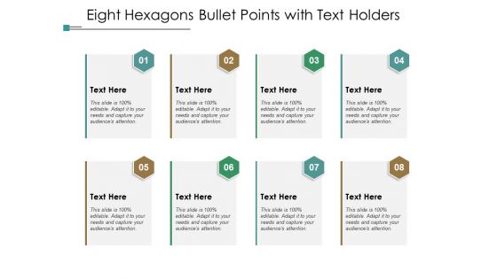
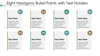
Eight hexagons bullet points with text holders





Try Before you Buy Download Free Sample Product
 Impress Your
 Audience
 100%
100% Editable
 Save Hours
 of Time


Accelerate growth with our Eight Hexagons Bullet Points With Text Holders. Achieve your aims earlier than expected.
People who downloaded this PowerPoint presentation also viewed the following :
Eight hexagons bullet points with text holders with all 5 slides:
Do as you fancy with our Eight Hexagons Bullet Points With Text Holders. They allow you to break out of the cage.

FAQs for Eight hexagons bullet points
Honestly, hexagonal bullet points are such an easy way to make your slides look way more polished. Everyone's stuck using boring circles, so the six-sided shape automatically makes you stand out. They create this nice visual interest without being too distracting – plus they work great for organizing info since you can nest smaller ones inside bigger hexagons. I mean, they're still professional looking but actually memorable. Definitely try them for your next quarterly review (or whatever presentation you've got coming up). Your audience will think you're some design genius, and you barely had to do anything different.
Hexagons are weird enough that people actually stop and look at them. Your brain processes different shapes in different ways, so when you throw hexagons into a presentation instead of boring old circles, it creates this little "pause moment." Kind of like how stop signs aren't circles - there's real psychology behind using distinctive shapes. I've noticed people actually read through bullet lists instead of skimming when you use them. The unusual format makes readers engage more actively with your content. Honestly, swap them into your next deck and you'll see the difference immediately.
Honestly? Hexagonal bullets are great for tech stuff, design presentations, anything innovation-heavy. They give off that sleek, modern vibe that round bullets just can't match. I've seen startups and creative agencies use them really well - especially in portfolios and product launches where you want to look cutting-edge. Perfect when your audience expects something different from the usual PowerPoint snooze-fest. Just double-check your software handles them properly first. Nothing worse than wonky hexagons that look like someone sneezed on your slide deck.
Yeah totally! PowerPoint and those other presentation apps let you swap out bullet styles pretty easily. Just hunt around in the formatting menus for custom bullets or symbols. Honestly the trickiest part is usually getting the spacing to not look weird - templates can be super picky about that stuff. I'd start with just one slide to test it out first. Make sure your hexagons aren't too big or clashing with whatever colors you've got going on. Oh and keep them all the same size or it'll drive you nuts. Should work fine once you get the formatting dialed in!
So with hexagonal bullets, start by getting your sizing consistent - wobbly shapes that don't line up look terrible. The spacing between text and hexagon edges matters way more than you'd think. Too cramped feels claustrophobic, too loose looks disconnected. Pick colors that work with your design but don't overpower everything. Hexagons are already visually heavier than regular bullets, so they can dominate if you're not careful. Oh, and definitely test them at different sizes first. What looks crisp on your screen might turn into a pixelated mess when printed smaller.
Honestly, color choice can make or break those hexagon bullet points. Dark blue on white? Perfect - super readable and grabs attention. But I've literally watched presentations where someone used pale yellow hexagons on white slides and you couldn't see them from the back row. Total disaster. You want colors that match your brand but don't sacrifice contrast for style. Quick test: check how it looks on your phone vs laptop screen. Different lighting will mess with visibility too. Your audience shouldn't have to squint to read your points - that's just annoying for everyone.
I'd go with PowerPoint or Google Slides first - both let you swap regular bullet points for hexagons pretty easily. Just hit the bullet formatting menu and pick "picture bullets," then grab a hexagon from their symbols or upload your own. Keynote works great too if you're on Mac. Canva's probably overkill honestly, but they do have some nice templates with geometric stuff already done. Oh, and definitely keep those hexagons small - learned that the hard way when my slides looked like a hot mess with huge shapes everywhere.
Keep those hexagon animations simple - fade in or slide from one side. Don't do the spinning/bouncing stuff, it's super distracting. I sat through this one presentation where I literally remember more about the rotating graphics than what the guy actually said lol. Timing should be around 0.5-1 seconds each. Make each bullet appear after you've finished the previous point so people aren't watching animations while you're still talking. Practice it a few times to get the pacing right - your content should be the star, not flashy hexagons.
Dude, hexagons are weirdly effective for bullet points. Your brain remembers unusual shapes way better than boring circles - same reason you remember that one house with the bright purple door, you know? The shape catches your eye and makes info stick. I started using them last month and people actually pay attention now. They make your slides look more intentional too, less thrown-together. Honestly didn't expect such a simple swap to work this well, but here we are. Try it for your next presentation's main points.
Honestly, hexagonal bullet points work great for tech companies and creative agencies - they want that modern, innovative vibe. Startups love them too. Regular circles feel so dated now, don't you think? Manufacturing and consulting firms also use them when they're trying to look more forward-thinking. Oh, and they're perfect if you're presenting to younger crowds or just want to ditch the boring corporate look. Architecture firms are surprisingly into them too. Just make sure it actually fits your brand personality - you don't want to force a trendy shape where it looks weird.
Oh there's so many other options! Circles and squares are honestly your safest bet - way more readable than hexagons. For urgent stuff, triangles work really well. Dashes look super clean and minimal (totally trendy right now). Stars are perfect for achievements, and checkmarks for finished tasks - though I'm probably obsessed with checkmarks because they're weirdly satisfying to look at. You want to match whatever style fits your content's vibe. Also your audience matters too. But seriously, when you're unsure? Just go with circles. They never look weird and nobody's gonna judge your formatting choices.
Honestly, hexagonal bullet points are pretty genius for storytelling presentations. The angular shape creates this natural momentum that pulls people forward - way different from those static circles everyone uses. I love using them for problem-solution flows or before-and-after stuff because there's this built-in sense of progression. Each point connects to build toward your main message, you know? Plus they look clean without being distracting. Your audience stays focused on the actual story instead of getting lost in messy slides. Try them next time you're doing narrative arcs - they really work.
Nah, hexagonal bullets won't help with complex data. They look kinda cool, I'll give you that, but your readers are trying to scan info quickly. When they see weird shapes, their brain has to process that first before getting to your actual content. Pretty counterproductive if you think about it. Regular circles or squares work way better since people are used to them. Instead of getting fancy with bullet shapes, focus on organizing your info logically and keeping everything consistent. That's what'll actually make complex data easier to digest.
Honestly, less is more with hexagon colors - stick to 2-3 max or it gets chaotic real quick. Give them breathing room with white space too. I've definitely made the mistake of cramming them together and it looked terrible. Make sure they actually contrast with your background (sounds obvious but you'd be surprised). Alignment is huge - wonky hexagons scream amateur hour. Oh, and size them based on your text importance. Try subtle shadows for depth without going overboard. Trust me, rainbow hexagons are tempting but they'll hurt your eyes after like 30 seconds.
Honestly, keep those hex bullet points super short - like 3-7 words tops. Each one should be one clear idea that people can grab instantly. I learned this the hard way after making mine way too wordy once and they looked terrible. Think of them more like mini headlines than actual sentences. You'll want to arrange them in some logical order - maybe by importance or just group similar stuff together. Oh, and try to keep the structure consistent, like all starting with action words. Here's a weird tip that actually works: read them out loud before you finalize anything. The rhythm will tell you if something's off.
No Reviews