


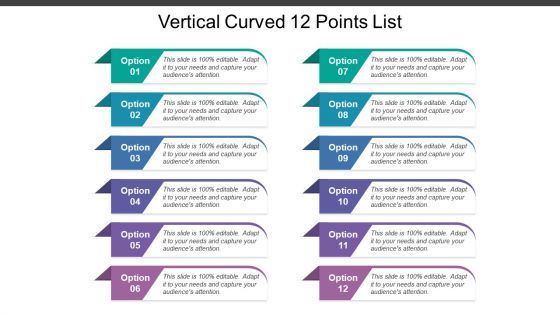
Vertical curved 12 points list


Try Before you Buy Download Free Sample Product
 Impress Your
 Audience
Editable
of Time


Welcome to one of our rigorous prepared collection of PowerPoint presentation designs. Vertical curved 12 points list is your way to your business acknowledgment. Shown colorful and sharp designs are all set to take you by surprise. This diligently made compilation of relevant icons will be very decisive to make you understand the fundamentals of a well-off business. This diagram template contains the concept of important tasks and knows the key points. Use this diagram template for business and data associated presentations. A very simple yet powerful design created for the motive of expressing your ideas technology and vertical blocked list, through a minimal design. Cease your search and be proactive to download and prepare your presentation essentials beforehand to overcome challenges. Insist on examining every detail with our Vertical Curved 12 Points List. Be able to investigate complex issues.
People who downloaded this PowerPoint presentation also viewed the following :
Vertical curved 12 points list with all 5 slides:
Give a boost to financial activity with our Vertical Curved 12 Points List. They create business enthusiasm.


FAQs for Vertical curved
Honestly, curved designs just flow better than those rigid straight-line slides everyone defaults to. Your audience's eyes naturally follow the curves instead of jumping around randomly. It's weird how much more engaging it feels - like you're not just staring at another boring corporate presentation. Short attention spans love the visual rhythm curves create. Dense info becomes way more digestible too. I started throwing curved dividers and flowing graphics into my decks last month and people actually stay awake now. Give it a shot next time you're building something.
Dude, curves are like magic for web design. Your eye just flows along them naturally - way better than boring straight lines everywhere. There's something about the movement that keeps people scrolling because they're curious what's coming next. It's probably some weird brain thing, but curved elements feel more human and comfortable too. Just don't go overboard with it! Gentle arcs work best. You want people gliding through your site, not getting motion sickness from crazy swoops everywhere. Keep it subtle and you'll see users stick around longer.
Honestly, tech and healthcare companies get the most out of vertical curved designs - they're always drowning in data that needs to flow logically. Finance too, obviously. The curve thing just makes complex info easier to follow than those awful bullet point slides everyone hates. Architecture firms love this approach since they already think in 3D anyway. Oh, and consulting - they eat this stuff up. Basically any industry with processes or timelines benefits. I mean, think about it - curves guide your eye naturally instead of making people hunt for what's next. You should definitely try it for multi-step presentations.
So vertical curves are actually pretty cool - they guide people's eyes down your page like a natural flow. Kind of mimics how we scan stuff anyway, you know? Makes it way easier for people to follow without getting mentally tired. The curves give you this nice rhythm and space that straight lines just... don't. There's something warmer about them too. I've been using gentle S-curves and arc transitions lately (honestly took me forever to get them right), but the time people spend on pages definitely goes up. Worth trying for sure.
Honestly, Rhino's your best bet for those curved designs - handles complex geometry like a champ. SketchUp Pro works too if you're more comfortable with that interface. Civil 3D is great for technical roadway work but might be way more than you need for presentations. For the sexy renderings, Lumion or Twinmotion will make your elevation changes look incredible. Clients eat that stuff up. Oh, and if you really want to get fancy, After Effects can add some nice motion graphics on top. My usual workflow? Model in Rhino first, then throw it into Lumion for rendering. That combo hasn't failed me yet.
So basically those vertical curves help move people's eyes down your page naturally, which pairs really well with horizontal layouts. It's like - all those straight lines and boxes can get super rigid looking? The curves break that up and add some flow. You get this cool contrast where your horizontal sections give structure but the curves make everything feel more elegant. Plus they're great for separating content without those harsh divider lines. I'd start simple though - maybe try curved sidebars with your regular grid first and see how it feels.
Don't go overboard with aggressive curves - that's the fastest way to make people sick. Test everything early because smooth animations in Figma can feel awful on actual devices. Performance matters too, especially on crappy phones. Here's the thing - curves need a purpose beyond looking cool. Guide the user's eye or show how elements connect. I always start subtle and ramp up based on testing. Oh, and frame rates will tank if you get too fancy with complex animations. Better to dial it back than have users bouncing off your site feeling queasy.
Curves are perfect for color theory! The natural flow lets you create these amazing visual journeys up and down the design. I'd put your main color at the focal points, then use analogous or complementary colors to follow those curves - way more organic than geometric shapes. Lighter values at the top give you that lifting effect, darker ones ground everything. Honestly, curves do half the heavy lifting for you. One thing though - definitely sketch your color flow on paper first. Trust me, you'll avoid so many digital revisions later. The eye just follows those transitions naturally.
Okay so curved typography is honestly harder than people think! You need fonts that bend without looking like garbage. Sans-serif works way better than serif - cleaner lines when you're warping text. Letter spacing becomes super important too, otherwise everything bunches up weird or gets too stretched out. Bold, simple fonts are your best friend when you're starting out. I always test mine at different curve levels to see what actually looks readable. Oh and maintaining text hierarchy while following curves? That's the real challenge. Once you get comfortable with basic fonts, then you can mess around with fancier ones.
Curved designs are actually perfect for this - they guide your eye naturally through different sections without that jarring jump between ideas. Think of it like a visual roadmap. Ascending curves work great for showing growth or progress, while downward ones help you break complex stuff into smaller pieces. Each curve should represent one clear concept, otherwise people get lost. I'd sketch out your info hierarchy first, then figure out how to map it onto the curves. It's way more intuitive than straight layouts because your brain already processes things this way. Makes the whole thing feel less overwhelming, you know?
Dude, curved designs are *everywhere* in good tech presentations. Apple does those flowing product reveals, Tesla has those clean curved timelines. Your eye just follows them naturally down the page. Airbnb's pitch decks are incredible - they use these soft S-curves to connect data points and it looks so smooth. Netflix does something similar with their progress bars and user journey stuff. The trick is making curves feel purposeful, not just thrown in there for looks. Maybe try connecting related info with subtle arcs? Or use gentle transitions between your main sections. Works way better than sharp angles honestly.
You know how good conversations have natural ups and downs? That's exactly what vertical curves do for presentations. Build up to your big moments, then give people a second to breathe and actually absorb what you just said. I honestly think this works way better than just hitting them with nonstop intensity - our brains need those little breaks. Map out your next presentation's energy levels and you'll spot where to add these curves. The whole thing starts feeling more like how we naturally pay attention instead of this overwhelming wall of information.
Okay so there's this whole curved slide thing happening right now that's actually pretty cool. Instead of boring straight lines, people are doing these flowing layouts that pull your eye down - like Instagram stories but for presentations. The animations between sections are way smoother now too. PowerPoint and Figma make it super easy to add curved dividers or those circular progress bars. Honestly breaks up all the boxy corporate stuff we're used to. I'm kind of obsessed with how dynamic it looks compared to old-school linear decks. You should totally try some curved pathways in your next presentation.
Honestly, vertical curves are a game-changer for making designs more accessible. They create this smooth visual flow that's way easier on the eyes than harsh angles. People with dyslexia especially benefit because curved lines don't cause as much visual stress. I've noticed they make layouts feel less intimidating too - more welcoming somehow. The curves give content room to breathe and help establish reading hierarchies naturally. Everyone can navigate better when there's that gentle guidance. Next time you're designing something, try adding subtle S-curves or gentle arcs. You'll probably be surprised how much softer everything feels.
Think of vertical curves as connectors, not the main show. Map out your key focal points first, then let curves guide people's eyes between them. Don't go overboard though - I made that mistake once and it looked like a hot mess with all the competing angles. Your curve thickness should vibe with your fonts and spacing. Gentle curves feel friendly, sharper ones are more dramatic. Here's the annoying part: test them against your grid system early on. Trust me on this one. Also double-check how they look on mobile - curves can get weird on smaller screens.
-
Very good collection of templates
-
Great quality product.
-
Visually stunning presentation, love the content.