


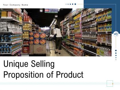
Unique selling proposition of product powerpoint presentation slides


Try Before you Buy Download Free Sample Product
 Impress Your
 Audience
Editable
of Time


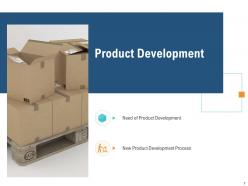
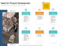
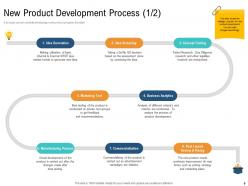
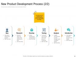
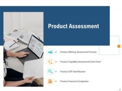
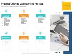
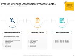
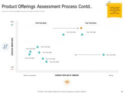
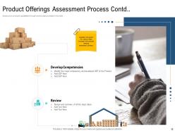
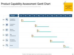
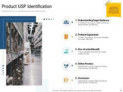
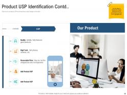
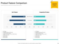
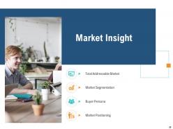
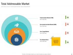
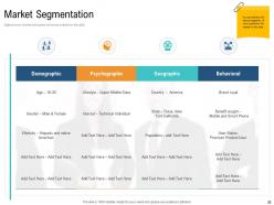
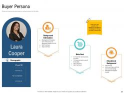
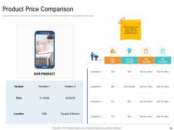
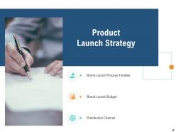
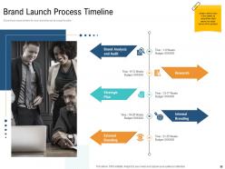
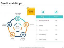
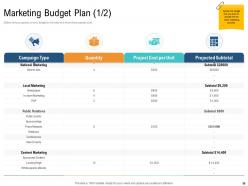
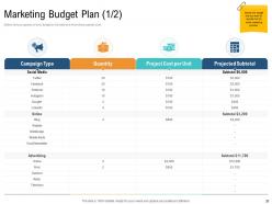
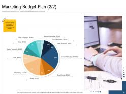
Presenting our content-ready Unique Selling Proposition Of Product PowerPoint Presentation Slides that will help to build an effective market plan. Characterize the features and deliverable of the product with the help of easy-to-use PowerPoint layouts. Display the need for product development along with its process with the help of aesthetically pleasing PPT visuals. The unique value proposition PPT slides also present the product offering assessment process, Gantt chart, USP identification, and features comparison. Steps to develop the USP of the product can be easily explained with these ready-to-use PowerPoint templates. These PPT slides will also help create the budget that you want to allocate for the entire marketing process. Take advantage of our visually appealing unique selling point PowerPoint themes to compare and contrast your product with the competitors. Information on the total addressable market, segmentation, buyer persona, segmentation, and market share can also be provided with the help of these creative PPT visuals. Hence grab this stunning presentation without any further delay.
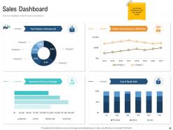
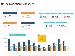
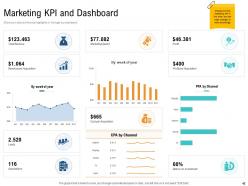
People who downloaded this PowerPoint presentation also viewed the following :
Unique selling proposition of product powerpoint presentation slides with all 56 slides:
Use our Unique Selling Proposition Of Product Powerpoint Presentation Slides to effectively help you save your valuable time. They are readymade to fit into any presentation structure.
FAQs for Unique selling proposition of product
Okay so three things matter here: your design style, what problem you're actually solving, and why someone wouldn't just grab a free Canva template instead. First, get specific about your aesthetic - minimalist, data-heavy, whatever makes your stuff recognizable. Then nail the pain point you're fixing. "Saves design time" is good, but "turns boring quarterly reports into something people actually read" is better. Here's what kills me though - so many creators totally skip explaining their differentiator! Maybe it's your finance background, or everything's pre-animated, or they're just stupidly easy to customize. Quick test: would YOU pay for these over free options based on your pitch?
Look, your USP needs to solve something specific that actually bugs people. Instead of saying "professional designs" (yawn), try something like "templates that don't break when you add real content" or "slides that work for people who aren't designers." Honestly, I've downloaded so many templates that looked great online but turned into a mess the second I touched them. That's the kind of pain point you want to hit. Pick one clear benefit and stick with it everywhere. There's way too much generic stuff out there already - you need something that makes people go "finally, someone gets it."
Honestly, customer feedback is where the magic happens for figuring out your USP. I learned this the hard way after years of just guessing what people wanted (spoiler: I was usually wrong). Send a quick survey to your current users asking why they picked your templates over competitors - that's pure gold right there. You can also dig through competitor reviews to see what people are complaining about. The feedback shows whether your audience actually cares about design flexibility, saving time, or maybe industry-specific stuff. It's wild how different their priorities can be from what you'd expect.
Put your USP right at the top where nobody can miss it - bold fonts, eye-catching visuals, the whole thing. Don't make the mistake I see everywhere and hide it on page two of your about section. Weave it through everything instead. Your colors, fonts, buttons, even contact forms should scream what makes you different. Honestly, if someone can't figure out your unique value in like 5 seconds, you've already lost them. Make it obvious from the second they land on your page. Everything should work together to tell that same story.
Honestly, most people just make their USP way too boring and generic. Like "we have great customer service" - okay, and? Everyone claims that. Focus on benefits, not features nobody cares about. Another huge mistake is trying to please literally everyone instead of speaking to your actual target customers. Makes you totally forgettable. And don't get me started on the corporate jargon - just say what you mean in plain English. Pick the ONE thing that actually sets you apart and explain why it matters to people. That's it.
Look, nobody wants to sit through another boring slide deck. Stories change everything though - suddenly your templates aren't just "customizable" but they're helping actual people transform their messy drafts into killer presentations. Think Netflix vs instruction manual, you know? People remember stories way better than feature lists anyway. Show that client journey from disaster to success. Honestly, even one good transformation story baked into your descriptions will make your templates stick in people's heads. Way more effective than just listing what they can do.
Okay so look at how the big players do it. Canva's whole thing is "design for people who can't design" - brilliant honestly. Beautiful.ai does the AI angle where stuff automatically looks good as you add content. Slidebean went super niche with startup pitch decks specifically. Gamma's interesting because they don't just design your slides, they'll write the content too (which is kinda wild if you think about it). Point is, none of them just say "hey we have templates." They're fixing real problems - like you suck at design, you're drowning in work, or you need industry-specific stuff. Find your angle and commit hard.
Honestly, a solid USP changes everything for your template marketing. You stop trying to please everyone and actually connect with people who need what you've got. Say your templates are built for startup pitches - talk about features entrepreneurs care about, not just "professional designs" like every other seller out there. It's way more compelling that way. Short sentences hit different too. Your messaging becomes sharper, you'll attract customers who actually get why you're better than the competition, and - this is key - you won't blend into the noise. Figure out what your templates do that others can't, then make that the center of everything you write.
Mix surveys with actual conversations - that's where you'll find the real insights. Analytics give you the numbers, but customer interviews are honestly way more valuable than most people think. Social listening helps too, plus don't forget checking what your competitors are missing. I'd also throw in some user testing if you can swing it. The whole point is getting data from different angles so you're not just guessing. Oh and here's the thing - pick like 2-3 methods max and actually do them instead of overthinking it forever.
Look, I'd check your USP every 3-6 months - or right away if something big shifts in your market. Most people just set it once and never touch it again (huge mistake). Your audience changes, new competitors pop up, your own stuff evolves. When presentations start feeling meh or people aren't engaging like before? That's your wake-up call. Honestly, I just put a quarterly reminder in my calendar because otherwise I'd totally forget. Ask yourself: "Is this still what makes us stand out?" Simple but it works.
Dude, a solid USP is everything for keeping customers in the template game. People need a reason to stick with you instead of wandering off to browse the million other options out there. Maybe it's your sick design style, niche industry layouts, or those smooth animations - whatever it is, make it obvious. The market's crazy saturated right now, honestly. Your USP becomes their go-to thought: "oh yeah, these guys actually understand what I'm after." I'd focus hard on getting that difference crystal clear in how you talk about your stuff and what you're building.
Focus on the transformation your templates create - like "Turn boring presentations into career-defining moments" instead of just listing features. Think about your audience's pain points: deadline stress, fear of looking unprofessional, wanting to impress their boss. We've all suffered through terrible slide decks, right? Position your templates as the solution that makes them feel confident and successful. Power words work great here - "effortless," "impressive," "game-changing." The whole point is connecting what your product does to how people actually want to feel when they're using it. That's where the magic happens.
Make your USP super scannable - bold headlines, good contrast, lots of white space. Simple icons help too. Honestly, I see way too many designs where the main message gets completely lost in visual chaos. It's frustrating! Keep everything else minimal so your unique value prop stands out. Use visual hierarchy that guides eyes straight to what makes you different. Here's a quick test: show someone your design for 3 seconds. Can't remember your main benefit? Time to simplify. Short sentences work. So do longer ones that actually flow naturally when you read them.
Look, you gotta keep your USP current or you're toast. Remote work blew up and suddenly template companies couldn't just sell "pretty designs" anymore - they had to pivot to "works great for remote teams" or whatever. Now it's all about AI integration. Honestly, it's kinda ridiculous how fast things change, but that's business I guess. You can't be pushing last year's solutions when your audience has completely different problems now. Watch what pain points your competitors are tackling and adjust accordingly. Nobody wants to hear about features that don't solve their actual headaches.
Conversion rate is what you really want to watch - from landing page all the way to checkout. That tells you if people actually care about what makes you different. I'd also check your ad click-through rates when you're pushing that USP messaging. Bounce rate's pretty revealing too since people bail quick if they're not feeling it. Time on product pages matters, and honestly your customer acquisition cost will show if it's working. Oh, and don't ignore the feedback you're getting - reviews where customers mention those unique benefits you're pushing. Run some A/B tests with different USP headlines to see what hits. But yeah, start with conversion rate first.
-
Great designs, really helpful.
-
Unique design & color.
-
Great designs, really helpful.
-
Design layout is very impressive.
-
Excellent design and quick turnaround.
-
Informative design.
-
Thanks for all your great templates they have saved me lots of time and accelerate my presentations. Great product, keep them up!
-
Wonderful templates design to use in business meetings.
-
Innovative and attractive designs.
-
Awesomely designed templates, Easy to understand.