

Upward trend graph template powerpoint graphics




Try Before you Buy Download Free Sample Product
 Impress Your
 Audience
 100%
100% Editable
 Save Hours
 of Time


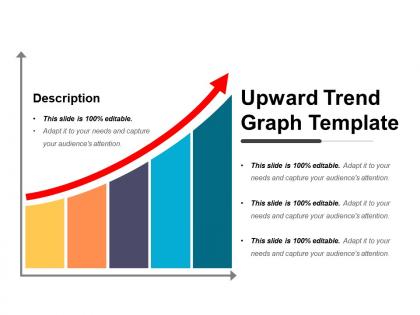
Produce quality presentations by using this upward curves template for PowerPoint because of its stunning visuals. The upward trend graph PPT slide is ideal for representing increasing trends. This slide has an upward slope in different steepness which is useful to display frequencies. The upward growth graph template for PowerPoint is useful for illustrating a linear graph with increasing value. Our upward growth template is a generic design template. A user can use this upward arrow diagram slide for any information that requires an upward trending curve. The five bars in the uptrend graph PPT slide has different heights and steepness so these are useful to describe the different parameters. The upward arrow curve in the upward growth presentation template design symbolizes an increasing pace and it can metaphor concepts related to progress, growth, innovation, and many more. A user can illustrate that the strategy or business is getting stronger by using the uptrend arrow design PowerPoint slide. The business upward trend graph chart slide reflects positive changes in the business. A presenter can also represent the business target which his team has to achieve for betterment of his organization. Our Upward Trend Graph Template Powerpoint Graphics are bound to buck you up. You will begin with a bang.
People who downloaded this PowerPoint presentation also viewed the following :
Upward trend graph template powerpoint graphics with all 5 slides:
Illustrate the journey with our Upward Trend Graph Template Powerpoint Graphics. Display interesting images of different destinations.
FAQs for Upward trend graph
You'll want a solid title first - something that actually tells people what they're looking at. Make your y-axis show the metric with proper units, and keep your x-axis time intervals consistent. Days, months, whatever fits your data best. Definitely add labels to the data points so people aren't squinting trying to figure out the numbers. A trend line helps smooth things out if your data's all over the place. Colors should be simple - I learned this the hard way when my fancy chart looked terrible printed out. Oh, and throw in a quick note about what caused the growth if it's not super obvious.
Honestly, I've messed this up before - color choices will totally make or break your graph. Go for high contrast, like dark blue on white instead of some barely-there gray combo. Green's perfect for upward trends since everyone thinks "growth" when they see it. Multiple data lines? Blues, oranges, and greens play nice together. God, I hate when people use those pretty pastels you can't even read! Your background should be boring so the actual data stands out. Oh, and test it in grayscale first - you'll catch problems before anyone else sees them.
So upward trend graphs are clutch when you've got data that's consistently growing - revenue, user signups, sales numbers, that kind of stuff. Basically anything moving from bottom-left to top-right on your chart. They're money for "look how awesome we're doing" presentations to the boss. You need time-series data with an overall positive trajectory (small dips are fine, nobody grows in a perfect straight line). Just double-check your data actually trends upward first - trust me, nothing's more awkward than forcing an upward template on flat or declining numbers. I learned that one the hard way once!
Upward trend graphs are honestly your best friend for convincing stakeholders. Show them revenue climbing, user growth spiking, market share expanding - boom, instant credibility. Pick your timeframe carefully though. You want that slope looking impressive but not sketchy, you know? Mark the big wins where you hit milestones or launched something major. Here's the thing - don't just throw numbers at them. Explain what actually caused those jumps. Was it a new product? Better marketing? People need to see it's real growth, not some random fluke that'll crash next quarter.
Honestly just start with Excel or Google Sheets - you probably already have them and they work fine for basic trend charts. Canva's surprisingly good if you need it to look nice for a presentation (their templates are actually pretty decent). Power BI and Tableau exist if you want to get fancy with interactive stuff, but that's probably way more than you need right now. I'd mess around with the simple options first. You can always upgrade later if your boss wants something flashier or whatever.
Keep it simple, honestly. Pick 2-3 colors max that won't fight with your data - I swear some charts look like someone dumped Skittles on them. Your trend line needs to pop with good contrast while everything else (gridlines, labels) stays subtle. Don't let the background stuff steal the spotlight. Oh, and test it on someone else first. If they can spot that upward trend right away without squinting or asking questions, you're golden. Sometimes I'll even step back from my screen to see if it still reads clearly.
Ugh, don't mess with your y-axis to make trends look more dramatic - people catch that stuff and it kills your credibility instantly. Too many colors are the worst though. Same with cramped gridlines everywhere. Your trend line needs to be thick enough to actually see, and honestly? Always test with real data first. I've watched people present charts where you literally couldn't read the axis labels. Basic stuff like consistent intervals and data sources matter way more than fancy design elements that just distract from whatever story you're trying to tell.
Callout boxes and arrows are your best friends here - they'll point out the important stuff and explain why things changed. I'm telling you, annotations literally transform a messy chart into something that makes sense! Put them near the big spikes or dips to call out things like product launches or seasonal weirdness. Don't write novels though - keep the text short but actually useful. Oh, and don't go crazy with placement or you'll end up with a cluttered mess. Above or beside the data points usually looks cleanest.
Upward trend graphs are clutch when you're showing growth over time. Revenue going up? User numbers climbing? That's your go-to chart right there. They tell a story way better than boring pie charts or static bar graphs - there's something genuinely satisfying about watching that line climb. I mean, who doesn't love a good "up and to the right" moment? You can even use them for forecasting by extending the trend forward. The psychological impact hits different too. Stakeholders see that steady upward movement and immediately think "success." Perfect for any presentation where growth is your main point.
So basically you're swapping out metrics and tweaking the look to fit each industry. Finance folks want clean lines, maybe green/red coding for stuff like revenue growth or ROI - you know how they are. Education dashboards? Way more colorful and friendly looking. Think student enrollment, test scores, graduation rates. The template structure doesn't really change though. Your data labels and time periods just need to feel right for whoever's reading it. Oh, and don't forget your y-axis ranges actually make sense for your data.
Dude, axis labels are everything! Without them you've got a random line going up and nobody knows what it means. Your x-axis needs to show time periods or whatever categories you're tracking. The y-axis should have your units and scale clearly marked. I swear I've seen too many presentations tank because someone couldn't be bothered to label what they were measuring. Make your labels specific enough that anyone could look at it, walk away, and actually explain your data to their boss or whatever. Otherwise it's just a pretty squiggly line that tells nobody anything useful.
Interactive trend graphs are pretty straightforward to set up. Start with hover tooltips - they're the easiest win and show exact values when people mouse over points. Add clickable legends so users can toggle different data series on/off. Zoom and pan features let people dig into specific timeframes, which is super useful for longer datasets. Honestly, drill-down functionality is my favorite though - click a point and boom, you get detailed breakdowns. Animated transitions when data loads look slick too. For presentations, try clickable hotspots that reveal extra context. Don't overthink it initially, just get those hover effects working first.
Definitely go with SVG if you can - they scale perfectly and won't get all pixelated when someone's viewing on their phone vs a huge projector. PNG works too, just export at 300 DPI minimum. Honestly, I learned this the hard way after using JPEG once and my trend lines looked like garbage when compressed. Oh, and test it projected beforehand if possible! Nothing worse than realizing your carefully crafted graph is unreadable when you're already presenting.
Time periods are honestly such a sneaky way data gets twisted. Like, a 20% stock jump looks incredible over a week but pretty average across five years, you know? Same exact data points, but your graph tells completely different stories depending on daily vs monthly vs yearly views. Short timeframes make everything look super dramatic - longer ones smooth out all the crazy ups and downs. I always try to match whatever period actually makes sense for the decision I'm making. And yeah, definitely be honest about which timeframe you picked because people will notice if you're being weird about it.
Honestly, treat your upward trend like telling a story - start with whatever mess or low point you're showing, then walk people through what actually changed things. Before/during/after works great for this. Don't just slap a line graph up there and call it done. Point out the exact moments where stuff shifted and explain WHY it happened. I always throw little callout boxes or notes right on the chart at those key turning points - makes it way easier for people to follow along. The whole hero's journey thing sounds cheesy but it actually works pretty well for data presentations.
-
Easily Understandable slides.
-
Qualitative and comprehensive slides.