


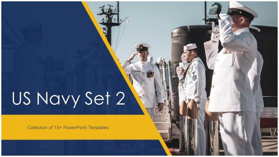
US Navy Set 2 Powerpoint Ppt Template Bundles




Try Before you Buy Download Free Sample Product
 Impress Your
 Audience
 100%
100% Editable
 Save Hours
 of Time


Our US Navy Set 2 Powerpoint Ppt Template Bundles are topically designed to provide an attractive backdrop to any subject. Use them to look like a presentation pro.
People who downloaded this PowerPoint presentation also viewed the following :
US Navy Set 2 Powerpoint Ppt Template Bundles with all 33 slides:
Use our US Navy Set 2 Powerpoint Ppt Template Bundles to effectively help you save your valuable time. They are readymade to fit into any presentation structure.
-
US Navy Set 2
-

US Navy High Rank Officer Icon with Badge
-

US Navy Landing Air Craft Cushion with Vehicles
-

US Navy Officer Hugging Veteran Sailor during Deployment
-

US Navy Officer Icon with Ship
-

US Navy Officer in Service Uniform
-

US Navy Officers Holding National Flag During Burial Ceremony
-

US Navy Response Boat in Ocean with Soldier
-

US Navy Sailors Praying for Martyrs
-

US Navy Sailors Standing in Queue
-

US Navy Sailors Taking Participation in Oath Ceremony
-

US Navy Sailors working on Aircraft Carrier
-

US Navy Sign Including Crossed Anchors and Wreath
-

US Navy Soldier Carrying Out Ship Maintenance
-

Navy Soldier Doing Scuba Diving Training
-

US Navy Soldiers Lifting Boat during Exercise
-

US Navy Soldiers lifting Wooden Log in Training
-

US Navy Soldiers Saluting Commanding Officer
-

US Navy Soldiers with American Flag
-

US Navy Soldiers with Military Rifles in Hand
-

US Navy Soldiers with National Flag in Hand
-

US Navy Soldier in Queue During Morning Parade
-

US Navy Soldier on Nautilus Submarine
-

US Navy Soldier Wearing Type 3 Uniform
-

US Navy Soldier with K9 Force Dog
-

US Navy Sailors Taking Participation in Oath Ceremony
-

US Navy Submarine near Shore with Different Country Flags
-

Thank You
-

-

-

-

-

FAQs for US Navy Set 2 Powerpoint
Okay so you definitely need the official Navy logo and proper classification markings - that's the big one that'll bite you if you mess it up. Use Navy blue and gold for colors, stick with Arial or Calibri fonts. Don't forget unit ID and slide numbers either. Honestly, I'd just grab your base's standard template if they have one - saves so much time wrestling with formatting. Some commands are picky about their own branding stuff too, so check what your unit wants specifically. The classification markings are no joke though, that's where people actually get in trouble.
Honestly, military templates work really well if you're pitching to defense folks or actual military people. They already know this format, so they can focus on what you're saying instead of figuring out your fancy design choices. Plus the whole structured layout thing just makes sense - everything has its place and there's no confusing clutter. I actually prefer them over those corporate templates that try way too hard with animations and weird fonts. The clean hierarchy helps your audience follow along easier since it matches what they see in their daily work. Just don't write casual content for a formal template - that'd be awkward.
So Navy PowerPoint templates are pretty straightforward - they stick with that classic navy and gold color scheme, plus anchor symbols everywhere. The layouts are super clean and structured, which makes sense given how much they value precision. Most templates have the Navy seal or ship silhouettes, and honestly some look really sharp. Bold, readable fonts are standard since clear communication is huge in military settings. The whole vibe screams professionalism and maritime tradition. If you're presenting to Navy folks, definitely use their official template - shows you respect their customs and makes your stuff look way more legit.
Navy blue, gold, and white are your go-to colors - they're the official ones you'll see everywhere. Gold gives it that military prestige look (plus it just looks really sharp honestly). White's great for contrast so people can actually read your text. Navy blue obviously screams authority and trust. You can throw in some gray too if you need a neutral. I'd stick with these since they're instantly recognizable as Navy branding. Oh and definitely test your colors on a projector first - I've seen too many presentations where you can't read anything because the contrast sucks on the big screen.
Honestly, a solid Navy template forces you to put your strategic goals right up front - no burying the lede. You get dedicated sections for mission statements and key priorities, which stops you from diving straight into tactical details (we've all sat through those painful briefings). The whole thing flows logically from big picture down to execution. Plus your command stays consistent - leadership knows exactly where to find the important stuff every time. Oh, and always circle back to that objectives slide throughout your brief. Keeps everyone focused on what actually matters.
Never touch the Navy logo or mess with official colors - learned that one the hard way. Text-wise, don't cram everything onto one slide, and honestly just use whatever fonts come with the template. I swear people think they need fancy animations but it looks ridiculous in military briefings. Oh, and watch out for covering up classification markings when you add stuff - that'll definitely get you in trouble. The templates exist for a reason so just follow them and you're good.
Keep your multimedia super clean and purposeful for Navy presentations. High-quality images work great - ships, personnel, mission photos as backgrounds or accents. Videos should be short, like under 2 minutes, and actually support your main points. Think mission briefings or equipment demos. Honestly, skip audio unless it's ceremonial stuff. Most Navy presentations just don't need it. Stick with proper Navy visual standards - correct logos, color schemes, all that. Keep animations subtle too. Those flashy transitions just distract from your message. Oh, and definitely test everything beforehand! AV equipment is so hit-or-miss between different facilities.
Dude, stick with the basics - Arial, Calibri, Times New Roman. Clean and readable wins every time. Don't get creative with decorative fonts (seriously, save that for your kid's birthday invite). Comic Sans will literally get you laughed out of the room. Pick one font, maybe two if you absolutely need to, then use it everywhere. Make sure it's big enough - 24pt minimum so the people in back aren't squinting. I learned this the hard way when my CO couldn't read my slides from his usual spot. Consistency shows you actually care about the details, which matters more than you'd think.
Honestly, templates are a game-changer for retention. Your brain gets used to seeing the same layout and stops wasting energy hunting for info. Short sentences work better here. It's like muscle memory - once people know where everything goes, they absorb content way faster instead of getting lost in formatting. Plus during stressful briefings (which, let's be real, most of them are), cognitive overload is already an issue. I've seen this work really well when you stick to one template across all your training stuff. People just click with it quicker.
Use the Navy template when you're presenting to military folks - briefings, operational stuff, training materials, contractor pitches. Works great for veteran events too. The formal layout and clean design really shine with data-heavy content where you need to look credible. Honestly, it's kinda like wearing the right uniform to a meeting - shows you get the culture. If your audience has Navy ties or you're talking defense topics, this template sets the right tone immediately. Plus it demonstrates respect for military protocols, which matters more than people think.
Honestly, the template structure is probably pretty solid - military people are weirdly good at organizing info cleanly. Just strip out all the Navy logos and replace them with your company's branding. Change those navy blue colors to whatever matches your brand. Remove any military jargon from the text too, obviously. The layout and typography should work fine for civilian stuff. Main thing is avoiding their official seals or insignia since that could get you in trademark trouble. Focus on keeping the clean formatting but making the content actually relevant to your audience instead of, you know, sailors.
Dude, just use the Navy template - it'll save you hours of work. All the logos, colors, and formatting are already done for you. No more guessing if your slides look "official" enough. Most of us suck at design anyway, so why torture yourself? The template keeps everything consistent and hits all those visual requirements they're obsessed with. Honestly, I learned this the hard way after spending way too long on a presentation that still looked amateur. Just plug in your content and you're golden.
Start with big, bold headers - navy blue looks sharp and matches your theme perfectly. Body text should be smaller and stick to black or dark gray so people can actually read it. Don't cram everything together though! White space makes slides way less overwhelming. Step down your font sizes: main heading, then subheadings, then regular text. Bold stuff sparingly or it loses impact. Align everything properly and keep spacing consistent between elements. Honestly, the squint test works - if you can't see the hierarchy from across the room, make your sizes more dramatic.
Yeah, definitely use historical stuff when it actually supports what you're trying to accomplish. Change of command ceremonies are perfect for this. Same with training briefs about tactics that worked or bombed completely. When you're explaining to leadership why we do things a certain way, history gives great context. Morale events too - people eat that heritage stuff up. Just don't randomly drop Admiral Nimitz's name because it sounds impressive, you know? Make sure there's actually a connection to your point. I've sat through too many briefings where someone throws in Naval Academy trivia just to fill time. Your audience will get it when it's relevant but zone out otherwise.
Honestly, templates are a lifesaver for mission briefings. Your audience can actually follow the logic instead of getting confused by random info dumps. I learned this the hard way after bombing a presentation once lol. Templates give you that clean flow from situation → objectives → execution details. Different stakeholders know exactly where to find timelines and risk stuff too. Plus it looks way more professional than scrambling slides together last minute (guilty as charged). Just grab a solid template and tweak it for your needs. Trust me, you'll thank yourself later.
-
The designs by SlideTeam are honestly the best I have seen so far. Will be definitely coming back for more.
-
Awesome presentation, really professional and easy to edit.