


2 Components Powerpoint Ppt Template Bundles





Try Before you Buy Download Free Sample Product
 Impress Your
 Audience
 100%
100% Editable
 Save Hours
 of Time


Our 2 Components Powerpoint Ppt Template Bundles are topically designed to provide an attractive backdrop to any subject. Use them to look like a presentation pro.
People who downloaded this PowerPoint presentation also viewed the following :
2 Components Powerpoint Ppt Template Bundles with all 18 slides:
Use our 2 Components Powerpoint Ppt Template Bundles to effectively help you save your valuable time. They are readymade to fit into any presentation structure.

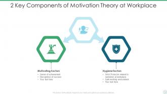
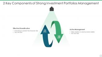
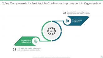






FAQs for 2 Components Powerpoint
Just make sure the bundle has tons of different layouts – aim for 50+ so you don't get bored. Consistent design is key, but check that you can actually edit fonts and colors. Some templates are weirdly locked down. You want a good mix: text slides, image spots, chart templates, the works. Master slides are clutch because they keep everything formatted when you add stuff. Oh, and seriously avoid anything that screams 2015 – so much outdated design out there it's painful. Get something that looks modern and you'll actually want to use it.
Honestly, good templates are a game-changer for keeping people focused on what you're saying instead of cringing at messy slides. Your audience judges you instantly based on how professional everything looks. I've watched presentations completely bomb just because the slides hurt to look at - terrible fonts, weird spacing, the whole disaster. Quality templates help guide people's eyes to your main points first, then the supporting stuff. Makes sense, right? Plus they actually help you organize your thoughts better, which makes presenting way less stressful. Trust me, spend the money on a decent template bundle. Your audience won't be scrolling Instagram halfway through.
Bundles are definitely the way to go over buying individual templates. Way cheaper since they're usually discounted, plus you get that consistent look across everything - pitch decks, reports, whatever you need. Honestly saved my butt so many times when I needed something quick. The matching colors and fonts just make everything look way more put-together. I'd grab one that covers your usual presentation types and you're golden for like 6 months. Oh, and avoid the super trendy ones - they get dated fast.
Dude, colors make or break presentations. Seriously - they set the vibe before you even open your mouth. Stick with 2-3 colors that actually work together and match your topic's mood. Your audience will think you've got your stuff together. But man, avoid the neon disasters. I watched this otherwise solid pitch die because someone put lime green text over royal blue. Like, come on. Those clashing combos just scream "amateur hour" and people zone out from your actual points. Find a decent template bundle and don't go rogue with random colors halfway through. Trust me, consistency sells your message way better.
Visuals are seriously clutch for presentations - like, they can totally save a boring slide deck. People zone out with walls of text, but throw in some good graphics and suddenly everyone's paying attention again. Our brains just process images way faster than reading anyway. The trick is finding templates where the visuals actually match what you're talking about, not just random stock photos that look nice. I've sat through way too many presentations with irrelevant clipart... it's painful. Good icons and images basically give your audience multiple ways to "get" your message. Plus they break things up so slides don't feel overwhelming.
Honestly, they're pretty genius - you basically get a whole bunch of different design styles crammed into one package. So like, corporate stuff, creative agency vibes, plus niche ones for healthcare, tech, whatever. I grabbed one last month and it had way more variety than I expected. Short presentations, long ones, different industries covered. You don't have to rebuild everything from zero each time, which is clutch when you're presenting to different crowds. Just hunt for bundles that mention your specific field so you're not stuck with random templates you'll never use.
Look for templates that already match your brand colors - saves you so much headache down the road. Swap in your actual fonts and logos, keep colors consistent throughout. Honestly, the biggest mistake people make? Going nuts customizing every single slide. Don't do that to yourself. Instead, nail down like 3-4 master layouts that work well together and just stick with those. I learned this the hard way after spending way too many late nights trying to make random slides look cohesive. Your presentations will look way more professional when everything actually matches.
Oh totally! Template creators are basically trend-stalkers - they watch what's hot and bundle those styles together. Right now you'll see tons of minimalist packs, dark mode themes, and honestly way too many gradient overlays (but people eat that stuff up). They're always chasing the latest color palettes and fonts too. Nobody wants templates that scream 2015, you know? When you're shopping for bundles, grab ones mixing 2-3 current trends instead of those generic "works for everything" packs - those usually suck at everything.
Honestly, start with the boring stuff first - make sure fonts are big enough and there's good contrast so everyone can actually read it. Those template bundles look amazing but half the time they're total eye candy that doesn't work with real content. I learned this the hard way lol. Test how your actual material fits instead of cramming it into some fancy layout. Oh and definitely check it on whatever ancient projector you're stuck with - animations can look like garbage on old tech. Preview everything beforehand or you'll be scrambling during class.
Dude, template bundles are a lifesaver for marketing presentations. I swear they've saved me so many late nights before big client meetings. Pick one that matches your brand vibe and you're basically halfway done - all the fonts, colors, and layouts are already coordinated. Your team can use the same bundle too, which keeps everything looking consistent (instead of everyone doing their own random thing). The presentations end up way more polished than anything I could design from scratch. Just customize the content for each pitch and you're golden. Trust me, clients notice when slides actually look professional.
So these bundles usually have slide layouts, infographics, charts - the whole deal. Most come with matching fonts and color schemes already set up, which honestly saves so much time. You'll get specific stuff too like pitch deck templates or social media graphics. Some even throw in stock photos, though those can be hit or miss quality-wise. They organize everything by category which is nice because otherwise you'd be scrolling forever. My advice? Grab a couple free ones first to test out different styles before committing to anything.
Dude, template bundles are a total game changer - I'm talking like 60-70% less prep time. Instead of building everything from zero, you just drop in your content and boom, you're done. Used to waste forever on fonts and getting things lined up right (seriously the worst part). Now I actually spend time on what I'm saying instead of how it looks. Oh, and definitely grab ones with style guides included. Makes everything way more consistent without thinking about it. Just make sure the layouts actually work for your stuff first.
Yeah, animations can totally help with retention if you don't go crazy with them. Simple transitions are great - they guide people's eyes and keep the flow smooth. But I've sat through presentations where the spinning text was literally more interesting than what the speaker was saying, which... not the goal lol. The flashy stuff just becomes a distraction. Stick with subtle effects that actually support your message. You want people remembering your content, not wondering how you made that swooshy thing happen. Less is definitely more here.
Honestly, it's mostly about quality and what you can actually do with them. Free ones are pretty basic - you'll get simple designs but usually have to credit the creator, which is kinda annoying for client stuff. Premium bundles though? Way more bang for your buck. You get hundreds of slides, different color options, better graphics, plus you can use them however you want commercially. The design quality is just... noticeably better, you know? They throw in extras too like icons and fonts. If it's for something important or you're charging clients, definitely go premium. The polish makes a difference.
So template bundles basically come with all the accessibility stuff already built in - high contrast colors, readable fonts, proper headings for people with visual impairments. Plus you get different layout options since some folks are visual learners while others prefer text-heavy slides. Honestly, it saves you from doing the math on color contrast ratios yourself (because who wants to figure that out?). Most bundles throw in alt-text spots and screen reader compatibility too. I'd start with clean, simple designs and maybe run them by your team first. Way easier than building from scratch.
-
Nothing beats the well-formatted and professionally designed templates offered. Kudos to SlideTeam for their amazing collection of PPT slides.
-
Nice and innovative design.