


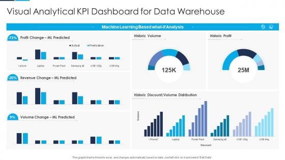
Visual Analytical KPI Dashboard Snapshot For Data Warehouse




Try Before you Buy Download Free Sample Product
 Impress Your
 Audience
 100%
100% Editable
 Save Hours
 of Time


Our Visual Analytical KPI Dashboard Snapshot For Data Warehouse are topically designed to provide an attractive backdrop to any subject. Use them to look like a presentation pro.
People who downloaded this PowerPoint presentation also viewed the following :
Visual Analytical KPI Dashboard Snapshot For Data Warehouse with all 7 slides:
Use our Visual Analytical KPI Dashboard Snapshot For Data Warehouse to effectively help you save your valuable time. They are readymade to fit into any presentation structure.





FAQs for Visual Analytical KPI Dashboard Snapshot
Essential KPIs vary by industry but typically include financial metrics, operational efficiency measures, customer satisfaction scores, employee productivity indicators, and growth targets. Effective dashboard presentation requires strategic visual hierarchy, real-time data integration, and intuitive design elements, with many organizations finding that sector-specific KPI combinations—like patient outcomes in healthcare or inventory turnover in retail—deliver enhanced decision-making capabilities and competitive advantage.
Customize KPI dashboards by creating role-specific views, adjusting metrics granularity, implementing dynamic filtering options, configuring automated alerts, and establishing personalized access permissions. These customization approaches enable executives to view high-level strategic metrics while operational teams access detailed performance data, ultimately delivering relevant insights that enhance decision-making across organizational levels.
Effective KPI visualization techniques include gauge charts for performance against targets, trend lines for progress tracking, heat maps for comparative analysis, and color-coded status indicators for quick assessment. These visual approaches enhance understanding by transforming complex data into intuitive displays, enabling faster decision-making and clearer performance insights, with many organizations finding that strategic visualization combinations significantly improve stakeholder engagement and operational transparency.
Popular KPI dashboard software includes Tableau, Power BI, Looker, Qlik Sense, and Grafana, each offering distinct visualization and integration capabilities. These platforms streamline performance monitoring by providing real-time data connectivity, customizable widgets, and automated reporting features, with many organizations finding that interactive filtering, mobile responsiveness, and seamless database integration ultimately deliver faster decision-making and enhanced operational visibility.
Ensuring KPI dashboard accuracy requires implementing automated data validation rules, establishing regular data audits, maintaining clean source systems, and creating cross-verification checkpoints between different data streams. Organizations across sectors like manufacturing and healthcare find that combining real-time monitoring alerts with periodic manual reviews significantly reduces errors, while standardized data collection protocols ultimately deliver more reliable insights and confident decision-making.
**INPUT**: What is the optimal frequency for updating data on my KPI dashboard to keep it relevant and actionable? **OUTPUT**: KPI dashboard update frequency depends on your business needs, data criticality, and decision-making cycles, with real-time updates for operational metrics and daily or weekly refreshes for strategic indicators. Many organizations find that combining hourly updates for sales performance, daily refreshes for customer metrics, and weekly updates for financial KPIs delivers optimal balance between relevance and resource efficiency, ultimately enabling faster responses while maintaining data accuracy.
Integrating real-time data feeds into KPI dashboards involves connecting APIs, database connections, cloud-based data pipelines, automated data refresh systems, and streaming analytics platforms. These technologies enable organizations to monitor performance metrics instantly, identify trends as they emerge, and respond to operational changes within minutes rather than hours, with many enterprises finding that real-time visibility significantly enhances competitive advantage and strategic responsiveness.
Common pitfalls include overcrowding with too many metrics, using poor visual hierarchy, lacking clear data definitions, ignoring user workflows, and failing to align KPIs with business objectives. These design mistakes create confusion rather than clarity, with many organizations finding that streamlined dashboards focusing on 5-7 key metrics ultimately deliver better decision-making outcomes and user adoption rates.
User feedback improves KPI dashboard effectiveness by identifying visualization gaps, highlighting missing metrics, and revealing workflow inefficiencies that impact decision-making processes. Through regular feedback collection, organizations can refine data presentations, add relevant benchmarks, and streamline navigation paths, ultimately delivering dashboards that enhance operational efficiency and strategic insights across teams.
Storytelling transforms KPI data into compelling narratives that drive actionable business decisions, helping stakeholders understand trends, causations, and strategic implications beyond raw numbers. Through contextual explanations and visual progression, organizations create meaningful connections between metrics and business outcomes, with executives and department managers finding that narrative-driven dashboards enhance comprehension, accelerate decision-making, and ultimately improve strategic alignment across teams.
KPI dashboards drive accountability by establishing transparent performance metrics, enabling real-time monitoring of individual and team contributions, and creating clear visibility into goal achievement across all organizational levels. Through automated tracking and regular reporting cycles, managers can identify performance gaps quickly, provide targeted coaching interventions, and recognize high performers, ultimately fostering a data-driven culture where accountability becomes embedded in daily operations.
Best practices for organizing KPIs on dashboards include grouping related metrics by department or function, using visual hierarchy with size and color coding, placing critical KPIs prominently at the top, and maintaining consistent formatting throughout. These approaches streamline decision-making by enabling quick identification of performance trends, reducing cognitive load, and facilitating faster responses to business changes, ultimately delivering enhanced operational efficiency and strategic oversight.
Establish KPI hierarchy by aligning metrics with strategic objectives, categorizing them into primary business drivers, secondary operational metrics, and supporting indicators based on decision-making impact. Start with executive-level outcomes like revenue and profitability, then cascade to departmental performance measures, with many organizations finding that limiting primary KPIs to 5-7 ensures focus while enabling drill-down capabilities for deeper analysis.
Mobile-friendly KPI dashboard solutions include responsive web platforms, dedicated mobile apps, progressive web applications, cloud-based analytics tools, and mobile-optimized business intelligence suites. These technologies streamline executive decision-making by delivering real-time insights, enabling remote monitoring, and facilitating instant data access, with many organizations finding that mobile accessibility enhances operational agility and competitive responsiveness.
Effective KPI dashboard training involves establishing clear data literacy foundations, conducting hands-on workshops with real scenarios, and creating standardized interpretation guidelines for key metrics. Start with basic analytics concepts, then progress to industry-specific KPIs relevant to each team member's role, while encouraging collaborative analysis sessions where teams can discuss trends, identify actionable insights, and connect dashboard data to strategic business outcomes.
-
“Slides are formally built and the color theme is also very exciting. This went perfectly with my needs and saved a good amount of time.”
-
The team is highly dedicated and professional. They deliver their work on time and with perfection.