

Wheel diagram ppt slides presentation 26




Try Before you Buy Download Free Sample Product
 Impress Your
 Audience
 100%
100% Editable
 Save Hours
 of Time


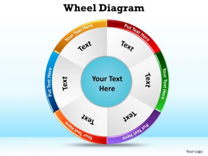
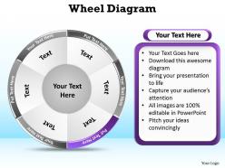
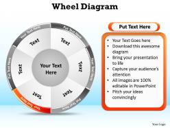
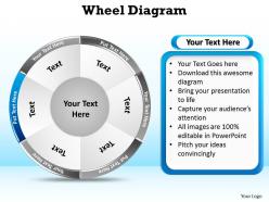
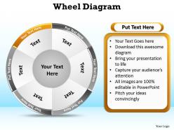
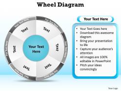
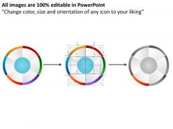
We are showing this wheel diagram ppt slides presentation 26 PowerPoint format slide foundation for influencing your business to work productively. This is a novel plan used to exhibit the arrangement of occasions collaborating more than once through a cycle. A business has a great deal to exhibit like the stream of cash in an economy, the cycle in nature, the wholesalers and retail buys, the deals and a considerable measure. With this wheel diagram ppt slides presentation 26 PPT format a client can obviously depict the lesson which is anything but difficult to recognize and to be utilized for a wide range of procedures and arrangement of occasions. This chart can be utilized to exhibit the stream of cash where the assets travel through the generation procedure or the lifecycle of a thought. These are regularly round and sorted out to make utilization of run of the mill assets. Subsequently utilize it for graphical association, for building learning and sorting out data. Brew a potion with our wheel diagram ppt slides presentation 26. Your thoughts will acquire magical strength.
People who downloaded this PowerPoint presentation also viewed the following :
Wheel diagram ppt slides presentation 26 with all 11 slides:
How good and exciting a presentation is will depend on the time spent on the organisation. Luckily you don't have to do it for we've done it for you with our wheel diagram ppt slides presentation 26.
FAQs for Wheel diagram ppt
So basically you stick your main idea in the center, then all the related stuff radiates out from there. Think spokes on a bike wheel. What's cool about it is people instantly get how everything connects - they see the big picture AND the details at once. Way better than boring bullet points, honestly. I use these all the time for explaining strategies or breaking down product features. Actually, now that I think about it, they're perfect when you've got one concept with a bunch of moving parts. Your audience won't get lost trying to figure out relationships between things.
Wheel diagrams are honestly perfect for this stuff. Everything connects back to one main idea, so people can actually see how it all fits together instead of trying to figure it out from a wall of text. The center-and-spokes thing makes it obvious what matters most. You can build them step by step too - just start with the middle concept, then add each spoke as you talk through it. Way less overwhelming than dumping everything at once. I learned this the hard way after confusing way too many people with overly complex slides lol.
So start with your main idea in the center - that's your hub. Then draw 6-8 spokes coming out with your key points. The outer edge is where you dump all your examples and details. Try to make the sections flow together, but don't stress if some connections feel weird - mine always have at least one awkward spot. Colors help tons for keeping things organized. Oh, and balance is key so one spoke doesn't completely take over (unless you want it to). I always sketch the center first then work my way out - makes the whole thing less overwhelming.
Honestly, good design is everything with wheel diagrams. Make sure your labels around the edge are actually readable - nobody wants to squint at tiny text. Group related stuff together logically, and don't just throw colors everywhere like confetti. I learned that one the hard way! Your main idea goes in the center, then connect everything with spokes that make visual sense. Size it right too - massive diagrams lose focus, tiny ones are useless. Test it on someone first because what seems obvious to you might be total gibberish to them.
Oh man, don't cram too much text on there - it'll look messy as hell. Also watch your segment sizes, they should actually match what they represent proportionally. Color-wise, pick shades that don't blend together (seriously, I've seen wheels where you squint trying to figure out what's what). Keep labels short and punchy. Sketch it out on paper first - way easier to fix proportions before you go digital. Oh, and leave breathing room! White space is your friend here. The hierarchy thing matters too - your center should clearly be the main idea with everything else supporting it.
Honestly, wheel diagrams are clutch when you've got a bunch of stuff that all connects back to one main thing. Perfect for stakeholder maps or showing how different departments tie into a project. Brainstorming sessions too - there's something about that circular layout that gets people's brains working differently than boring old flowcharts. Way easier to understand than those nightmare org charts when you're dealing with hub-and-spoke type relationships. Oh, and they're terrible for step-by-step processes - don't even try that. Use them when everything points back to the center instead.
Blue and orange work great together - same with purple and yellow. These combos naturally grab attention and help separate your different sections. For related data, I'd go with colors that flow into each other, like blues melting into greens. Makes the connections obvious. Don't put similar shades next to each other though, nobody wants to squint at your diagram trying to figure out what's what. Oh, and definitely test your colors on Coolors.co first - saves you from staring at it later wondering why something feels off.
Dude, go with **Lucidchart** or **draw.io** - they've got templates that'll make your life way easier. Canva's pretty decent too if you want something more visual and less techy. PowerPoint actually works fine (I know, I know, sounds basic) but you'll be doing more manual stuff. Oh wait, do you have Adobe? Illustrator gives you crazy control over everything if you're into that level of detail. Honestly though, I'd just start with Lucidchart since it's literally made for this stuff and your team can jump in to edit if needed.
Think about who's actually looking at this thing first. Corporate folks want clean designs and quick wins - show them ROI numbers and keep it simple since they're probably multitasking in meetings anyway. Students are different though. They can handle way more detail and honestly prefer colorful, busy designs that would make executives cringe. Decision-makers need outcomes spelled out clearly. Learners want the full explanation with all the bells and whistles. I'd say start there - are they trying to understand a concept or just need the bottom line? That'll tell you whether to go minimal and sleek or detailed and interactive.
Honestly, wheel diagrams are a game changer for project planning. Put your main goal in the center, then all your tasks and resources branch out like spokes. Way better than those confusing hierarchy charts if you ask me. You'll spot missing pieces super fast and see exactly where teams overlap. Dependencies become obvious too - which is huge when you're trying to explain scope to stakeholders who don't get the technical stuff. I used one last month and suddenly everyone understood why we needed extra developers. Give it a shot next time you're stuck visualizing a complex project.
Oh, interactive wheel diagrams are actually pretty cool! Start with hover effects - they'll light up sections when you mouse over them. PowerPoint and Prezi both let you add clickable segments that pop up with more details. My favorite trick? Progressive disclosure where pieces appear as you click through your story. You can also embed hotspots that jump to other slides or websites. Honestly, the animation stuff is what makes these way better than boring static charts. People love being able to explore data themselves instead of just sitting there watching. Even simple hover highlights make a huge difference - suddenly your audience is actually engaged instead of zoning out.
Honestly, wheel diagrams are perfect for consulting and project management stuff - you know, those McKinsey frameworks where everything connects back to one main idea. Marketing teams love them too for showing how different campaign pieces tie to the brand message. Healthcare uses them a lot for patient care flows, and schools do curriculum mapping with them. The whole hub-and-spoke thing just makes sense to people's brains, I guess? It's pretty much ideal whenever you've got one central concept with a bunch of supporting pieces radiating out. Next time you're pitching a strategy, definitely try it - way clearer than bullet points.
After you show wheel diagrams, definitely ask people what confused them. "Which parts were hardest to get?" or "Did the colors make sense?" Trust me, people will tell you exactly what's broken - they're way more honest than you'd think! Then actually use that feedback to fix your labels, resize segments, or tweak the color scheme. I always do quick surveys after presentations now. The trick is testing multiple versions instead of just hoping your first design works. It's kinda obvious when you think about it, but most people skip this step entirely.
So you've got a few options here. Hub-and-spoke wheels are solid for connecting stuff to one main idea. Segmented ones work perfect for percentages - you know, those pie chart things everyone uses for budgets. My personal favorite though? Layered wheels with multiple rings. Great for showing different levels of info at once. There's also circular flow wheels where arrows connect everything to show step-by-step processes. Honestly just pick whatever fits your data best and people will get it way easier.
Honestly, wheel diagrams are a game changer for making strategy actually stick. You put your main goal in the center, then each priority becomes a spoke radiating out - suddenly everyone can see how their piece connects to the whole thing. Way better than those endless bullet point lists that nobody remembers anyway. I started using them in our team meetings and it's wild how much faster people "get it" now. Visual stuff just clicks differently, you know? Plus it kills those awkward moments where someone's like "um, how does this tie back to what we're trying to do again?" Give it a shot next time.
-
Excellent template with unique design.
-
Design layout is very impressive.