

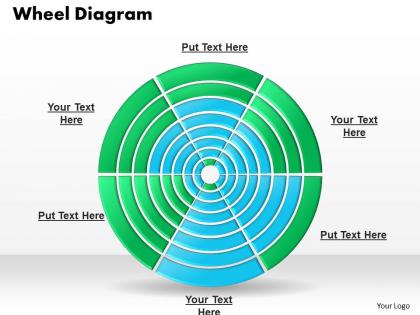
Multi level wheel diagram powerpoint template slide




Try Before you Buy Download Free Sample Product
 Impress Your
 Audience
 100%
100% Editable
 Save Hours
 of Time


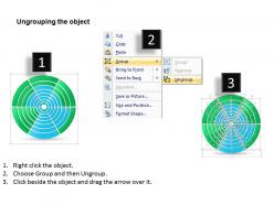
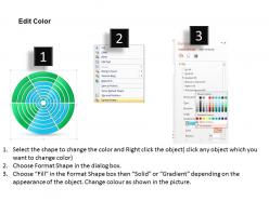
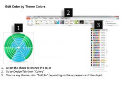
If you want to target the specific types of customers for your products or services then you should use our multi-level wheel diagram PowerPoint template slide to build up a marketing or sales strategy for the target customers. You can elaborate the business process with this PPT template design which helps in describing the various types of segments. This PowerPoint slide presentation example can help you to make presentations on decision making or problem solving presentations. The slide design is prepared with a 3D maze design and you can place the arrows in the desired positions to indicate the entrance of the labyrinth and the exit. This PowerPoint slides are useful in explaining the business benefits of such marketing types such as key to attract new business opportunities, increase the sales, more cost effective and easier marketing approach and many more like these. Hurry up now! Download this diagram and target your potential audiences. Business is about time as well as money. If you run a business you can?t have all the time to create your own presentations from scratch. That?s why you should make use of high quality Multi Level Wheel Diagram Powerpoint Template Slide.
People who downloaded this PowerPoint presentation also viewed the following :
Multi level wheel diagram powerpoint template slide with all 6 slides:
Envisage events to follow with our Multi Level Wheel Diagram Powerpoint Template Slide. Your forward looking approach will be admired.
FAQs for Multi level wheel diagram
So picture Russian nesting dolls but flat - that's basically what these are. You stick your main idea right in the center circle. Then the first ring around it gets your big categories. Keep adding rings outward, getting more specific each time. The outer edges have all your detailed examples and subcategories. I actually love these for messy brainstorming sessions because they force you to think hierarchically without getting overwhelmed. Start simple though - just do three rings at first or you'll drive yourself crazy trying to organize everything perfectly.
Multi-level wheel diagrams are perfect for showing hierarchical stuff - like org charts, decision trees, or breaking down big projects. They work great when you have one main concept in the center with layers branching out. Honestly, they're way better than boring lists or tables because people can see the big picture AND the details at once. I've used them in planning meetings and everyone actually follows along instead of zoning out. The visual format just clicks with people's brains, you know? Next time you're presenting layered info, try one - your audience will thank you for not making them decode another spreadsheet.
Dude, multi-level wheel diagrams are actually pretty solid for breaking down complex stuff. The main idea goes in the center, then everything else branches out in rings around it. Way better than those mind-numbing bullet point slides everyone makes. You can play with colors and sizes to show what's most important. Plus the circular thing naturally draws people's eyes around the whole diagram - works great for showing processes or how teams are structured. I used one last month for a project breakdown and people actually paid attention for once. Your audience won't zone out like they usually do.
You can actually see all the layers of your data at once, which is pretty cool - no more clicking between a million different charts. The way it flows from center outward just makes sense visually. Honestly, people actually look at them instead of glazing over like they do with boring bar charts. Perfect for when you've got that messy hierarchical stuff that's hard to explain otherwise. You can zoom into details but still see the big picture context. Worth trying if your data has natural levels or categories that build on each other.
Put your main idea in the middle, then branch out by asking "what are the big pieces here?" Each layer should be like pizza slices - no overlap, but covers everything. I literally always screw this up on my first try and create categories that blend into each other lol. Don't go over 3-7 categories per level or it gets messy fast. Here's what I do: explain each section to someone else. If they're scratching their head about where stuff fits, you need to tweak those categories. The pizza slice thing really works though - that mental image saved me so many times.
Honestly, Lucidchart is probably your go-to here - super intuitive for those concentric circle setups. Draw.io works well too and it's free, which is nice. Canva's got some decent templates if you want something that looks polished without much effort. PowerPoint can technically do it but gets annoying fast with all the nested levels - been there. Adobe Illustrator gives you crazy control but feels like using a sledgehammer to hang a picture frame, you know? I'd start with Lucidchart since you can easily share it around afterward.
Oh man, these wheel diagrams are literally everywhere once you notice them! McKinsey and those big consulting firms are obsessed - they use them for breaking down business strategies with the main problem in the center and solutions branching out. Tech companies do the same thing for system architecture and UX mapping. Manufacturing loves them for quality control and supply chain stuff. Healthcare uses them too, mainly for patient care pathways. Honestly they're kind of addictive once you get started (I may have gone overboard with them at my last job). My advice? Start with just two levels and add more complexity later.
Okay so color psychology is actually super important for those wheel diagrams. Use warm colors like reds and oranges for your main stuff since they grab attention first. Blues and greens are perfect for the less important details. I swear, half the diagrams I see are total disasters because people just threw random neon colors everywhere! Stay within the same color families for related ideas, but make some darker or lighter to show how they connect. Oh and definitely run it by someone else first - I learned this the hard way when my "obvious" color coding made zero sense to anyone else.
Honestly, the worst thing you can do is cram way too much text into each section. Nobody wants to squint at tiny words. Your inner rings shouldn't be super narrow either - looks weird and throws everything off balance. I made this mistake once and it was a disaster lol. Short labels work way better. Oh, and please don't go crazy with colors because it just becomes a confusing mess. You need good contrast between each level so people can actually see the hierarchy. Start from the center with your main idea, then build outward step by step instead of randomly jumping around.
Honestly, less is more with these things - stick to 5-7 items per ring or it gets overwhelming fast. Put your most important stuff in the center and work outward. Make your fonts smaller as you go out, which naturally draws people's eyes where you want them. Color coding helps group related stuff together, but don't go crazy with it. Leave some breathing room too - cramming everything in just because there's space is tempting but looks terrible. Oh, and definitely print a test copy! What looks fine on screen can be completely unreadable on paper.
Look, you absolutely need labels or your wheel thing will be totally useless. People will just stare at pretty colors going "what am I even looking at?" Been there - seen way too many diagrams that looked great but told me nothing. Make your text readable at every level, and don't be afraid to use those little callout lines for tiny segments. Each ring needs consistent labeling so people can actually follow your logic. Oh, and make sure it tells a clear story - nobody should have to play guessing games with your data. Your diagram's only as good as people's ability to understand it.
Try putting your main story in the center of a multi-level wheel diagram, then build outward with supporting details in each ring. Core message goes in the hub. Context and evidence fill the outer layers as you move through your presentation. It's like building an onion in reverse - adding complexity instead of peeling it away. Works great for case studies where you need to connect multiple factors back to your central point. Oh, and reveal each ring one at a time! Keeps people engaged and lets you control the pacing way better.
Animate from center outward - show your main idea first, then reveal each ring layer by layer. Learned this after completely bombing a stakeholder meeting where everyone just zoned out! Give each reveal 2-3 seconds, and maybe add subtle color changes to show how the levels connect. Don't do spinning animations though - they're flashy but actually make things harder to follow. Stick with simple fade-ins or wipes. Oh, and definitely test the timing beforehand. You'll want a backup static version too, just in case the animation doesn't work during your actual presentation.
So basically these wheel diagrams are genius because they put simple stuff in the middle and get more technical as you go out. People just naturally pick their level - newbies stick to the center while experts can geek out on the outer rings. I love how nobody gets lost or bored since they choose their own depth. Plus the visual flow just makes sense, you know? One trick I've been using: start with just that inner circle, then add layers based on what questions people ask. Works way better than dumping everything at once.
Hover effects are your best friend here - they'll highlight segments and show tooltips with all the details. Click-to-drill-down is super useful too, where people click outer rings to zoom into deeper levels. Some of the coolest ones I've seen actually rotate when you drag them around (though that might be overkill depending on your data). You can throw in filters, search bars, or smooth transitions between different views. Honestly, the main thing is keeping it obvious how to navigate - nobody wants to guess what clicking does. Start with basic hover and click stuff, then add fancier features if people actually need them.
-
Best Representation of topics, really appreciable.
-
Design layout is very impressive.